In today’s design-driven world, logos are more than just symbols—they’re the heart of a brand’s identity. A Symmetrical Sushi Logo Design stands out for its balance, elegance, and ability to capture the precision that sushi craftsmanship represents. Whether you’re rebranding a sushi business or creating a fresh visual identity, this step-by-step guide will help you master the art of logo creation.
Ready to dive in? Let’s roll through the process.
Step 1: Understanding the Brand’s Core
The first step in any logo design process is to uncover the brand’s personality. For sushi brands, this often includes themes of balance, precision, freshness, and tradition.
- Ask these questions: What emotions should the logo evoke? Who is the target audience? Does the brand lean towards traditional Japanese culture or a more modern vibe?
Understanding the answers helps set the stage for the rest of the design journey.
Symmetrical sushi logo design process Mind Map
Step 2: Sketching the Concept
A great design begins on paper. Start by brainstorming concepts that integrate sushi-related elements and symmetry.
- Pro Tip: Experiment with geometric shapes like circles or patterns that resemble sushi rolls or fish.
This stage is where you let creativity flow, so don’t worry about getting it perfect just yet.
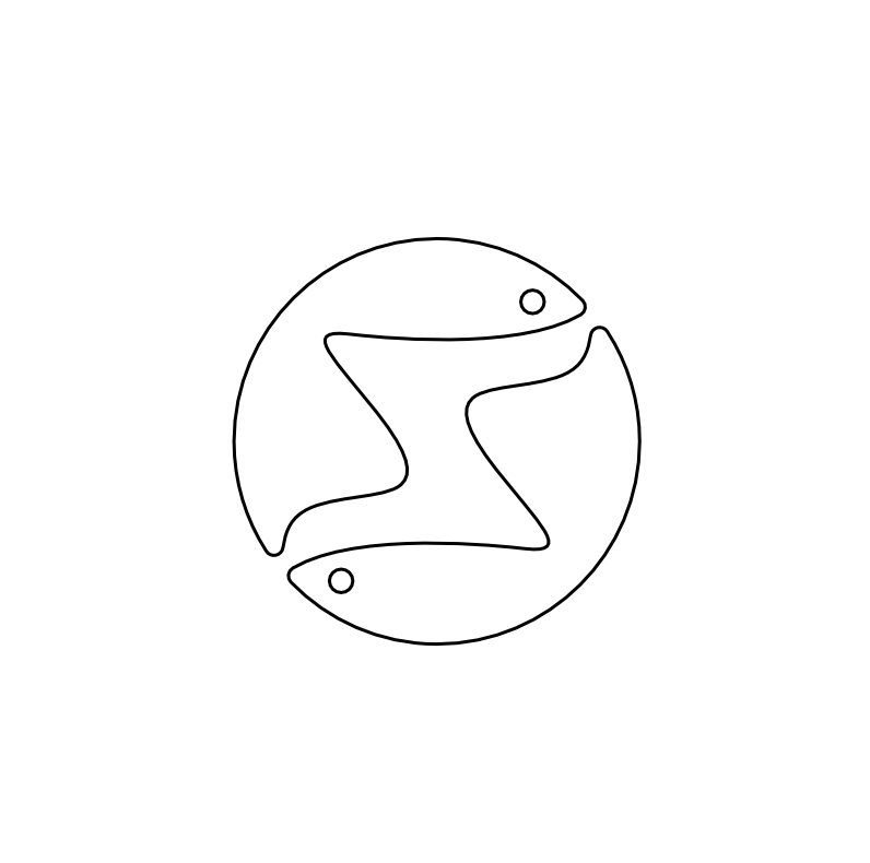
Sketch
Step 2: Sketching the Concept
A great design begins on paper. Start by brainstorming concepts that integrate sushi-related elements and symmetry.
- Pro Tip: Experiment with geometric shapes like circles or patterns that resemble sushi rolls or fish.
This stage is where you let creativity flow, so don’t worry about getting it perfect just yet.
Final Shape
Step 4: Selecting the Color Palette
Colors breathe life into a logo. For a symmetrical sushi logo, the right palette can evoke appetite, elegance, and harmony.
- Best colors for sushi logos:
- Scarlet (#FC2C04): A vibrant, appetite-inducing hue that symbolizes passion and energy.
- Mine Shaft (#343434): A deep, sophisticated tone that adds balance and contrast.
Pair these colors thoughtfully to create a logo that’s bold yet refined.
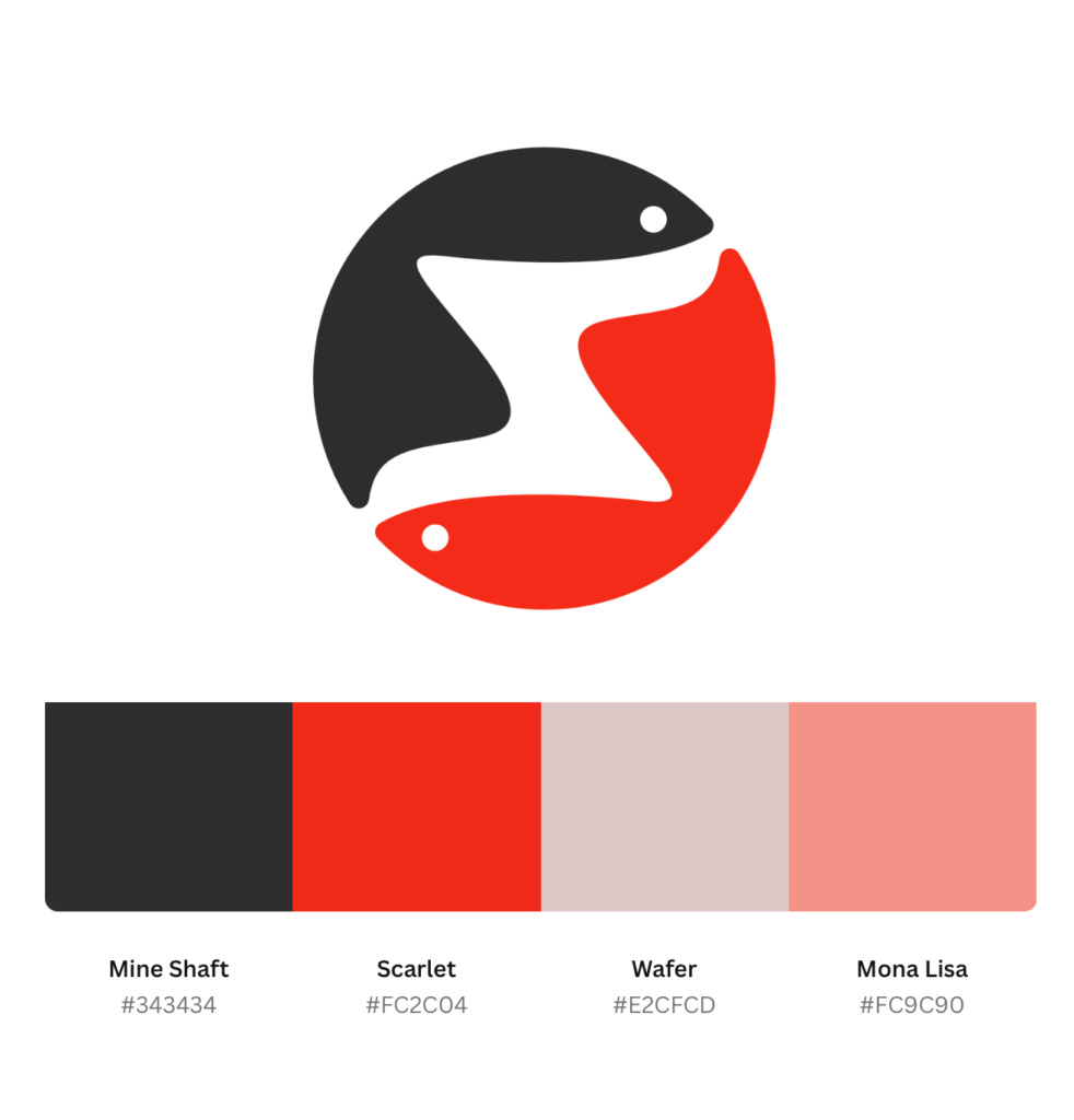
Color Palette
Step 5: Digitizing the Design
Take your refined sketch and digitize it using vector-based design software like Adobe Illustrator.
- Key tips for digitization:
- Maintain clean, scalable lines to ensure the logo looks flawless on everything from menus to billboards.
- Test the design on both light and dark backgrounds to check versatility.
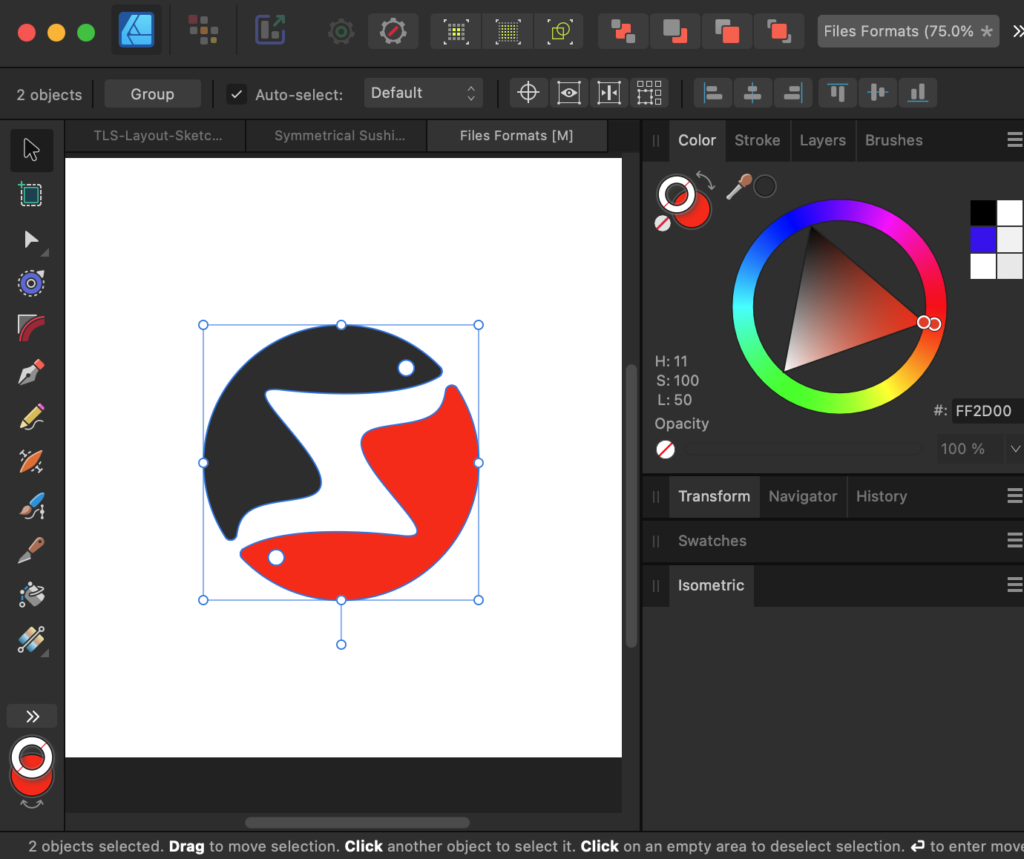
Digitizing
Step 6: Finalizing the Details
Once digitized, refine the logo to perfection. This involves testing the design at various sizes and ensuring every detail aligns with the brand’s vision.
- What to check:
- Does the symmetry remain intact across applications?
- Are the colors balanced and visually appealing?
This is the stage where the logo truly comes to life.
Variations
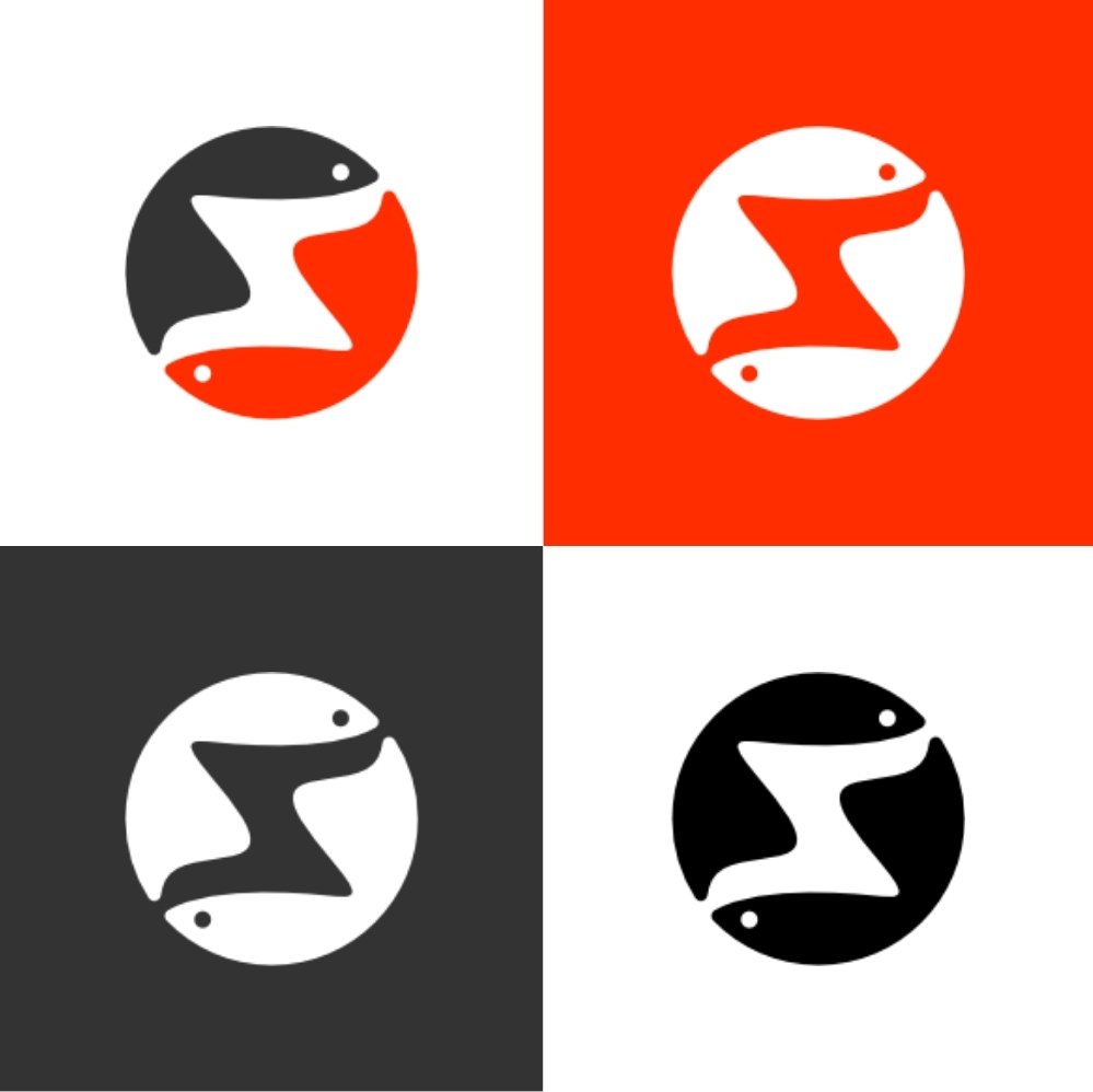
Step 7: Delivering the Final Package
A professional designer knows that delivery is just as important as the design process. Provide the client with a comprehensive logo package that includes:
- Scalable vector files (SVG, AI)
- High-resolution PNGs and JPEGs
- Variations for light and dark backgrounds
- Monochromatic and grayscale versions
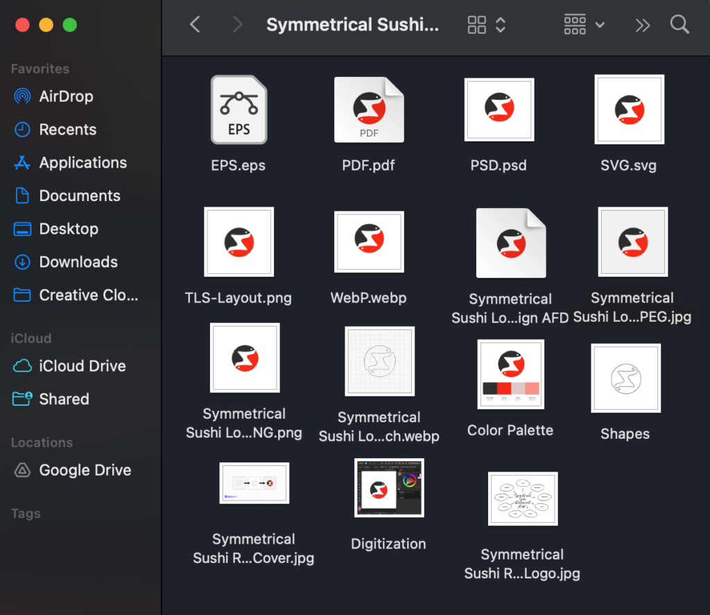
Raster & Vector Formats
Why Symmetry Matters in Sushi Logo Design: Conclusion
Mastering the Symmetrical Sushi Logo Design Process isn’t just about creating a pretty picture—it’s about telling a story. By following these seven actionable steps, you can design a logo that not only stands out but also connects emotionally with its audience. Ready to create a logo that’s bold, balanced, and unforgettable? Let’s get designing!
FAQs for Symmetrical Sushi Logo Design Process
1. What is the Symmetrical Sushi Logo Design Process?
The Symmetrical Sushi Logo Design Process is a creative approach to crafting sushi-themed logos with perfect balance and harmony. This process integrates symmetry, sushi-inspired elements, and brand identity to design visually striking and meaningful logos.
2. Why is symmetry important in sushi logo design?
Symmetry communicates balance, precision, and trustworthiness—all essential qualities for a sushi brand. It reflects the meticulous craftsmanship of sushi-making and creates a logo that is aesthetically pleasing and memorable.
3. How do I choose the right color palette for a sushi logo?
In the Symmetrical Sushi Logo Design Process, vibrant colors like Scarlet (#FC2C04) evoke appetite and energy, while deeper tones like Mine Shaft (#343434) add sophistication and contrast. Selecting the right palette ensures your logo resonates with your brand’s essence.
4. What elements should a sushi logo include?
A sushi logo should incorporate elements like sushi rolls, chopsticks, fish, or circular shapes to represent harmony. Adding a symmetrical design ensures the logo looks professional and cohesive.
5. What software is best for creating a symmetrical sushi logo?
Vector-based software like Adobe Illustrator or Affinity Designer is ideal for creating symmetrical logos. These tools ensure your design is scalable and maintains clean, precise lines.
6. How can I ensure my sushi logo looks professional?
To ensure a polished design:
- Use symmetry for balance.
- Choose a professional color palette.
- Digitize your design for scalability.
- Test the logo on various backgrounds and sizes.
7. Can symmetry make a logo more memorable?
Yes! Symmetry creates visual harmony, making logos easier to recognize and remember. It conveys a sense of stability and professionalism, especially important for sushi brands.
8. How long does it take to complete the sushi logo design process?
The time required depends on the complexity of the design and the designer’s expertise. On average, the Symmetrical Sushi Logo Design Process can take anywhere from a day to a couple of weeks.
9. How can a sushi logo represent the brand’s core values?
A well-designed sushi logo reflects the brand’s values by incorporating elements like freshness, tradition, and precision. Combining these elements with symmetry ensures the logo connects emotionally with the audience.

Dil Nawaz | Visual Storyteller
About the Author
Hi, I’m Dil Nawaz, a passionate hand-drawn logo designer dedicated to creating meaningful and unique brand identities. With over a decade of experience, I’ve had the privilege of designing logos that tell stories and connect with audiences worldwide.
Follow me on:
Let’s bring your vision to life! Feel free to reach out via email at info@thelionstudios.com or visit my portfolio at https://thelionstudios.com/.