Creating a great logo isn’t just about visuals it’s about storytelling. When you’re building a brand in the wellness or supplement industry, your logo becomes your handshake, your first impression, your silent salesperson. So when I set out to design a beetroot supplement logo, I knew it needed more than just flair it needed strategy, function, and meaning.
Here’s a full breakdown of the design process from concept to delivery.

Beetroot Supplement Logo
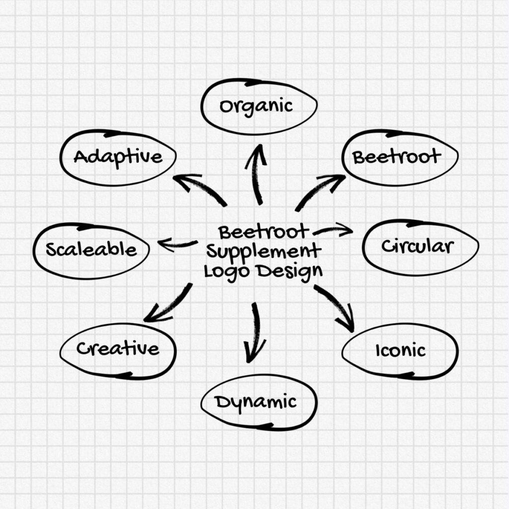
Step 1: Brainstorming & Brand Mapping
Before diving into visuals, I began by identifying the core attributes the brand should represent. Some words that shaped the direction:
- Beetroot
- Organic
- Circular
- Dynamic
- Iconic
- Versatile
- Clean
- Scalable
This phase was all about ensuring the logo would work across packaging, labels, digital platforms, and even future merchandise.
Beetroot Supplement Logo: Mind Map
Step 2: Sketching the First Concepts
I moved straight to sketching using a grid-style layout to stay balanced. The central idea? A beetroot-inspired icon that’s modern and symbolic, not overly literal.
This allowed for a design that feels premium and versatile without looking like just another food label.
Beetroot Supplement Logo: Final Sketch
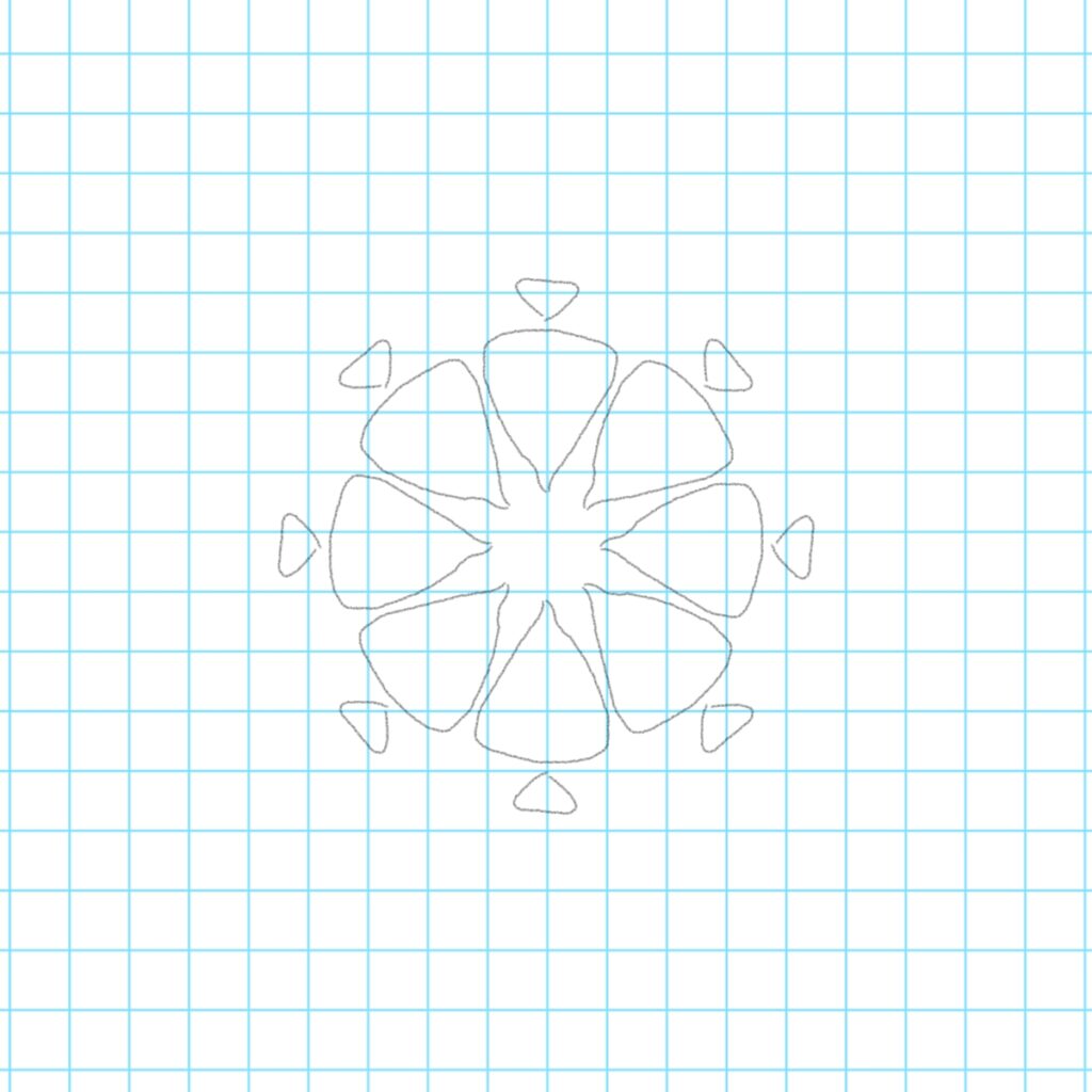
Step 3: Shaping the Structure
I chose circular geometry with petal-like forms to mimic beetroot slices and infused subtle triangular leaves around the circle to add that earthy, healthy touch.
Shapes were carefully chosen to reflect:
- Harmony
- Balance
- Movement
- Natural rhythm

Beetroot Supplement Logo: Final Shape
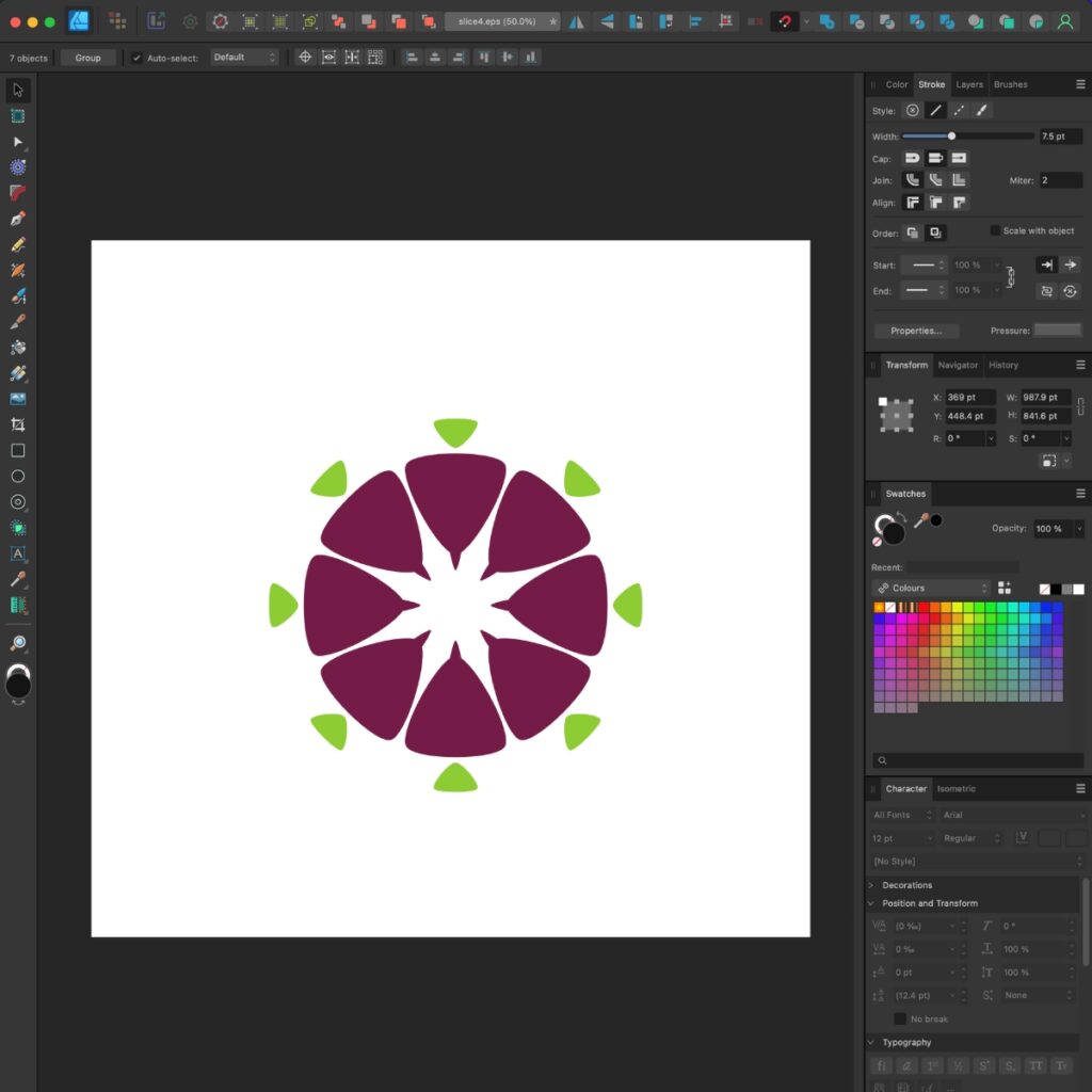
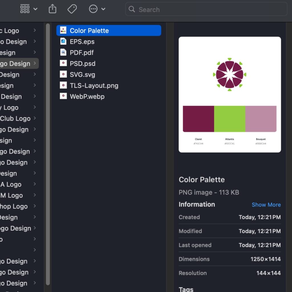
Step 4: Picking the Color Palette
Color psychology plays a massive role in supplement packaging.
I picked the following:
- Claret (#741C44) – A deep beetroot red to convey richness and strength
- Atlantis Green (#93CC41) – Fresh, energetic, and organic
These tones feel natural but also pop on shelves—a must for any product competing in the supplement or health snack aisle.

Beetroot Supplement Logo: Color Palette
Step 5: Digitizing with Precision
The design was then recreated in vector format using Affinity Designer to ensure pixel-perfect scalability.
Every anchor point was adjusted for:
- Symmetry
- Alignment
- Clean outlines for perfect laser or foil printing
Now the logo could be used from tiny icons to billboard-sized packaging without distortion.
Beetroot Supplement Logo: Digitizing
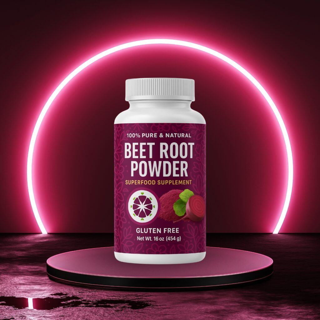
Step 6: Mockup & Presentation
No logo presentation is complete without a mockup.
I placed the design onto a supplement bottle with a clean white background and deep magenta lighting. This highlighted the organic and high-energy feel, giving potential buyers and investors a clear vision of the brand in action.
Beetroot Supplement Logo: Supplement Mockup
Step 7: Final File Delivery
The full brand package included:
- Vector Files: AI, EPS, SVG, PDF
- Raster Files: PNG, JPG, WEBP
- Editable PSD
- Reversed version, sketches, and color palette guide
Ready for print, web, labels, and even social content.
Raster & Vector Formats
Why It Works
This beetroot supplement logo isn’t just a design it’s a branding solution. Built to scale, built to last, and built to connect with health-conscious audiences who crave authenticity and style.
Looking to develop a standout supplement or superfood logo for your brand?
Let’s make your product shelf-ready and scroll-stopping.
1. Why is logo design important for supplement brands?
A logo is the face of your supplement brand. It creates instant recognition, communicates trust, and helps your product stand out in a highly competitive industry especially on retail shelves and online marketplaces.
2. What makes a great supplement logo design?
A strong supplement logo should be simple, scalable, and symbolic. It must look professional on labels, websites, packaging, and promotional material. Bonus points if it communicates the product’s benefits visually like vitality, purity, or natural ingredients.
3. Why use a beetroot-inspired design for a supplement?
Beetroot is associated with natural energy, heart health, and nitric oxide boosting. Using a beetroot-inspired design taps into these health benefits visually, instantly aligning the logo with wellness and superfood values.
4. What colors work best for wellness and superfood products?
Earthy, natural tones like deep reds, greens, and soft neutrals work well. For beetroot, rich burgundy, leafy greens, and muted tones reflect health, vitality, and premium quality.
5. Can I use this logo for bottles, jars, and eCommerce listings?
Yes! The logo was designed in vector format, making it scalable for all surfaces bottle labels, flexible pouches, shippers, social media, and even laser-etched tools or merchandise.
6. Will I get editable files for future updates?
Absolutely. You’ll receive a complete brand package including editable files (AI, PSD), high-res exports (JPG, PNG, WEBP), and scalable vectors (SVG, EPS, PDF). You’ll also get reversed versions and a color guide for easy integration across platforms.
7. Can I request a custom supplement logo like this?
Yes! Whether you’re building a wellness brand from scratch or refreshing an existing product line, I offer full custom branding services tailored to the supplement, skincare, and wellness industries.

Dil Nawaz | The Lion Studios | Visual Storyteler
About the Author
Hi, I’m Dil Nawaz, a passionate hand-drawn logo designer dedicated to creating meaningful and unique brand identities. With over a decade of experience, I’ve had the privilege of designing logos that tell stories and connect with audiences worldwide.
Follow me on:
Let’s bring your vision to life! Feel free to reach out via email at info@thelionstudios.com or visit my portfolio at https://thelionstudios.com/.