Description
Minimalist Sushi Logo Design – Elevate Your Brand with Modern Elegance
| Aspect | Details |
|---|---|
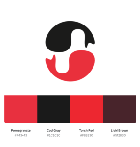
| Title | Minimalist Sushi Logo Design – Clean and Modern Branding for Culinary Experts |
| Color Psychology | Pomegranate (#F43443): Symbolizes passion, flavor, and vibrancy. Cod Gray (#1C1C1C): Represents sophistication, modernity, and elegance. |
| Shapes Used | Abstract circular and wave elements to mimic sushi rolls and ocean waves, evoking freshness and craftsmanship. |
| Symbolism | The logo embodies a harmonious balance between traditional sushi artistry and a sleek modern appeal, emphasizing quality and authenticity. |
| Typography | Thin, elegant sans-serif fonts paired with subtle brushstroke elements to highlight tradition and finesse. |
| Design Approach | Minimalist, clean, and artistic design focusing on freshness, authenticity, and culinary excellence. |
| Best For | Sushi restaurants, Japanese culinary brands, seafood delivery services, and Asian cuisine-focused businesses. |
| Target Audience | Food enthusiasts, sushi lovers, modern food bloggers, and high-end dining customers. |
| Applications | Ideal for restaurant menus, signage, food packaging, business cards, and social media branding. |
| Why This Design? | The combination of vibrant pomegranate and sleek cod gray ensures an eye-catching, premium logo design that appeals to both modern and traditional sushi fans. |
Color Psychological Traits Table for Pomegranate (#F43443) and Cod Gray (#1C1C1C)
| Aspect | Pomegranate (#F43443) | Cod Gray (#1C1C1C) |
|---|---|---|
| Color Psychology | Passion, energy, and appetite. This vibrant red evokes boldness and stimulates hunger, making it ideal for food branding and culinary businesses. | Sophistication, mystery, and strength. This deep black-gray tone conveys elegance and modernity, perfect for minimalist and luxurious branding. |
| Symbolism | Represents enthusiasm, warmth, and the essence of life. Frequently used to highlight action and excitement in logos. | Symbolizes authority, timelessness, and high-end appeal, often used in professional and premium designs. |
| Best Applications | Ideal for food-related logos, restaurants, packaging, and ads emphasizing appetite and excitement. | Best for minimalist logos, text overlays, backgrounds, and luxury branding elements. |
| Harmonizing Colors | White (#FFFFFF), Charcoal Gray (#3C3C3C), and Golden Yellow (#FFC107) enhance Pomegranate’s vibrancy. | Metallic Silver (#C0C0C0), Pomegranate (#F43443), and Pearl White (#F2F2F2) complement Cod Gray’s richness. |
| Emotional Impact | Stimulates energy and engagement, making it effective for attention-grabbing visuals and branding. | Creates a sense of calm authority and sophistication, ideal for high-end and professional branding. |
| Industries Best Suited | Food, hospitality, fashion, and creative industries seeking to inspire boldness and excitement. | Luxury goods, tech, fashion, and minimalist branding focused on modern appeal. |
| Why Choose This Color? | Pomegranate’s bright and lively tone draws attention and evokes positive emotional connections, especially in food branding. | Cod Gray’s deep and neutral tone provides a timeless and sophisticated look, perfect for creating balance in modern designs. |
Pomegranate (#F43443)
In an RGB color space (made from three colored lights for red, green, and blue), hex #F43443 is composed of 95.69% red, 20.39% green, and 26.27% blue.
In a CMYK color space (used in printing), #F43443 is made up of 0% cyan, 78.7% magenta, 72.5% yellow, and 4.3% black.
- Hue Angle: 355.1°
- Saturation: 89.8%
- Lightness: 58%
| Color Conversion | Pomegranate (#F43443) |
|---|---|
| CSS HEX | #F43443 |
| RGB Decimal | R: 244, G: 52, B: 67 (rgb(244, 52, 67)) |
| RGB Percentage | 95.7%, 20.4%, 26.3% (rgb(95.7%, 20.4%, 26.3%)) |
| CMYK | C: 0, M: 78.7, Y: 72.5, K: 4.3 |
| HSL | 355.1°, 89.8%, 58% (hsl(355.1°, 89.8%, 58%)) |
| HSV (or HSB) | 355.1°, 78.7%, 95.7% |
| Web Safe | #FF3333 |
| CIE-LAB | L: 61.09, A: 63.46, B: 37.25 |
| XYZ | X: 36.754, Y: 20.915, Z: 5.068 |
| CIE-LCH | L: 61.09, C: 74.18, H: 30.55 |
| Binary | 11110100, 00110100, 01000011 |
Cod Gray (#1C1C1C)
In an RGB color space, hex #1C1C1C consists of 10.98% red, 10.98% green, and 10.98% blue.
In a CMYK color space, #1C1C1C contains 0% cyan, 0% magenta, 0% yellow, and 89% black.
- Hue Angle: 0°
- Saturation: 0%
- Lightness: 11%
| Color Conversion | Cod Gray (#1C1C1C) |
|---|---|
| CSS HEX | #1C1C1C |
| RGB Decimal | R: 28, G: 28, B: 28 (rgb(28, 28, 28)) |
| RGB Percentage | 10.98%, 10.98%, 10.98% (rgb(10.98%, 10.98%, 10.98%)) |
| CMYK | C: 0, M: 0, Y: 0, K: 89 |
| HSL | 0°, 0%, 11% (hsl(0°, 0%, 11%)) |
| HSV (or HSB) | 0°, 0%, 10.98% |
| Web Safe | #333333 |
| CIE-LAB | L: 11.32, A: 0, B: 0 |
| XYZ | X: 0.369, Y: 0.388, Z: 0.423 |
| CIE-LCH | L: 11.32, C: 0, H: 0 |
| Binary | 00011100, 00011100, 00011100 |
FAQs for Minimalist Sushi Logo Design
1. What is a Minimalist Sushi Logo Design?
A minimalist sushi logo design is a sleek, simple, and clean representation of sushi and Japanese cuisine. It uses minimalist design principles like clean lines, modern typography, and neutral or vibrant color palettes, emphasizing elegance and simplicity.
2. Why Choose a Minimalist Logo for a Sushi Brand?
Minimalist sushi logos are perfect for creating a premium brand image. They communicate sophistication, focus, and authenticity, appealing to customers seeking a high-quality sushi experience.
3. What Colors Work Best for Sushi Logo Designs?
For a minimalist sushi logo design, colors like Pomegranate (#F43443), symbolizing passion and flavor, and Cod Gray (#1C1C1C), representing modernity and elegance, work best. Soft neutrals or vibrant accents can complement these shades.
4. Can a Minimalist Logo Attract a Younger Audience?
Absolutely! Minimalist designs resonate with younger audiences due to their modern and trendy aesthetics. Pairing clean fonts with sushi-inspired visuals like chopsticks or nigiri silhouettes can make your brand instantly relatable.
5. How Do You Make a Sushi Logo Stand Out?
To make your sushi logo unique:
- Use Japanese cultural elements like waves, rice grains, or sushi rolls.
- Experiment with negative space for a clever design.
- Incorporate bold colors like red, white, and black to evoke freshness and elegance.
6. Is Typography Important in Sushi Logo Design?
Yes, typography is crucial! Clean, modern fonts convey a sense of trust and sophistication, while Japanese-inspired fonts add cultural authenticity. Pairing sans-serif fonts with custom lettering enhances the overall minimalist appeal.
7. Where Can a Minimalist Sushi Logo Be Used?
Your minimalist sushi logo can be applied to:
- Menus
- Packaging (bento boxes, sushi wraps)
- Websites
- Social media profiles
- Restaurant signage
8. How Do Minimalist Logos Improve Branding?
Minimalist logos create a lasting impression by being simple yet memorable. They convey professionalism, focus on the brand’s core values, and are versatile across multiple platforms and mediums.
9. Are Minimalist Logos Cost-Effective?
Yes, minimalist logos are cost-effective to print and use across various mediums due to their clean design, fewer elements, and scalability.
Reviews
There are no reviews yet.