Description
Symmetrical Sushi Restaurant Logo – A Perfect Blend of Tradition, Modernity, and Visual Balance
| Aspect | Details |
|---|---|
| Title | Symmetrical Sushi Restaurant Logo – Bold and Balanced Design for Your Culinary Brand |
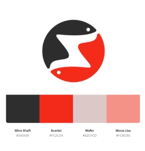
| Primary Colors | – Mine Shaft (#343434): Symbolizes balance, sophistication, and modernity. |
| – Scarlet (#FC2C04): Represents energy, appetite, and passion for food. | |
| – Wafer (#E2CFCD): Highlights warmth, elegance, and comfort. | |
| – Mona Lisa (#FC9C90): Evokes softness, creativity, and playfulness. | |
| Shapes Used | Symmetrical circular composition inspired, combined with fish motifs to depict balance and freshness. |
| Symbolism | Represents harmony, freshness, and a premium sushi experience with bold and vibrant energy. |
| Typography | Modern, clean sans-serif font with subtle rounded edges to convey simplicity and approachability. |
| Design Approach | Minimalist and symmetrical, emphasizing cultural elements while ensuring a modern appeal. |
| Best For | Sushi restaurants, Japanese cuisine brands, fusion restaurants, or seafood-related businesses. |
| Target Audience | Foodies, fine-dining enthusiasts, sushi lovers, and eco-conscious diners. |
| Applications | Ideal for menu designs, restaurant signage, social media branding, and takeaway packaging. |
| Why This Design? | The symmetrical design merges traditional Japanese aesthetics with a modern twist, creating a memorable and versatile logo. |
Color Psychological Traits
| Color | HEX Code | Psychological Traits | Best Applications |
|---|---|---|---|
| Mine Shaft | #343434 | Evokes elegance, professionalism, and authority. This deep shade of gray is associated with sophistication, balance, and modernity, making it ideal for serious and upscale brands. | Ideal for logos, backgrounds, and designs requiring a timeless and professional appearance. Often used in corporate branding. |
| Scarlet | #FC2C04 | Represents passion, energy, and excitement. This bold red hue grabs attention and stimulates emotions, making it perfect for evoking hunger and enthusiasm. | Best suited for food-related brands, restaurant logos, or marketing campaigns focused on creating urgency or excitement. |
| Wafer | #E2CFCD | Soft, calming, and warm, this pastel beige shade creates a sense of comfort, simplicity, and approachability. It conveys a feeling of natural elegance and subtlety. | Perfect for backgrounds, minimalist branding, and designs aiming for a soft and approachable aesthetic. |
| Mona Lisa | #FC9C90 | A playful and friendly light coral tone that represents creativity, warmth, and approachability. It radiates a youthful and welcoming energy, ideal for connecting with audiences. | Great for use in family-oriented designs, health and wellness logos, and projects requiring a touch of playful creativity. |
Color Information: Mine Shaft (#343434)
| Aspect | Details |
|---|---|
| CSS HEX | #343434 |
| RGB Decimal | R: 52, G: 52, B: 52 (rgb(52, 52, 52)) |
| RGB Percentage | R: 20.4%, G: 20.4%, B: 20.4% (rgb(20.4%, 20.4%, 20.4%)) |
| CMYK | C: 0, M: 0, Y: 0, K: 79 |
| HSL | 0°, 0%, 20.4% (hsl(0°, 0%, 20.4%)) |
| HSV (or HSB) | 0°, 0%, 20.4% |
| WEB SAFE | #333333 |
| CIE-LAB | 21.755, 0.007, -0.013 |
| XYZ | X: 4.919, Y: 5.187, Z: 5.646 |
| CIE-LCH | L: 21.755, C: 0.015, H: 116.565 |
| CIE-LUV | L: 21.755, U: 0.004, V: -0.009 |
| Hunter-Lab | L: 18.018, A: 0.003, B: -0.005 |
| Binary | 00110100, 00110100, 00110100 |
Color Information: Scarlet (#FC2C04)
| Aspect | Details |
|---|---|
| CSS HEX | #FC2C04 |
| RGB Decimal | R: 252, G: 44, B: 4 (rgb(252, 44, 4)) |
| RGB Percentage | R: 98.8%, G: 17.3%, B: 1.6% (rgb(98.8%, 17.3%, 1.6%)) |
| CMYK | C: 0, M: 83, Y: 98, K: 1 |
| HSL | 11°, 96%, 50% (hsl(11°, 96%, 50%)) |
| HSV (or HSB) | 11°, 98%, 98.8% |
| WEB SAFE | #FF3300 |
| CIE-LAB | 55.197, 69.334, 56.664 |
| XYZ | X: 42.496, Y: 27.055, Z: 3.314 |
| CIE-LCH | L: 55.197, C: 89.469, H: 39.116 |
| CIE-LUV | L: 55.197, U: 114.994, V: 68.421 |
| Hunter-Lab | L: 53.433, A: 51.928, B: 32.033 |
| Binary | 11111100, 00101100, 00000100 |
Color Information: Wafer (#E2CFCD)
| Aspect | Details |
|---|---|
| CSS HEX | #E2CFCD |
| RGB Decimal | R: 226, G: 207, B: 205 (rgb(226, 207, 205)) |
| RGB Percentage | R: 88.6%, G: 81.2%, B: 80.4% (rgb(88.6%, 81.2%, 80.4%)) |
| CMYK | C: 0, M: 8, Y: 9, K: 11 |
| HSL | 9°, 25%, 84% (hsl(9°, 25%, 84%)) |
| HSV (or HSB) | 9°, 9%, 88.6% |
| WEB SAFE | #CCCCCC |
| CIE-LAB | 84.029, 8.746, 6.117 |
| XYZ | X: 63.525, Y: 65.717, Z: 64.357 |
| CIE-LCH | L: 84.029, C: 10.729, H: 35.882 |
| CIE-LUV | L: 84.029, U: 11.141, V: 8.195 |
| Hunter-Lab | L: 83.513, A: 7.128, B: 4.931 |
| Binary | 11100010, 11001111, 11001101 |
FAQs for Symmetrical Sushi Restaurant Logo Design
1. What is a Symmetrical Sushi Restaurant Logo Design?
A symmetrical sushi restaurant logo design features a balanced and proportional layout, often reflecting the harmony and precision associated with sushi preparation. Symmetry conveys professionalism and creativity, making your sushi brand stand out in a competitive market.
2. Why is symmetry important in a sushi restaurant logo?
Symmetry in a sushi restaurant logo symbolizes the attention to detail and balance inherent in sushi making. It creates a visually appealing and memorable design that resonates with customers seeking high-quality dining experiences.
3. What colors work best for a symmetrical sushi restaurant logo?
Traditional sushi colors such as red, white, and black often dominate designs due to their cultural significance. Adding modern colors like pastel greens or coral can enhance the logo’s appeal while maintaining a balanced, symmetrical aesthetic.
4. How does a symmetrical logo affect brand identity?
A symmetrical logo strengthens your brand identity by exuding professionalism and reliability. It communicates consistency, which aligns with the precise craftsmanship sushi enthusiasts expect from a restaurant.
5. Can symmetrical logos be customized for unique sushi brands?
Absolutely! While symmetry provides a structured base, designers can customize elements like color schemes, fonts, and graphic details to reflect your sushi restaurant’s unique values and atmosphere.
6. What design elements are essential for a symmetrical sushi logo?
Key design elements include:
- Minimalist shapes: Circles, rectangles, and triangles work well.
- Cultural motifs: Chopsticks, sushi rolls, or waves can add personality.
- Typography: Clean, modern fonts with balanced kerning emphasize the symmetrical layout.
7. Can a symmetrical sushi logo work for digital and print platforms?
Yes, symmetrical logos are versatile! Their balanced design ensures they look professional on menus, websites, social media, and signage, enhancing your brand presence across all platforms.
Reviews
There are no reviews yet.