Description
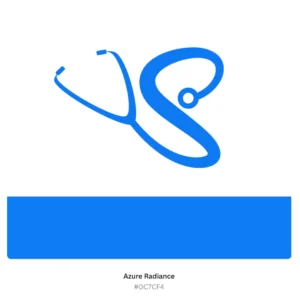
Stethoscope S Logo Design | Modern Medical Branding Logo
| Aspect | Details |
|---|---|
| Title | Stethoscope S Logo Design – Modern & Professional Medical Branding |
| Color Psychology | Azure Radiance: Represents trust, care, and professionalism. Cod Gray: Symbolizes sophistication, authority, and reliability—key traits in the healthcare industry. |
| Shapes Used | A sleek “S” intertwined with a stethoscope design, representing medical precision and a personal touch. |
| Symbolism | Combines the stethoscope as a universal symbol of healthcare with the “S” to signify service, safety, and sophistication. |
| Typography | Modern sans-serif fonts to convey clarity, professionalism, and approachability. |
| Design Approach | Minimalist and professional, focusing on clean lines and impactful visuals for maximum recognition in the medical field. |
| Best For | Medical clinics, healthcare professionals, telemedicine startups, pharmaceutical brands, and wellness centers. |
| Target Audience | Doctors, medical staff, healthcare institutions, wellness coaches, and medical service providers aiming for modern, professional branding. |
| Applications | Ideal for websites, social media branding, business cards, medical uniforms, signage, and promotional materials for healthcare businesses. |
| Why This Design? | The elegant integration of the “S” with the stethoscope captures trust and professionalism, while the Azure Radiance color instills confidence and clarity in healthcare branding. |
Color Psychological Traits: Azure Radiance (#0C7CF4)
| Aspect | Details |
|---|---|
| Color Name | Azure Radiance |
| Hex Code | #0C7CF4 |
| RGB Breakdown | R: 12 (4.7%) G: 124 (48.6%) B: 244 (95.7%) |
| CMYK Breakdown | C: 95% M: 49% Y: 0% K: 4% |
| Hue, Saturation, Lightness (HSL) | Hue: 211° Saturation: 92% Lightness: 50% |
| HSV (or HSB) | Hue: 211° Saturation: 95% Brightness: 96% |
| Color Psychology Traits | Trust & Reliability: Widely associated with dependability, making it ideal for professional branding in healthcare, tech, and corporate industries. |
| Emotion & Impact | Promotes feelings of calmness, confidence, and clarity. Evokes a sense of innovation and forward-thinking. |
| Best Applications | Suitable for logos in healthcare, tech startups, finance, education, and any industry that values professionalism and innovation. |
| Symbolism | Represents intelligence, loyalty, and modernity. Its vibrant tone reflects energy and progressiveness. |
| Complementary Colors | Pairs well with Cod Gray (#1C1C1C) for a professional look, or White (#FFFFFF) for contrast and clarity. |
| Why Use This Color? | Azure Radiance captures attention while conveying professionalism and trustworthiness, making it perfect for brand identities aiming to leave a lasting positive impression. |
Color Information: Azure Radiance (#0C7CF4)
In an RGB color space (made from three colored lights for red, green, and blue), hex #0C7CF4 is composed of 4.7% red, 48.6% green, and 95.7% blue.
In a CMYK color space (used in color printing), hex #0C7CF4 is made of 95% cyan, 49% magenta, 0% yellow, and 4% black.
Azure Radiance has a hue angle of 211°, a saturation of 92%, and a lightness of 50%.
| Color Conversion | Details |
|---|---|
| Value | Azure Radiance |
| CSS HEX | #0C7CF4 |
| RGB Decimal | 12, 124, 244 (rgb(12, 124, 244)) |
| RGB Percentage | 4.7%, 48.6%, 95.7% (rgb(4.7%, 48.6%, 95.7%)) |
| CMYK | C: 95%, M: 49%, Y: 0%, K: 4% |
| HSL | 211°, 92%, 50% (hsl(211°, 92%, 50%)) |
| HSV (or HSB) | 211°, 95%, 96% |
| Web Safe | #0066FF |
| CIE-LAB | 50.57, -0.179, -66.284 |
| XYZ | 23.815, 25.895, 90.063 |
| CIE-LCH | 50.57, 66.284, 270.155° |
| CIE-LUV | 50.57, -7.548, -74.801 |
| Hunter-LAB | 44.625, -8.473, -50.429 |
| Binary | 00001100, 01111100, 11110100 |
Color Variations
- Dodger Blue (#1E90FF): A lighter variation of Azure Radiance, ideal for brighter, cheerful designs.
- Midnight Blue (#191970): A deeper blue shade for formal or serious branding.
- Cornflower Blue (#6495ED): A softer, pastel-like tone for a more friendly and approachable feel.
Why This Color Matters for Branding
- Trust and Professionalism: Its strong, vibrant blue shade inspires confidence and dependability, making it ideal for industries like healthcare, technology, and corporate sectors.
- Attention-Grabbing: The high saturation ensures the color stands out, making it perfect for branding logos, websites, and advertisements.
- Versatility: Works well with both light and dark themes, enhancing adaptability across various mediums.
FAQs for Stethoscope S Logo Design:
1. What is a Stethoscope S Logo Design?
The Stethoscope S Logo Design is a modern and professional logo concept that combines the shape of a stethoscope with the letter “S.” This minimalist medical logo is perfect for healthcare professionals, clinics, and medical startups seeking a clean, recognizable identity.
2. Who can use the Stethoscope S Logo Design?
This logo design is ideal for:
- Doctors: To create a professional brand identity.
- Clinics and Hospitals: For branding on uniforms, websites, and signage.
- Health and Wellness Startups: To establish a memorable and trustworthy logo.
- Medical Equipment Companies: For product branding and packaging.
3. What colors are best for a Stethoscope S Logo Design?
The Stethoscope S Logo Design often uses trustworthy and calming colors like:
- Azure Radiance (#0C7CF4): Symbolizes trust and reliability.
- Silver (#C0C0C0): Adds a modern and sophisticated touch.
- White: Enhances simplicity and professionalism.
4. How does a Stethoscope S Logo Design reflect your brand identity?
- Professionalism: The stethoscope shape conveys expertise in the medical field.
- Simplicity: The minimalist design ensures it is versatile and easy to recognize.
- Trust and Care: Blue hues in the logo evoke trust, while the stethoscope symbolizes health and care.
5. Can the Stethoscope S Logo Design be customized?
Yes! You can customize:
- Colors: Match your brand’s theme (e.g., green for eco-health brands).
- Typography: Add clean, sans-serif fonts for a professional look.
- Shapes: Adjust the stethoscope design to suit your niche.
6. What file formats are included with the logo?
The logo is provided in:
- SVG: For high-resolution scalability.
- PNG: For websites and digital use.
- PDF: For printing purposes.
- JPEG: For social media and presentations.
7. Why is a minimalist design important for medical logos?
Minimalist logos are:
- Memorable: Simple designs are easier to recognize.
- Versatile: They adapt well to various mediums (websites, business cards, uniforms).
- Timeless: A clean design won’t look outdated over time.
Reviews
There are no reviews yet.