A logo is more than just an image—it’s a symbol of a brand’s personality, values, and uniqueness. When designing the Pink Pony Logo, every element was carefully considered to craft a playful, dynamic, and engaging identity.
This guide takes you through the Pink Pony Logo Design Process, breaking down each phase from initial brainstorming to final delivery. Whether you’re a designer or a brand owner, these insights will help you understand what it takes to create a visually compelling and meaningful logo.
The Pink Pony Logo Design Process
Step 1: Concept Development & Mind Mapping
Every great design starts with a solid foundation. The first step of the Pink Pony Logo Design Process involved:
- Understanding the brand’s tone, audience, and purpose
- Exploring playful, elegant, and fun visual elements
- Mind mapping to connect ponies, hearts, and movement
This phase ensures that the logo aligns with the brand’s core message while being instantly recognizable.
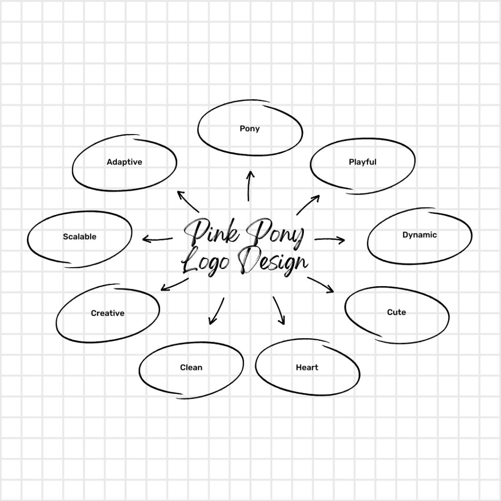
The Pink Pony Logo Design Process: Mind Map
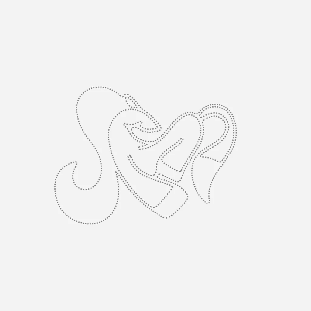
Step 2: Sketching & Idea Refinement
Once the idea was clear, the next step was to sketch out different versions of the logo. This involved:
- Experimenting with various pony poses and expressions
- Blending a heart shape into the design for an emotional touch
- Creating smooth, flowing lines that convey energy and joy
Through multiple iterations, the most balanced and visually appealing concept emerged.
The Pink Pony Logo Design Process: Sketch
Step 3: Choosing the Perfect Shape & Layout
A well-structured logo is versatile and easy to recognize. The final sketch was refined to:
- Maintain a symmetrical, well-balanced form
- Ensure clarity and scalability across different sizes
- Keep the playful yet sophisticated theme intact
This guarantees that the logo retains its charm on both digital and print materials.
The Pink Pony Logo Design Process: Shape
Step 4: Selecting the Right Color Palette
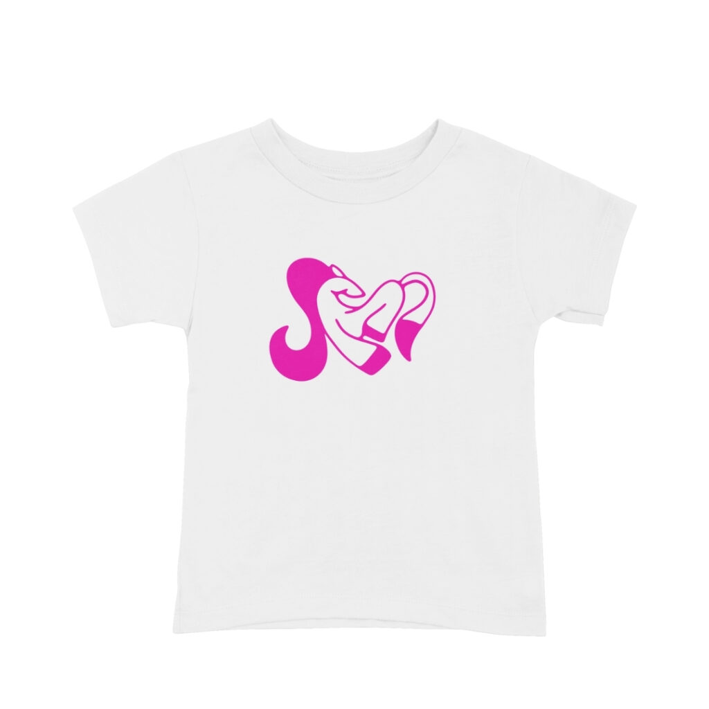
Color psychology plays a significant role in branding. For this logo, Shocking Pink (#F40CAC) was chosen because it:
- Exudes energy, confidence, and creativity
- Grabs attention while maintaining a fun and approachable feel
- Enhances the playful and dynamic personality of the brand
The right color helps ensure that the logo stands out and resonates with the target audience.
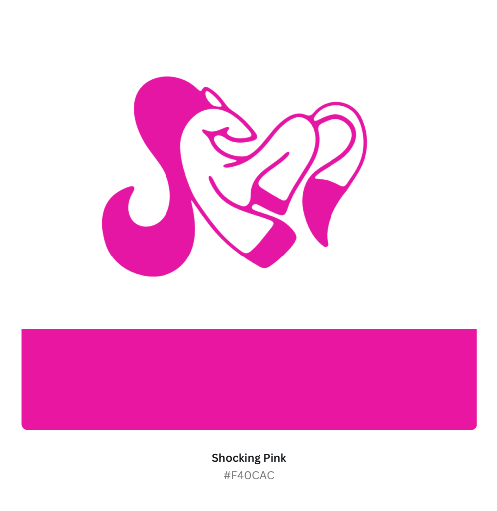
The Pink Pony Logo Design Process: Color Palette
Step 5: Digital Rendering & Vectorization
After finalizing the shape and colors, the Pink Pony Logo Design Process moved to digital refinement:
- Converting the hand-drawn sketch into a precise vector format
- Enhancing the curves, proportions, and spacing
- Ensuring perfect symmetry and sharpness for high-resolution usage
This step guarantees that the logo looks crisp and clean across all mediums.
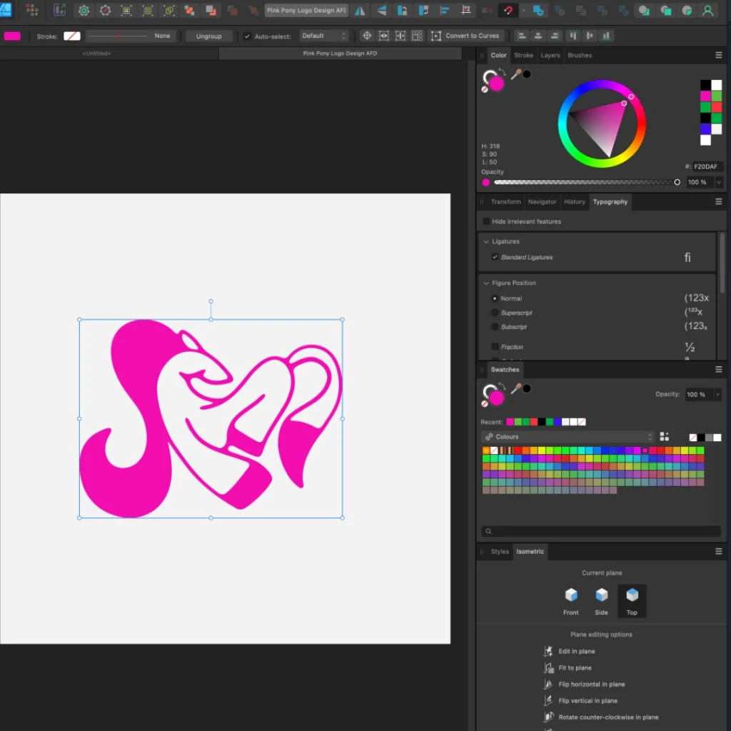
The Pink Pony Logo Design Process: Digitizing
Step 6: Testing with Mockups & Real-World Application
To verify the logo’s usability, it was tested on various branding materials, including:
- Business cards and stationery
- Social media banners and ads
- Product packaging and promotional items
Seeing the design in real-world applications helped confirm its scalability and impact.
The Pink Pony Logo Design Process: Mockup
Step 7: Finalization & Delivery
Once the logo was tested and refined, the final files were prepared:
- Vector files (AI, SVG, EPS) for professional printing
- PNG and JPEG formats for web use
- Monochrome and alternative versions for flexible branding
With these assets, the brand can confidently use its new identity across all platforms.

Raster & Vector Formats
Conclusion
A great logo is more than just a visual mark—it’s a representation of a brand’s story and identity. The Pink Pony Logo Design Process ensures that every element, from shape to color, contributes to a unique and engaging brand experience.
Looking to create a custom, meaningful logo that speaks to your audience? Let’s bring your vision to life.
1. What inspired the Pink Pony Logo Design?
The design was inspired by a blend of playfulness, energy, and creativity. The pony symbolizes grace and movement, while the heart shape adds a touch of warmth and emotion.
2. Why was Shocking Pink (#F40CAC) chosen as the primary color?
Shocking Pink was selected because it represents boldness, fun, and excitement. It captures attention instantly and aligns with the dynamic and playful theme of the brand.
3. How long does it take to complete a logo design process like this?
The timeline varies depending on research, iterations, and client feedback, but typically, a well-crafted logo takes anywhere from 1-3 days to finalize.
4. What makes a minimalist logo effective?
A minimalist logo is effective because it is clean, memorable, and versatile. Removing unnecessary details ensures the logo looks great across all mediums, from social media icons to billboards.
5. What file formats are included in the final logo delivery?
The final package includes AI, SVG, EPS, PNG, and JPEG formats, ensuring that the logo is usable for both digital and print applications.
6. How can this logo be used for branding?
The Pink Pony Logo can be used on business cards, packaging, social media, websites, merchandise, and more. Its adaptable design makes it suitable for various branding needs.
7. Can the logo be customized for different business types?
Yes! The design process allows for customization in colors, typography, and elements, making it adaptable for different industries while maintaining the essence of the brand.

Dil Nawaz | Visual Storyteller
About the Author
Hi, I’m Dil Nawaz, a passionate hand-drawn logo designer dedicated to creating meaningful and unique brand identities. With over a decade of experience, I’ve had the privilege of designing logos that tell stories and connect with audiences worldwide.
Follow me on:
Let’s bring your vision to life! Feel free to reach out via email at info@thelionstudios.com or visit my portfolio at https://thelionstudios.com/.