A powerful logo is the foundation of any book publishing brand. It embodies wisdom, creativity, and structure, offering a strong visual identity that captures the essence of knowledge. A Geometrical Books Publisher Logo uses clean lines, symmetry, and minimal elements to create a memorable and scalable mark that stands the test of time.
This guide walks you through seven structured steps to designing a unique and modern publishing logo that speaks volumes about your brand’s mission.
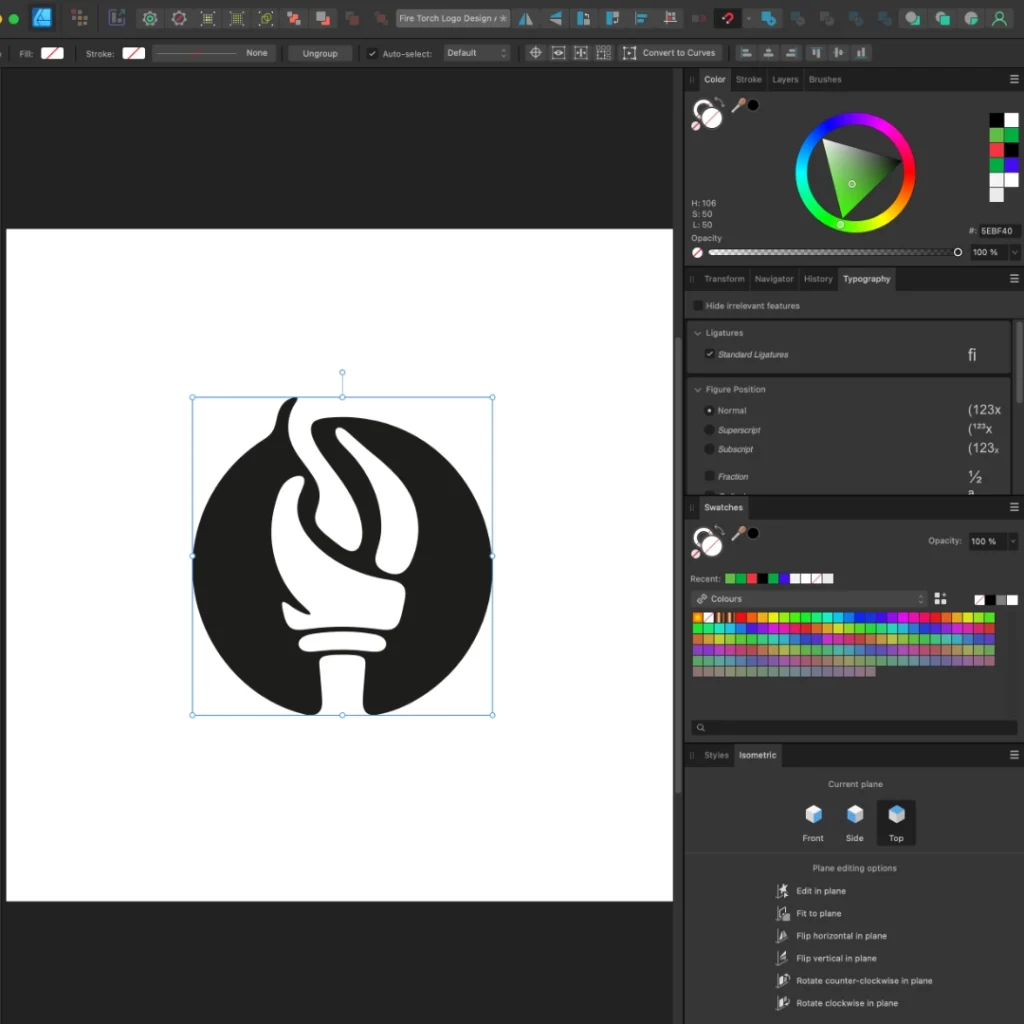
Geometrical Books Publisher Logo
Step 1: Concept Mapping – Laying the Foundation
Before designing, it’s essential to define your brand vision and symbolism. Concept mapping helps establish a strong direction for your logo’s structure and meaning.
Core Elements to Incorporate:
- Fire Torch Symbol: Represents knowledge, enlightenment, and passion.
- Geometric Precision: Enhances clarity and professional appeal.
- Freedom & Energy: Reflects creative thought and innovation.
- Minimalism: Keeps the design modern, scalable, and adaptable.
A well-structured concept map keeps the entire logo creation process aligned with your branding goals.
Geometrical Books Publisher Logo: Mind Map
Step 2: Sketching the Initial Design
The next step is translating ideas into rough sketches. This phase is where creativity flows and multiple design possibilities are explored.
Sketching Guidelines:
- Experiment with abstract flames and book elements.
- Use basic geometric shapes to create a structured look.
- Refine the proportions and alignments for balance.
Sketching allows designers to visualize multiple variations before moving to digital refinement.
Geometrical Books Publisher Logo: Sketch
Step 3: Selecting the Right Geometrical Shape
A well-designed publishing logo must be structured and visually balanced. Geometrical elements provide a modern, timeless, and adaptable design.
Best Shapes for a Books Publisher Logo:
- Circular Logos: Symbolize wholeness and continuity.
- Grid-Based Layouts: Offer a structured and sharp aesthetic.
- Minimalist Forms: Ensure instant brand recognition.
A strong geometric foundation strengthens the overall branding impact.

Geometrical Books Publisher Logo: Shape
Step 4: Choosing an Impactful Color Palette
The right colors reinforce your brand’s identity. For a books publisher logo, a sophisticated, timeless palette works best.
Recommended Color Scheme:
- Cod Gray (#1C1C1C): Represents authority, knowledge, and elegance.
- Monochrome Variants: Allow for versatility and simplicity.
- Accent Colors (Optional): Can be used subtly for added depth.
A well-chosen color palette ensures the logo remains bold and professional.

Geometrical Books Publisher Logo: Color Palette
Step 5: Digitizing the Logo for a Polished Look
Once the sketch is finalized, it’s time to vectorize the design for scalability and precision.
Key Steps in Digital Refinement:
- Convert the sketch into vector format for sharpness.
- Adjust line thickness, curves, and proportions.
- Optimize for multiple applications, from print to web.
A digitized vector logo maintains its clarity and sharpness across all sizes.
Geometrical Books Publisher Logo: Digitizing
Step 6: Testing the Logo in Real-World Mockups
Mockups provide a realistic preview of how the logo will appear across various branding materials. A mockup presentation helps refine the final adjustments before launch.

Geometrical Books Publisher Logo: Mockup
Step 7: Delivering a Complete Logo Package
Once perfected, the final logo should be delivered in a comprehensive branding package for easy application.
What Should Be Included?
- Vector Formats (AI, SVG, EPS) – For unlimited scalability.
- High-Resolution PNG & JPEG – For digital use.
- Brand Guidelines Document – Covers color codes, font recommendations, and usage rules.
A well-packaged logo ensures consistent branding across all media.
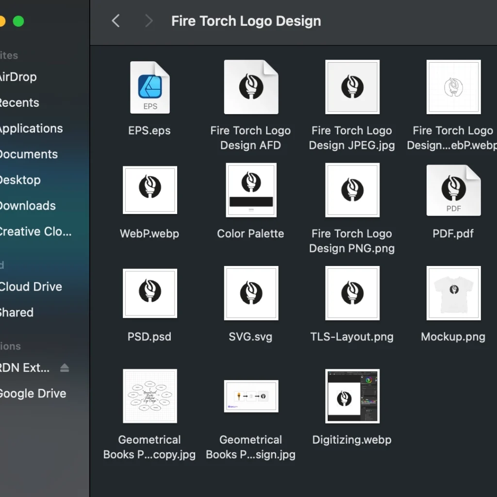
Raster & Vector Formats
A Timeless Logo for a Lasting Brand
A Geometrical Books Publisher Logo represents wisdom, freedom, and clarity. By following these 7 key steps, you can create a modern, structured, and visually compelling logo that elevates your publishing brand.
Ready to design a logo that ignites curiosity and knowledge? Let’s build something iconic!
1. Why should a books publisher logo have a geometrical design?
A geometric logo provides balance, structure, and professionalism, making it ideal for a publishing company. It also ensures easy scalability across various branding materials.
2. What makes the fire torch symbol a great choice for a publishing logo?
The fire torch symbolizes knowledge, enlightenment, and progress, making it a powerful visual representation for book publishers and educational brands.
3. How do I choose the best shape for my publisher’s logo?
A circular logo conveys unity and continuity, while grid-based designs add a modern and structured aesthetic. The best shape depends on your brand’s vision and application needs.
4. What color is best for a publishing logo, and why?
Cod Gray (#1C1C1C) is ideal for a professional, timeless look. Monochrome palettes ensure adaptability, while subtle accent colors can enhance depth and versatility.
5. How do I ensure my logo is scalable for all branding needs?
Using vector-based formats (AI, EPS, SVG) allows for scalability without losing quality. Testing the logo on business cards, book covers, and digital platforms helps maintain its clarity.
6. Why is mockup testing important before finalizing a logo?
Mockups help visualize how the logo will look in real-world applications, ensuring it remains legible, impactful, and adaptable across print and digital formats.
7. What are the key files needed in a complete logo package?
A professional logo package should include:
- Vector Files (AI, SVG, EPS) for professional use.
- High-resolution PNG & JPEG for digital branding.
- Brand Guidelines to maintain consistency across platforms.