Crafting a distinctive and impactful logo is a journey filled with creativity and strategic thinking. One of the most innovative design techniques is using negative space to create clever and visually captivating designs. In this article, we’ll explore a streamlined LS negative space logo design process, providing seven actionable steps to help bring your brand’s identity to life.
Step 1: Understanding the Brand’s Core
Every great logo begins with a deep understanding of the brand. Start by identifying the brand’s values, mission, and target audience.
Ask yourself:
- What message should the logo convey?
- What emotions should it evoke?
- How can negative space amplify the brand’s essence?
Clarifying these points sets the foundation for a design that resonates.
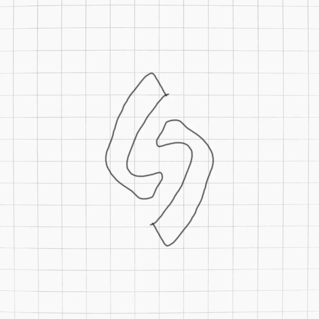
Step 2: Concept Sketching – Putting Ideas on Paper
Before diving into digital tools, sketch out rough concepts for the LS logo. Focus on creating shapes where the negative space forms meaningful visual elements.
Tips for effective sketching:
- Don’t worry about perfection; aim for variety.
- Experiment with different layouts to integrate negative space creatively.
- Keep shapes simple for clarity.
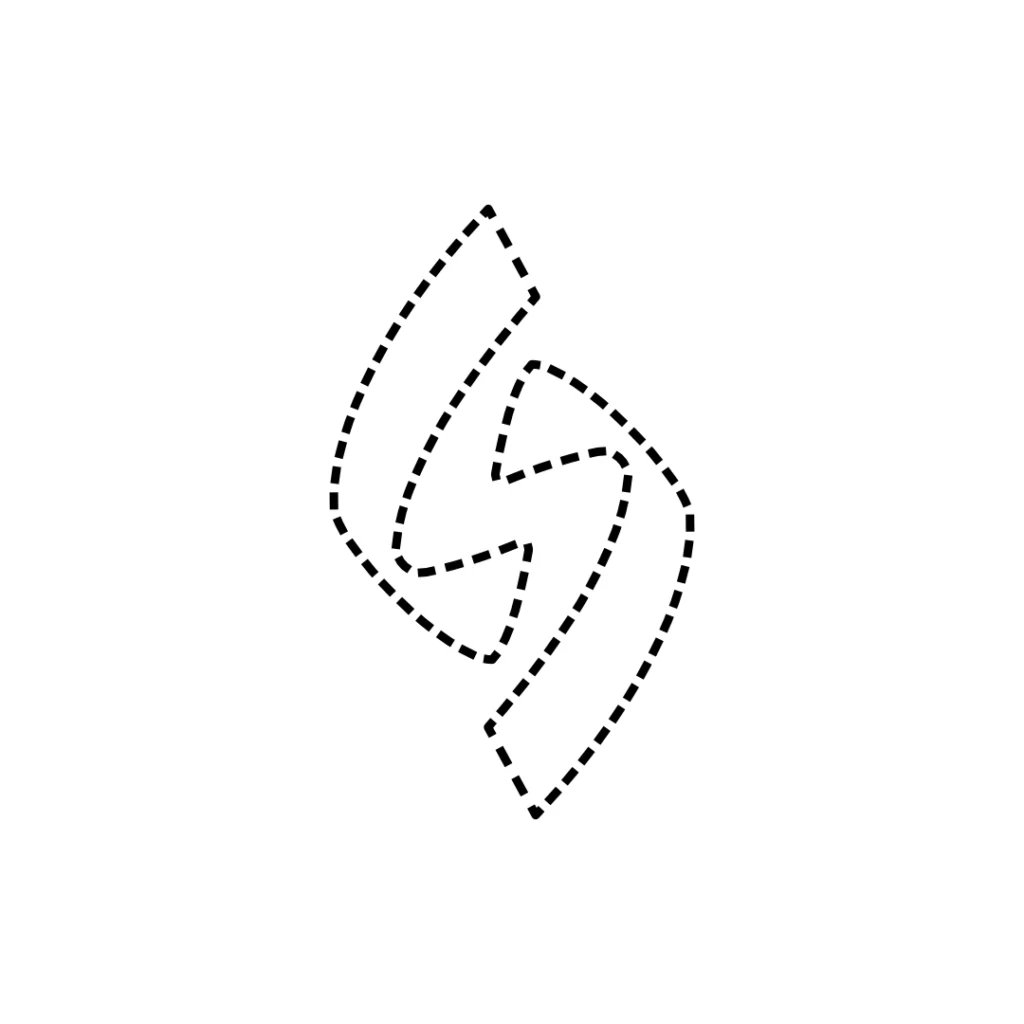
Step 3: Choosing the Perfect Shape
Shapes play a crucial role in how a logo communicates its message. Rounded forms convey friendliness, while sharp lines represent energy and precision.
Since we’re focusing on the LS letters, look for ways to interlock them harmoniously while leveraging negative space.
Pro Tip: Use geometric shapes as guides for alignment and symmetry.
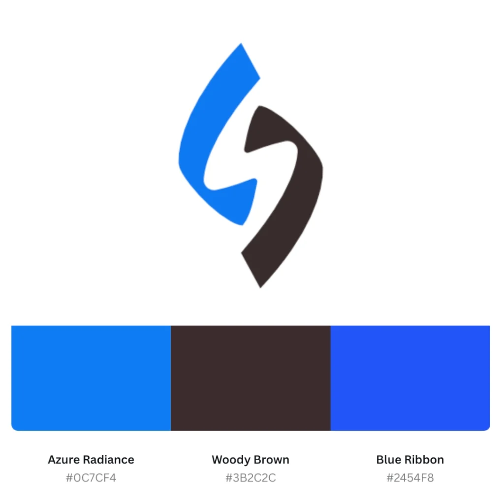
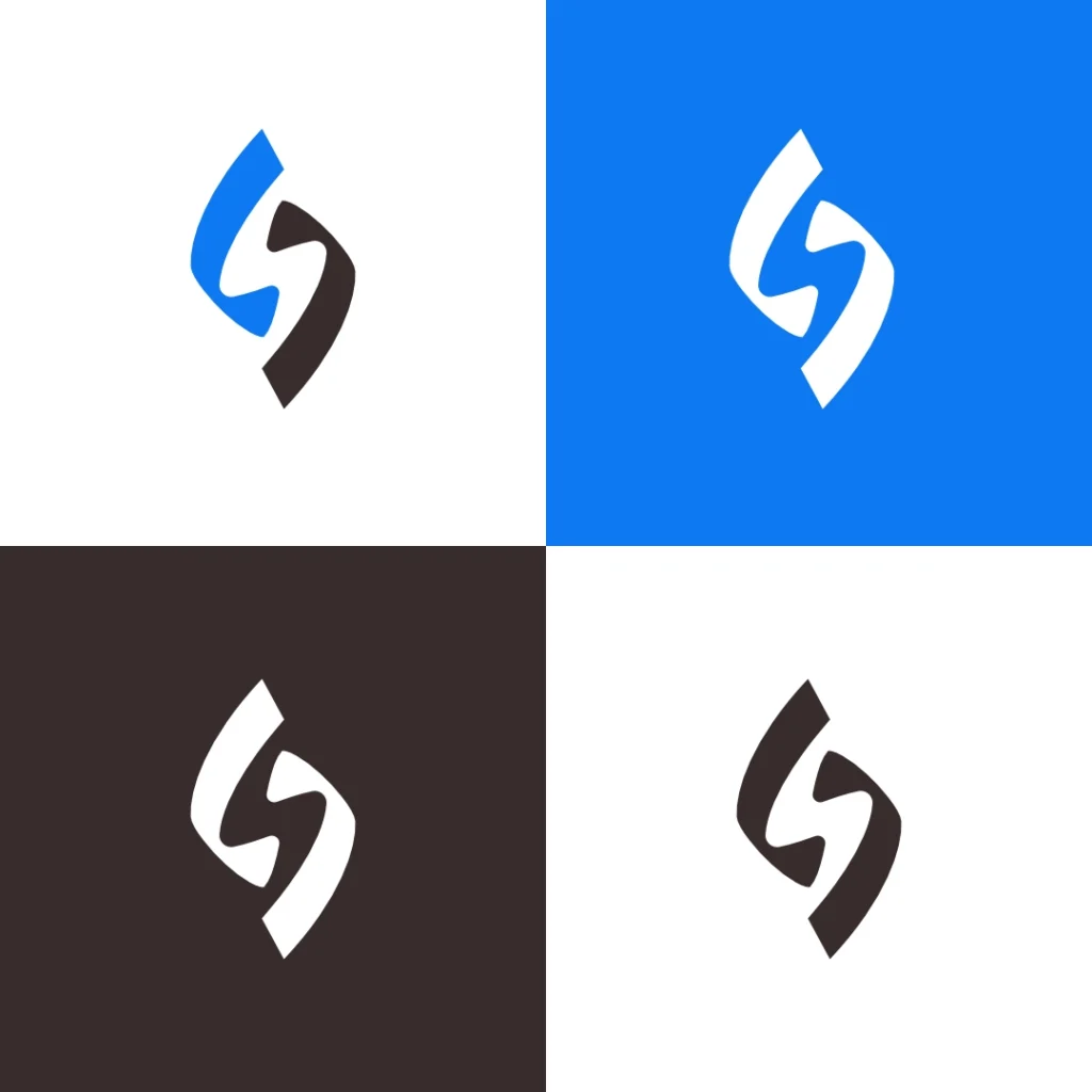
Step 4: Selecting the Color Palette
Colors evoke emotions and play a pivotal role in logo design. For this particular logo design process, I opted for:
- Azure Radiance (#0C7CF4) — Evoking trust and creativity.
- Woody Brown (#3B2C2C) — Representing warmth and stability.
Tips for choosing colors:
- Limit your palette to two or three colors.
- Ensure high contrast for visibility.
- Test color combinations on light and dark backgrounds.
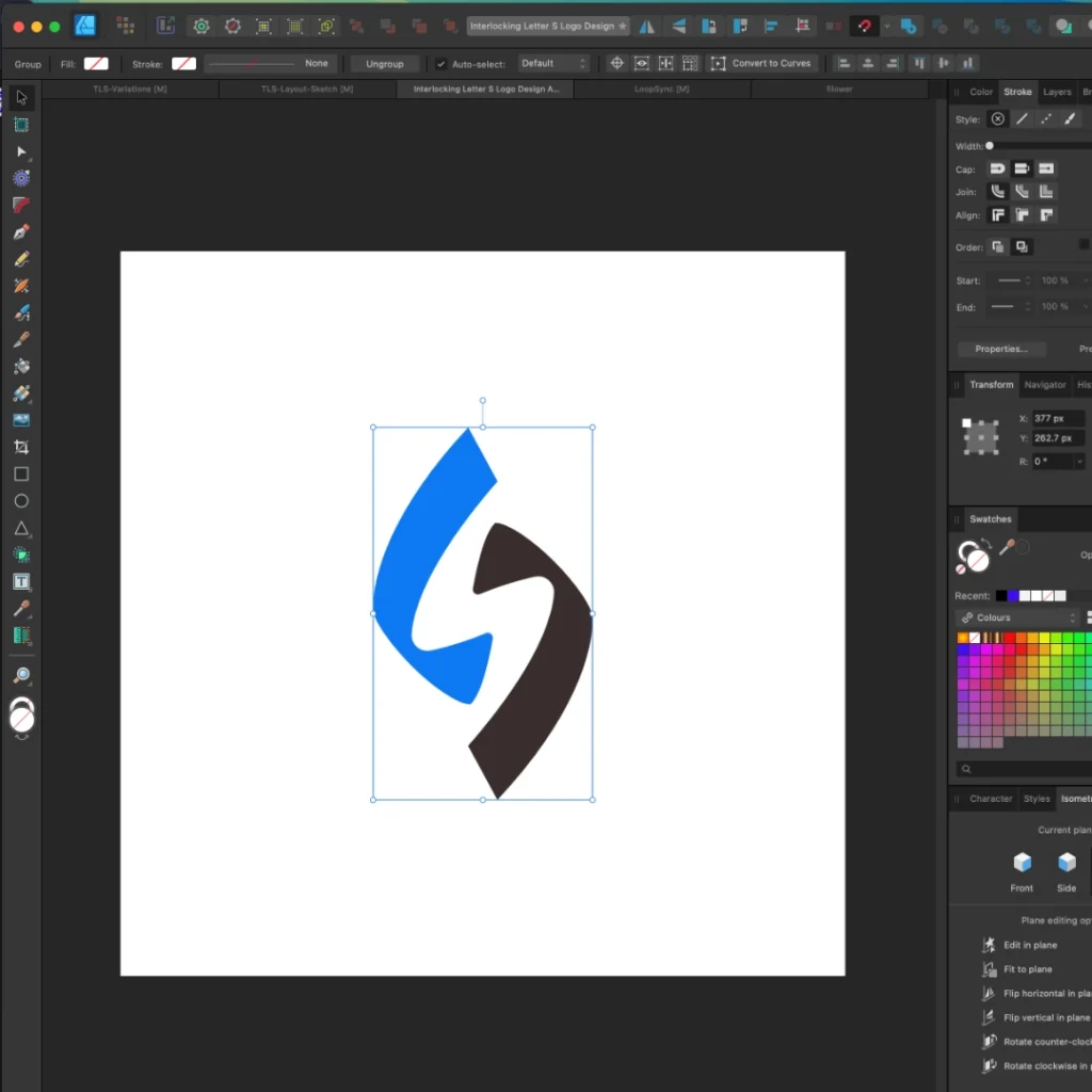
Step 5: Digitizing the Concept
Once the sketch is finalized, it’s time to transfer the design to digital software like Adobe Illustrator or Affinity. Designer.
Key considerations during digitization:
- Use vector shapes for scalability.
- Align the LS letters symmetrically.
- Pay attention to the negative space to ensure it’s clear and intentional.
Step 6: Refining and Finalizing the Design
Zoom in and out of the design to check for balance and clarity. Ensure the logo maintains its integrity at all sizes.
Checklist for perfection:
- Is the negative space clearly defined?
- Does the logo scale well from small icons to large banners?
- Can it be easily identified in monochrome?
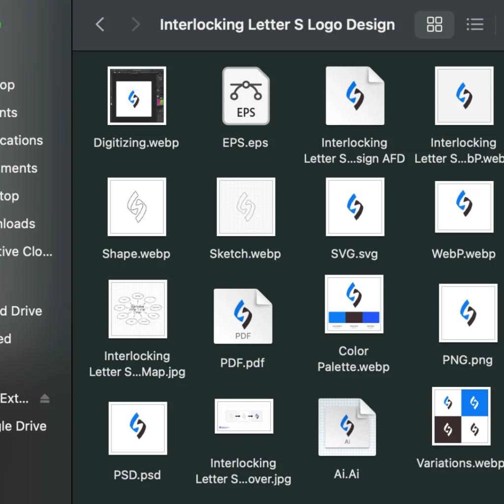
Step 7: Delivering the Final Logo
Export the logo in multiple formats (PNG, SVG, and JPG) and create a simple brand guideline to ensure consistent usage.
Delivery tips:
- Provide different file formats for print and digital use.
- Include color variations for different backgrounds.
- Share usage instructions for maintaining brand integrity.
Why Choose a Negative Space Logo Design?
Negative space logos are memorable and visually striking. They communicate a brand’s message subtly yet effectively. By mastering this process, you can design logos that are not just aesthetically pleasing but also meaningful.
By following these seven steps, your LS negative space logo design journey will become a creative adventure, resulting in a design that captures attention and leaves a lasting impression.
FAQs for LS Negative Space Logo Design Process:
1. What is the LS Negative Space Logo Design Process?
The LS Negative Space Logo Design process involves seven essential steps that creatively utilize negative space to form visually engaging and meaningful logos. This process is designed to deliver a sleek, modern, and memorable brand identity using strategic design elements.
2. Why is Negative Space Important in Logo Design?
Negative space helps create logos that are clean, innovative, and instantly recognizable. In an LS Negative Space Logo Design, the empty areas between shapes form hidden elements or messages, making your logo more impactful and visually appealing.
3. What are the Key Steps in the LS Negative Space Logo Design Process?
- Brand Discovery:
Understanding your brand values, goals, and target audience to define the logo’s direction. - Concept Development:
Sketching creative ideas that leverage negative space creatively between letters L and S. - Shape Refinement:
Refining the abstract shapes to form a seamless and cohesive design. - Color Selection:
Using strategic colors like Azure Radiance (#0C7CF4) for trust and Woody Brown (#3B2C2C) for stability. - Typography Integration:
Choosing bold and clean sans-serif fonts for a modern and professional look. - Feedback and Iteration:
Reviewing and tweaking the design based on client feedback to ensure alignment with brand identity. - Finalization and Delivery:
Delivering a versatile logo optimized for websites, business cards, and social media graphics.
4. How Does Color Psychology Influence the LS Negative Space Logo Process?
The right colors evoke emotional responses and enhance brand perception.
- Azure Radiance (#0C7CF4): Represents trust, reliability, and clarity — ideal for service-based businesses.
- Woody Brown (#3B2C2C): Symbolizes strength, tradition, and professionalism — suitable for heritage and craft-focused brands.
5. What Role Does Typography Play in LS Negative Space Logo Design?
Typography is essential for creating a balanced and harmonious logo. In the LS Negative Space process:
- Clean, bold sans-serif fonts convey professionalism and modernity.
- Typography ensures readability and complements the negative space elements.
6. How Long Does the LS Negative Space Logo Design Process Take?
The process duration varies based on client requirements but typically spans 7 to 14 days, including brand discovery, design concepts, and iterations. A thoughtful approach ensures a positively impactful brand identity through strategic design.
7. Why Choose an LS Negative Space Logo for Your Brand?
An LS Negative Space Logo offers:
- Memorable and creative brand identity
- Clean and modern visual appeal
- Effective use of negative space for unique shapes and storytelling
- Versatility across multiple platforms

Dil Nawaz | Visual Storyteller
About the Author
Hi, I’m Dil Nawaz, a passionate hand-drawn logo designer dedicated to creating meaningful and unique brand identities. With over a decade of experience, I’ve had the privilege of designing logos that tell stories and connect with audiences worldwide.
Follow me on:
Let’s bring your vision to life! Feel free to reach out via email at info@thelionstudios.com or visit my portfolio