In today’s fast-paced digital world, a logo isn’t just an emblem—it’s the foundation of a brand’s identity. A Geometric M Letter Logo Design merges precision, flow, and adaptability into one cohesive symbol. Whether you’re designing for a corporate business, tech startup, or modern brand, the right geometric logo design process ensures your mark is memorable and impactful.
Let’s walk through 7 strategic steps to craft a sleek, scalable, and professional M-letter logo that embodies creativity and functionality.
Step 1: Brainstorming & Conceptualization
Every great design starts with a strong idea. The first step is mind mapping, where you identify the core brand associated with the letter “M.” Consider:
- Symmetry and flow for a modern aesthetic.
- Circular vs. angular structures for different brand tones.
- Adaptability across digital and print formats.
A geometric lettermark logo should reflect clarity, movement, and scalability. The goal is to simplify complexity into a visually striking, minimalist mark.
Geometric M Letter Logo Design Process: Mind Map
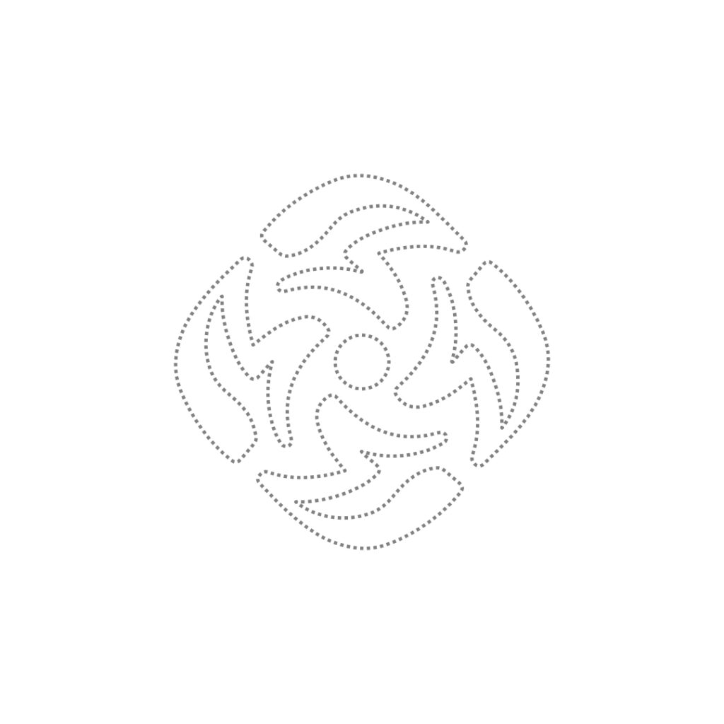
Step 2: Rough Sketching – Bringing Ideas to Life
Now that we have a direction, it’s time to sketch initial logo concepts. Even in the digital era, hand-drawn sketches allow unrestricted creativity.
- Experiment with abstract shapes to form the letter “M.”
- Try rotational symmetry for a dynamic look.
- Focus on negative space for a minimalist approach.
This step is crucial for discovering a unique visual identity that sets your brand apart.
Geometric M Letter Logo Design Process: Sketch
Step 3: Choosing the Right Geometric Structure
The foundation of a great logo is its structure. In geometric typography logos, choosing the right form is essential.
- Circular logos evoke motion and inclusivity.
- Square-based designs feel stable and professional.
- Hexagonal or rotational logos add a futuristic appeal.
A well-balanced geometric monogram logo ensures readability, impact, and brand recall.
Geometric M Letter Logo Design Process: Shape
Step 4: Selecting a Strategic Color Palette
Color psychology plays a huge role in logo branding. For this geometric M letter logo, we use Azure Radiance (#0C7CF4)—a bold and vibrant shade of blue.
Why Blue?
- Trust & Reliability: Used by top tech, corporate, and financial brands.
- Professional & Modern: Ideal for digital branding, fintech, and futuristic identities.
- Minimalist & Versatile: Works great in monochrome, grayscale, and vibrant displays.
Limiting your logo to one or two colors keeps it clean, modern, and visually appealing.
Geometric M Letter Logo Design Process: Color Palette
Step 5: Digitization – Refining in Vector Format
Once your sketch is finalized, it’s time to digitize it using professional logo design software like:
- Adobe Illustrator
- Affinity Designer
Key aspects to focus on:
- Clean vector lines for crisp scaling.
- Symmetry and alignment for balance.
- Precision in curves and angles to maintain readability.
A well-crafted vector M logo will retain its sharpness on business cards, websites, social media, and packaging.
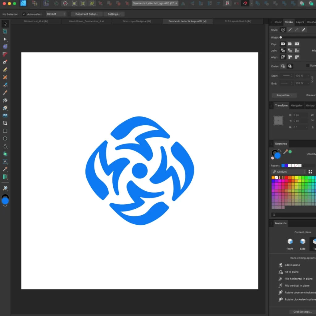
Geometric M Letter Logo Design Process: Digitizing
Step 6: Mockup & Brand Presentation
Before finalizing, test your lettermark logo design across multiple real-world applications like:
- Merchandise (Mugs, T-shirts, Stationery).
- Corporate Branding (Signage, Business Cards, Letterheads).
- Digital Assets (Website headers, App icons, Social Media).
Using mockups and presentations ensures that the logo aligns with the brand’s personality and audience.
Geometric M Letter Logo Design Process: Logo Mockup
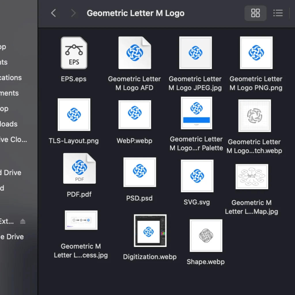
Step 7: Finalization & Logo Delivery
Once the logo has been refined, export it in multiple formats to ensure usability across platforms.
Final deliverables include:
Scalable Vector Files (SVG, EPS, PDF)
Transparent PNG & JPG for web and print
Monochrome & Inverted Versions for versatility
Brand Guidelines to maintain consistency
By following these 7 steps, you’ll create a geometric M letter logo that is timeless, scalable, and visually compelling.
Raster & Vector Formats
Why a Geometric M Letter Logo?
A well-structured letter M logo design stands out for several reasons:
✔ Scalable: Perfect for websites, mobile apps, and print branding.
✔ Minimalist: Clean lines make it timeless.
✔ Memorable: Simplicity enhances brand recognition.
✔ Versatile: Works across industries, from corporate branding to fashion and tech startups.
Final Thoughts
A Geometric M Letter Logo is more than just a design—it’s a powerful branding tool that reflects modernity, professionalism, and elegance. Whether you’re building a technology brand, luxury label, or digital agency, a well-designed monogram logo adds credibility and impact.
If you’re looking for custom logo design services, let’s bring your brand to life with a design that’s both strategic and artistic.
1. What Makes a Geometric M Letter Logo Unique?
A Geometric M Letter Logo stands out due to its clean lines, symmetry, and structured form. It combines modern typography with geometric balance, making it a versatile and memorable branding choice.
2. Which Industries Can Benefit from a Geometric M Logo?
A minimalist lettermark logo is ideal for various industries, including:
✔ Technology & IT Startups
✔ Corporate & Financial Brands
✔ Fashion & Luxury Labels
✔ Creative Agencies & Design Studios
✔ Automotive & Engineering Companies
Its modern appeal and flexibility allow it to fit multiple sectors seamlessly.
3. Why Is Azure Radiance (Blue) Used in This Logo?
The Azure Radiance color (#0C7CF4) represents trust, reliability, and innovation—qualities that resonate with technology, corporate, and fintech brands. Blue is a highly preferred color in branding due to its calming yet authoritative presence.
4. How Do You Ensure Scalability in a Geometric Logo?
A vector-based logo design ensures scalability. Using Adobe Illustrator, Figma, or Affinity Designer, the design remains crisp and clear on:
Small sizes (app icons, business cards)
Large formats (billboards, banners, signage)
Digital and print media
A well-structured M letter monogram maintains its shape and readability across all platforms.
5. What Are the Key Elements of a Strong Geometric Logo?
A professional Geometric M Letter Logo Design should incorporate:
Symmetry & Balance – Ensuring clean, sharp edges.
Minimalist Approach – Avoid unnecessary complexity.
Proper Alignment – Grid-based structure for precision.
Versatile Shapes – Works well in monochrome and multi-color versions.
Adaptability – Looks great in digital and print formats.
These elements guarantee a timeless, professional, and recognizable logo.
6. What File Formats Should Be Included in the Final Logo Delivery?
A well-prepared logo package includes multiple file formats to ensure usability:
Vector Files: AI, EPS, SVG (for infinite scalability).
Raster Files: PNG, JPG (for web and print usage).
Black & White Version: Essential for monochrome printing.
Transparent Background: PNG format for easy overlaying.
These formats allow seamless branding across all media.
7. How Can I Use a Geometric M Letter Logo for Branding?
Your lettermark logo can be applied across multiple branding assets, such as:
✔ Website & Social Media Profiles
✔ Corporate Stationery (Business Cards, Letterheads, Invoices)
✔ Branded Merchandise (Mugs, Hoodies, Stickers, Packaging)
✔ Marketing Collateral (Flyers, Brochures, Digital Ads)
✔ Office Signage & Event Banners
A well-designed geometric logo strengthens brand recognition and creates a professional, cohesive visual identity.

Dil Nawaz | Visual Storyteller
About the Author
Hi, I’m Dil Nawaz, a passionate hand-drawn logo designer dedicated to creating meaningful and unique brand identities. With over a decade of experience, I’ve had the privilege of designing logos that tell stories and connect with audiences worldwide.
Follow me on:
Let’s bring your vision to life! Feel free to reach out via email at info@thelionstudios.com or visit my portfolio at https://thelionstudios.com/.