Creating a memorable coffee logo is an art that goes beyond simple aesthetics. A well-designed logo can become the face of your coffee brand, capturing the essence of your business. Let’s dive into a dynamic journey of crafting the ideal Coffee Girl Logo, with actionable insights and essential design tips.
Step 1: How to Start with Mind Mapping for Coffee Logo Design?
Mind mapping is a crucial first step in the creative process. But how do you map out your design ideas effectively?
Key Elements to Include:
- Identify the brand’s personality and target audience.
- Jot down symbolic elements like coffee beans, steam, or a feminine symbol.
- Brainstorm creative ways to represent warmth, energy, and elegance.
Pro Tip: Use online tools like canva or traditional pen-and-paper sketches to freely organize your thoughts.
The Coffee Girl Logo Design Process: Mind Map
Step 2: Why is Sketching Important Before Designing a Coffee Logo?
Before diving into digital tools, sketching helps visualize concepts.
Benefits of Sketching:
- Quick visualization of multiple ideas.
- Freedom to explore diverse shapes and forms.
- Refining details based on initial visual cues.
Pro Tip: Don’t aim for perfection—the goal is to let your creativity flow.
The Coffee Girl Logo Design Process: Sketch
Step 3: What Shape Should You Choose for Your Coffee Logo?
Shapes communicate emotions and structure within a logo.
Effective Shapes for Coffee Logos:
- Circular shapes convey warmth and inclusiveness.
- Organic forms create a sense of natural artistry.
- Abstract shapes can symbolize steam or coffee swirls.
Pro Tip: Test different shapes to see which aligns best with your brand’s identity.

The Coffee Girl Logo Design Process: Shape
Step 4: How to Choose the Best Color Palette for a Coffee Brand Logo?
Color plays a pivotal role in triggering emotions and brand recall.
Ideal Coffee Logo Colors:
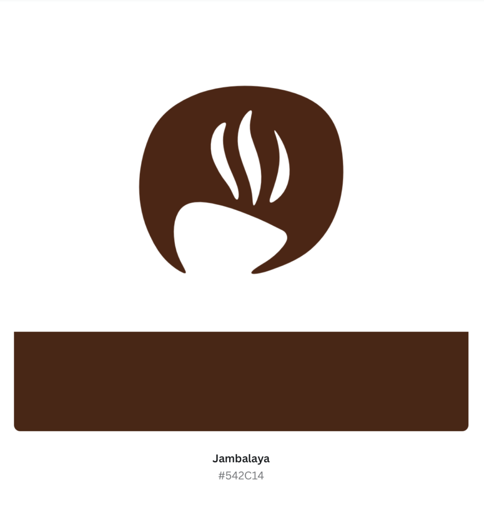
- Jambalaya Brown (#542C14) to evoke warmth and richness.
- Earthy tones like beige or tan for a natural vibe.
- A splash of soft pastels for a feminine touch.
Pro Tip: Stick to 2-3 primary colors to keep the design clean and impactful.
The Coffee Girl Logo Design Process: Color Palette
Step 5: What Tools Can You Use to Digitize Your Coffee Logo Design?
Digitizing takes your sketches from paper to a polished digital format.
Recommended Design Tools:
- Adobe Illustrator for vector-based design.
- Affinity for optimized graphic creation.
- Canva for ready-made templates.
Pro Tip: Ensure your design is scalable and retains quality at different sizes.
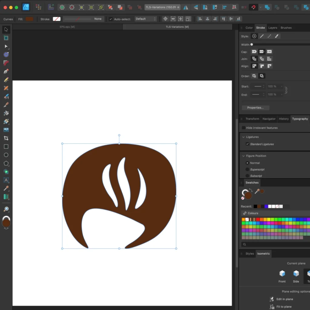
The Coffee Girl Logo Design Process: Digitizing
Step 6: How to Finalize a Coffee Logo Design That Stands Out?
The finalization stage is all about refinement and feedback.
Checklist for Finalization:
- Ensure clean lines and balanced proportions.
- Test the logo on mockups—cups, business cards, and signage.
- Seek feedback from peers or focus groups.
Pro Tip: Create versions for both light and dark backgrounds.
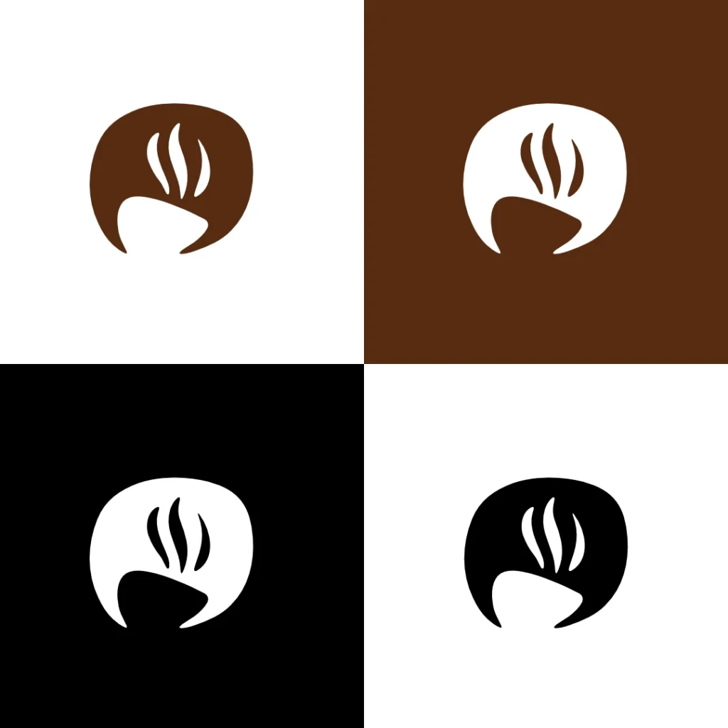
The Coffee Girl Logo Design Process: Logo Variations
Step 7: How to Deliver the Final Coffee Logo to Your Client?
Delivering the logo is more than sending a file—it’s about creating a brand asset.
Essential Deliverables:
- Vector files (AI, EPS) and web formats (PNG, JPG).
- Branding guidelines, including color codes and typography.
- Usage instructions for different platforms.
Pro Tip: Include a brand story to help the client connect emotionally with the design.
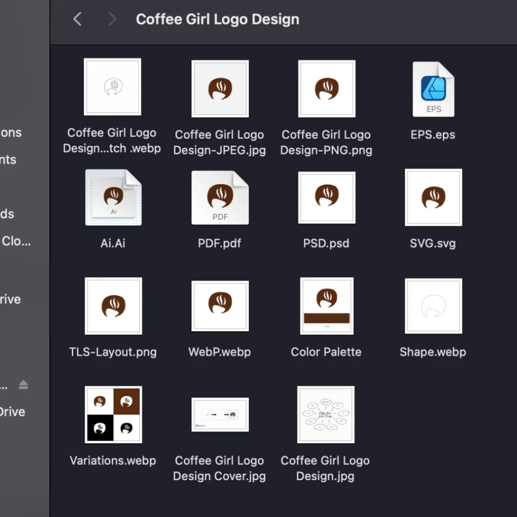
The Coffee Girl Logo Design Process: Raster & Vector Formats
Conclusion:
Creating a coffee girl logo is a blend of creativity, strategy, and precision. By following these steps, you can craft a design that not only looks visually stunning but also resonates with coffee lovers and builds a strong brand identity.
Ready to elevate your coffee branding? Start your design journey today and bring your vision to life!
FAQs about The Coffee Girl Logo Design Process
1. Why is a coffee logo important for a brand?
A coffee logo helps establish brand identity, build customer loyalty, and visually communicate the brand’s story and values to customers.
2. What elements make a coffee logo stand out?
Effective coffee logos typically include warm color palettes, coffee-related symbols like cups or beans, creative typography, and minimalist design approaches.
3. How can I choose the right color palette for my coffee logo?
Opt for earthy tones such as brown, cream, and muted gold to evoke a sense of warmth and quality. Bright hues can work well for modern or quirky coffee brands.
4. What is the best shape for a coffee logo design?
Circular shapes are popular because they are versatile and visually pleasing. However, abstract shapes can add a unique touch to represent creativity.
5. How long does it take to design a coffee logo?
Depending on the complexity and level of customization, creating a professional coffee logo may take anywhere from a day to a week.
6. Should I hire a professional graphic designer for my coffee logo?
If you want a unique and memorable design that aligns with your brand strategy, hiring a professional is highly recommended.
7. Can I use AI tools for my coffee logo design?
AI tools can be helpful for inspiration, but for a polished and brand-specific design, working with a designer ensures originality and creative precision.

Dil Nawaz | Visual Storyteller
About the Author
Hi, I’m Dil Nawaz, a passionate hand-drawn logo designer dedicated to creating meaningful and unique brand identities. With over a decade of experience, I’ve had the privilege of designing logos that tell stories and connect with audiences worldwide.
Follow me on:
Let’s bring your vision to life! Feel free to reach out via email at info@thelionstudios.com or visit my portfolio at https://thelionstudios.com/.