


Description
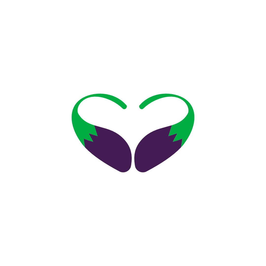
Vegan Club logo design crafted for brands that want to visually celebrate plant-based living with style and meaning. This unique mark combines two mirrored eggplants into a clean heart shape, instantly communicating love for vegetables, mindful eating, and ethical food choices. The vibrant green stems emphasize freshness, organic ingredients, and sustainability, while the deep purple body hints at rich flavor, antioxidant-packed produce, and premium quality.
Designed as a scalable, minimal icon, this vegan logo works beautifully across digital and print touch points—website headers, social media avatars, packaging labels, menu covers, loyalty cards, tote bags, and community event branding. The balanced, symmetrical composition makes it easy to recognize at a glance, even at smaller sizes, which is essential for strong visual identity and brand recall.
Ideal for vegan clubs, plant-based cafes, vegetarian restaurants, nutritionists, recipe platforms, farmers’ markets, and wellness communities, this heart-shaped eggplant logo signals kindness, health, and inclusivity. The design is versatile enough to be used as a primary brand logo or as a supporting emblem for campaigns, membership programs, and product lines. If you’re building a modern vegan brand that wants to feel friendly, vibrant, and trustworthy, this logo is strategically designed to help you stand out in a crowded food and wellness landscape.
|
Aspect |
Details |
|---|---|
|
Title |
Vegan Club logo design – Heart-Shaped Eggplant Emblem for Conscious Food Brands |
|
Color Psychology |
The Vegan Club logo design uses deep Grape (#441C54) paired with fresh Green Haze (#06AC46) to communicate flavor, vitality, and trust. The rich purple suggests premium plant-based ingredients, culinary creativity, and a slightly luxurious feel, while the vibrant green instantly signals freshness, organic produce, and eco-friendly values. Together, these colors create a balanced visual identity that feels both indulgent and healthy—ideal for a modern vegan community or ethical food brand. |
|
Shapes Used |
The mark is built from two symmetrical eggplant silhouettes forming a heart in the negative space, creating a bold yet minimal logo symbol. Smooth curves and rounded forms soften the overall look, while the mirrored composition gives the logo a sense of balance, harmony, and togetherness. The simplified shapes scale well across small and large applications, similar in clarity to a modern cleaning emblem or professional icon. |
|
Symbolism |
At its core, the Vegan Club logo design represents love for plant-based living. The heart shape communicates care, compassion, and community, while the eggplant forms highlight whole foods, vegan cooking, and nutritious choices. The green tips subtly nod to growth, sustainability, and eco-conscious lifestyles. This combination makes the mark perfect for brands that want to express kindness to animals, the planet, and personal well-being in one memorable symbol. |
|
Typography |
While the logo mark is standalone, it pairs best with a clean, geometric sans-serif typeface that feels contemporary and approachable. A slightly rounded font keeps the tone friendly and inclusive, while consistent stroke widths ensure legibility across packaging, menus, and social media. The type can be customized into a subtle monogram style if the brand wants to mirror the simplicity of a monogram cleaning logo or modern emblem. |
|
Design Approach |
The design approach is minimal, concept-driven, and highly versatile. Rather than relying on busy details, the logo uses negative space and strong silhouettes to tell a clear story at a glance. The gradient or flat color options both maintain strong contrast, ensuring the mark works in one-color printing, embroidery, or digital interfaces. This branding method follows the same high-clarity logic that professional cleaning icon designers use: fewer elements, stronger recognition, and instant readability. |
|
Best For |
This Vegan Club logo design is ideal for vegan restaurants, plant-based cafés, meat-free clubs, nutrition coaches, vegan subscription boxes, ethical grocery brands, and community groups focused on plant-based lifestyle education. It also adapts well to wellness programs, vegan cooking classes, and eco-conscious food festivals that want a recognizable, friendly emblem for signage, social media, and merchandise. |
|
Target Audience |
The logo is crafted for health-conscious consumers, vegan and vegetarian communities, flexitarians exploring plant-based options, eco-minded millennials, and brand owners building ethical food or lifestyle businesses. It also appeals to decision-makers in hospitality, food retail, and wellness sectors who value clean design, strong symbolism, and a memorable brand identity that reflects their values. |
|
Applications |
The eggplant heart mark is optimized for restaurant signage, menus, food packaging, product labels, social media avatars, mobile apps, loyalty cards, enamel pins, reusable tote bags, and branded apparel. Its simple construction means it reproduces well in embroidery, screen printing, stamps, and digital icons—similar to how a clear cleaning business logo concept performs across uniforms, vans, and promotional materials. |
|
Why This Design? |
This Vegan Club logo design stands out because it instantly communicates “plant-based + love” without needing words. The clever use of negative space and symbolic color palette makes it highly recognizable, while the minimal structure ensures longevity in a crowded market of generic food logos. It delivers emotional impact, brand clarity, and practical flexibility—allowing vegan brands to build a cohesive visual identity that feels premium, trustworthy, and community-driven, with the same strategic clarity found in the best hygiene branding and professional emblem design. |

Color Psychological Traits Table
| Color Name | Psychological Traits | Emotional Meaning | Branding Impact | Best For |
|---|---|---|---|---|
| Royal Grape | Luxury, Wisdom, Creativity, Mystery, Ambition, Sophistication. | Evokes a sense of exclusive majesty and imaginative depth. It combines the stability of blue with the passion of red, inspiring curiosity and visionary thinking. | Communicates premium quality, originality, and exclusive insight. It positions a brand as an innovative leader with a deep, compelling narrative. | Luxury Goods & Beauty (prestige, allure), Tech & Innovation (creative ingenuity), Education & Academia (wisdom, depth), Entertainment & Media (creative storytelling, mystery), Spiritual Wellness (introspection, transformation). |
| Vital Green Haze | Growth, Vitality, Harmony, Success, Renewal, Balance, Clarity. | Triggers feelings of organic progress, healthy energy, and restorative balance. It is inherently optimistic and associated with positive action and natural harmony. | Projects a brand image that is trustworthy, forward-moving, and authentically positive. It fosters perceptions of eco-consciousness, health, and prosperous success. | Eco/Sustainable Brands (environmental commitment), Finance & FinTech (growth, “green” success), Health & Wellness(vitality, renewal), SaaS & Productivity(efficiency, clarity), Food & Beverage(freshness, natural quality). |
Color Description for Royal Grape (#441C54)
Royal Grape is a color of profound color symbolism, weaving together the regal authority of purple with the introspective depth of a deep violet. Its psychological meaning is complex, generating an emotional impact that balances creative stimulation with a sense of exclusive mystery. This hue does not merely attract attention; it commands a thoughtful pause, appealing to an audience that values sophistication and intellectual or creative depth. In the realm of brand perception, it is a strategic choice for entities that wish to be perceived not as commonplace, but as purveyors of wisdom and innovative luxury.
Within marketing color theory, Royal Grape serves as a powerful tool for brand color meaning. It signifies a departure from the conventional, making it exceptionally effective for brands that aim to disrupt markets or cater to niche, discerning consumers. Its color messaging in visual identity is one of confident originality. In digital design, it provides a rich, immersive backdrop that enhances the perceived value of overlaid content. On product packaging in the beauty or luxury tech sectors, it immediately elevates the unboxing experience, signaling premium contents and a thoughtful brand color theory.
Modern consumer behavior shows a growing affinity for brands with distinct personalities and stories. Royal Grape answers this by offering a narrative-rich palette. It aligns with trends toward maximalism and bold, expressive branding when used dominantly, yet also performs brilliantly as an accent in a luxury color palette, adding a shot of creative authority. For logos, it conveys that a company is both established and imaginatively forward-thinking, making it a cornerstone for building a memorable and authoritative market presence.
Color Characteristics for Royal Grape (#441C54)
-
Tone & Depth: A very deep, highly saturated hue with a low lightness value. It conveys substantial weight, richness, and a grounded sense of luxury.
-
Visual Temperature: Perceptually cool due to its blue dominance, but the underlying red provides a subtle, intriguing warmth that prevents it from feeling sterile or cold.
-
Saturation: Maintains high chromatic intensity despite its depth, ensuring it retains vibrancy and does not read as a neutral black.
-
Cultural & Associative Significance: Historically linked to royalty, spirituality, and artistry due to the rarity of its original pigment. Associated with wisdom, ambition, and exclusive creativity.
-
Branding Impressions: Projects creative authority, luxurious mystery, and visionary intelligence. It is the color of the niche expert and the premium innovator.
Color Conversion Table for Royal Grape (#441C54)
| Value | Format | Output |
|---|---|---|
| CSS HEX | #441C54 |
|
| RGB (Decimal) | rgb(68, 28, 84) |
|
| RGB (Percentage) | rgb(26.7%, 11%, 32.9%) |
|
| CMYK | C:19%, M:67%, Y:0%, K:67% |
|
| HSL | hsl(283°, 50%, 22%) |
|
| HSV / HSB | hsv(283°, 67%, 32.9%) |
|
| Web Safe Color | #330033 |
|
| CIE-LAB | L:17.93, a:29.66, b:-24.54 |
|
| CIE-XYZ | X:4.35, Y:2.64, Z:8.67 |
|
| xyY | x:0.280, y:0.170, Y:2.64 |
|
| CIE-LCH | L:17.93, C:38.50, h:318.48° |
|
| CIE-LUV | L:17.93, u:10.47, v:-30.97 |
|
| Hunter-Lab | L:15.82, a:18.92, b:-18.20 |
|
| Binary RGB | 01000100 00011100 01010100 |
Technical Explanation for Royal Grape: In the additive RGB color space, this deep purple is composed of 26.7% red, 11% green, and 32.9% blue light. The dominant blue and red components create its violet character, while the low green percentage deepens its richness. In the subtractive CMYK model used for printing, it is formulated with 19% Cyan, 67% Magenta, 0% Yellow, and 67% Key (black). This high magenta and black mix is crucial for achieving its dense, luxurious, and slightly mysterious print quality.
Color Description for Vital Green Haze (#06AC46)
Vital Green Haze represents the zenith of positive color psychology meaning in the spectrum. It is the unequivocal hue of growth, renewal, and affirmative action. Its emotional impact is instantly refreshing and optimistic, directly triggering associations with flourishing nature, clear signals of “go,” and financial prosperity. This makes its brand perception inherently tilted towards trustworthiness, health, and forward momentum. In the lexicon of marketing color theory, it is a workhorse of positive color messaging, utilized to communicate safety, success, and ecological integrity.
The brand color meaning of Vital Green Haze is one of authentic progress. It is indispensable for brands whose core values are tied to environmental stewardship, wellness, or financial growth. Its high visibility and positive connotations make it a powerhouse in visual identity for cutting through digital noise with a message that feels both energetic and trustworthy. In UI/UX design, it is frequently employed for success states, calls-to-action, and positive notifications, directly influencing consumer behavior by providing clear, reassuring feedback. On packaging, particularly in organic food or clean beauty, it acts as an immediate visual shorthand for natural ingredients and ethical sourcing.
Aligning with contemporary branding trends that prioritize authenticity and positive impact, Vital Green Haze is more relevant than ever. It fits seamlessly into modern, clean design systems, often paired with neutrals for a balanced, professional look or with complementary accents for vibrant energy. As a primary logo color, it conveys a brand that is dynamic, accessible, and committed to positive outcomes—whether for the customer’s health, wallet, or the planet. This versatility and unambiguous positive brand color theory cement its status as a perpetually effective choice in competitive markets.
Color Characteristics for Vital Green Haze (#06AC46)
-
Tone & Depth: A bright, vivid hue with a medium-high lightness. It feels energetic and luminous, projecting clarity and openness rather than depth or weight.
-
Visual Temperature: A decidedly cool green, leaning towards cyan, which enhances its associations with clarity, technology, and refreshment.
-
Saturation: Exceptionally high and pure saturation, resulting in maximum visual vibrancy and eye-catching appeal.
-
Cultural & Associative Significance: Universally tied to nature, life, and renewal. Culturally, it signifies “go,” safety, permission, prosperity, and in some contexts, health and envy.
-
Branding Impressions: Communicates dynamic growth, trusted clarity, and optimistic vitality. It is the color of the effective solution and the ethical choice.
Color Conversion Table for Vital Green Haze (#06AC46)
| Value | Format | Output |
|---|---|---|
| CSS HEX | #06AC46 |
|
| RGB (Decimal) | rgb(6, 172, 70) |
|
| RGB (Percentage) | rgb(2.4%, 67.5%, 27.5%) |
|
| CMYK | C:97%, M:0%, Y:59%, K:33% |
|
| HSL | hsl(143°, 93%, 34.9%) |
|
| HSV / HSB | hsv(143°, 97%, 67.5%) |
|
| Web Safe Color | #009933 |
|
| CIE-LAB | L:61.74, a:-60.87, b:41.86 |
|
| CIE-XYZ | X:16.08, Y:30.15, Z:10.80 |
|
| xyY | x:0.281, y:0.527, Y:30.15 |
|
| CIE-LCH | L:61.74, C:73.89, h:144.31° |
|
| CIE-LUV | L:61.74, u:-54.94, v:65.14 |
|
| Hunter-Lab | L:54.87, a:-44.67, b:27.87 |
|
| Binary RGB | 00000110 10101100 01000110 |
Technical Explanation for Vital Green Haze: In the additive RGB color space, this vibrant green is composed of 2.4% red, 67.5% green, and 27.5% blue light. Its intense green dominance with a significant blue component creates its fresh, cyan-leaning character. For professional printing in the subtractive CMYK model, it is formulated with 97% Cyan, 0% Magenta, 59% Yellow, and 33% Key (black). This near-total cyan component, combined with substantial yellow and black, is necessary to replicate its electrifying vitality and depth on the printed page.
FAQ: Vegan Club Logo Design
1. What makes a Vegan Club logo design effective for plant-based branding?
A Vegan Club logo design is effective when it immediately communicates plant-based values through clear symbolism, color psychology, and simple shapes. Using organic forms, leaf motifs, or heart-shaped elements helps trigger associations with compassion, sustainability, and ethical eating. From a brand psychology perspective, the logo should balance trust (often expressed with greens and deep purples) with warmth and community. When crafted as a modern vegan logo mark, it works seamlessly across digital platforms, packaging, and signage while staying memorable at small sizes.
2. Which colors work best in a Vegan Club logo design for health-focused brands?
In a high-performing Vegan Club logo design, saturated greens, earthy neutrals, and deep berry tones signal freshness, nutrition, and vitality. Green suggests growth and eco-conscious values, while purple or grape tones can position the brand as premium and crafted. According to color psychology, this palette reassures health-conscious consumers that the club is rooted in natural ingredients and mindful choices. When used consistently across visual identity, these hues strengthen brand perception and trust.
3. How minimal should a Vegan Club logo design be for modern digital use?
A modern Vegan Club logo design benefits from a minimal, scalable structure—clean lines, limited colors, and a strong silhouette that reads instantly on apps, social media icons, and website favicons. Design theory shows that simple, well-balanced marks perform better in crowded feeds and small digital spaces. By reducing visual noise and focusing on one key symbol—such as a stylized leaf heart or plant-based monogram—the logo becomes easier to recognize and remember. This minimal approach also makes it cost-effective for printing on membership cards, menus, labels, and merchandise.
4. Can a Vegan Club logo design work for both restaurants and packaged products?
Yes, a strategically crafted Vegan Club logo design can flex across hospitality and retail environments. For vegan restaurants, the logo functions as a welcoming sign, menu header, and storefront emblem that communicates flavor, freshness, and ethical dining. For packaged plant-based products, the same mark serves as a quality seal, helping customers quickly spot vegan-friendly options on shelves. By designing with strong contrast, simple geometry, and clear symbolism, the logo maintains clarity whether it’s on a glowing neon sign or a small product label.
5. How does brand psychology influence the shape of a Vegan Club logo design?
Brand psychology plays a major role in shaping a Vegan Club logo design. Rounded, heart-like forms suggest kindness, community, and emotional warmth, which are core values in vegan culture. Symmetrical shapes signal balance and harmony, reinforcing ideas of holistic wellness and mindful living. When combined with organic curves rather than sharp angles, the design feels more approachable and nurturing, which encourages sign-ups, memberships, and repeat visits from ethically driven consumers.
6. What file formats do I need for a professional Vegan Club logo design?
For a fully functional Vegan Club logo design, you should receive vector files (AI, EPS, or SVG) alongside high-resolution PNG and JPEG exports. Vectors allow you to scale the logo from tiny social icons to large outdoor signage without losing quality. Transparent PNGs work well for websites, social media posts, and overlays on photography. Having a structured logo pack—primary logo, icon-only version, and monochrome variant—ensures consistent usage across menus, loyalty cards, merchandise, and digital campaigns.
7. How can a Vegan Club logo design help build community and loyalty?
A thoughtfully crafted Vegan Club logo design acts as a visual badge that members are proud to wear, share, and associate with. When the mark clearly reflects vegan values—compassion, sustainability, and conscious consumption—it becomes a symbol of identity rather than just a decorative icon. Featuring the logo on reusable totes, loyalty cards, social media content, and event signage reinforces a sense of belonging. Over time, this consistent visual identity deepens emotional connection and strengthens community-driven word-of-mouth around the vegan brand.
Reviews
There are no reviews yet.