Description
Bull Construction Logo Design – Powerful Branding for Builders
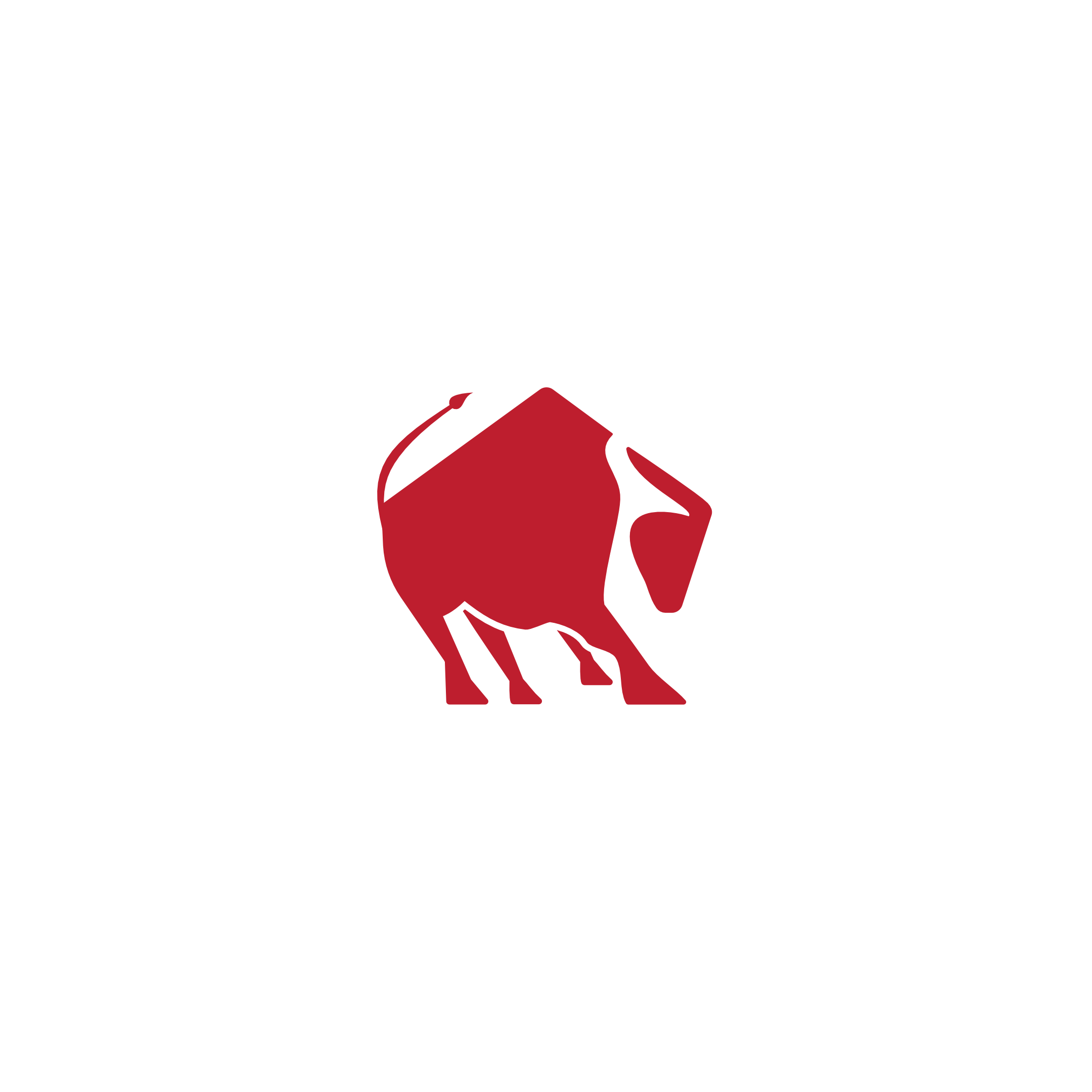
Bull construction logo design crafted to give your building brand a powerful, unforgettable presence. This minimalist red bull icon combines the body of a charging bull with subtle roof and structure shapes, instantly linking your company to construction, real estate development, and heavy-duty contracting work. The strong, angular silhouette and forward-leaning posture convey momentum, resilience, and “we get it done” energy.
Rendered in rich Cardinal red (#BC1C2C), the logo signals confidence, leadership, and bold decision-making ideal for general contractors, steel structure companies, demolition experts, concrete services, and property developers. The clean, scalable vector design works beautifully on business cards, job-site signage, safety helmets, vehicle wraps, invoices, websites, social media profiles, and bidding documents.
You’ll receive a high-resolution, fully editable logo file that can be customized with your company name and tagline, making it easy to launch or refresh a professional brand identity quickly. If you’re looking for a memorable bull builder logo that stands out from generic construction logos, this design gives your business an instant competitive edge and a brand symbol your clients will trust.
|
Aspect |
Details |
|---|---|
|
Title |
Bull construction logo design for bold builder brands – a powerful, minimal mascot mark that fuses structural geometry with a charging bull silhouette to create a memorable contractor brand identity. |
|
Color Psychology |
The logo uses Cardinal red (#BC1C2C), a deep construction-grade red associated with strength, urgency, and determination. In branding psychology, this color signals power, resilience, and “job-site readiness,” helping your bull construction logo design feel reliable on heavy-duty vehicles, machinery, and safety gear while still looking clean and modern compared to a typical sparkle cleaning logo or hygiene branding mark. |
|
Shapes Used |
Built from sharp angular shapes and a compact rectangular body, the mark forms a forward-leaning bull whose back subtly echoes a pitched roof or structural beam. The solid fills and confident negative space create a modern emblem that reads clearly at any size—similar to a professional cleaning icon or monogram cleaning logo in terms of simplicity, but engineered for rugged construction use. |
|
Symbolism |
The lowered head and planted legs represent focus, stability, and unstoppable momentum—qualities every construction brand identity wants to project. The single-color silhouette makes the animal feel iconic, while the diagonal backbone suggests upward growth, new builds, and expansion, turning the bull into a visual metaphor for aggressive progress in a competitive market. |
|
Typography |
While the icon can be paired with many fonts, it works best alongside a bold, condensed sans-serif wordmark that mirrors its strong verticals and crisp angles. Using uppercase lettering with generous tracking supports a premium contractor look and keeps the overall logo system minimal, modern, and highly legible on helmets, signage, and digital touchpoints. |
|
Design Approach |
The design follows a “one-glance recognition” approach—minimal detail, strong silhouette, and zero clutter. This strategy mirrors the clarity of a modern cleaning emblem while leaning harder into industrial aesthetics: thick strokes, compact proportions, and a logo system that survives rough environments, low-resolution prints, and high-contrast placements on construction sites. |
|
Best For |
Ideal for general contractors, structural steel companies, demolition firms, concrete suppliers, heavy equipment rentals, and real-estate developers seeking a fierce yet clean bull construction logo design. Also works for building materials brands that want a tough mascot logo instead of a generic lettermark. |
|
Target Audience |
Built to impress project owners, investors, architects, procurement managers, and homeownerswho associate a strong mascot with reliability and performance. The assertive bull silhouette reassures clients that your crew can handle large-scale projects just as effectively as detail-oriented tasks where a more traditional sparkle cleaning logo or hygiene-focused identity would be used. |
|
Applications |
Designed for versatile use across hard hats, safety vests, fleet vehicles, job-site banners, equipment decals, proposals, invoices, websites, bidding portals, and social media avatars. Its single-color construction ensures low-cost printing while remaining sharp on digital screens, much like the best monogram cleaning logo or cleaning business logo concept—only tailored to the construction sector. |
|
Why This Design? |
This bull construction logo design stands out because it combines the emotional punch of an aggressive mascot with the clarity of a corporate symbol. It delivers instant recognition, scales perfectly from app icons to billboard cranes, and creates a cohesive visual anchor for any builder brand identity. The result is a logo that feels fearless, trustworthy, and ready for work—helping your construction business win attention and stay top-of-mind in search, on-site, and online. |
Color Psychological Traits Table
|
Color Name |
Psychological Traits |
Emotional Meaning |
Branding Impact |
Best For |
|---|---|---|---|---|
|
Cardinal Red (#BC1C2C) |
Determined, bold, high-energy, dominant, leadership-driven, performance-oriented |
Conveys courage, drive, urgency, passion, and an unshakable sense of forward momentum |
Creates a strong, memorable brand perception; signals power, ambition, and reliability in tough markets |
Construction brands, financial bullish brands, sports teams, automotive and machinery logos, premium packaging, safety and warning accents, call-to-action highlights |
Color Description
Cardinal Red in Brand Psychology
Cardinal red (#BC1C2C) is a powerful, saturated red that sits between classic crimson and brick, giving it both emotional intensity and grounded stability. In color psychology meaning, this tone instantly communicates drive, confidence, and decisive action. It feels less playful than bright scarlet and more sophisticated than basic primary reds, which makes it ideal for brands that want to project strength without looking cheap or overly aggressive.
Color Symbolism & Brand Perception
In modern color symbolism, Cardinal red is strongly associated with courage, leadership, and high performance. When integrated into a visual identity or logo system, it shapes brand perception toward trust in tough situations—think heavy construction, security, sports, or finance. The color’s emotional impact blends determination and focus, signaling a brand that shows up, takes responsibility, and gets things done.
Behavior in Design & Visual Identity
On screen and in print, Cardinal red behaves as a dominant accent that naturally attracts the eye and anchors composition. It pairs beautifully with neutrals like charcoal, concrete grey, off-white, and deep black, creating a balanced yet commanding visual identity. In marketing color theory, this red works best for calls-to-action, hero marks, and icons where you need instant recognition and recall. Used in packaging or logo design, it suggests premium quality and robust performance without losing accessibility.
Relevance to Modern Branding Trends
Current branding trends favor bold, minimal icons with reduced color palettes. Cardinal red fits perfectly into this brand color theory, working as a hero shade in a luxury color palette when combined with metallic foils or matte finishes. For logos, labels, and structural packaging, this red stands out on shelves and digital feeds alike, driving consumer behavior toward brands that feel energetic, modern, and unafraid to lead.
Color Characteristics
-
Tone: Deep, rich red with subtle hints of crimson and brick; more mature than bright, primary reds.
-
Depth: Medium-dark value that holds detail well in icons, line work, and flat logo shapes.
-
Visual Temperature: Clearly warm, giving a sense of heat, movement, and kinetic energy.
-
Saturation: High saturation that delivers strong color messaging without looking fluorescent or cheap.
-
Associations: Strength, resilience, construction, power tools, sports performance, financial growth, premium meats/steaks, safety signage.
-
Branding Impressions: Confident, serious, masculine-leaning, performance-driven; ideal for brands that want to look tough, reliable, and highly capable.
-
Cultural Significance: In many cultures red signals prosperity, luck, celebration, and importance, while in Western markets it also conveys boldness, passion, and urgency—making it an excellent strategic choice on any color emotion chart.
Color Conversion Table
|
Value |
Format |
Output |
|---|---|---|
|
CSS HEX |
Hex |
#BC1C2C |
|
RGB (Decimal) |
R, G, B |
188, 28, 44 |
|
RGB (Percentage) |
R%, G%, B% |
73.73%, 10.98%, 17.25% |
|
CMYK |
C, M, Y, K |
0, 85, 77, 26 (approx.) |
|
HSL |
H°, S%, L% |
354°, 74%, 42% |
|
HSV / HSB |
H°, S%, V% |
354°, 85%, 74% |
|
Web Safe Color |
Hex |
#CC3333 (closest web-safe approximation) |
|
CIE-LAB |
L*, a*, b* |
40.74, 60.59, 34.22 |
|
CIE-XYZ |
X, Y, Z |
23.94, 12.17, 4.01 |
|
xyY |
x, y, Y |
0.557, 0.283, 12.17 |
|
CIE-LCH |
L*, C*, h° |
40.74, 69.72, 29.4° |
|
CIE-LUV |
L*, u*, v* |
40.74, 164.24, 44.89 |
|
Hunter-Lab |
L, a, b |
3.46, 33.12, 21.71 (approx.) |
|
Binary RGB |
8-bit each |
R: 10111100, G: 00011100, B: 00101100 |
Technical Color Explanation
In an RGB color space built from red, green, and blue light, Cardinal red #BC1C2C contains 188 levels of red, 28 levels of green, and 44 levels of blue, which corresponds to approximately 73.73% red, 10.98% green, and 17.25% blue.
In CMYK color space used for printing, this translates to roughly 0% cyan, 85% magenta, 77% yellow, and 26% black, making it a print-friendly red that achieves strong saturation without excessive ink coverage. These precise values help designers maintain consistent brand color meaning, ensuring that Cardinal red delivers the same powerful message across digital, print, packaging, and environmental branding.
1. What does a bull construction logo design communicate about a brand?
A bull construction logo design instantly communicates strength, resilience, and unstoppable forward momentum. In brand psychology, the bull symbolizes power, stamina, and confidence—ideal traits for a construction company that tackles heavy projects and demanding sites. When paired with bold geometry and a solid color palette, this kind of animal mascot logo positions your firm as reliable, fearless, and capable of handling complex builds. The result is a construction brand identity that feels tough, trustworthy, and ready for big challenges.
2. Why is a bull construction logo design effective for contractors and builders?
A bull construction logo design works so well because it fuses industry relevance with emotional impact. Construction clients want to feel that their contractor is strong, steady, and committed—exactly what the bull symbol delivers visually. From a design theory standpoint, compact shapes and angular lines give the logo excellent legibility on helmets, trucks, job-site signage, and digital platforms. This combination of visual clarity and symbolic power makes the brand memorable in a crowded market.
3. How should color be used in a bull construction logo design?
Color plays a crucial role in a bull construction logo design because it influences trust and perception before a single word is read. Deep reds, burnt oranges, or charcoal tones often reinforce themes of energy, durability, and industrial grit, while neutral accents keep the mark professional and modern. According to marketing color theory, high-contrast palettes help the logo stand out on machinery, uniforms, and safety boards. Thoughtful color selection ensures the bull icon feels bold without appearing aggressive or chaotic.
4. Is a bull construction logo design suitable for both small firms and large enterprises?
Yes, a bull construction logo design can scale effectively from local builders to large infrastructure companies when the concept is executed with strategic restraint. Clean silhouettes, minimal details, and strong negative space enable the mark to reproduce clearly at any size—from business cards and bid documents to cranes and billboards. The bull’s symbolism of persistence and power resonates with residential, commercial, and industrial audiences alike. This makes it a flexible brand asset for companies planning long-term growth.
5. What design elements make a bull construction logo design look premium rather than generic?
A premium bull construction logo design relies on intentional geometry, balanced proportions, and distinctive negative-space details rather than clip-art style graphics. Subtle nuances in the horn angle, body posture, and stance can convey confidence without appearing cartoonish. When combined with carefully selected typography—such as a sturdy sans-serif or industrial slab serif—the logo feels bespoke and engineered, not templated. This elevated execution signals quality craftsmanship and professional project management to potential clients.
6. How can a bull construction logo design be used across different brand touchpoints?
A well-crafted bull construction logo design works seamlessly across uniforms, site hoardings, hard hats, vehicle wraps, proposals, and digital channels. Its strong silhouette ensures recognizability even when applied as a single-color mark, a small favicon, or an embroidered patch. In brand systems, the bull icon can be paired with secondary graphics such as grid lines, structural outlines, or blueprint textures to reinforce the construction theme. Consistent usage builds recall and positions your company as organized and dependable.
7. What should I consider before commissioning a custom bull construction logo design?
Before investing in a bull construction logo design, clarify your brand positioning, target clients, and long-term business goals. Decide whether you want the bull to represent raw power, disciplined control, or strategic aggression, as each direction guides the posture, angles, and style of the mascot. Discuss with your designer how the logo will perform in real-world conditions—dusty job sites, reflective vests, digital ads, and official documentation. A thoughtful discovery process ensures the final mark becomes a durable, growth-ready symbol for your construction brand.
Reviews
There are no reviews yet.