

Description
Saving Hands NGO Logo is a clean, mission-driven logo concept designed for nonprofits that want instant trust and recognizability.
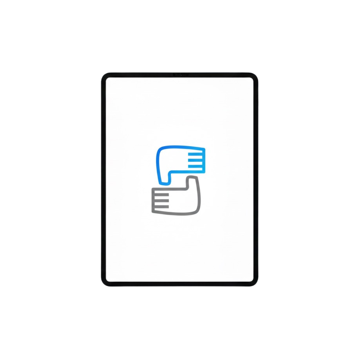
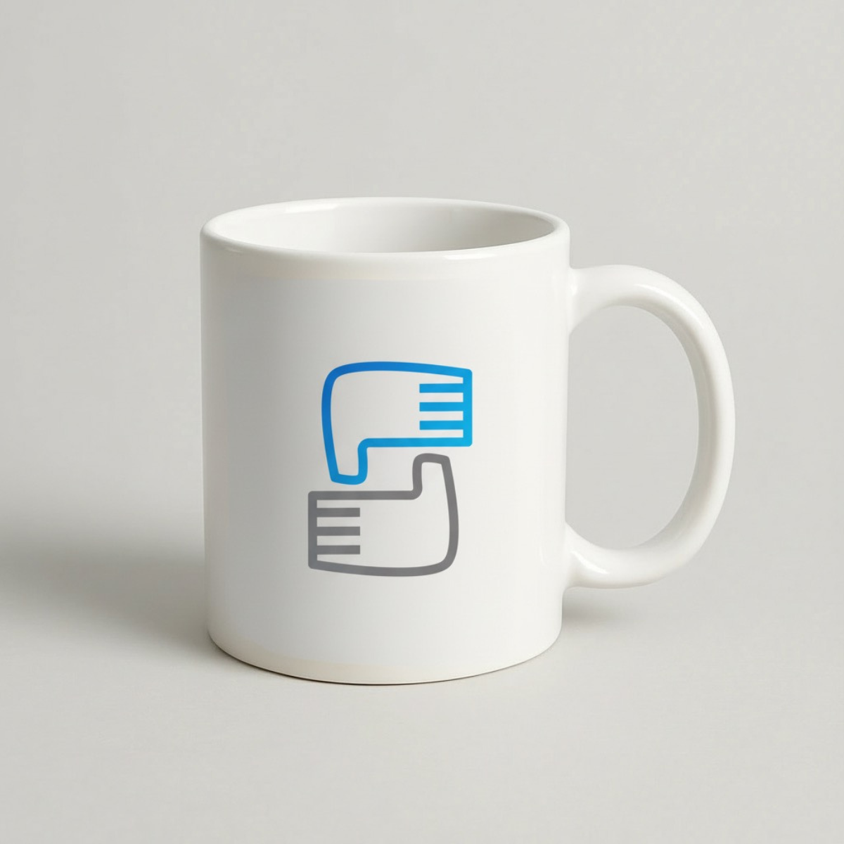
The icon features symmetrical hands forming an “S” letter shape, creating a strong, simple symbol of support, protection, and unity perfect for charities, foundations, community initiatives, and social impact programs.
This modern logo mark blends minimal geometry with smart negative space, keeping the design readable at small sizes while still feeling premium and professional.
The calming blue and neutral gray palette reinforces credibility and compassion, making the Saving Hands NGO logo ideal for donation campaigns, NGO websites, social media profiles, stationery, volunteer uniforms, event banners, and signage.
|
Aspect |
Details |
|---|---|
|
Title |
Saving Hands NGO Logo – Symmetric “S” Helping Hands Identity Mark |
|
Color Psychology |
The palette combines a trust-building sky blue with a stable charcoal gray. Blue signals reliability, transparency, and calm leadership ideal for donation-driven organizations that must inspire confidence fast. Gray adds professionalism and balance, helping the mark feel credible for partners, sponsors, and institutional audiences. Together, the colors communicate care + accountability, a strong mix for nonprofit brand identity. |
|
Shapes Used |
Built from two mirrored hand silhouettes forming an “S” lettermark. The shapes are simplified into rounded-rectilinear curves with consistent stroke weight and clean corners, giving the logo a minimal icon look that scales well as a favicon, app icon, or social avatar. Short horizontal lines suggest finger details while keeping the mark uncluttered. |
|
Symbolism |
The symmetrical hands create a clear message of support, protection, and unity a visual shorthand for helping others without needing words. The “S” structure adds memorability and brand recall, positioning the NGO as a dependable system of care: give, receive, and uplift. The balanced mirror layout also reinforces fairness and inclusion. |
|
Typography |
This concept reads best with a modern sans-serif (humanist or geometric) that feels warm yet professional. Pairing a clean wordmark with the icon strengthens clarity for international audiences and improves legibility across web and print. A medium weight with generous spacing keeps the tone approachable, trustworthy, and contemporary. |
|
Design Approach |
A minimal lettermark logo engineered for brand consistency: strong silhouette, simple geometry, and high recognition at small sizes. The design leans into symbol-first nonprofit branding, making it easy to deploy across campaigns, partnerships, and community programs while staying clean and premium. |
|
Best For |
Ideal for NGO branding, charity organizations, foundations, community support programs, volunteer networks, youth initiatives, healthcare outreach, education support, and humanitarian projects. Especially effective for searches like “nonprofit logo design for donations”, “minimal charity logo icon”, and “helping hands S letter logo”. |
|
Target Audience |
Built for NGO founders, nonprofit directors, CSR managers, donors, grant committees, community leaders, and partner organizations who evaluate trust signals quickly. Also fits social media–first teams needing a recognizable icon for fundraising and awareness campaigns. |
|
Applications |
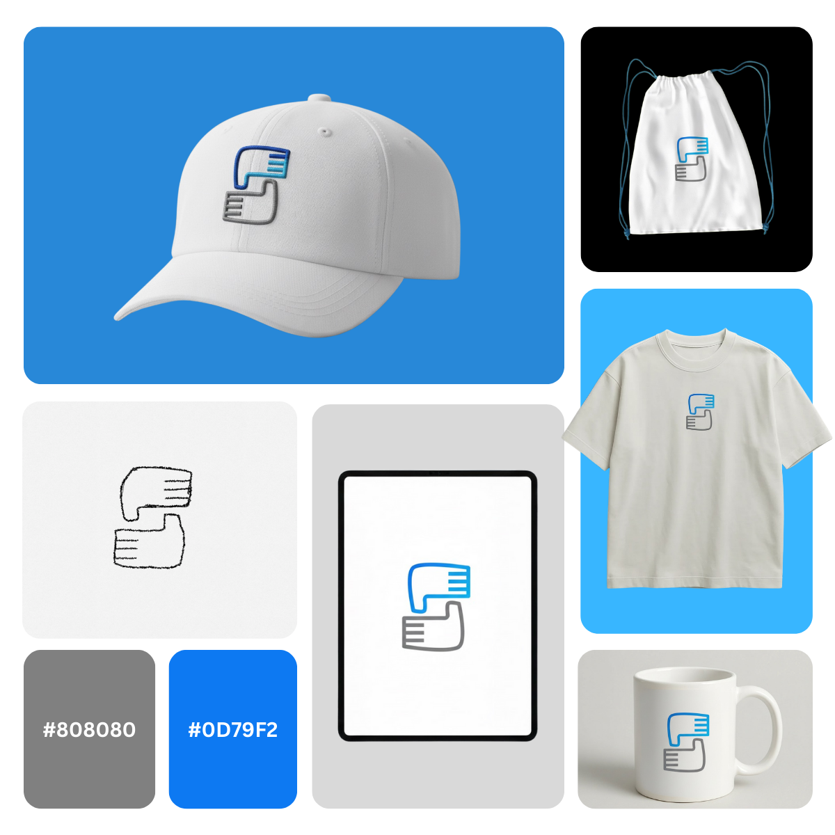
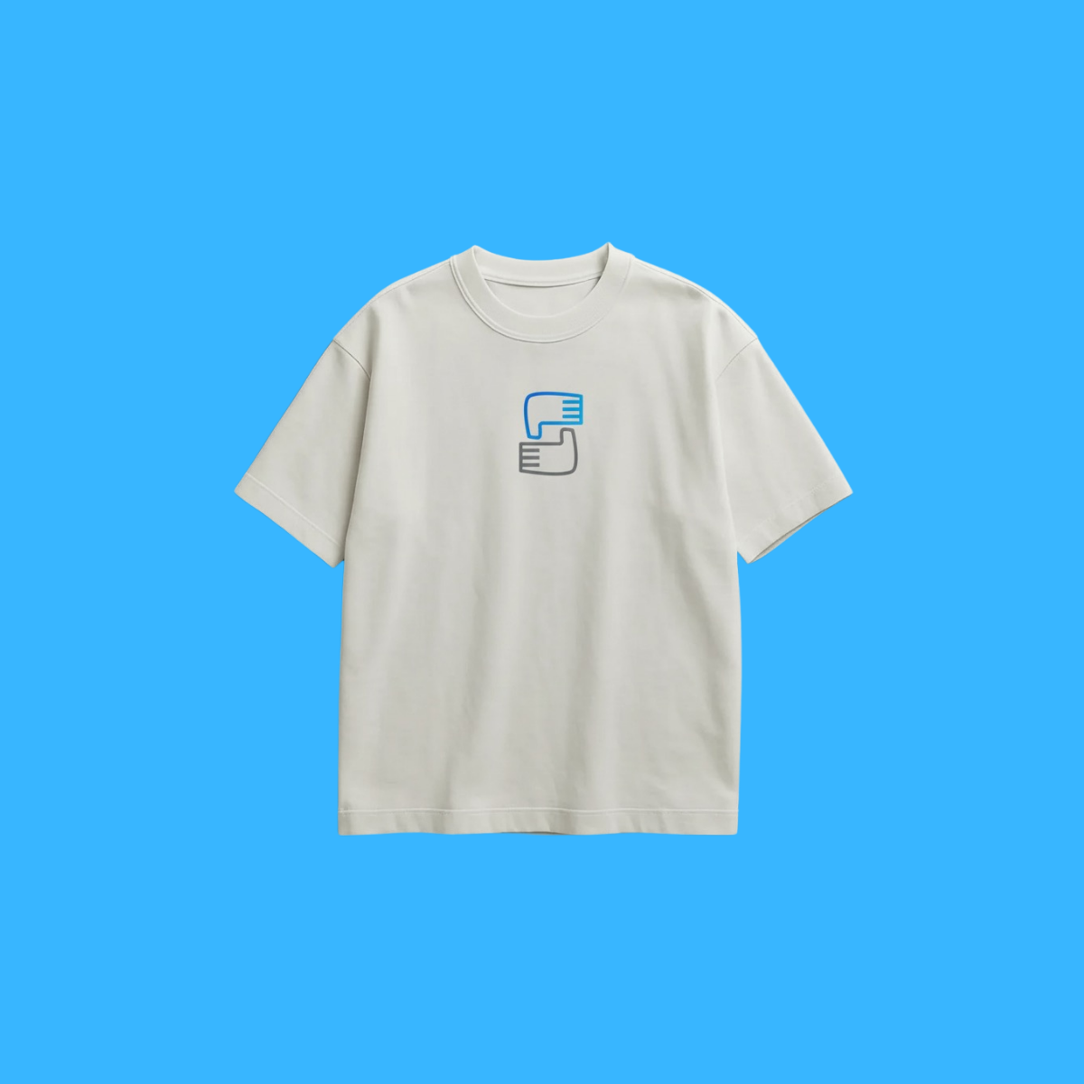
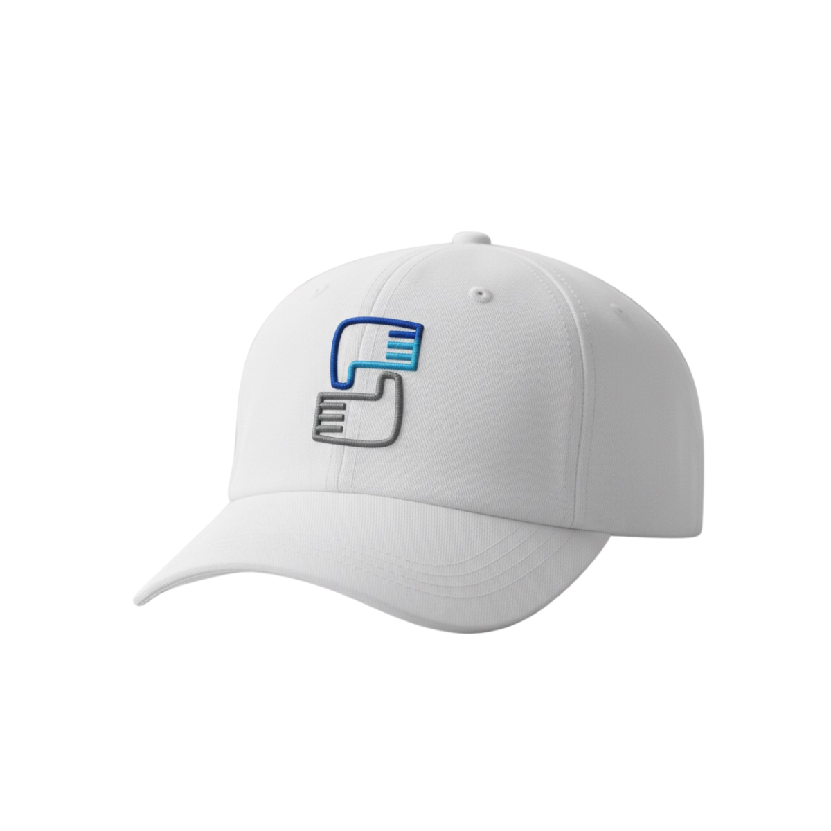
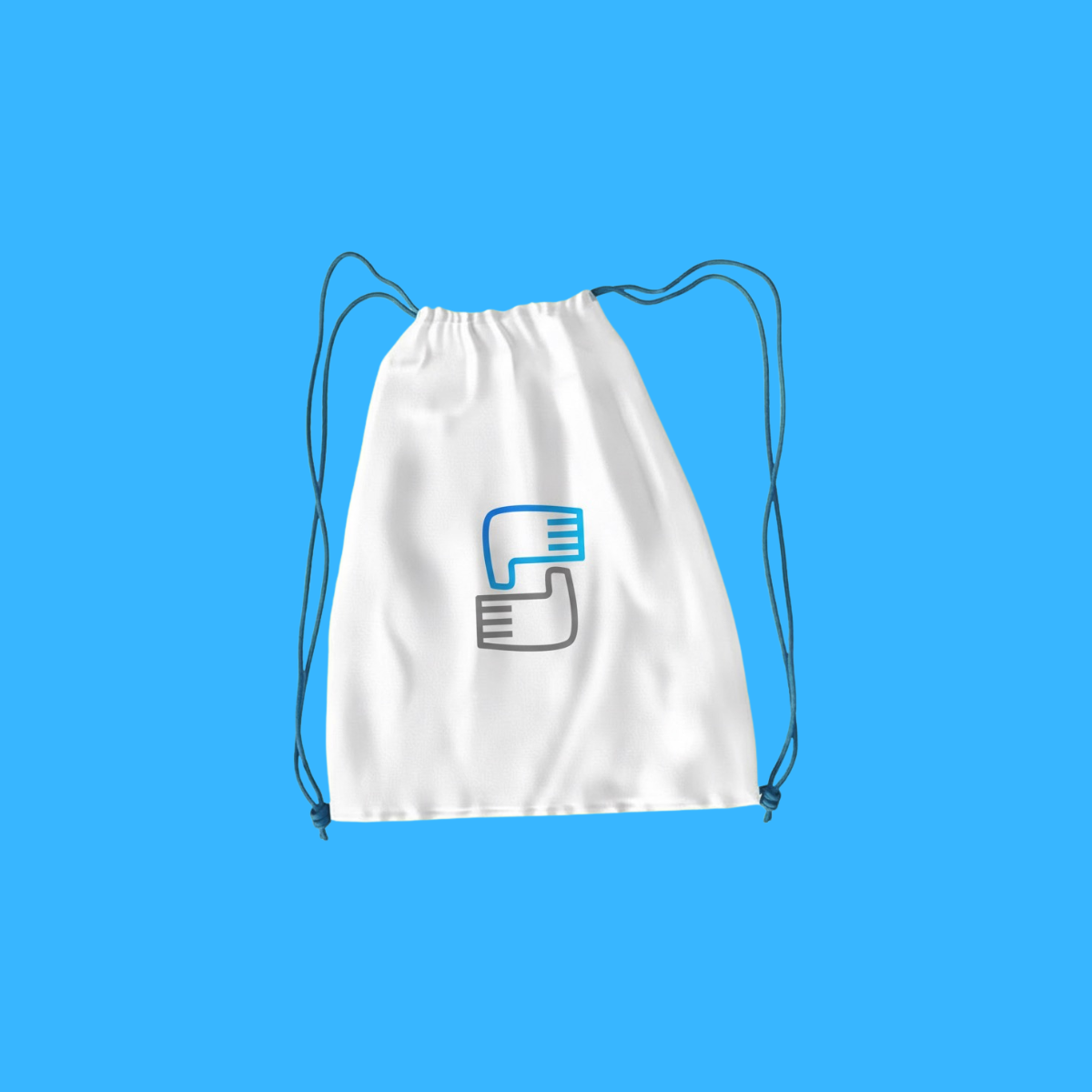
Works across website headers, donation pages, social media profiles, email signatures, letterheads, reports, ID cards, event banners, signage, stickers, and embroidery-ready merch (caps, tees, tote bags). The simple strokes translate cleanly to print, vinyl, screen printing, and laser engraving. |
|
Why This Design? |
This logo differentiates by combining meaningful symbolism (helping hands) with strategic brand function (S-shaped lettermark). The symmetry boosts credibility, the minimal style increases versatility, and the color system supports trust-led marketing resulting in a mission-driven identity that looks professional, modern, and easy to recognize everywhere. |
1. Color Psychological Traits Table
| Color Name | Psychological Traits | Emotional Meaning | Branding Impact | Best For |
|---|---|---|---|---|
| Azure Blue (#0F88F2) | Trustworthiness, Professionalism, Reliability, Intelligence, Stability | Evokes feelings of security, confidence, and calm assurance. Represents clarity and dependability. | Establishes immediate credibility and corporate sophistication. Signals technological competence and ethical standards. | Technology brands, financial institutions, healthcare platforms, corporate identities, professional services, enterprise software |
| Celestial Cyan (#0FC9F2) | Innovation, Creativity, Modernity, Freshness, Forward-Thinking | Inspires optimism, creative energy, and mental agility. Communicates approachability and progressive vision. | Positions brands as contemporary and inventive. Attracts youthful demographics and signifies digital transformation. | Creative agencies, startup ecosystems, wellness brands, educational technology, sustainable products, digital interfaces |
2. Color Description
Azure Blue (#0F88F2): The Epitome of Digital Trust
In contemporary color psychology meaning, Azure Blue (#0F88F2) represents the intersection of technological advancement and human reliability.
This vibrant spectrum hue carries profound color symbolism in branding, where it communicates corporate integrity while maintaining digital freshness. Unlike traditional navy blues that can appear conservative, this specific cyan-blue hybrid delivers both authority and approachability a crucial balance in modern brand perception strategies.
The emotional impact of #0F88F2 stems from its perfect saturation equilibrium: bright enough to capture attention in digital environments while maintaining the calming stability associated with blue’s core psychology.
In marketing color theory, this color performs exceptionally in building immediate trust with consumers, particularly in sectors where credibility is paramount. Its visual identity strength lies in its versatility equally effective in fintech applications demanding security and in healthcare interfaces requiring compassion.
When applied to consumer behavior contexts, this hue triggers associations with intelligence systems, cloud technology, and professional excellence. Its growing presence in luxury color palette selections for premium digital services underscores its status implications.
The color’s effectiveness in brand color theory emerges from its dual capacity: it anchors corporate messaging while allowing complementary colors to highlight innovation or action making it a cornerstone shade in comprehensive color messaging systems.
Celestial Cyan (#0FC9F2): The Signature of Modern Innovation
Celestial Cyan (#0FC9F2) embodies the color psychology meaning of breakthrough thinking and digital evolution. This luminous cyan variant carries distinct color symbolism in branding that communicates clarity of purpose and visionary thinking.
In today’s saturated digital landscape, its unique wavelength captures attention while conveying intellectual freshness a powerful combination in competitive brand perception environments.
The emotional impact of this hue is notably uplifting, stimulating mental agility and optimistic engagement. From a marketing color theory perspective, #0FC9F2 performs exceptionally in capturing millennial and Gen Z demographics who associate this color spectrum with technological empowerment and environmental consciousness. Its application in visual identity systems often signals companies prioritizing user experience and forward-thinking solutions.
In analyzing consumer behavior, this color triggers associations with clean technology, digital creativity, and modern wellness. Its effectiveness in brand color theory emerges from its ability to stand out in crowded markets while maintaining professional credibility.
Unlike brighter neon variations that can appear juvenile, this sophisticated cyan maintains premium connotations while signaling innovation making it increasingly prevalent in luxury color palette selections for progressive brands across fintech, sustainable fashion, and experiential retail.
3. SEO-Optimized Color Characteristics
Azure Blue (#0F88F2)
-
Tone: Vibrant yet balanced medium blue with subtle cyan undertones
-
Depth: Medium saturation with excellent luminosity retention
-
Visual Temperature: Cool-leaning with precise digital crispness
-
Saturation: High-chroma without visual aggression (85-90% HSV saturation)
-
Associations: Cloud technology, professional excellence, digital security, corporate responsibility
-
Branding Impressions: Establishes immediate credibility while maintaining contemporary relevance
-
Cultural Significance: Global recognition as a trustworthy digital interface color; minimal negative cultural connotations
Celestial Cyan (#0FC9F2)
-
Tone: Luminous cyan with crystalline clarity and radiant presence
-
Depth: High brightness with exceptional screen visibility
-
Visual Temperature: Distinctly cool with energetic luminosity
-
Saturation: Maximum chroma while maintaining visual comfort
-
Associations: Innovation ecosystems, clean technology, mental clarity, digital transparency
-
Branding Impressions: Signals forward-thinking approach with premium digital aesthetics
-
Cultural Significance: Increasingly associated with environmental consciousness and technological optimism
4. Complete Color Conversion Tables
Azure Blue: #0F88F2
| Value | Format | Output |
|---|---|---|
| CSS HEX | #0F88F2 | |
| RGB (Decimal) | rgb(15, 136, 242) | |
| RGB (Percentage) | rgb(5.9%, 53.3%, 94.9%) | |
| CMYK | cmyk(94%, 44%, 0%, 5%) | |
| HSL | hsl(208°, 90%, 50%) | |
| HSV / HSB | hsv(208°, 94%, 95%) | |
| Web Safe Color | #0099FF | |
| CIE-LAB | lab(56.2, 7.9, -61.5) | |
| CIE-XYZ | XYZ(26.9, 24.7, 88.1) | |
| xyY | xyY(0.196, 0.229, 24.7) | |
| CIE-LCH | lch(56.2, 62.0, 277.3°) | |
| CIE-LUV | luv(56.2, -51.9, -101.2) | |
| Hunter-Lab | Hunter(49.4, 0.3, -58.7) | |
| Binary RGB | 00001111 10001000 11110010 |
Celestial Cyan: #0FC9F2
| Value | Format | Output |
|---|---|---|
| CSS HEX | #0FC9F2 | |
| RGB (Decimal) | rgb(15, 201, 242) | |
| RGB (Percentage) | rgb(5.9%, 78.8%, 94.9%) | |
| CMYK | cmyk(94%, 17%, 0%, 5%) | |
| HSL | hsl(191°, 90%, 50%) | |
| HSV / HSB | hsv(191°, 94%, 95%) | |
| Web Safe Color | #00CCFF | |
| CIE-LAB | lab(75.2, -27.4, -31.9) | |
| CIE-XYZ | XYZ(38.9, 49.1, 91.2) | |
| xyY | xyY(0.219, 0.345, 49.1) | |
| CIE-LCH | lch(75.2, 42.0, 229.3°) | |
| CIE-LUV | luv(75.2, -64.2, -49.3) | |
| Hunter-Lab | Hunter(70.3, -26.8, -29.1) | |
| Binary RGB | 00001111 11001001 11110010 |
5. Technical Color Explanation
Azure Blue (#0F88F2): In the RGB additive color model composed of red, green, and blue light this color contains 5.9% red, 53.3% green, and 94.9% blue. This composition creates its distinctive cyan-blue appearance with strong luminosity.
In the CMYK subtractive model used for professional printing, it comprises 94% cyan, 44% magenta, 0% yellow, and 5% black, requiring precise calibration for accurate reproduction. The high blue dominance (95% in HSV) with moderate green presence creates its balanced digital appearance that maintains visibility across various display technologies.
Celestial Cyan (#0FC9F2): This color in RGB space contains 5.9% red, 78.8% green, and 94.9% blue, creating its luminous cyan character with exceptional screen presence.
The CMYK printing formulation requires 94% cyan, 17% magenta, 0% yellow, and 5% black a combination that can challenge some printing processes but delivers vibrant results on premium substrates.
The near-maximum blue value (95% in HSV) combined with substantial green creates its distinctive modern cyan appearance that appears particularly vibrant on high-definition digital displays while maintaining color consistency across platforms.
1) What does the Saving Hands NGO Logo represent?
The Saving Hands NGO Logo uses symmetrical hand forms shaped into an “S” lettermark to communicate support, protection, and unity at a glance. From a brand psychology perspective, hands signal care and human connection key emotional triggers for donor trust and community engagement. The balanced symmetry reinforces credibility and fairness, while the minimal mark improves recognition across digital and print. This makes it highly relevant for nonprofits, charities, foundations, and social impact programs that need an instantly reassuring identity.
2) Why is a minimal icon effective for the Saving Hands NGO Logo ?
A minimal icon keeps the Saving Hands NGO Logo clean, scalable, and easy to recognize especially on social avatars, donation pages, and mobile screens. In design theory, strong silhouettes and controlled negative space improve recall and reduce visual noise, which matters when audiences skim quickly. A simplified helping-hands lettermark also prints well on uniforms, banners, and stationery without losing detail. The result is a professional nonprofit brand identity that feels modern and trustworthy.
3) Which organizations benefit most from the Saving Hands NGO Logo style?
The Saving Hands NGO Logo style is ideal for charities, humanitarian initiatives, community development programs, volunteer networks, health outreach, and education support projects. Its modern logo mark communicates stability and empathy two traits partners and donors look for when evaluating credibility. The symmetrical hands lettermark is also flexible for multi-language branding, since the symbol carries meaning even without text. It performs especially well for fundraising campaigns and sponsorship decks where trust must be built fast.
4) How should the Saving Hands NGO Logo be used across brand touch-points?
Use the Saving Hands NGO Logo as the primary mark on website headers, donation call-to-actions, social media profiles, and campaign creatives to strengthen consistency. For print, the minimal hands icon works cleanly on letterheads, ID cards, event signage, volunteer tees, caps, tote bags, and stickers. Keep adequate clear space around the mark to maintain readability and avoid crowding this protects perceived professionalism. A single-color version is recommended for embroidery and low-cost printing while preserving recognition.
5) What color choices work best with the Saving Hands NGO Logo?
The Saving Hands NGO Logo pairs well with calm blues and neutral grays because blue signals trust, clarity, and reliability, while gray adds structure and authority. This color psychology supports donor confidence and communicates operational transparency important for NGOs and foundations. For campaigns, you can introduce a warm accent (soft green or gentle coral) to add hope and approachability without overpowering the core mark. Always test contrast for accessibility so the logo stays legible on screens and print.
6) Can the Saving Hands NGO Logo be customized into different logo variations?
Yes Saving Hands NGO Logo variations can include a horizontal lockup (icon + wordmark), a stacked version for social media, and a simplified micro-mark for favicons and app icons. From a branding standpoint, consistent geometry and stroke weight should be maintained so every version feels like the same identity system. You can also create a badge-style seal for events or partnerships while keeping the symmetrical “S” hands concept intact. These variations help the brand stay cohesive across diverse NGO marketing materials.
7) How is the Saving Hands NGO Logo different from generic charity logos?
The Saving Hands NGO Logo stands out by combining a meaningful symbol (helping hands) with a clear lettermark structure (“S”), which increases memorability and brand recall. Many charity logos rely on literal hearts or abstract shapes; this design uses symmetry, minimalism, and negative space to feel modern and premium. The mark also scales exceptionally well, making it practical for everything from social media fundraising to signage and merchandise. That balance of emotion and clarity helps organizations appear more credible, organized, and worthy of support.
Reviews
There are no reviews yet.