Description
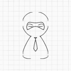
NinjaDesk Logo: A Powerful Symbol of Productivity and Efficiency

| Category | Details |
|---|---|
| Logo Analysis | – Represents professionalism (tie). – Ninja symbolizes agility, stealth, and efficiency. – Monochrome color scheme conveys simplicity and elegance. |
| Design Elements | – Minimalist design. – Clean, rounded font for “NinjaDesk.” – Icon blends ninja mask with a tie shape. |
| Concepts Reflected | – Business professionalism. – Agile and efficient service. – Strong, recognizable branding. |
| Target Audience | – Corporate professionals. – Small to medium-sized businesses. – Tech-savvy individuals. |
| Questions to Explore | – What service does NinjaDesk offer? – What is the brand’s mission? – How does this logo resonate with clients? – What differentiates NinjaDesk from competitors? |
| Color Psychology | – Black: Power, elegance, sophistication. – White: Simplicity, balance, and clarity. |
| Font Analysis | – Rounded font adds a friendly and approachable vibe. – Combines professionalism and playfulness. |
| Tools Used | – Design Tools: Affinity Designer 2, Adobe Illustrator, CorelDRAW. – Inspiration Sources: Pinterest, Dribbble. |
| Design Principles | – Simplicity. – Scalability. – Versatility (usable across digital and print media). |
| Applications | – Website branding. – Business cards. – Social media profiles. – Merchandise like stationery or apparel. |
| Refinement Questions | – Should the logo incorporate subtle color variations? – Are additional logo variations needed for different use cases? – Does the font align with the brand tone? |
| Suggestions for Future | – Create brand guidelines for logo usage. – Experiment with adding subtle colors like blue or grey for variations. – Test logo visibility in small sizes and on different backgrounds. |

Reviews
There are no reviews yet.