

Description
Fitness negative space logo design that turns a simple monogram into a high-impact brand asset clean, modern, and instantly recognizable. This L47-inspired mark is built with sharp geometric angles and a forward-leaning structure to communicate strength, motion, and precision the exact traits most fitness brands want customers to feel at first glance.
Unlike cluttered gym logos that rely on obvious icons, this concept uses negative space to create visual intelligence and memorability. The result is a minimalist logo mark that looks premium on digital screens and stays crisp in print ideal for brands that need a versatile identity across multiple touchpoints.
Best for:
-
Gyms, fitness companies, and personal trainers
-
CrossFit-style training studios and athletic programs
-
Sportswear / activewear labels and apparel branding
-
Fitness apps, social media avatars, and icon systems
Key features & benefits:
-
Minimal monogram logo that feels modern and confident
-
Designed for scalability (from favicon to signage)
-
Works cleanly in one-color applications (print, embroidery, stamps)
-
Strong contrast and simple silhouette for fast brand recognition
-
Built for a cohesive brand identity system across merch and marketing
Recommended uses:
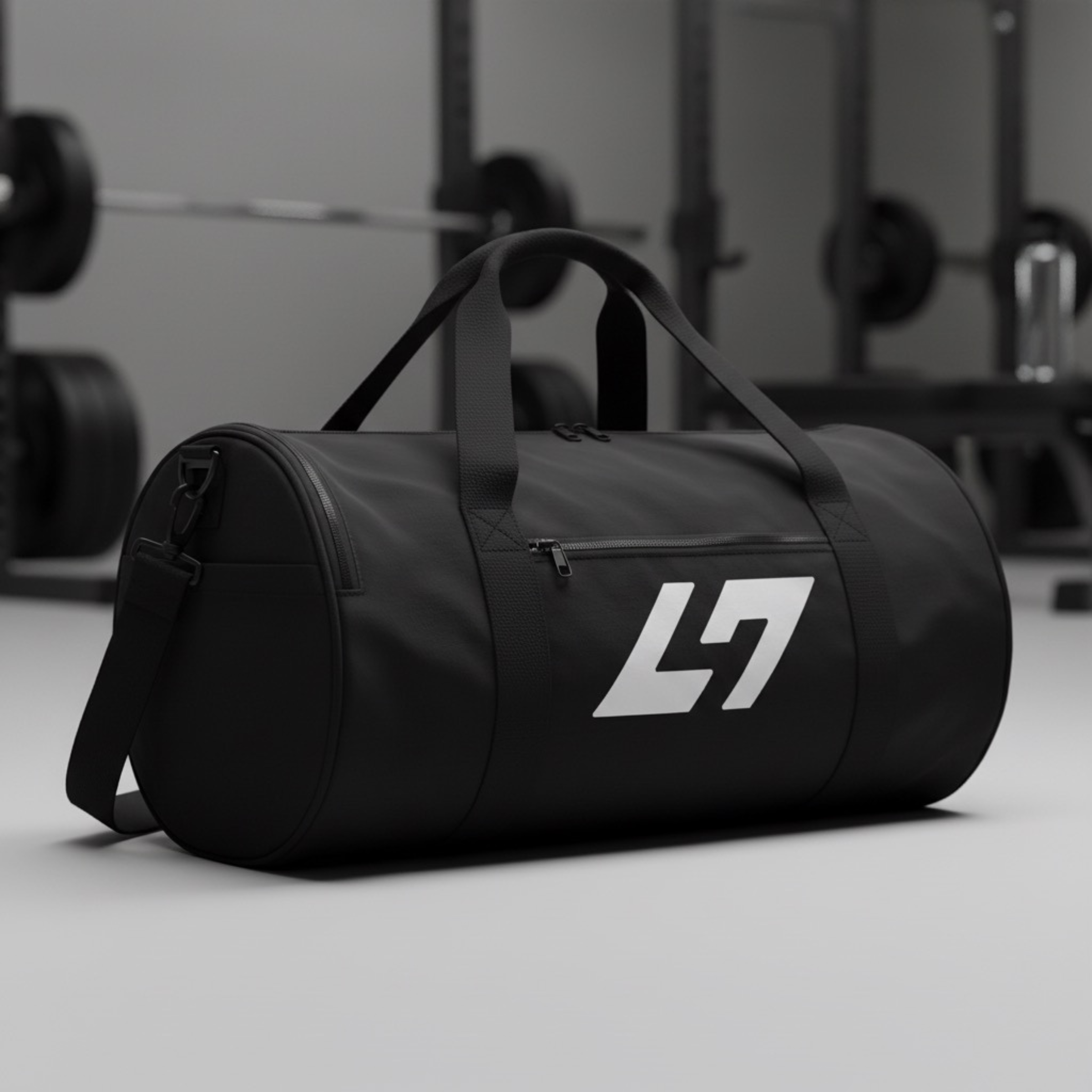
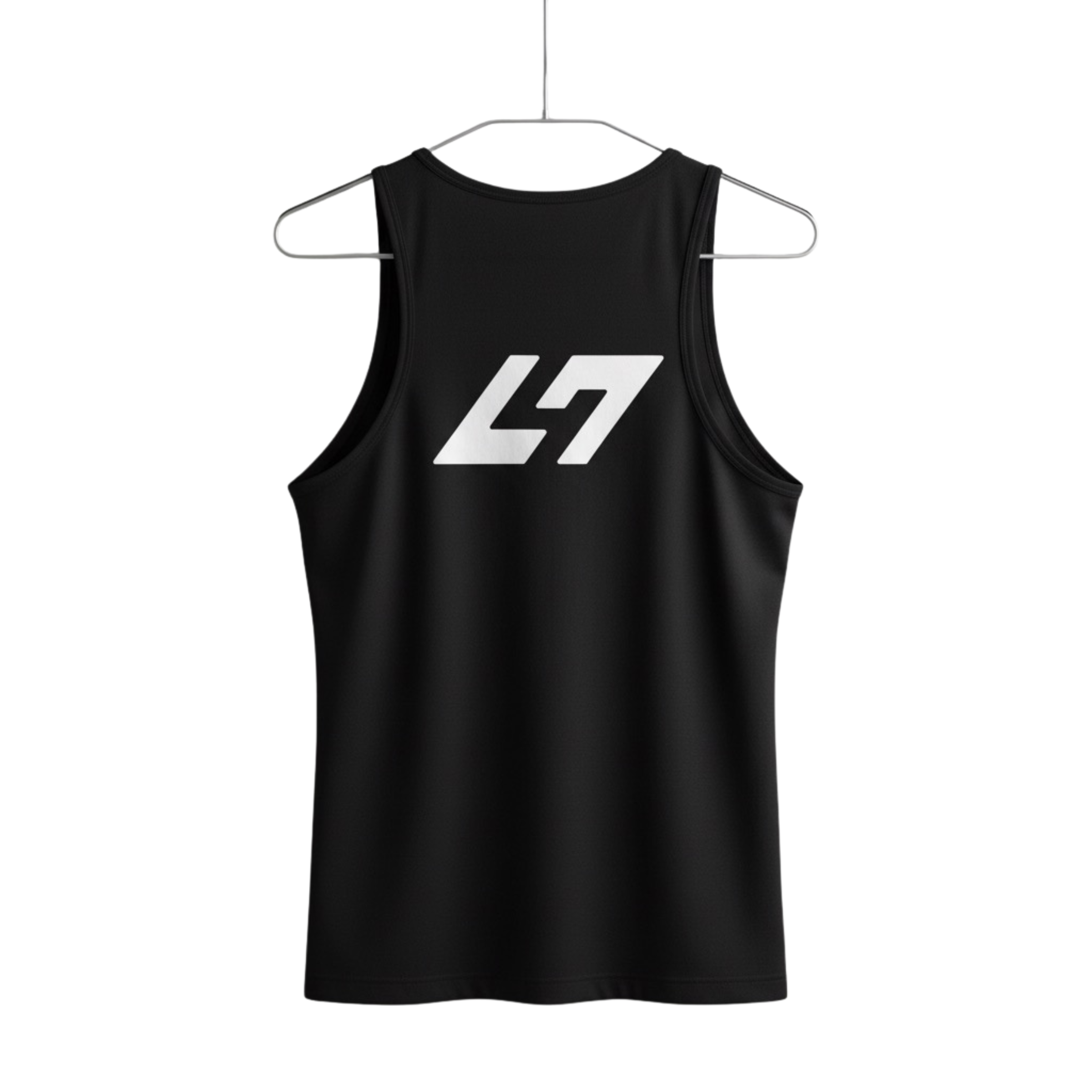
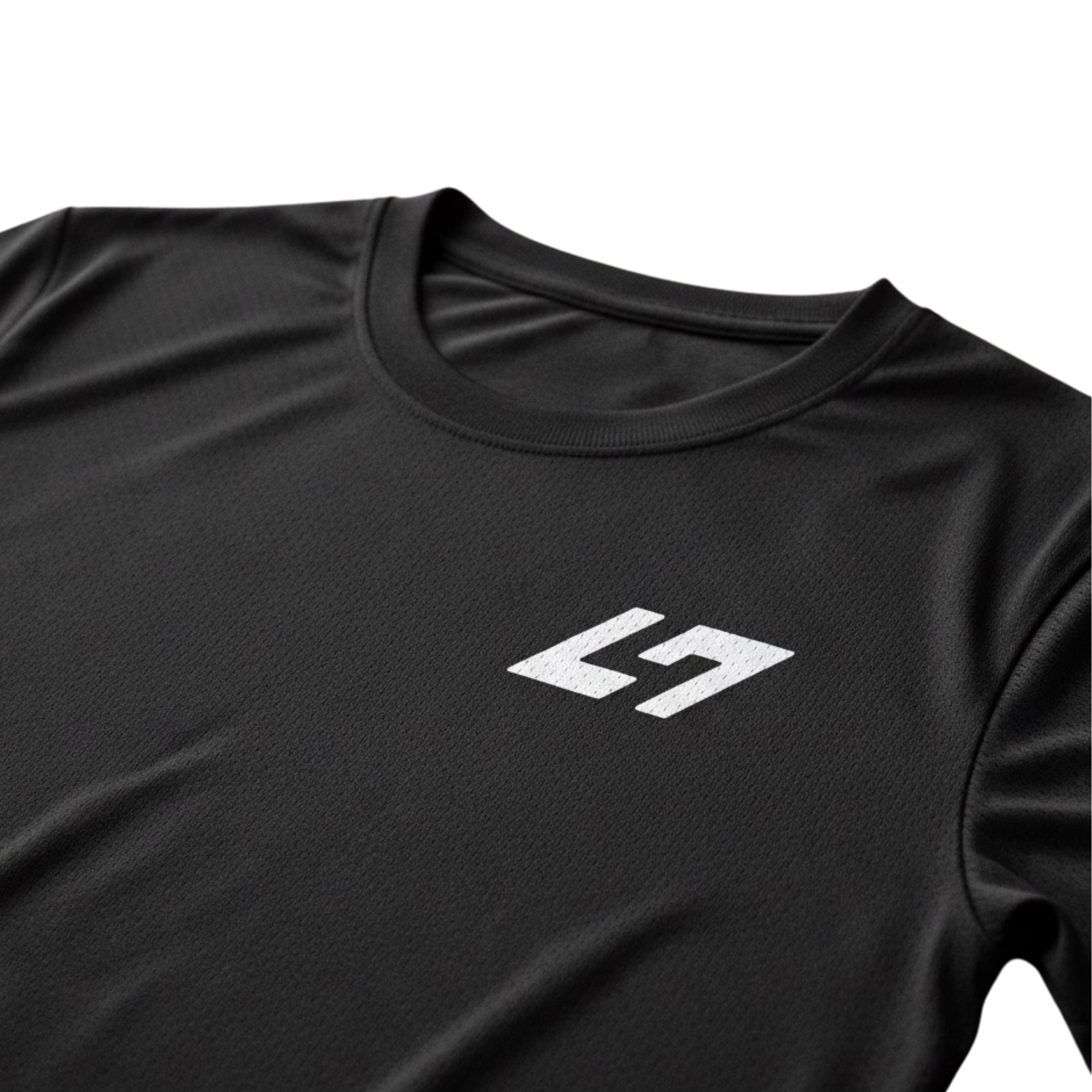
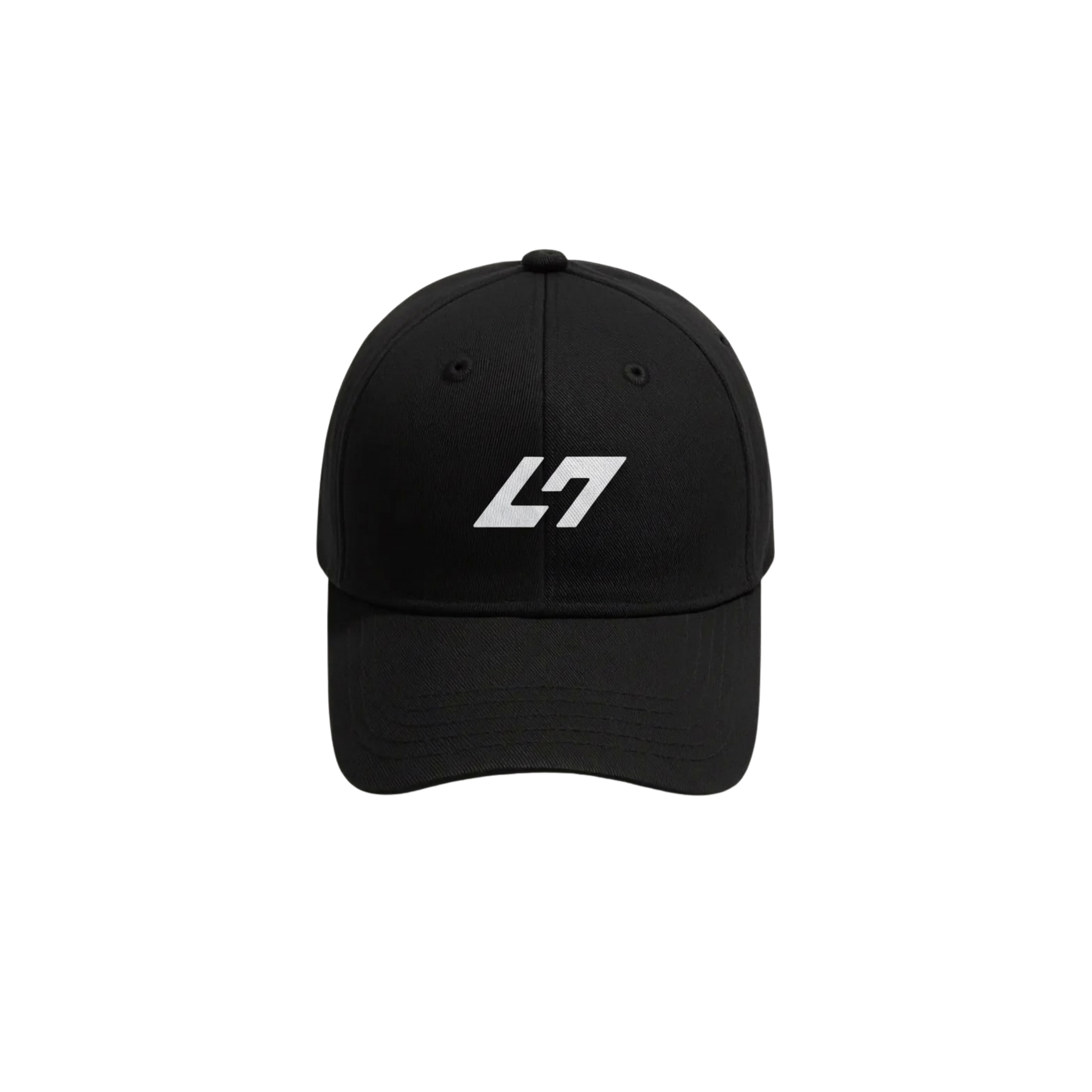
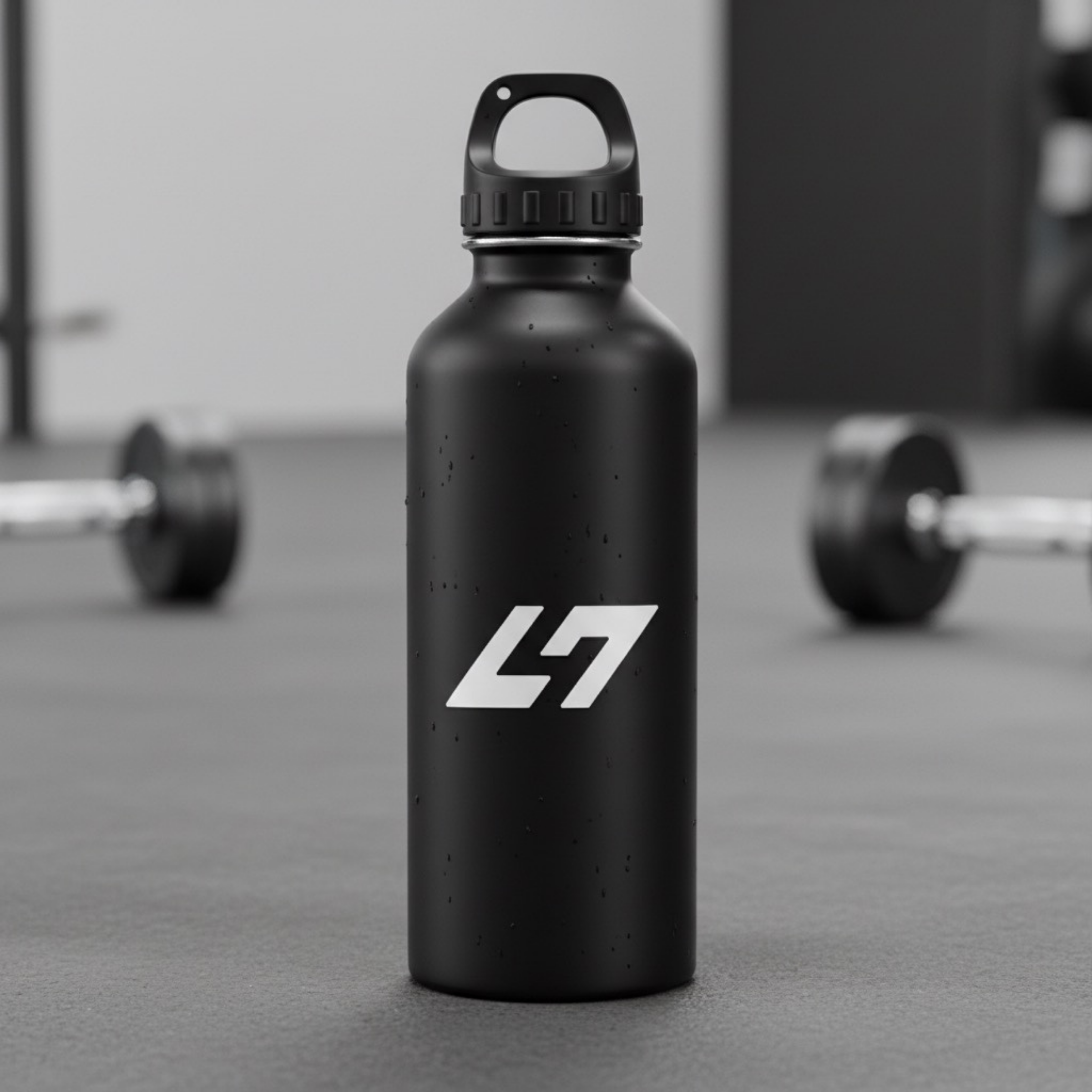
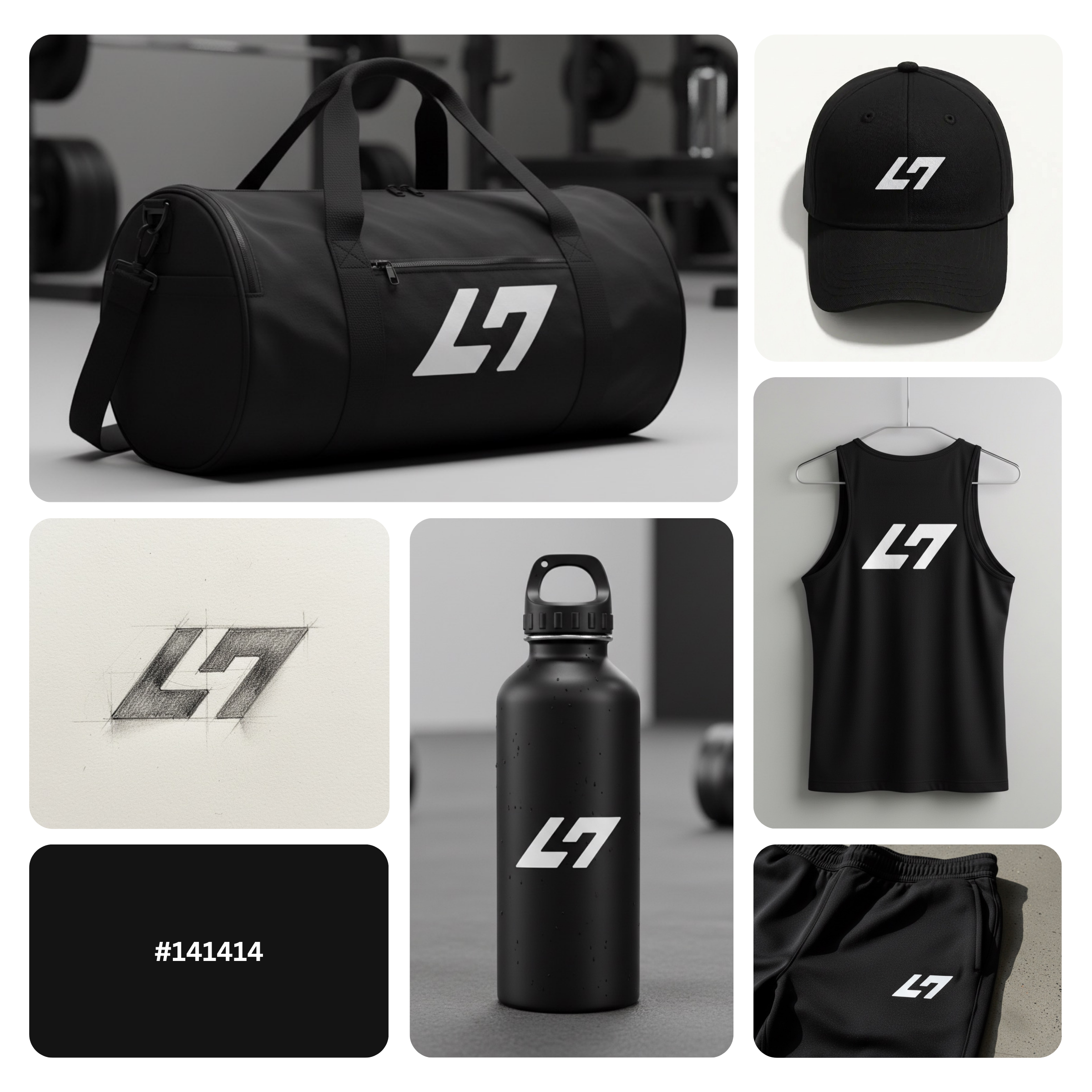
Business cards, gym signage, wall graphics, clothing tags, shaker bottles, packaging, uniforms, social media, and app icons.
If you want a sharp, performance-driven look that signals professionalism (without visual noise), this logo style is made to help your brand stand out and stay consistent everywhere it appears.
|
Aspect |
Details |
|---|---|
|
Title |
Fitness Negative Space Logo Design – L47-Style Monogram Mark |
|
Color Psychology |
Cod Gray (#141414) signals power, discipline, and premium restraint perfect for performance-led fitness brands. The near-black tone increases contrast on light backgrounds, improves legibility at small sizes, and communicates “serious training” energy without looking loud or gimmicky. |
|
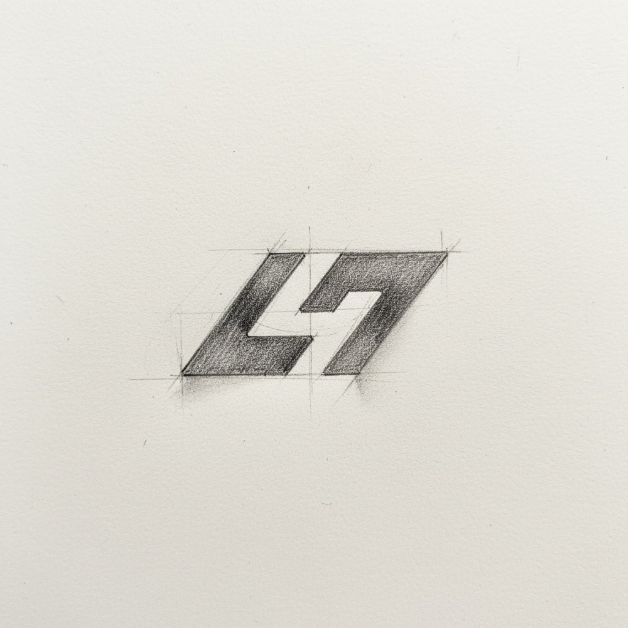
Shapes Used |
A geometric lettermark built from slanted, angular segments with clean cut-ins that create a negative space channel. The forward-leaning silhouette suggests momentum, while the simplified block forms keep the monogram crisp as a scalable brand icon. |
|
Symbolism |
The mark reads as an L47-inspired monogram with a hidden internal path visually representing progression, focus, and structured improvement. The negative space feels like a “lane” or “track,” reinforcing athletic movement and goal-driven training. |
|
Typography |
No traditional typography is required—the logo functions as an icon-first monogram. If paired with type, it suits a modern sans-serif wordmark (clean, condensed, and confident) to keep the identity sharp, contemporary, and performance-oriented. |
|
Design Approach |
A minimalist fitness logo approach with strong commercial intent: fast recognition, high versatility, and a premium, modern feel. The design avoids clichés (dumbbells/flames) and instead uses brand-first geometry that looks professional across digital and print. |
|
Best For |
Gym branding, personal trainers, strength & conditioning studios, HIIT programs, athletic clubs, sports coaching, activewear labels, fitness apps, and monogram gym logo systems that need a modern mark for social profiles and merchandise. |
|
Target Audience |
Fitness founders, gym owners, trainers, sports brand managers, and startup teams who want a modern athletic emblem that feels premium and credible—especially decision-makers focused on brand consistency, merch sales, and high-trust visual identity. |
|
Applications |
Social media avatars, app icons, website headers, signage, wall graphics, gym equipment decals, apparel prints, embroidery, hang tags, packaging labels, sponsorship graphics, watermarks, and one-color production (vinyl, foil, screen print). |
|
Why This Design? |
This fitness negative space logo design wins because it’s distinctive, scalable, and easy to remember. The monogram structure builds brand recall, the Cod Gray tone elevates perceived quality, and the clean geometry ensures it works in real-world production giving the brand a long-term identity asset, not a trend-based graphic. |
Color Psychological Traits Table
|
Color Name |
Psychological Traits |
Emotional Meaning |
Branding Impact |
Best For |
|---|---|---|---|---|
|
Cod Gray (#141414) |
Authority, discipline, precision, restraint, modern minimalism, high control |
Calm confidence, seriousness, focus, stability, “no-nonsense” energy |
Elevates brand perception instantly reads premium, sharp, and professional. Creates strong contrast for logo legibility, supports clean visual identity systems, and signals quality in brand color theory and marketing color theory. |
Luxury and premium branding, fitness & performance brands, tech and digital products, high-end packaging, fashion labels, interior accents, modern UI/UX design, monochrome logo systems |
Color Description
Cod Gray (#141414) is a near-black charcoal tone that delivers a strong color psychology meaning without the harshness of pure black. In branding, it communicates authority, structure, and premium intent—making it a reliable anchor color for logos that must feel confident, modern, and timeless. This is the kind of shade that quietly says “high standards,” which is why it’s widely used in luxury color palette systems, performance-focused brands, and minimalist design trends.
From a color symbolism standpoint, Cod Gray creates immediate visual clarity. It reinforces trust through consistency and control—two signals that influence consumer behavior when people evaluate professionalism online. In digital design, it reduces visual noise and supports a clean hierarchy, helping interfaces, icons, and typography feel more intentional. In print and packaging, this tone adds sophistication, especially when paired with matte finishes, foil accents, or textured substrates—enhancing the emotional impact of premium product presentation.
In logo design, Cod Gray performs exceptionally well because it protects readability at small sizes and stays sharp across backgrounds. It’s a strategic choice for modern brand systems that need to work everywhere—social media avatars, app icons, signage, apparel, and packaging—while keeping color messaging consistent. If your goal is a sleek, high-trust identity that feels current but won’t age quickly, Cod Gray is a top-tier brand color with strong hex color psychology value.
Color Characteristics
-
Tone: Deep charcoal / near-black with a refined, modern finish
-
Depth: High depth (reads premium and grounded; ideal for “hero” brand color roles)
-
Visual Temperature: Neutral-to-cool, which supports clean, modern brand aesthetics
-
Saturation: Extremely low (almost neutral), making it versatile and timeless
-
Contrast Behavior: Excellent contrast on light backgrounds; ideal for icons, wordmarks, and UI elements
-
Associations: Precision, strength, minimalism, professionalism, elevated craftsmanship
-
Branding Impressions: “Premium,” “serious,” “high-performance,” “trusted,” “well-engineered”
-
Cultural Significance: Often tied to luxury, authority, formal elegance, and modern design systems globally
-
Best Pairings: Crisp whites, warm neutrals, metallic accents (gold/copper), cool grays, and bold highlight colors for controlled emphasis
Full Color Conversion Table
|
Value |
Format |
Output |
|---|---|---|
|
CSS HEX |
HEX |
#141414 |
|
RGB (Decimal) |
RGB |
rgb(20, 20, 20) |
|
RGB (Percentage) |
RGB% |
(7.84%, 7.84%, 7.84%) |
|
CMYK |
CMYK |
(0%, 0%, 0%, 92.16%) |
|
HSL |
HSL |
hsl(0°, 0%, 7.84%) |
|
HSV / HSB |
HSV |
hsv(0°, 0%, 7.84%) |
|
Web Safe Color |
HEX |
#000000 |
|
CIE-LAB |
Lab |
L* 6.32, a* 0.00, b* 0.00 |
|
CIE-XYZ |
XYZ (D65) |
X 0.6649, Y 0.6995, Z 0.7617 |
|
xyY |
xyY |
x 0.3127, y 0.3290, Y 0.6995 |
|
CIE-LCH |
LCH |
L* 6.32, C* 0.00, h° 158.20 |
|
CIE-LUV |
Luv |
L* 6.32, u* 0.00, v* 0.00 |
|
Hunter-Lab |
Hunter Lab |
L 8.36, a 0.00, b 0.00 |
|
Binary RGB |
8-bit binary |
00010100 00010100 00010100 |
Technical Color Explanation
In an RGB color space (light-based), Cod Gray (#141414) is made from 20/255 red, 20/255 green, and 20/255 blue, which equals 7.84% red, 7.84% green, and 7.84% blue. Because all three channels are equal, it behaves as a neutral charcoal/near-black—perfect for consistent brand perception and clean contrast in modern visual identity systems.
In CMYK printing, the color converts primarily into black ink: 0% cyan, 0% magenta, 0% yellow, and ~92.16% black (K). This means it typically prints as a rich dark gray/near-black, making it highly reliable for professional logo applications, packaging, and monochrome brand systems.
1) What is a Fitness Negative Space Logo and why does it work so well?
A Fitness Negative Space Logo uses intentional empty space to form a second meaning often a hidden letter, symbol, or motion cue inside a clean shape. This approach triggers curiosity and boosts memorability, which improves brand recall in crowded gym and training markets. From a design-theory standpoint, negative space strengthens silhouette recognition, so the mark stays readable on app icons, social avatars, and signage. Psychologically, it signals intelligence, discipline, and premium positioning ideal for modern fitness brands that want credibility without visual clutter.
2) How does a Fitness Negative Space Logo build a premium brand perception?
A Fitness Negative Space Logo feels premium because it relies on restraint, balance, and visual logic rather than obvious fitness clichés (weights, flames, flexing arms). Minimalism increases perceived quality by making the brand look engineered, intentional, and confident. In brand psychology, this creates trust and authority key emotional triggers for clients choosing a gym, coach, or wellness program. It also supports a modern athletic brand identity that translates smoothly across apparel, packaging, and digital platforms.
3) What industries benefit most from a Fitness Negative Space Logo?
A Fitness Negative Space Logo performs best for gyms, personal trainers, HIIT studios, strength & conditioning programs, sports clubs, fitness apps, and activewear brands. It’s especially effective for premium offerings boutique studios, high-ticket coaching, and performance-first communities because it communicates focus and professionalism. If you’re building a modern fitness brand identity that needs consistency across merch and marketing, negative space gives you a flexible icon system. The result is a logo that looks credible on everything from wall graphics to shaker bottles.
4) What makes a Fitness Negative Space Logo scalable for digital and print?
A Fitness Negative Space Logo is inherently scalable because it prioritizes simple geometry, clean contours, and high contrast three essentials for legibility at any size. A well-built vector mark keeps its clarity on favicons and mobile headers while still holding impact on signage and large-format prints. From a production standpoint, minimal shapes also translate better to embroidery, screen printing, vinyl cuts, and one-color stamping. This makes the logo practical, cost-efficient, and consistent across real-world brand applications.
5) How do you choose the best style for a Fitness Negative Space Logo?
The best Fitness Negative Space Logo style depends on brand personality: aggressive performance, premium minimal, or community-driven wellness. Geometric lettermarks work well for modern gyms and training systems, while softer curves can suit wellness and recovery brands that prioritize calm and trust. A branding-agency approach starts with audience positioning, then selects shape language that matches emotional intent power, precision, or approachability. The negative space should feel intentional, not accidental, so the hidden form reads instantly and supports the brand story.
6) Can a Fitness Negative Space Logo work for female-focused or wellness branding?
Yes, a Fitness Negative Space Logo can be adapted into a modern feminine brand identity by refining proportions, adding elegant simplicity, and using softer geometry while keeping the mark strong. For female-focused fitness, beauty and wellness brands, or minimalist feminine emblem directions, negative space helps create a clean, confident symbol that feels premium and modern. This can align with trends like line-art styling or subtle silhouette cues without becoming overly decorative. The emotional trigger shifts from intensity to empowerment: calm strength, self-control, and high trust.
7) What files and variations should you deliver for a Fitness Negative Space Logo?
A professional Fitness Negative Space Logo delivery should include vector formats (AI, SVG, EPS, PDF) plus web-ready exports (PNG with transparency, JPG, and WEBP). You’ll also want key variations: full color, one-color black, one-color white, and icon-only versions for social media and app use. A short usage guide should define clear space, minimum size, and background rules so the logo stays consistent across teams and vendors. This protects brand equity and ensures the identity remains sharp everywhere it appears.
Reviews
There are no reviews yet.