

Description
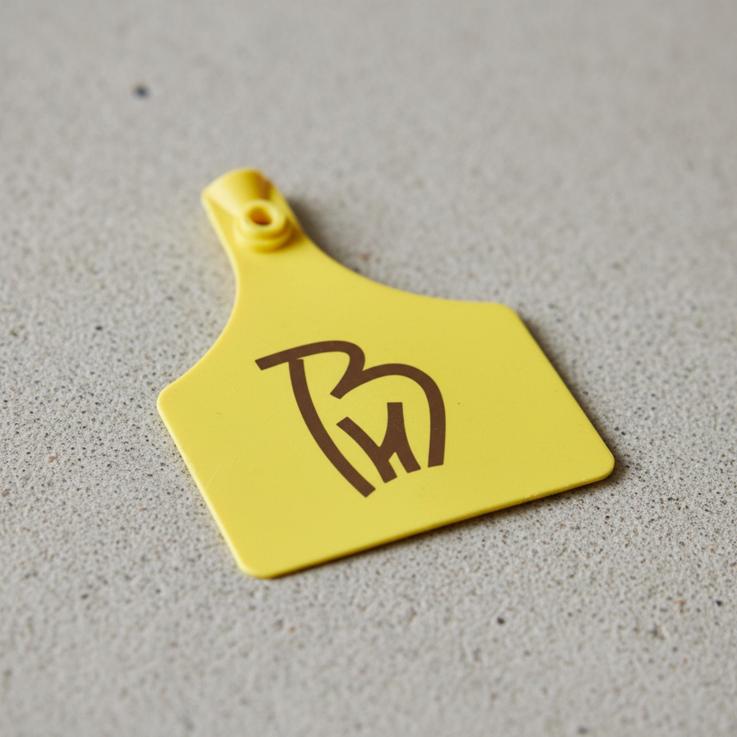
BH Cattle Farm Logo Design is a clean, modern farm brand mark built around a smart B+H monogram that forms a recognizable goat silhouette perfect for cattle farms, livestock brands, dairy businesses, and ranch-style labels that need a logo that looks professional everywhere.
This logo concept is designed to communicate trust, quality, and heritage while staying minimalist and scalable. The bold Cork tone (#442C1D) adds an earthy, premium feel ideal for brands that want to look authentic, grounded, and high-value across both digital and print touch points.
What you get (brand-ready deliverables):
-
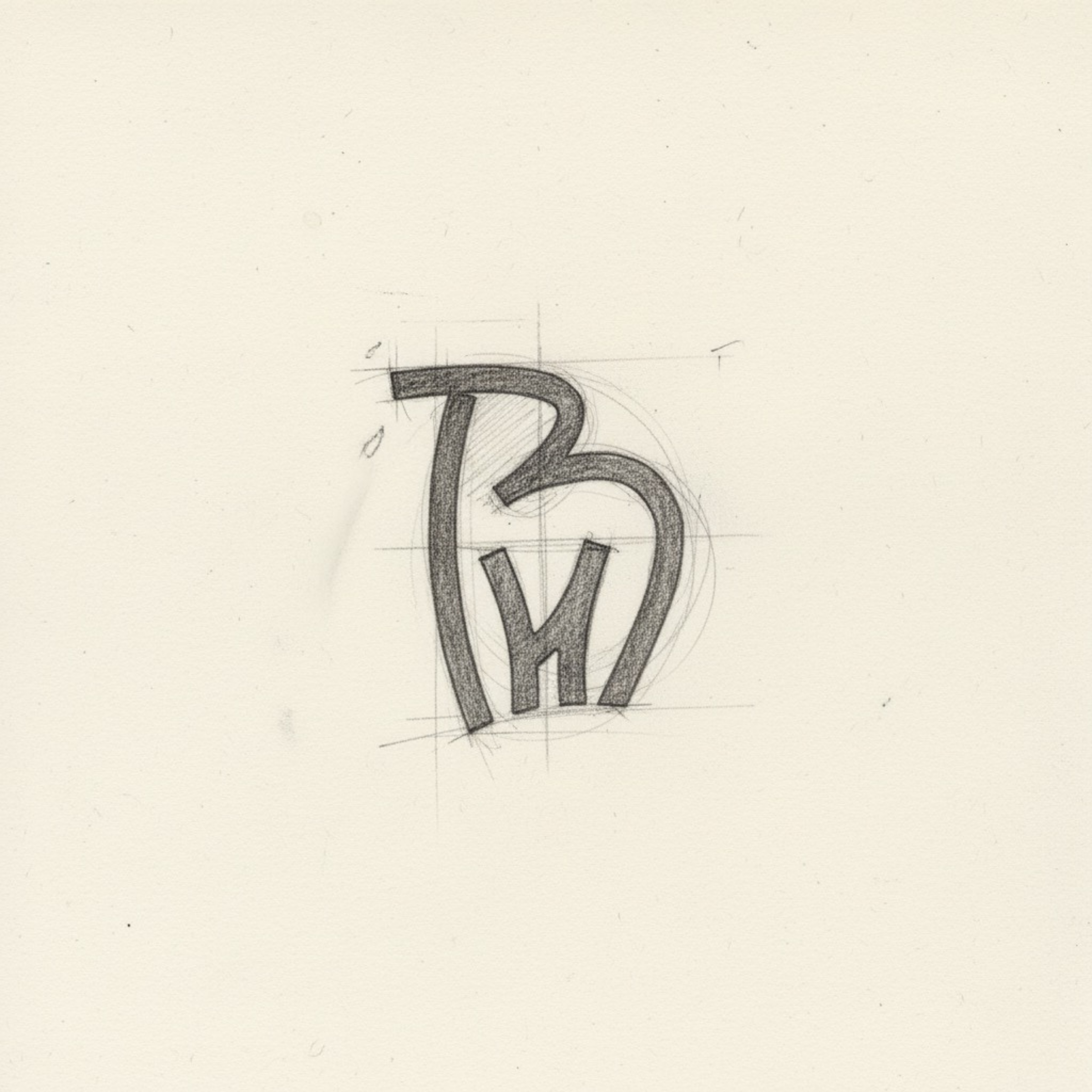
Custom vector logo mark with refined geometry and balanced negative space for sharp readability
-
Versatile variations: full color, 1-color, black/white, icon-only (social avatar ready)
-
Files for every use: AI, SVG, EPS, PDF + PNG/JPG in multiple sizes for web and print
-
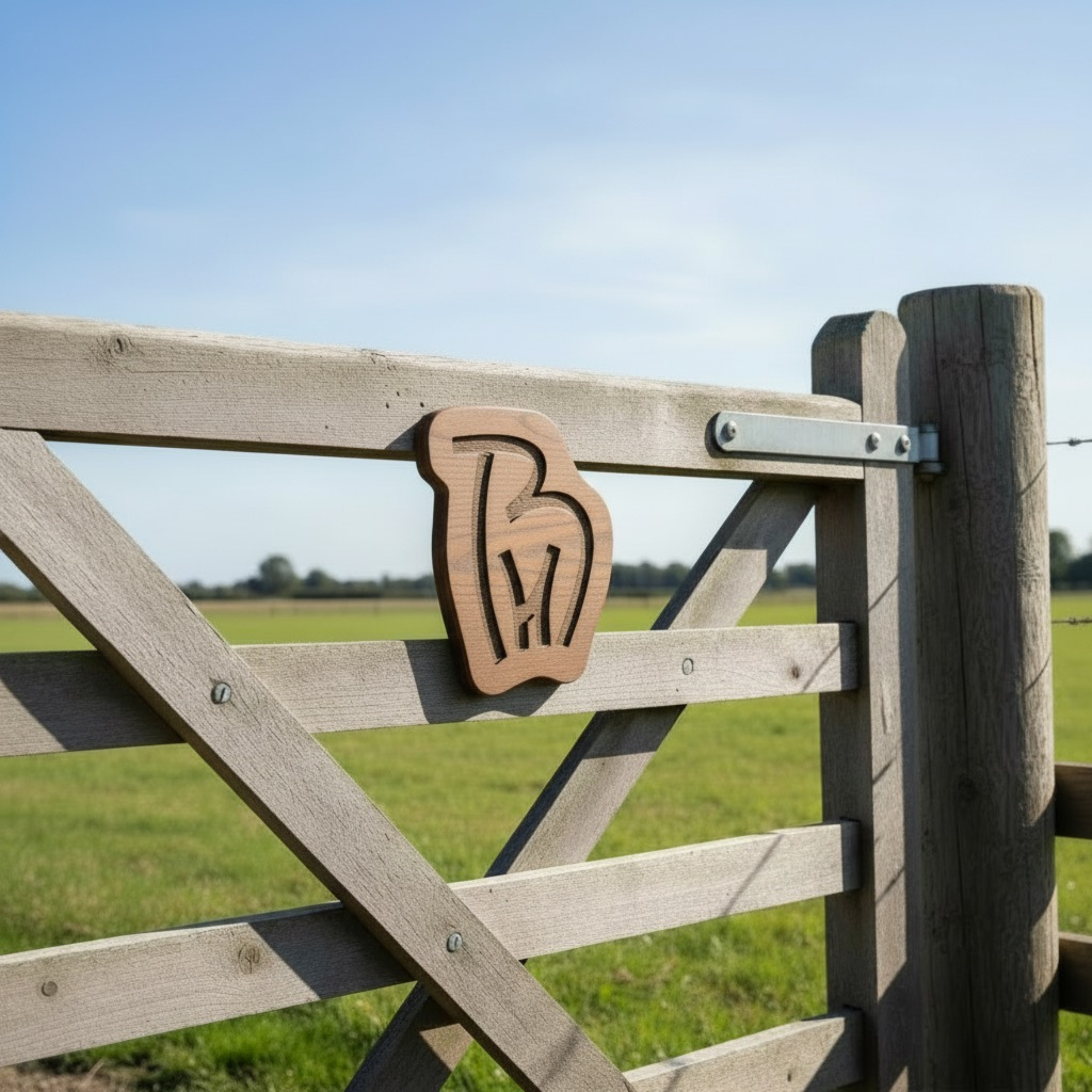
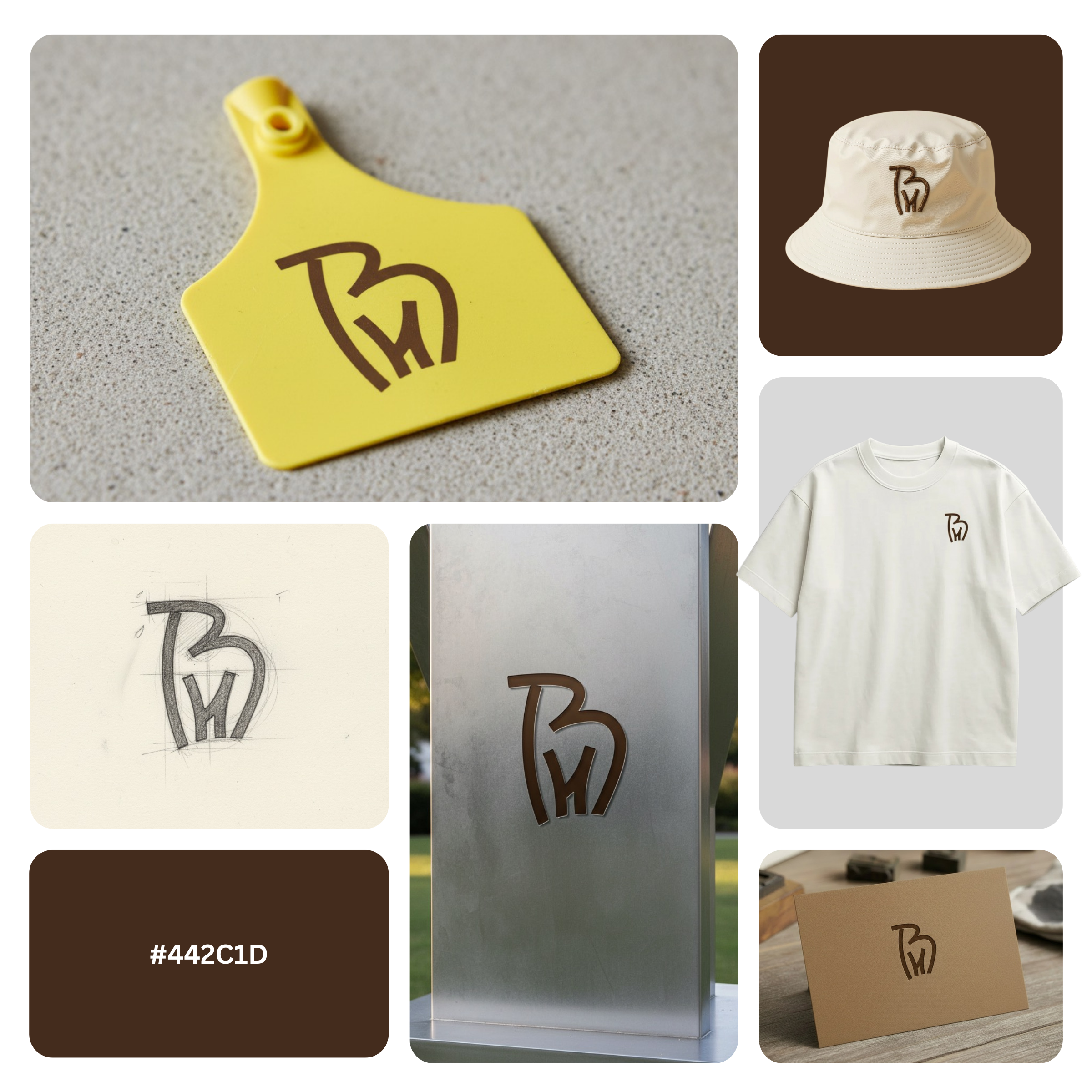
Designed for real-world applications: farm packaging, product labels, cattle feed bags, storefront signage, uniforms, vehicle decals, and website headers
If you want a logo that feels modern, premium, and instantly recognizable, this BH monogram livestock identity delivers a confident first impression and stays consistent as your farm brand grows.
|
Aspect |
Details |
|---|---|
|
Title |
BH Cattle Farm Logo – “Cork Heritage” BH Goat Monogram |
|
Color Psychology |
The Cork brown (#442C1D) delivers a premium “farm-to-market” feel signaling heritage, trust, warmth, and grounded quality. This earthy tone boosts brand credibility for agricultural businesses because it reads natural and honest (not artificial), while still feeling upscale for packaged goods and modern brand presentation. |
|
Shapes Used |
A simplified goat-outline emblem built with smooth, confident strokes, paired with an integrated BH monogram. The design relies on clean negative space and bold line weight to stay legible in small sizes an approach often used in a modern cleaning emblem or professional cleaning icon, but adapted here for livestock branding. |
|
Symbolism |
The goat silhouette communicates farm authenticity, resilience, and rural strength, while the BH letter structure adds ownership, professionalism, and recognition. Together, it creates a “signature mark” that feels reliable similar to how a strong cleaning brand identity signals trust and consistency, but tailored to cattle and ranch heritage. |
|
Typography |
Custom letterform construction (monogram-based, no full wordmark required). The BH forms are bold, slightly rounded, and intentional giving the impression of a monogram cleaning logo (clean, structured, service-ready) while still matching the agricultural personality of a farm brand. |
|
Design Approach |
A minimal, icon-first system designed for instant recall: one shape, one message, one strong silhouette. This strategy supports faster brand recognition across merch and packaging much like a sparkle cleaning logo aims for quick identification, but here the emphasis is on earthy premium trust rather than decorative effects. |
|
Best For |
Cattle farms, goat & livestock farms, ranch brands, dairy producers, meat and milk product labels, farm-to-table startups, livestock feed brands, and rural supply companies needing a BH Cattle Farm Logo Design that scales across packaging and signage (e.g., “farm logo for product labels,” “ranch monogram logo for uniforms,” “livestock brand identity for trucks”). |
|
Target Audience |
Farm owners, ranch operators, dairy producers, livestock product sellers, agri-entrepreneurs, and buyers/partners (distributors, retailers, wholesalers) who judge trust quickly through branding similar decision behavior to service markets like hygiene branding and any cleaning business logo concept where professionalism drives conversion. |
|
Applications |
Packaging labels, stamp seals, livestock tags, farm signage, gate boards, hats/uniform embroidery, vehicle decals, website headers, social media avatars, invoices, business cards, product stickers, and marketplace thumbnails. Designed to work cleanly in one-color printing and crisp vector output. |
|
Why This Design? |
This mark stands out because it combines brand initials + animal silhouette into one memorable icon making it both personal and instantly category-relevant. The Cork palette adds premium authenticity, while the minimal construction keeps it production-friendly for print, embroidery, and digital delivering the same “trust-at-a-glance” impact that top-tier professional cleaning icon systems achieve, but for farm branding. |
Color Psychological Traits Table
| Color Name | Psychological Traits | Emotional Meaning | Branding Impact | Best For |
|---|---|---|---|---|
| Cork Brown (#442C1D) | Grounded, Earthy, Stable, Resilient, Authentic, Durable, Honest, Traditional, Reliable. | Evokes feelings of security, warmth, comfort, and timelessness. It is an anchoring, nurturing color that suggests resilience and heritage. | Projects an image of unwavering quality, artisanal craftsmanship, and natural, sustainable origins. It builds trust through perceived honesty and organic simplicity. | Branding: Heritage brands, artisanal goods, organic/natural products, luxury leather goods, craft coffee/ chocolate, outdoor apparel. Interior: Accent walls, flooring, vintage furniture, cozy libraries, rustic kitchens. Digital: Backgrounds for premium e-commerce (food, furniture, fashion), text overlays on light imagery, iconography for sustainability. |
Color Description
Cork Brown, a deep and muted shade with the hex code #442C1D, is a cornerstone of sophisticated color psychology meaning in the design world. This hue is not merely a dark brown; it is the rich, warm patina of aged wood, the protective seal on a vintage bottle, and the rugged comfort of well-worn leather. Its emotional impact is profound and grounding, directly connecting the viewer to concepts of natural stability, artisanal authenticity, and enduring resilience. In a digital landscape often saturated with artificial brightness, Cork Brown offers a visual respite an implicit promise of substance and tangible quality.
In the realm of brand perception and visual identity, this color is a powerful communicator of heritage and trustworthiness. Its low lightness and desaturated nature suggest a product or service that is not fleeting but built to last. It speaks a language of luxury color palette sophistication, one that is understated and earned rather than ostentatious. When applied to marketing color theory, Cork Brown excels in attracting a discerning audience that values craftsmanship, sustainability, and narrative depth. It tells a story of origin, material honesty, and time-honored methods, directly influencing consumer behavior by elevating perceived value and fostering brand loyalty.
From a functional design perspective, Cork Brown behaves as a formidable anchor. It provides exceptional contrast against creams, light tans, and soft metallics, creating layouts that feel both premium and accessible. In digital design, it can establish a dominant, trustworthy foundation or serve as a potent accent to guide user attention. In physical applications like product packaging, it conveys robustness and eco-consciousness, often subconsciously signaling that the contents are organic, premium, or handcrafted. This mastery of color messaging balancing warmth with seriousness, nature with refinement makes Cork Brown an exceptionally effective tool for brands seeking to project unwavering reliability and authentic character in a competitive market.
Color Characteristics
-
Tone & Depth: A deep, low-value tone with significant blackness, conveying substance, weight, and formality. It possesses a rich, enveloping depth.
-
Visual Temperature: Inherently warm due to its strong red and yellow undertones, but tempered by its darkness, resulting in a cozy, subdued warmth rather than an energetic one.
-
Saturation: Desaturated (low chroma), giving it a muted, natural, and organic feel. It avoids appearing garish or artificial, reinforcing its earthy authenticity.
-
Primary Associations: Aged leather, fertile soil, dark roasted coffee, walnut wood, cork bark, vintage paper, artisanal chocolate, and wrought iron.
-
Branding Impressions: Communicates heritage, durability, craftsmanship, sustainability, and premium quality. It is often perceived as honest, reliable, and reassuringly traditional.
-
Cultural Significance: Universally associated with the earth, stability, and resilience. In Western contexts, it strongly connects to rustic craftsmanship, archival materials, and a sense of historical permanence.
Complete Color Conversion Table
| Value | Format | Output |
|---|---|---|
| CSS HEX | #442C1D |
|
| RGB (Decimal) | rgb(68, 44, 29) |
|
| RGB (Percentage) | rgb(27%, 17%, 11%) |
|
| CMYK | (0%, 35%, 57%, 73%) |
|
| HSL | hsl(23°, 40%, 19%) |
|
| HSV / HSB | hsv(23°, 57%, 27%) |
|
| Web Safe Color | #333333 (Not a perfect match) |
|
| CIE-LAB | L*: 18.74 / a*: 8.97 / b*: 13.98 |
|
| CIE-XYZ | X: 3.475 / Y: 2.999 / Z: 1.583 |
|
| xyY | x: 0.433 / y: 0.374 / Y: 2.999 |
|
| CIE-LCH | L*: 18.74 / C*: 16.62 / h°: 57.27 |
|
| CIE-LUV | L*: 18.74 / u*: 14.55 / v*: 10.76 |
|
| Hunter-Lab | L: 18.66 / a: 6.29 / b: 9.21 |
|
| Binary RGB | 01000100 00101100 00011101 |
Technical Color Explanation:
In the RGB (Red, Green, Blue) additive color model used for screens, Cork Brown (#442C1D) is composed of approximately 27% red, 17% green, and 11% blue. Its low values across all three channels confirm its deep, dark nature. When converted to the CMYK (Cyan, Magenta, Yellow, Key/Black) subtractive model used for professional printing, this color comprises 0% Cyan, 35% Magenta, 57% Yellow, and 73% Black. The high black (Key) and yellow values are characteristic of deep, warm browns, indicating it is primarily created by combining a significant amount of black with rich yellow and magenta pigments.
1) What makes a Cattle logo design effective for ranch branding?
A strong Cattle logo design balances instant recognition with practical usability across farm touchpoints. In brand psychology, a clean monogram with livestock-inspired form signals trust, heritage, and operational professionalism qualities buyers associate with quality stock and reliable farms. From a design theory perspective, simplified shapes and controlled negative space improve legibility at small sizes (ear tags, stamps) and at distance (gate signs, trailers). The result is a logo that feels premium, authentic, and built to last.
2) Why do monogram marks work so well in a design?
A monogram-based design compresses the brand name into a memorable symbol that reads fast ideal for agriculture where visibility matters. Monograms create “mental shortcuts” in consumer behavior, helping customers recognize your farm identity on tags, uniforms, and invoices. Because the mark is modular, it scales cleanly from social media icons to large signage without losing clarity. This makes it an excellent choice for ranches, breeders, and agribusiness brands that need consistency across print and digital.
3) How does color psychology impact a logo design?
Color is a trust lever, and a logo design in earthy cork brown cues stability, warmth, and craftsmanship. In branding, brown tones often communicate natural quality, land connection, and tradition perfect for livestock, dairy, and farm-to-market positioning. Pairing it with clean negative space keeps the look modern rather than “rustic-only,” which helps the brand appeal to both local buyers and premium markets. This color choice also performs well in embossing, engraving, and embroidered applications.
4) Where should you use a Farm logo for maximum brand visibility?
To build recognition, a Farm logo should appear wherever customers interact with your farm ear tags, packaging labels, business cards, invoices, social headers, and property signage. Consistent placement strengthens brand recall and increases perceived professionalism, especially for buyers comparing multiple farms. Design-wise, a simplified emblem is ideal for embroidery on hats, chest logos on tees, and vinyl decals on vehicles. The goal is a cohesive visual identity that looks intentional at every touchpoint.
5) Can a Cattle Farm logo be both modern and traditional?
Yes, an effective Cattle Farm logo can blend heritage cues with contemporary simplicity. Using minimal linework, balanced proportions, and smart negative space creates a modern silhouette while still feeling rooted in ranch culture. This hybrid approach supports emotional triggers like trust, pride, and authenticity without looking dated. It’s especially valuable for farms that want to attract premium customers, partnerships, or farm-branded merchandise buyers.
6) What file formats and variations should come with a Farm logo design?
A professional Farm logo design should include vector files (AI, EPS, SVG, PDF) plus high-resolution PNGs for web and print. For real-world usage, you also want a one-color version, a reversed version (for dark backgrounds), and an icon-only mark for small spaces like profile images and ear tag printing. From a brand system standpoint, these variations protect consistency across embroidery, laser engraving, signage fabrication, and digital marketing. This reduces production errors and ensures your logo always looks sharp.
7) How do you ensure a Cattle Farm logo design stays readable on ear tags and signage?
A Cattle Farm logo design stays readable when it’s built with strong silhouette logic, minimal fine details, and clear internal spacing. In design theory, reducing visual noise increases recognition speed critical for outdoor environments and fast-moving farm operations. Testing the logo at tiny sizes (ear tags, stamps) and large formats (gate signs, billboards) ensures it holds up everywhere. That reliability builds confidence, signaling a farm brand that is organized, credible, and quality-driven.
Reviews
There are no reviews yet.