
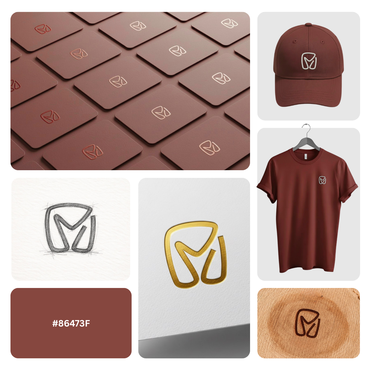
Description
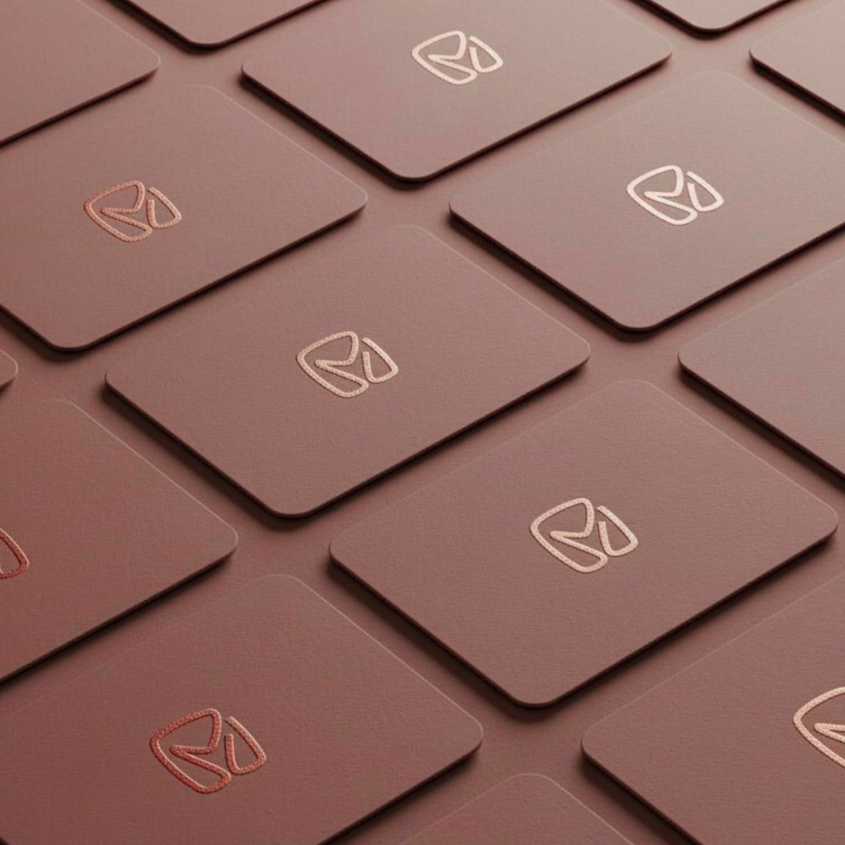
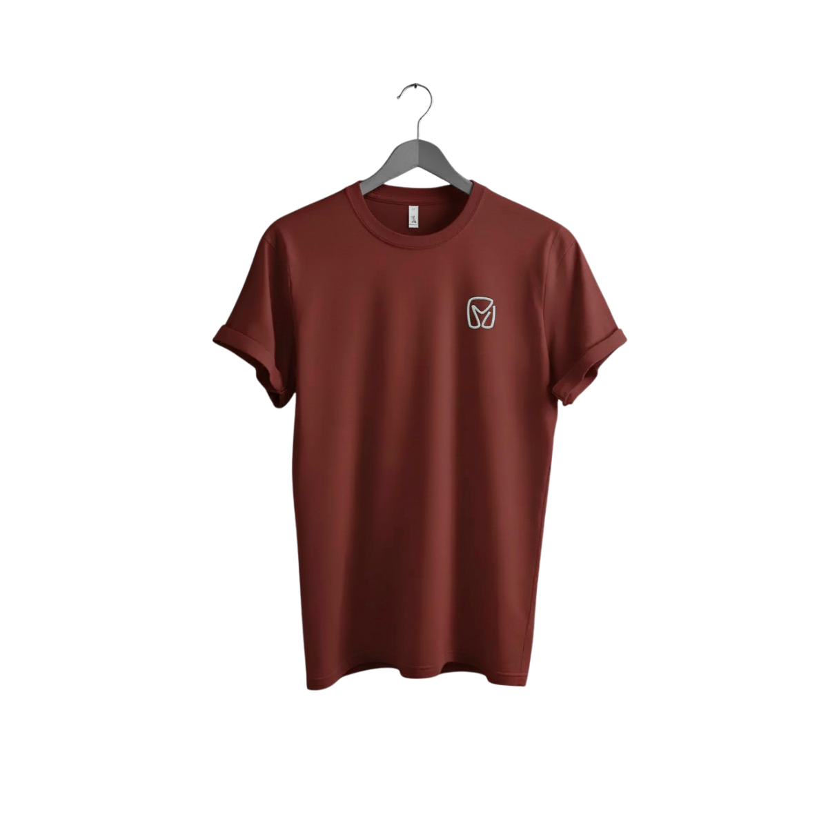
M lettermark cattle logo Design crafted as a premium, minimal monogram that merges a bold “M” with a subtle goat/sheep-inspired silhouette for instant farm recognition.
Built with clean line-art geometry and strong negative space, this logo stays sharp at small sizes and looks confident on signage, packaging, and digital platforms.
Ideal for cattle farms, ranch brands, goat and sheep farms, dairy labels, feed suppliers, farmers markets, and agriculture startups, the mark communicates trust, heritage, and modern professionalism without feeling dated.
The warm, earthy tone supports a natural, authentic story while the simplified form keeps the identity scalable and memorable.
What you get / key benefits:
-
Distinct M monogram logo with livestock symbolism for fast brand recall
-
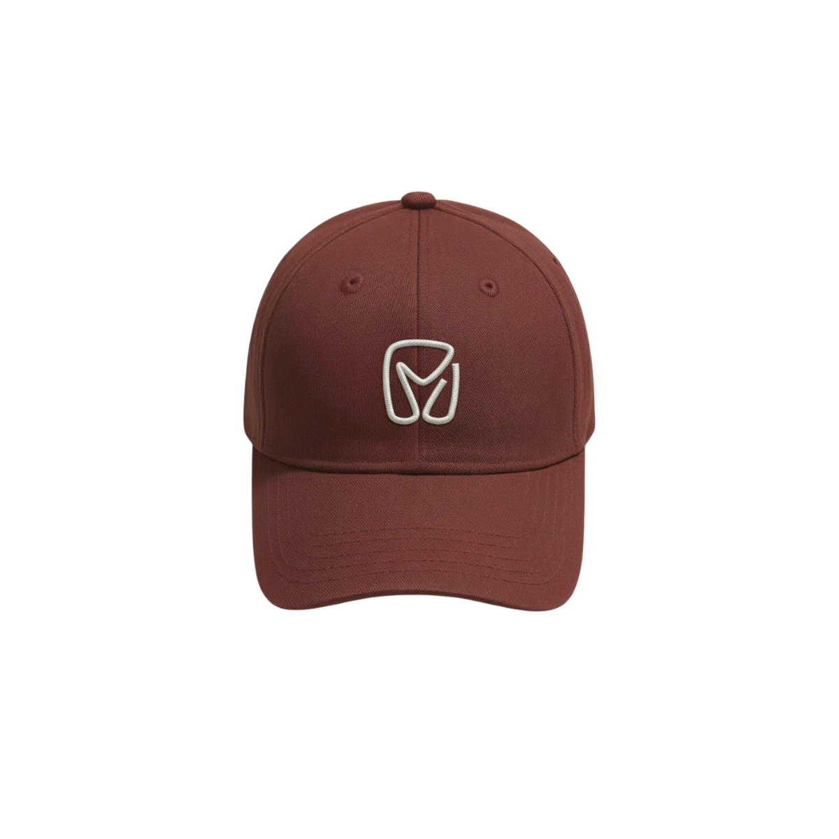
Versatile for packaging labels, uniforms, hats, embroidery, stamps, vehicle decals, social media icons, and website headers
-
Clean, modern style suited for both rustic and premium farm positioning
-
Works as icon-only or paired with a wordmark for a complete brand system
If you want a livestock brand identity that feels trusted, premium, and instantly recognizable, this lettermark is designed to carry your farm name with confidence.
|
Aspect |
Details |
|---|---|
|
Title |
M lettermark cattle logo design in an Ironstone monogram style a modern livestock brand mark that blends premium ranch identity with clean, scalable minimalism. |
|
Color Psychology |
Ironstone (#84453D) is an earthy, clay-brown tone that signals grounded trust, heritage, and craftsmanship. In brand psychology, this warm rugged palette evokes natural materials (leather, soil, barn wood) and creates an “authentic farm” perception ideal for ranching, dairy, and sustainable agriculture brands that want to feel established, honest, and premium without looking corporate. |
|
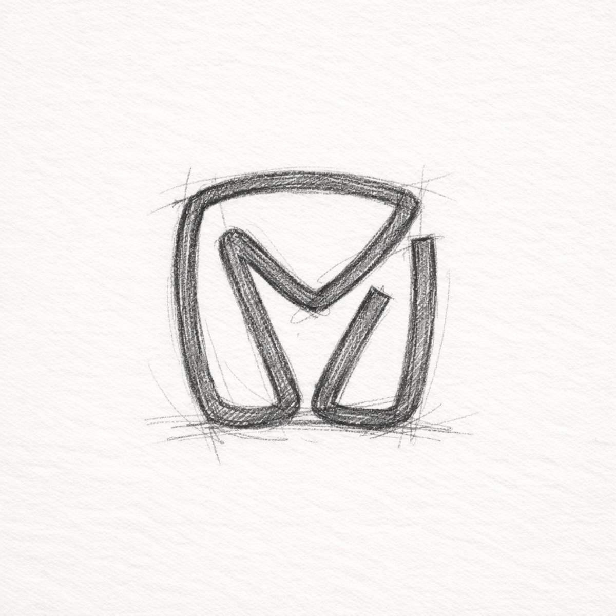
Shapes Used |
A rounded-rectangle monogram frame forms a sturdy badge silhouette, while smooth line-art strokescarve an abstract “M” with intentional negative space. The inner curves read as livestock contours(goat/sheep-inspired) using simplified geometry, thick-to-thin rhythm, and balanced symmetry for high recognition at small sizes. |
|
Symbolism |
The mark communicates strength + care: a confident “M” for the brand name, paired with subtle animal cues to represent livestock quality and farm integrity. The enclosed form feels protective and dependable (good husbandry), while the open negative space adds clarity suggesting transparency, traceability, and modern farm standards. |
|
Typography |
This icon is designed to pair best with a clean modern wordmark (geometric sans or a refined slab serif). The brand impression is premium-rustic: contemporary enough for eCommerce and packaging, yet warm enough for local ranch storytelling and heritage positioning. |
|
Design Approach |
A minimal lettermark emblem built for performance: simplified shapes, strong spacing, and a memorable silhouette that scales from favicon to storefront signage. The approach focuses on brand recall, versatility, and timeless form, making it suitable for long-term livestock brand identity systems. |
|
Best For |
Cattle farms, ranch brands, goat & sheep farms, dairy and cheese labels, livestock trading, animal feed suppliers, farmers markets, sustainable agriculture startups, farm-to-table brands, and western apparel/outdoor lifestyle identity needs (patches, hats, and tags). |
|
Target Audience |
Farm owners, ranch managers, agriculture entrepreneurs, dairy producers, livestock breeders, and co-op decision-makers who need a professional identity that builds trust with buyers, distributors, and local communities plus agencies designing modern agribusiness branding. |
|
Applications |
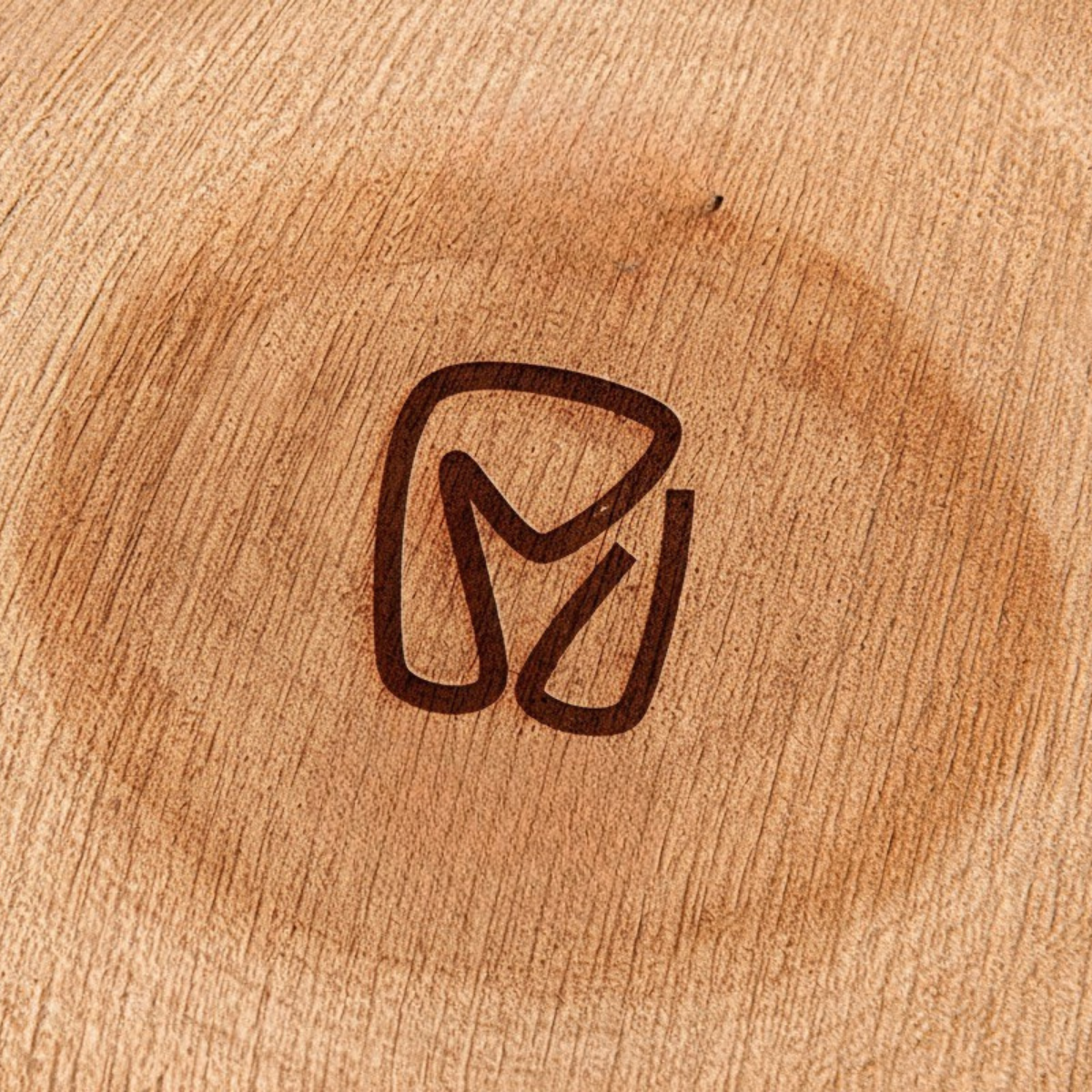
Works across brand identity design touchpoints: packaging labels, stamps, embossing, etched wood signage, metal plates, uniforms, caps, embroidery, vehicle decals, social media avatars, website headers, product stickers, business cards, invoices, and marketplace listings. |
|
Why This Design? |
It differentiates by combining monogram clarity with livestock symbolism a rare mix that feels both modern and authentic. The Ironstone palette adds premium warmth, while the clean line construction ensures scalability, legibility, and consistent reproduction across print and digital helping the brand look trustworthy, established, and memorable. |
1. Color Psychological Traits Table
| Color Name | Psychological Traits | Emotional Meaning | Branding Impact | Best For Industries |
|---|---|---|---|---|
| Ironstone | Grounded, Resilient, Authentic, Robust, Time-Tested | Evokes feelings of stability, warmth, security, and sophisticated earthiness. Suggests durability and honest craftsmanship. | Projects an image of reliable, artisanal quality and heritage. It builds trust through perceived integrity and organic strength. | Branding: Craft breweries, artisanal goods, luxury outerwear, heritage financials. Fashion: Autumn collections, leather goods, durable apparel. Interior: Feature walls, rustic-modern kitchens, premium textiles. Packaging: Organic foods, coffee, wood-finish cosmetics, premium tools. Digital: E-commerce for handmade goods, outdoor brands, historical sites. |
2. Color Description
Ironstone: The Epitome of Earthy Sophistication and Authentic Brand Narratives
In the realm of color psychology meaning, Ironstone stands as a profound symbol of resilient elegance. This muted, red-brown hue draws its emotional impact from the very earth and forged metals it resembles, communicating a narrative of strength, longevity, and organic origin.
It is not a loud or trendy color; instead, it operates on a frequency of quiet confidence, directly influencing brand perception by signaling authenticity and time-honored quality. In an age where consumers crave genuineness, Ironstone serves as a visual anchor of trust and substance.
From a marketing color theory perspective, Ironstone’s behavior in design is both versatile and commanding. Its depth allows it to act as a powerful neutral, providing a warm, enveloping backdrop that enhances richer accents or complements natural materials like wood, linen, and stone.
This color symbolism is crucial in visual identity systems, where it conveys durability without appearing industrial or cold. In logos and product packaging, it subconsciously assures the user of a product’s robustness, artisanal care, and connection to tradition key drivers in consumer behavior for luxury and craft sectors.
Understanding color messaging reveals why Ironstone aligns perfectly with contemporary branding trends centered on sustainability, craftsmanship, and “quiet luxury.”
It rejects artificial gloss in favor of textured reality, making it exceptionally effective for brands that wish to be perceived as pillars of their industry. Its application in digital design fosters a sense of user trust and comfort, reducing digital coldness and encouraging engagement through a perceived human, handcrafted touch.
Ultimately, Ironstone is not merely a color choice; it is a strategic brand statement of unwavering quality and grounded sophistication.
3. Color Characteristics
-
Tone & Depth: A deep, muted tertiary color with a low-key, complex character. It possesses substantial visual weight and gravitas, sitting at the intersection of brown, red, and gray.
-
Visual Temperature: Inherently warm due to its red base, but tempered and sophisticated by its earthy brown and gray undertones. It emits a subdued, radiant heat rather than an intense blaze.
-
Saturation: Desaturated with a moderate to low chroma. This lack of vividness is its defining strength, contributing to its vintage, weathered, and natural aesthetic.
-
Cultural & Associative Significance: Directly associated with forged iron, terracotta pottery, autumn foliage, and rich clay soil. It carries connotations of the artisan’s workshop, historical resilience, and the raw beauty of the natural landscape.
-
Branding Impressions: Communicates premium durability, heritage, artisanal authenticity, and eco-conscious stability. It is the antithesis of mass-produced flash, favoring a narrative of careful creation and enduring value.
4. Complete Color Conversion Table (Professional Format)
| Value | Format | Output |
|---|---|---|
| CSS HEX | #84453D |
|
| RGB (Decimal) | rgb(132, 69, 61) |
|
| RGB (Percentage) | rgb(51.8%, 27.1%, 23.9%) |
|
| CMYK | (0%, 48%, 54%, 48%) |
|
| HSL | hsl(7°, 37%, 38%) |
|
| HSV / HSB | hsv(7°, 54%, 52%) |
|
| Web Safe HEX | #993333 |
|
| CIE-LAB | L*: 35.52, a*: 22.96, b*: 15.86 |
|
| CIE-XYZ | X: 13.15, Y: 9.86, Z: 5.64 |
|
| xyY | x: 0.458, y: 0.343, Y: 9.86 |
|
| CIE-LCH | L*: 35.52, C*: 27.84, h°: 34.62 |
|
| CIE-LUV | L*: 35.52, u*: 41.98, v*: 15.89 |
|
| Hunter-Lab | L: 35.698, a: 15.934, b: 10.887 |
|
| Binary RGB | 10000100 01000101 00111101 |
5. Technical Color Explanation
Ironstone (#84453D) is an additive color model composition primarily derived from red light. In the RGB color space used for screens and digital displays it is created with approximately 52% red, 27% green, and 24% blue. This significant red dominance, tempered by moderate green and blue, gives the color its foundational warm, earthy character.
For physical reproduction in print, the CMYK color model (subtractive) is used. Ironstone’s ink composition is 0% Cyan, 48% Magenta, 54% Yellow, and 48% Key (black). The absence of cyan underscores its warmth, while the high levels of magenta, yellow, and black combine to produce its deep, desaturated, brick-like quality, crucial for accurate branding in packaging and marketing materials.
1) What makes M lettermark cattle logo design effective for ranch branding?
An M lettermark cattle logo design works because it combines instant name recognition with livestock symbolism in a compact, memorable mark. From a brand psychology standpoint, a strong monogram signals ownership, heritage, and trust key emotions buyers look for in farm products. Design-wise, simplified geometry and clean negative space keep the cattle logo readable on everything from ear tags to social icons. It also builds a consistent visual identity that looks premium without feeling corporate.
2) Are cattle logo designs with a monogram better than a full mascot illustration?
Often, yes especially for modern agribusiness branding. A monogram-style cattle logo stays legible at small sizes, scales cleanly for embroidery and stamping, and feels more “brand system” than “one-off illustration.” A mascot can add personality, but it can also lose clarity on packaging, invoices, and vehicle decals. If you want a timeless identity with strong recall, an m cattle logo usually performs better across real-world applications.
3) How do I choose the right style for an m cattle logo —minimal, vintage, or modern?
Start with your positioning: minimal feels clean and premium, vintage feels heritage and traditional, and modern sits in-between with sharp clarity and confidence. For farms selling direct-to-consumer, minimal cattle logo designs often improve perceived quality and trust online. If your brand leans “legacy ranch,” a badge logo or western emblem can support that story. A good designer will align the style with target audience expectations, market category norms, and how the logo will be used.
4) What should M lettermark cattle logo design communicate emotionally?
The best cattle logo marks communicate reliability, care, and strength without looking aggressive. Rounded forms can feel friendly and humane, while a sturdy silhouette adds authority and “built to last” confidence. Subtle animal cues (goat/sheep/cattle traits) trigger authenticity and craftsmanship, which supports higher perceived value on labels and signage. The goal is to make customers feel they’re buying from a credible, well-run operation.
5) Where should I use cattle logo designs to maximize brand recognition?
Use your cattle logo consistently across high-frequency touch-points: packaging labels, farm signage, social media avatars, website header, invoices, and WhatsApp/DM profile images. For physical branding, prioritize hats, uniforms, truck decals, stamps, and stickers—these create repeated exposure and reinforce trust. A strong m cattle logo should also have variations (icon-only, one-color, reversed) so it stays sharp on light/dark backgrounds. Consistency is what turns a logo into a recognizable brand asset.
6) What design elements help a cattle logo stay clean and professional at small sizes?
Focus on a bold silhouette, controlled line weight, and intentional spacing especially around interior cutouts and negative space. Avoid tiny details that disappear on embroidery, rubber stamps, and favicon sizes. In modern cattle logo designs, simplified shapes and balanced proportions improve readability and brand recall. A designer should test the mark at 16px–32px and in single-color to ensure it remains strong everywhere.
7) How do colors affect M lettermark cattle logo design and buyer trust?
Color psychology matters a lot in agriculture and farm-to-market branding. Earth tones like ironstone, clay brown, and warm neutrals signal authenticity, stability, and “from the land” credibility boosting trust and premium perception. Darker palettes also reproduce well on packaging and apparel, making the cattle logo look refined and durable. A smart palette supports your product story while keeping the identity flexible across digital and print.
Reviews
There are no reviews yet.