Description
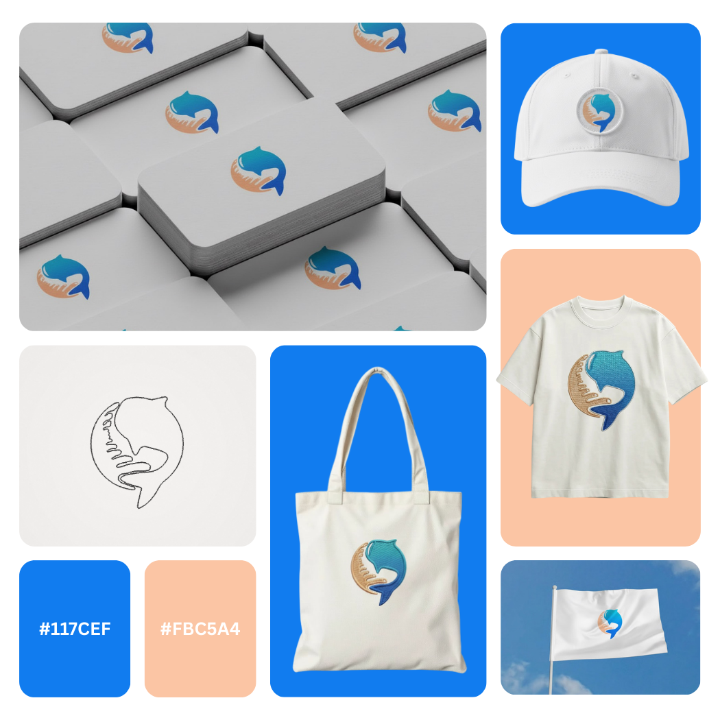
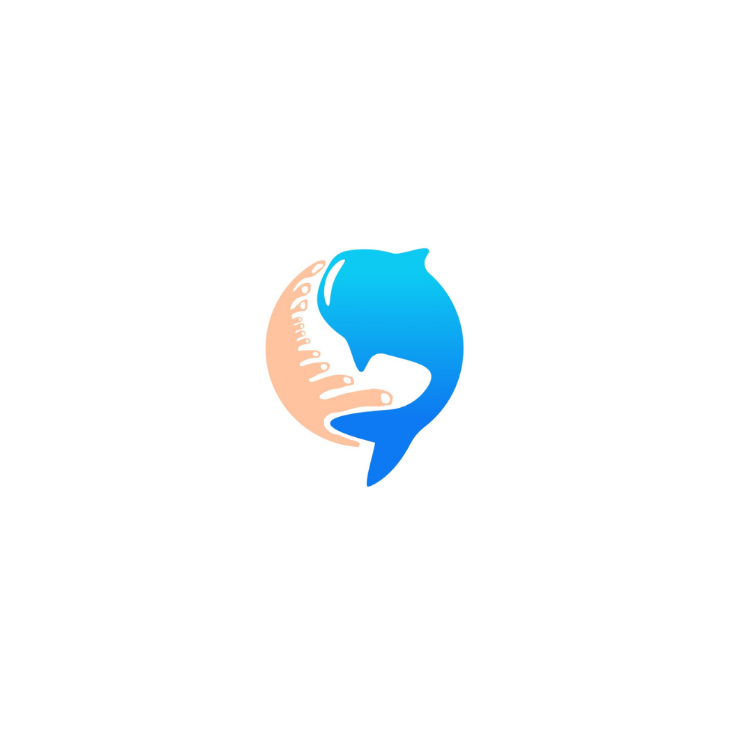
Marine Life Conservancy Logo Design crafted for ocean-focused nonprofits, marine research programs, coastal clean-up initiatives, and eco-led organizations that need a calm, trustworthy visual identity.
The mark blends a simplified fish silhouette with sea-urchin inspired texture and a protective, human-centered gesture creating a modern emblem that feels compassionate, mission-driven, and instantly recognizable at small sizes.
Designed with scalable geometry and clean negative space, this modern logo mark performs beautifully as a social media avatar, website header, app icon, donation page badge, event signage, educational materials, and embroidered merchandise.
The oceanic blue tones signal clarity and trust, while the warm sand accent adds humanity, approachability, and community care ideal for brands that rely on public confidence and long-term supporter loyalty.
|
Aspect |
Details |
|---|---|
|
Title |
Marine Life Conservancy Logo Design Modern Ocean Care Emblem Identity |
|
Color Psychology |
The ocean blue (#117CEF) signals trust, clarity, and scientific credibility ideal for conservation programs and public-facing NGOs. The soft coral-sand tone (#FBC5A4) adds warmth, humanity, and approachability, balancing “mission + community” so the brand feels both authoritative and compassionate. |
|
Shapes Used |
A minimal icon mark built from smooth organic curves: a fish silhouette integrated with a sea-urchin inspired texture/arc and a protective hand-like gesture. The rounded negative space creates a compact badge-style symbol that stays legible at small sizes (avatars, favicons, patches). |
|
Symbolism |
The fish represents marine biodiversity and ocean life, while the sea-urchin motif cues reef ecosystems and underwater balance. The embracing gesture communicates protection, stewardship, rescue, and restoration a clear brand promise for marine conservation and coastal initiatives. |
|
Typography |
Typography is intentionally optional here this is an icon-first brand-mark designed to pair with clean, modern sans-serif word-marks. The symbol supports a professional, nonprofit-ready tone: credible, calm, and globally adaptable for multilingual branding. |
|
Design Approach |
Modern minimalist logo design with strong negative space and a simplified silhouette. Built for versatility across NGO campaigns: quick recognition, emotional clarity, and a scalable vector structure that performs in digital, print, and embroidery. |
|
Best For |
Ocean conservation NGOs, marine wildlife rescue, coastal cleanup projects, reef restoration programs, sustainable fisheries initiatives, marine research labs, environmental education brands, and eco-friendly foundations needing a professional conservation logo and trust-building visual identity. |
|
Target Audience |
NGO founders, environmental program managers, fundraising teams, marine biologists, community organizers, and brand managers who need a credible nonprofit brand identity that resonates with donors, partners, volunteers, and the public. |
|
Applications |
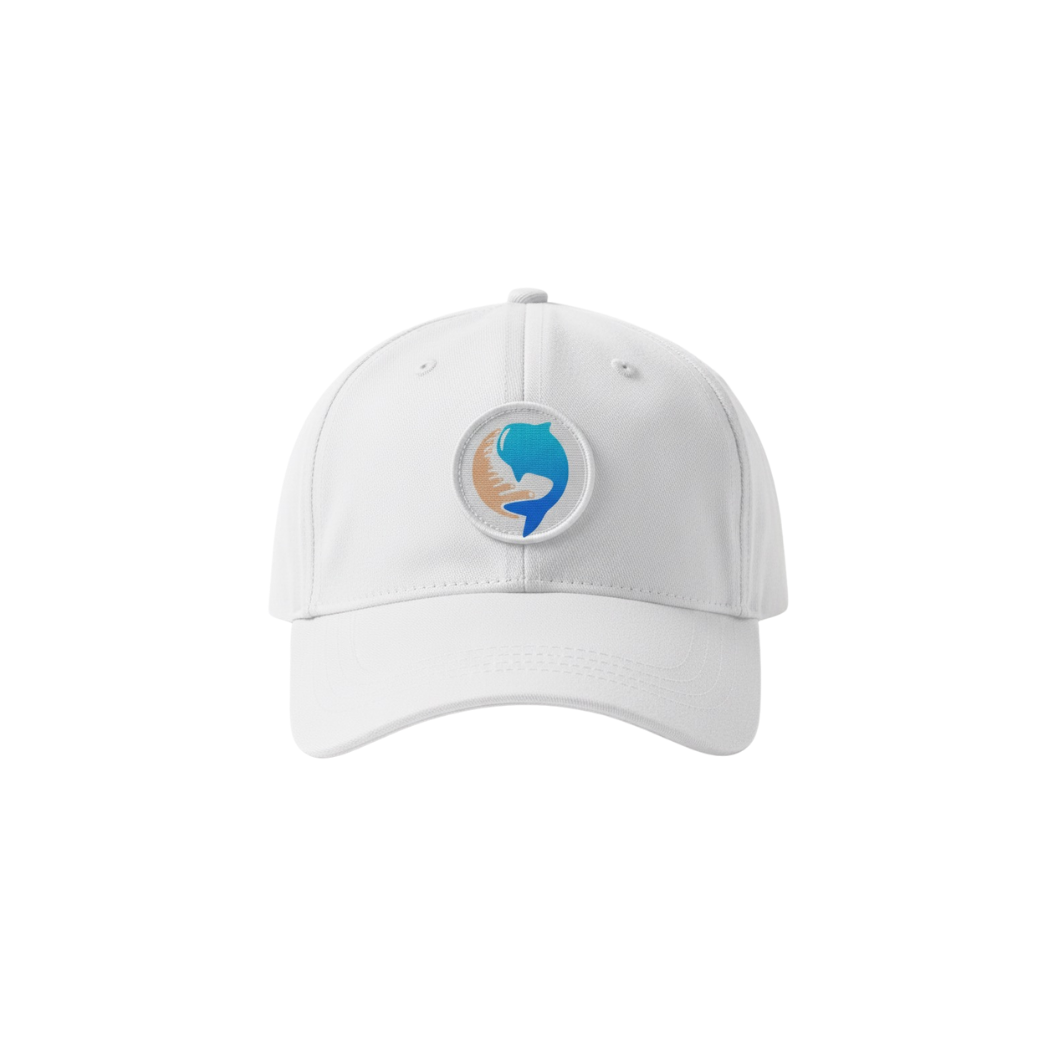
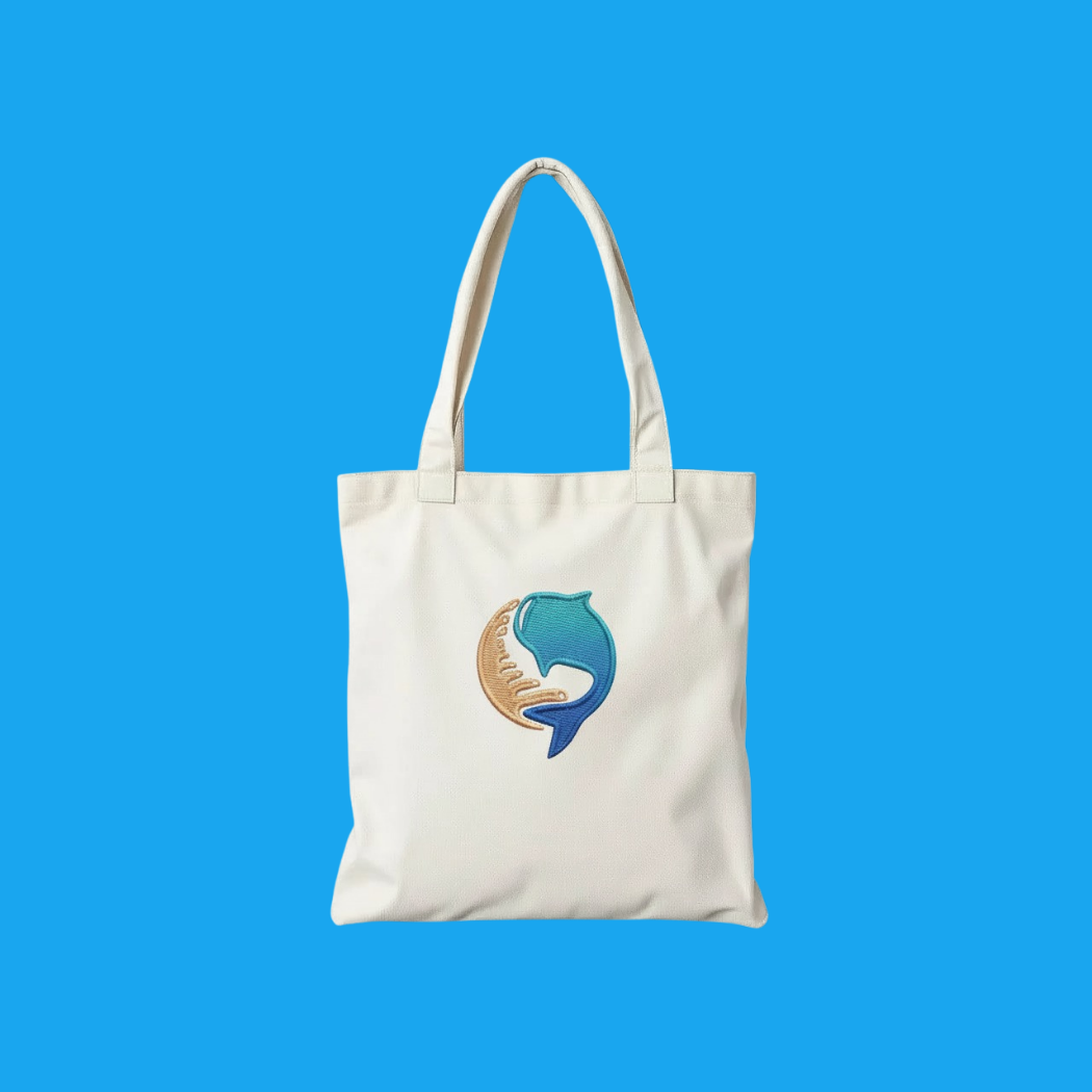
Website headers, social media profiles, donation pages, email signatures, annual reports, campaign posters, event banners, stickers, uniforms, caps, tote bags, enamel pins, vehicle decals, educational worksheets, and sponsor presentations plus mono/1-color use for stamps and laser/embroidery. |
|
Why This Design? |
It combines emotion + authority: the caring gesture improves donor trust, while the marine symbolism supports scientific legitimacy. The compact emblem is highly memorable, easy to reproduce, and distinct in a crowded eco/NGO space making it a strong long-term asset for awareness, fundraising, and community growth. |
1. Color Psychological Traits Table
| Color Name | Psychological Traits | Emotional Meaning | Branding Impact | Best For |
|---|---|---|---|---|
| Azure Blue (#117CEF) | Trust, Intelligence, Calm, Reliability, Modernity | Evokes security, mental clarity, and serene confidence. Reduces anxiety while promoting focus and logical thinking. | Positions brands as technologically advanced, dependable, and professionally competent. Enhances perceived credibility and corporate stability. | Tech Companies, Financial Services, Healthcare Portals, Corporate Logos, Social Media Platforms, Cybersecurity Firms |
| Coral Blush (#FBC5A4) | Warmth, Approachability, Nurturing, Optimism, Creativity | Elicits feelings of kindness, gentle energy, and human connection. Stimulates warmth, comfort, and positive emotional engagement. | Humanizes brands, fostering approachability and emotional resonance. Communicates caring, innovation, and inclusive values. | Wellness Brands, Lifestyle Retail, Food & Beverage Packaging, Educational Platforms, Creative Agencies, Beauty Products |
2. Color Description
Azure Blue (#117CEF): The Epitome of Digital Trust & Modern Intelligence
In the realm of color psychology meaning, this particular azure blue occupies a strategic space between serene cyan and authoritative navy. It represents a sophisticated evolution of traditional blue symbolism, carrying the emotional impact of stability and trust while injecting a distinctively modern, technological vibrance. This hue directly influences brand perception, signaling not just reliability, but forward-thinking innovation and digital-native competence. Its luminance suggests transparency and openness, key components in building user trust in digital environments.
From a marketing color theory perspective, this color behaves dynamically in design. On screen, it possesses enough saturation to command attention without visual aggression, making it exceptionally effective for primary calls-to-action and interactive elements. It creates a perceptual bridge between corporate professionalism and approachable innovation a balance crucial for fintech, SaaS, and enterprise brands. When applied to logos or product packaging, it leverages subconscious consumer behavior by associating products with intelligence, precision, and future-ready solutions. In visual identity systems, it pairs exceptionally well with clean typography and white space, reinforcing a message of clarity and cutting-edge capability.
Coral Blush (#FBC5A4): The Embodiment of Human-Centric Warmth & Optimistic Engagement
This Coral Blush hue masterfully harnesses color symbolism associated with both nurturing peach and energetic coral, resulting in a tone that is simultaneously soothing and invigorating. Its emotional meaning is rooted in human connection, evoking the warmth of interpersonal relationships and the gentle optimism of a new day. In branding psychology, this color is a powerful tool for companies wishing to express empathy, creativity, and inclusive values, directly shaping consumer behavior through positive emotional triggers.
Within brand color theory, Coral Blush performs as a versatile accent or primary brand color. It carries a tactile, almost tangible quality that enhances product packaging, suggesting natural ingredients, artisanal craftsmanship, or thoughtful design. In digital interfaces, it serves as a brilliant highlight against neutral backgrounds, guiding user attention with a friendly, non-intrusive luminosity. This color aligns perfectly with contemporary luxury color palette trends that favor authentic, wellness-oriented, and experience-driven branding. Its effectiveness stems from its ability to communicate premium accessibility—a brand that is both aspirational and warmly welcoming, making it ideal for modern lifestyle, beauty, and wellness markets seeking to build loyal communities.
3. Color Characteristics
Azure Blue (#117CEF)
-
Tone & Depth: A luminous, mid-to-high saturation blue with significant digital brightness and clear, crystalline depth.
-
Visual Temperature: Perceptually cool, yet its electric undertone carries a subtle, energizing warmth that prevents sterility.
-
Saturation Level: Highly saturated, conveying vibrancy and modernity without crossing into overwhelming intensity.
-
Primary Associations: Cloudless sky, deep clear water, digital interfaces, semiconductor light, precision engineering.
-
Branding Impression: Projects cutting-edge reliability, intelligent design, and confident innovation. Favored in B2B and high-tech B2C sectors.
-
Cultural Significance: Globally recognized as a color of trust and dependability. In digital culture, it signifies hyperlinks, active states, and trusted security (e.g., verified checkmarks).
Coral Blush (#FBC5A4)
-
Tone & Depth: A soft, luminous shade with low-to-medium saturation, exhibiting a delicate, creamy depth that feels both solid and ethereal.
-
Visual Temperature: Decisively warm, radiating the comforting heat of sunset and human skin tones, fostering immediate connection.
-
Saturation Level: Gently muted, providing a sophisticated softness that reads as contemporary and premium, avoiding childishness.
-
Primary Associations: Ripened apricot, inner glow of a seashell, blush on skin, terracotta at dawn, peach sorbet.
-
Branding Impression: Communicates empathetic innovation, artisanal quality, and optimistic well-being. Builds brands perceived as human-centered and authentic.
-
Cultural Significance: Often linked to health, vitality, and the “millennial pink” evolution towards more natural, inclusive warm neutrals. Symbolizes creativity and nurturing care.
4. Complete Color Conversion Table
Azure Blue (#117CEF)
| Value | Format | Output |
|---|---|---|
| CSS HEX | #117CEF |
|
| RGB (Decimal) | rgb(17, 124, 239) |
|
| RGB (Percentage) | rgb(7%, 49%, 94%) |
|
| CMYK | 93%, 48%, 0%, 6% |
|
| HSL | hsl(212, 87%, 50%) |
|
| HSV / HSB | hsv(212, 93%, 94%) |
|
| Web Safe Color | #0066FF |
|
| CIE-LAB | L*: 52.48, a*: 9.41, b*: -65.94 |
|
| CIE-XYZ | X: 22.23, Y: 21.03, Z: 85.07 |
|
| xyY | x: 0.173, y: 0.164, Y: 21.03 |
|
| CIE-LCH | L*: 52.48, C*: 66.61, h°: 278.13 |
|
| CIE-LUV | L*: 52.48, u*: -28.16, v*: -106.44 |
|
| Hunter-Lab | L: 45.56, a: 5.67, b: -48.91 |
|
| Binary RGB | 00010001 01111100 11101111 |
Coral Blush (#FBC5A4)
| Value | Format | Output |
|---|---|---|
| CSS HEX | #FBC5A4 |
|
| RGB (Decimal) | rgb(251, 197, 164) |
|
| RGB (Percentage) | rgb(98%, 77%, 64%) |
|
| CMYK | 0%, 22%, 35%, 2% |
|
| HSL | hsl(23, 91%, 81%) |
|
| HSV / HSB | hsv(23, 35%, 98%) |
|
| Web Safe Color | #FFCC99 |
|
| CIE-LAB | L*: 83.41, a*: 14.17, b*: 23.58 |
|
| CIE-XYZ | X: 65.96, Y: 63.06, Z: 44.25 |
|
| xyY | x: 0.381, y: 0.364, Y: 63.06 |
|
| CIE-LCH | L*: 83.41, C*: 27.51, h°: 58.98 |
|
| CIE-LUV | L*: 83.41, u*: 39.68, v*: 28.95 |
|
| Hunter-Lab | L: 79.34, a: 9.57, b: 22.31 |
|
| Binary RGB | 11111011 11000101 10100100 |
5. Technical Color Explanation
For Azure Blue (#117CEF): In the additive RGB color space used for screens and digital displays this color is composed of 7% red light, 49% green light, and 94% blue light. The significant dominance of blue and green channels creates its characteristic bright, cyan-leaning azure appearance. When converting for physical print (CMYK color model), it requires 93% Cyan, 48% Magenta, 0% Yellow, and 6% Key (black) to approximate the same vibrant hue, indicating its deep saturation and cool tone.
For Coral Blush (#FBC5A4): This color is generated on digital displays with a high intensity of 98% red light, 77% green light, and 64% blue light. The strong red component, softened by significant green and blue, produces its warm, peachy-coral quality. In the subtractive CMYK printing process, it is represented by 0% Cyan, 22% Magenta, 35% Yellow, and only 2% Black, reflecting its light, warm, and slightly desaturated nature that relies on magenta and yellow pigments.
1) What makes a Marine Life Conservancy Design effective for an NGO?
A strong Marine Life Conservancy Design communicates trust, protection, and long-term stewardship in a single, recognizable mark. From a brand psychology perspective, oceanic blues build credibility and safety, while warm coastal tones add empathy ideal for donor confidence. Design theory favors simplified silhouettes and clean negative space so the logo stays readable on small icons, badges, and mobile headers. In the conservation industry, this balance helps the brand feel both science-led and community-driven, which increases engagement and support.
2) Which logo style works best for a Marine Life Conservancy Design: emblem, icon, or wordmark?
For a Marine Life Conservancy Design, an icon-based emblem is often the most versatile because it scales across social avatars, website favicons, and campaign graphics. A refined symbol (like a fish + sea-life motif) creates instant category recognition and strengthens recall. Pairing it with a clean wordmark improves authority and accessibility for formal documents, grants, and reports. This approach supports a consistent visual identity system without relying on complex illustration.
3) How do colors influence trust in a Marine Life Conservancy Design?
In a Marine Life Conservancy Design, blue signals reliability, clarity, and environmental responsibility key emotional triggers for public trust. Soft coral or sand tones introduce warmth and human connection, which supports donations, volunteering, and community participation. From marketing color theory, the cool–warm contrast creates strong visual hierarchy and makes the logo stand out on white, navy, or ocean photography backgrounds. This palette also performs well in digital design and print collateral, maintaining legibility and brand consistency.
4) Where should you use a Marine Life Conservancy Logo Design for maximum impact?
A Marine Life Conservancy Logo Design should be deployed across high-visibility touch points: website header, donation pages, social media profiles, email signatures, and annual impact reports. For real-world credibility, use it on event banners, volunteer tees, stickers, signage, and partner co-branding layouts. Design theory recommends having responsive variations (full logo, icon-only, single-color) to protect clarity in every format. Consistent usage improves brand recognition and reinforces legitimacy in the environmental nonprofit space.
5) What file formats are essential when delivering a Marine Life Conservancy Design?
Any professional Marine Life Conservancy Design should include vector masters (AI/EPS/SVG) for perfect scaling and crisp printing, plus web-ready PNG/JPG for fast digital use. Provide color versions (full color, one-color, reversed) to ensure the logo works on light/dark backgrounds and photo overlays. For brand governance, include a simple usage guide covering spacing, minimum size, and approved color values. This safeguards quality across merchandise, sponsorship decks, and multi-channel campaigns.
6) How can a Marine Conservancy Logo Design feel modern without losing authenticity?
A modern Marine Life Conservancy Logo Design stays authentic by simplifying natural forms into clean geometry while keeping the symbolism emotionally clear. Minimalist design reduces visual noise and improves recognition, especially for mobile-first audiences. Using balanced curves, consistent stroke logic, and intentional negative space creates a contemporary mark that still feels organic and mission-aligned. This helps the brand appear credible to institutions while remaining approachable to supporters.
7) How do you create a unique Marine Life Design that doesn’t look generic?
To avoid generic outcomes, a Marine Life Design should be built from a distinct concept such as a unique interaction between marine species, habitat shapes, or lifecycle symbolism. From design theory, originality comes from custom proportion, controlled abstraction, and a signature silhouette that’s recognizable even in monochrome. Brand psychology matters too: a unique mark increases memorability and emotional attachment, which can improve donor conversion. Finally, testing the logo at small sizes and across mockups ensures it stays distinctive in real-world conservation branding.
Reviews
There are no reviews yet.