Description
MW Ortho & Dental Studio logo design is a modern, minimal brand mark created specifically for orthodontic and dental clinics that want to look professional, clean and tech-forward. The icon combines a bold circular shape with an integrated MWO monogram, forming a clear white tooth in the center. This smart visual concept instantly communicates dentistry, orthodontics and smile care in one simple, memorable logo.
The upper half of the symbol uses a fresh blue gradient to represent hygiene, trust and advanced dental technology, while the darker lower half adds stability and seriousness—ideal for clinics that offer braces, aligners, cosmetic dentistry and restorative treatments. Because the MW Ortho & Dental Studio logo design is built with clean geometry and solid vector shapes, it scales perfectly from tiny social media icons to large outdoor signage and reception backdrops without losing clarity.
This logo is ideal for:

-
Orthodontic practices and aligner clinics
-
General and family dental studios
-
Cosmetic and aesthetic dentistry brands
-
Multi-specialty dental centers and oral health startups
Use the MW Ortho & Dental Studio logo design across your full branding system: clinic signage, appointment cards, letterheads, business cards, prescription pads, uniforms, website headers, online booking portals and social media content. Its modern monogram structure makes it easy to recognize and remember, helping your practice stand out in a crowded dental market while still feeling friendly and approachable to patients of all ages.
|
Aspect |
Details |
|---|---|
|
Title |
MW Ortho & Dental Studio Logo Design – Modern Tooth MWO Monogram for Orthodontic & Dental Clinic Branding |
|
Color Psychology |
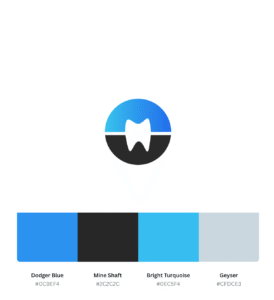
The Dodger Blue (#0C9EF4) and Bright Turquoise (#0EC5F4) in the MW Ortho & Dental Studio logo design symbolize cleanliness, trust, freshness, and advanced dental technology, while Mine Shaft (#2C2C2C) adds professionalism and stability. This combination is ideal for dental logo design, orthodontic logo design, and modern dental clinic branding. |
|
Shapes Used |
The logo uses a circular badge with an integrated MWO monogram that forms a hidden tooth shapein the negative space. This clever construction makes it a standout tooth logo and orthodontic logowhile keeping the mark minimal and easily recognizable. |
|
Symbolism |
The tooth inside the MWO shape symbolizes precision orthodontic treatment, complete smile care, and holistic dental solutions under one roof. The circle suggests continuity and protection, reinforcing trust for patients choosing MW Ortho & Dental Studio for braces, aligners, and general dental care. |
|
Typography |
Best paired with a clean, bold sans-serif font to emphasize clarity and professionalism. Straightforward lettering supports the dental clinic logo concept and ensures excellent readability on signage, appointment cards, and digital platforms for orthodontic and dental studio branding. |
|
Design Approach |
A minimalist, modern dental logo design that focuses on a single strong symbol: the tooth-shaped MWO monogram. The design avoids clutter, making it versatile for use as a dental studio logo, app icon, or social media profile image while still conveying high-tech orthodontic care. |
|
Best For |
Ideal for orthodontic clinics, dental studios, clear aligner centers, cosmetic dentistry practices, family dental clinics, and multi-specialty dental centers looking for a modern tooth logo and professional ortho & dental branding. |
|
Target Audience |
Teens and adults seeking braces or clear aligners, families looking for a trusted dental clinic, and patients who value clean, modern healthcare environments. The MW Ortho & Dental Studio logo design appeals to people who associate blue dental branding with safety, hygiene, and advanced treatment. |
|
Applications |
Perfect for clinic signage, reception backdrops, business cards, appointment cards, prescription pads, uniforms, dental packaging, website headers, online booking systems, Google Business profile, and social media marketing. The circular MWO tooth icon also works great as a favicon and app icon. |
|
Why This Design? |
This MW Ortho & Dental Studio logo design stands out because it integrates a tooth icon inside an MWO monogram, combining brand initials with a clear dental symbol. The blue and turquoise palette strengthens SEO relevance for dental logo design, orthodontic logo, tooth logo, and dental clinic branding, helping the brand look modern, trustworthy, and highly searchable online. |
Color Psychological Traits Table
|
Color Name |
Hex Code |
Psychological Traits (Branding SEO) |
How It Supports MW Ortho & Dental Studio |
|---|---|---|---|
|
Dodger Blue |
#0C9EF4 |
Trust, cleanliness, innovation, precision, calm reassurance |
Perfect for an orthodontic & dental studio logo, this bright blue signals clinical hygiene, technological expertise, and a stress-free experience for dental patients. |
|
Bright Turquoise |
#0EC5F4 |
Freshness, renewal, gentle energy, youthfulness |
Adds a modern, friendly touch to the dental clinic branding, suggesting fresh breath, revitalized smiles, and advanced cosmetic dentistry. |
|
Mine Shaft |
#2C2C2C |
Professionalism, stability, sophistication, clarity |
This deep charcoal anchors the palette, giving the MW Ortho & Dental Studio logo design a premium, high-end feel with strong legibility in typography and icon outlines. |
Dodger Blue – #0C9EF4
Color Description
Dodger Blue (#0C9EF4) is a vibrant clinical blue used in the MW Ortho & Dental Studio logo design to communicate trust, hygiene, and advanced dental technology. It instantly recalls polished tools, clean water, and bright smiles, making it ideal for orthodontic clinics, dental studios, and cosmetic dentistry brands.
Color Characteristics
-
Conveys trust, reliability, and calmness, crucial for nervous dental patients
-
Works well as a primary accent in orthodontic icons, tooth symbols, and UI highlights
-
Enhances readability when paired with white and dark neutrals like Mine Shaft (#2C2C2C)
-
Feels digital-ready, ideal for websites, dental apps, and booking platforms
Color Conversion – Dodger Blue (#0C9EF4)
|
Attribute |
Value |
|---|---|
|
CSS Hex |
#0C9EF4 |
|
RGB (decimal) |
12, 158, 244 |
|
RGB (percentage) |
4.7%, 62.0%, 95.7% |
|
CMYK |
C: 95%, M: 35%, Y: 0%, K: 4% |
|
HSL |
202.2°, 91.3%, 50.2% |
|
HSV (HSB) |
202.2°, 95.1%, 95.7% |
|
CIE-LAB |
L: 62.56, a: –3.154, b: –52.296 |
|
XYZ |
X: 28.708, Y: 31.064, Z: 90.071 |
Mine Shaft – #2C2C2C
Color Description
Mine Shaft (#2C2C2C) is a deep charcoal gray that gives the MW Ortho & Dental Studio brand identity a solid, professional foundation. In a dental logo, this color is excellent for typography, outlines, and icon bases, adding contrast without the harshness of pure black.
Color Characteristics
-
Suggests serious care, precision, and reliability in dental and orthodontic services
-
Creates excellent contrast against bright blues and whites for clean UI and signage
-
Ideal for body text, taglines, and clinic contact details on digital and print materials
-
Keeps the overall dental branding modern and upscale rather than clinical and cold
Color Conversion – Mine Shaft (#2C2C2C)
|
Attribute |
Value |
|---|---|
|
CSS Hex |
#2C2C2C |
|
RGB (decimal) |
44, 44, 44 |
|
RGB (percentage) |
17.3%, 17.3%, 17.3% |
|
CMYK |
C: 0%, M: 0%, Y: 0%, K: 83% |
|
HSL |
0°, 0%, 17.3% |
|
HSV (HSB) |
0°, 0%, 17.3% |
|
CIE-LAB |
L: 18.00, a: 0.002, b: –0.003 |
|
XYZ |
X: 2.394, Y: 2.519, Z: 2.743 |
Bright Turquoise – #0EC5F4
Color Description
Bright Turquoise (#0EC5F4) adds a fresh, energetic highlight to the MW Ortho & Dental Studio logo. It feels crisp and hygienic, making it perfect for dental icons, water-like gradients, and smile-focused visuals that communicate cleanliness and comfort.
Color Characteristics
-
Evokes freshness, cleanliness, and revitalization—great for teeth-whitening and aligner services
-
Works beautifully in gradients with Dodger Blue, enhancing the modern feel of the logo
-
Ideal for call-to-action buttons like “Book Appointment” or “Smile Consultation” on the clinic website
-
Reads well on digital screens, supporting SEO-driven landing pages and social media graphics
Color Conversion – Bright Turquoise (#0EC5F4)
|
Attribute |
Value |
|---|---|
|
CSS Hex |
#0EC5F4 |
|
RGB (decimal) |
14, 197, 244 |
|
RGB (percentage) |
5.5%, 77.3%, 95.7% |
|
CMYK |
C: 94%, M: 19%, Y: 0%, K: 4% |
|
HSL |
192.3°, 91.3%, 50.6% |
|
HSV (HSB) |
192.3°, 94.3%, 95.7% |
|
CIE-LAB |
L: 73.91, a: –24.173, b: –34.513 |
|
XYZ |
X: 36.476, Y: 46.558, Z: 92.652 |
1. What is MW Ortho & Dental Studio logo design and why is it unique?
The MW Ortho & Dental Studio logo design is a modern dental logo design that cleverly hides a tooth inside an MWO monogram logo. This creates a smart tooth monogram logo that instantly communicates both dentistry and orthodontics in one symbol. Unlike generic tooth icons, this orthodontic and dental logo uses initials plus a tooth silhouette, making the brand more memorable and professional.
2. How does MW Ortho & Dental Studio logo design help with dental studio branding?
A strong MW Ortho & Dental Studio logo design becomes the core of your dental studio branding, showing patients that your clinic is modern, clean and trustworthy. When you use this modern tooth logo consistently on signage, appointment cards, uniforms and your website, it supports your overall dental branding design and helps patients easily recognize your dental and orthodontic services.
3. Is this logo suitable for both orthodontic logo design and dental clinic logo design?
Yes, the MW Ortho & Dental Studio logo design works perfectly for both orthodontic logo design and dental clinic logo design because it represents braces, aligners and general smile care at the same time. The integrated tooth shape inside the MWO monogram logo makes it ideal for clinics that offer both dental and orthodontic logo needs under one unified brand.
4. Why is a modern tooth logo important for orthodontic and dental clinics?
A modern tooth logo like the MW Ortho & Dental Studio logo design signals that your clinic uses updated technology, clear aligners and contemporary treatment methods. Patients searching online for a clean, professional orthodontic and dental logo will trust clinics that use a refined modern dental logo design more than those with outdated or clipart-style graphics.
5. Can the MW Ortho & Dental Studio logo design work as a tooth monogram logo for digital use?
Absolutely. The MW Ortho & Dental Studio logo design was built as a strong tooth monogram logo, which means it scales beautifully as a social media icon, favicon, or app logo. Because the tooth is built into the MWO monogram logo, it stays readable at small sizes on websites, booking portals and mobile devices, making it ideal for digital-first dental clinic logo design.
6. How does this logo support professional dental branding design for a clinic?
In dental branding design, consistency is everything. Using the MW Ortho & Dental Studio logo design across your reception desk, patient forms, prescriptions, recall cards and digital channels gives your clinic a unified, polished look. The logo’s clean lines and blue gradient make it a great hero mark for complete dental studio branding, helping your practice look established and trustworthy.
7. Who should choose MW Ortho & Dental Studio logo design for their practice?
The MW Ortho & Dental Studio logo design is ideal for orthodontic clinics, aligner studios, cosmetic dentists and family practices that want a single dental and orthodontic logo to represent all their services. If you’re looking for orthodontic logo design and dental clinic logo design combined into one modern dental logo design, this MWO tooth monogram is a perfect choice to position your clinic as professional, innovative and patient-focused.

Reviews
There are no reviews yet.