


Description
Handcrafted Travel App Logo design crafted for travel startups, booking platforms, and tourism services that need a modern, trustworthy identity with instant recognition.
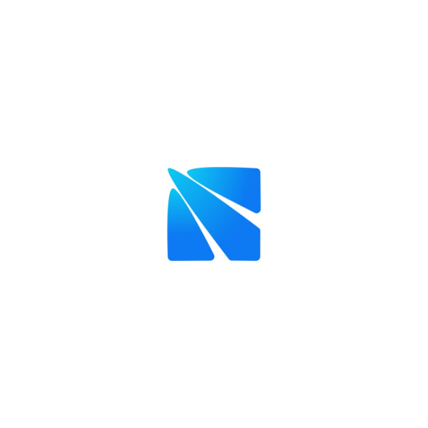
This logo concept uses a minimalist bird-in-letterform mark to communicate freedom, speed, and smooth journeys—the exact emotional triggers users expect from a travel app.
The clean geometry and negative space give you a modern logo mark that stays readable at small sizes (app icons, favicons) and remains bold at large sizes (signage, ads, vehicle graphics).
What you get is not a generic template—this is brand logo design built for real-world use across digital and print. Ideal for iOS/Android app icons, UI headers, landing pages, social media avatars, email signatures, luggage tags, stickers, uniforms, and promo materials.
Minimalist logos consistently win in competitive markets because they’re easier to remember, easier to scale, and easier to apply across brand touch-points.

|
Aspect |
Details |
|---|---|
|
Title |
Handcrafted Travel App Logo – Flynq-Style Bird Mark in Motion |
|
Color Psychology |
Azure Radiance (#0C8CF3) communicates trust, security, and reliability (ideal for bookings, payments, and travel planning). Picton Blue (#2CC7F1) adds freshness, optimism, and “open-sky” exploration energy. Together, the blue gradient feels tech-forward, clean, and premium—perfect for mobile UI visibility and strong icon contrast on light backgrounds. |
|
Shapes Used |
A rounded geometric icon built from soft rectangular forms with a diagonal wing-sweep cut. The smooth corners create approachability, while the angled negative space adds speed and direction—optimized as a scalable minimal icon logo for app-first branding. |
|
Symbolism |
The mark forms an “F” shaped bird, signaling freedom, flight, and fast navigation. The upward motion implies progress and effortless movement—positioning the brand as modern, efficient, and travel-ready. |
|
Typography |
Best paired with a modern rounded sans-serif wordmark (clean, high legibility, friendly tone). This style reinforces a product-led travel brand: professional, clear, and approachable without feeling overly corporate. |
|
Design Approach |
A minimalist, mobile-first logo mark designed for instant recognition. Focused on strong silhouette, negative-space storytelling, and a vector-clean build—making it ideal for app stores, UI headers, and consistent digital brand systems. |
|
Best For |
Travel booking apps, flight deal platforms, itinerary planners, tourism marketplaces, digital travel agencies, mobility/ticketing startups—especially for long-tail intent like travel app logo design, minimal bird icon logo, and booking platform branding. |
|
Target Audience |
Startup founders, product teams, and marketing managers building travel tech brands; also local travel businesses modernizing into apps. Designed to earn trust quickly from users, partners, and investors through clarity and professionalism. |
|
Applications |
App icon, splash screen, website favicon, onboarding UI, social avatars, ad creatives, pitch decks, email signatures, travel tags, stickers, merch, signage, uniforms, and vehicle decals. Works well in full color, mono, and reverse for print + digital. |
|
Why This Design? |
Combines lettermark clarity with bird symbolism so the name cue and category message land in one glance. Minimal geometry ensures crisp scaling, while the blue gradient increases perceived quality and reliability—creating a memorable, conversion-friendly identity for travel apps. |
1. Color Psychological Traits Table
| Color Name | Psychological Traits | Emotional Meaning | Branding Impact | Best For |
|---|---|---|---|---|
| Azure Radiance | Confidence, Clarity, Innovation, Reliability | Evokes feelings of trust, security, and intellectual stimulation. Represents clear communication and forward-thinking. | Projects technological sophistication, corporate stability, and progressive vision. Creates immediate brand recognition through vivid presence. | Technology brands, financial institutions, corporate B2B, SaaS platforms, healthcare tech, productivity apps |
| Picton Blue | Approachability, Creativity, Openness, Optimism | Inspires calm creativity, fluid thinking, and positive energy. Feels more playful and accessible than traditional blues. | Suggests innovation, friendly professionalism, and modern flexibility. Less corporate, more community-oriented. | Creative agencies, education platforms, lifestyle brands, wellness apps, modern retail, startup ecosystems |
2. Color Description
Azure Radiance (#0C8CF3) embodies the zenith of color psychology meaning in the digital age—a hue that balances corporate authority with technological dynamism. In brand perception, this intense, pure blue communicates unwavering reliability while simultaneously signaling innovation. Its emotional impact is profound: it triggers associations with clear skies (clarity), deep oceans (stability), and digital interfaces (progress). In marketing color theory, Azure Radiance occupies a strategic position—it’s bold enough to command attention yet familiar enough to foster immediate user trust. This duality makes it exceptionally effective for technology and finance sectors where credibility must coexist with forward momentum.
The color symbolism in branding contexts reveals Azure Radiance as a bridge between tradition and disruption. Unlike muted corporate blues, its high saturation and clean undertone project confidence without austerity. In design behavior, it functions as a dominant primary color that maintains legibility across digital and print media, enhancing visual identity through consistent recognizability. Modern branding trends favor this shade for its digital-native quality—it appears luminous on screens while retaining depth in physical applications. When deployed in logos or product packaging, it creates subconscious associations with intelligence (cognitive blue) and dependability (institutional blue), directly influencing consumer behavior through perceived competence.
Picton Blue (#2CC7F1) represents the evolution of blue color psychology meaning toward human-centered design. With its slightly cyan-leaning undertone, this hue introduces warmth into the typically cool blue spectrum, creating unique brand perception opportunities. Its emotional impactis distinctly optimistic—evoking tropical waters, summer skies, and creative flow. In marketing color theory, Picton Blue achieves what few blues can: it maintains professional credibility while radiating approachability. This balance makes it particularly effective for brands that need to communicate expertise without intimidation, directly affecting consumer behavior through perceived friendliness.
The color symbolism here shifts toward creativity and community. Where traditional blues communicate authority, Picton Blue suggests collaboration. In design applications, its slightly desaturated quality prevents visual fatigue while maintaining vibrancy—a crucial consideration in visual identity systems meant for prolonged engagement. This color excels in modern branding contexts that value transparency and openness, particularly in education, creative industries, and wellness sectors. When used in logos, it implies innovative thinking; in packaging, it suggests freshness and accessibility. The hue’s inherent brightness captures attention while its cyan infusion differentiates it from more common blues, creating memorable brand color meaning that stands out in competitive landscapes.
3. Color Characteristics
Azure Radiance (#0C8CF3)
-
Tone: Pure, high-energy blue with minimal cyan/green bias
-
Depth: Medium-deep with luminous quality
-
Visual Temperature: Cool with slight digital warmth (RGB bias)
-
Saturation: Highly saturated (94% in HSL)
-
Associations: Digital interfaces, clear skies, deep water, corporate authority
-
Branding Impressions: Technological leadership, corporate reliability, innovative thinking
-
Cultural Significance: Modernity, progress, intelligence (Western); immortality, advancement (East Asian)
Picton Blue (#2CC7F1)
-
Tone: Cyan-infused blue with aquatic freshness
-
Depth: Medium-light with airy quality
-
Visual Temperature: Cool with noticeable warmth from cyan component
-
Saturation: Moderately high (87% in HSL)
-
Associations: Tropical waters, summer horizons, creative energy, calm technology
-
Branding Impressions: Friendly innovation, approachable expertise, modern creativity
-
Cultural Significance: Healing, peace (universal); communication, fluidity (contemporary)
4. Complete Color Conversion Table
Azure Radiance (#0C8CF3)
| Value | Format | Output |
|---|---|---|
| CSS HEX | #0C8CF3 |
|
| RGB (Decimal) | rgb(12, 140, 243) |
|
| RGB (Percentage) | rgb(4.7%, 54.9%, 95.3%) |
|
| CMYK | cmyk(95%, 42%, 0%, 5%) |
|
| HSL | hsl(207°, 91%, 50%) |
|
| HSV / HSB | hsv(207°, 95%, 95%) |
|
| Web Safe Color | #0099FF |
|
| CIE-LAB | lab(57.5, 7.9, -60.9) |
|
| CIE-XYZ | xyz(27.5, 25.9, 88.6) |
|
| xyY | xyY(0.184, 0.208, 25.9) |
|
| CIE-LCH | lch(57.5, 61.4, 277.4) |
|
| CIE-LUV | luv(57.5, -58.6, -96.3) |
|
| Hunter-Lab | Hunter(50.3, 1.2, -55.7) |
|
| Binary RGB | 00001100 10001100 11110011 |
Picton Blue (#2CC7F1)
| Value | Format | Output |
|---|---|---|
| CSS HEX | #2CC7F1 |
|
| RGB (Decimal) | rgb(44, 199, 241) |
|
| RGB (Percentage) | rgb(17.3%, 78%, 94.5%) |
|
| CMYK | cmyk(82%, 17%, 0%, 5%) |
|
| HSL | hsl(193°, 87%, 56%) |
|
| HSV / HSB | hsv(193°, 82%, 95%) |
|
| Web Safe Color | #33CCFF |
|
| CIE-LAB | lab(75.2, -26.2, -31.8) |
|
| CIE-XYZ | xyz(37.8, 47.9, 90.8) |
|
| xyY | xyY(0.206, 0.311, 47.9) |
|
| CIE-LCH | lch(75.2, 41.2, 230.5) |
|
| CIE-LUV | luv(75.2, -60.3, -56.7) |
|
| Hunter-Lab | Hunter(68.9, -25.7, -30.1) |
|
| Binary RGB | 00101100 11000111 11110001 |
5. Technical Color Explanation
Azure Radiance (#0C8CF3): In an RGB color space (additive color for screens), this color is composed of 4.7% red, 54.9% green, and 95.3% blue light. The high blue component with substantial green creates its vivid, slightly electric quality. In CMYK (subtractive color for printing), it requires 95% cyan, 42% magenta, 0% yellow, and 5% black ink to reproduce accurately, indicating its purity and intensity. The hue angle of 207° places it in the cyan-blue transition zone, while its 91% saturation and 50% lightness create maximum vibrancy without crossing into neon territory.
Picton Blue (#2CC7F1): This color contains 17.3% red, 78% green, and 94.5% blue light in RGB space, creating its distinctive cyan-blue character through nearly equal green and blue dominance. The CMYK breakdown of 82% cyan, 17% magenta, 0% yellow, and 5% black reveals its cleaner, less purple-leaning nature compared to traditional blues. With a hue angle of 193°, it sits firmly in the cyan spectrum near the blue boundary. Its 87% saturation at 56% lightness produces a bright but not overwhelming presence, optimized for both digital display and print reproduction across various media.
1) What makes a Handcrafted Travel App Logo more effective than a generic template?
A Handcrafted Travel App Logo is built around brand strategy, not just aesthetics. Instead of a recycled icon, you get a unique bird-in-“F” mark designed for instant recognition, scalable vector clarity, and consistent brand perception across app stores, UI, and marketing assets—key factors that influence trust and conversion in travel tech.
2) Why does a bird-shaped “F” logo work so well for travel and booking platforms?
A bird symbol communicates freedom, movement, and exploration, while the “F” letterform anchors brand recall. This combination creates a memorable modern logo mark that performs like a visual shortcut—users understand the category fast, which improves click intent and reduces friction during onboarding.
3) How does negative space improve logo memorability and brand recall?
Negative space adds a “second read,” making the logo more engaging and sticky in memory. For app icons and social avatars where attention is limited, a negative-space bird mark creates a micro-moment of discovery—boosting recognition and sharing behavior without adding visual clutter.
4) Is a minimalist travel logo better for app icons and UI than a detailed emblem?
Yes. Minimal logos outperform complex marks at small sizes because they remain legible in 16–64px formats. A clean silhouette ensures clarity on iOS/Android home screens, favicons, and app store thumbnails—critical touchpoints for travel apps competing in crowded marketplaces.
5) Which color psychology signals the most trust for a travel app logo?
Bright blues like Azure Radiance and Picton Blue are strongly associated with trust, clarity, and reliability—important for booking and payment confidence. They also reinforce sky and motion symbolism, strengthening emotional alignment with travel while supporting clean visual hierarchy in modern branding.
6) What file formats should a professional travel app logo package include for real-world use?
A high-end delivery typically includes AI, SVG, EPS, PDF (vector masters), plus PNG/JPG/WEBP exports for web and social. For product teams, adding favicon packs, app icon sizes, and mono/reverse variations helps maintain consistent visual identity across every platform.
7) How can I optimize a logo image for Google Image SEO without keyword stuffing?
Use natural metadata: ALT text under 125 characters, a readable file name, and a descriptive caption. Include intent-based phrases like “travel app logo,” “bird icon mark,” and “modern brand identity,” and keep the description semantically rich with real use-cases (app icon, UI header, signage, social).
8) What should a travel app brand identity include beyond the logo for stronger market positioning?
A complete system includes typography pairing, color rules, spacing guidelines, icon style, UI usage, and social templates. For travel products, consistency across onboarding screens, booking flows, and marketing creatives builds trust and improves user perception—often impacting retention and referrals.
9) How do you ensure a travel logo stays original and legally safe?
Originality requires concept-first design, custom geometry, and a distinct silhouette—not stock icon edits. After design, a trademark search and a uniqueness review help reduce risk. A handcrafted bird-in-lettermark approach is typically safer than generic plane/globe icons commonly used in travel branding.
10) What design features help a travel app logo convert better in app stores and ads?
Conversion-friendly marks use a clear silhouette, high contrast, limited details, and strong emotional signaling. A minimal bird “F” logo reads fast, looks premium in gradients or mono, and stays sharp at small sizes—improving recognition in app lists, banners, and social ad placements.
Reviews
There are no reviews yet.