


Description
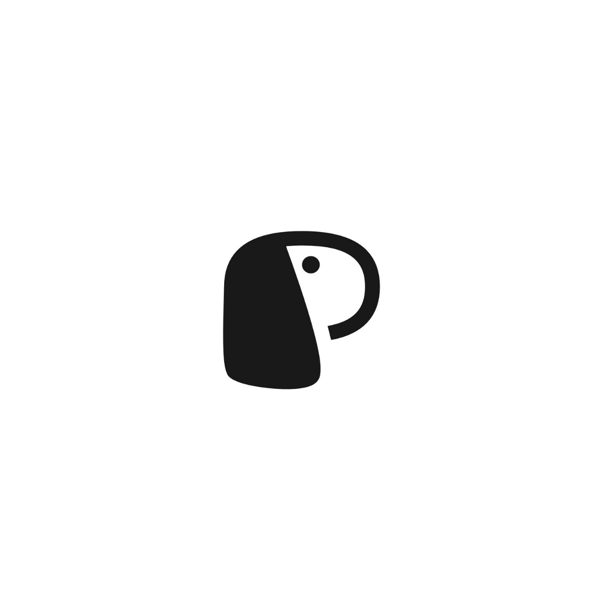
Handcrafted Puppy Brand Logo designed to help pet businesses look instantly trustworthy, memorable, and premium. This minimalist concept forms a friendly puppy face inside a bold P lettermark, creating a modern logo mark that communicates “pet-first” in one glance. The smooth geometry and high-contrast monochrome style keep the design timeless, while the simplified silhouette ensures it stays crisp across every touchpoint—from tiny social avatars and website favicon to storefront signage and packaging labels.
Built for real commercial use, this brand-ready logo fits puppy shops, pet boutiques, dog grooming salons, pet daycare services, subscription pet products, and animal accessories brands. You can confidently apply it on hang tags, stickers, apparel prints, uniforms, business cards, invoices, and eCommerce product pages. Minimal logos outperform complex marks in crowded markets because they scale cleanly, print easily, and improve brand recognition—helping customers remember you after the first visit.

|
Aspect |
Details |
|---|---|
|
Title |
Handcrafted Puppy Brand Logo – “Pup-in-P” Signature Mark System |
|
Color Psychology |
The deep charcoal black #191919 signals premium trust, stability, and professionalism—a strong choice for pet brands that want to feel clean, credible, and boutique-level. In brand color meaning, near-black tones reduce visual noise, make the puppy silhouette feel more iconic, and improve legibility on packaging, signage, and digital UI. This shade also triggers “quality + care” perception, which is valuable for pet owners making buying decisions. |
|
Shapes Used |
A rounded P lettermark built with smooth geometry and a crisp internal cutout forming a minimal puppy face. The dot eye adds immediate character, while the soft corners create friendliness. The mark’s silhouette is optimized as a minimal mascot logo, readable from app-icon size to storefront scale. |
|
Symbolism |
The design merges a puppy shop identity with a lettermark logo—delivering “pet-first” recognition in one glance. The puppy profile communicates warmth, care, and approachability, while the structured “P” shape implies organization and reliability, supporting brand perception for grooming, retail, and pet services. |
|
Typography |
Best paired with a modern rounded sans-serif (clean, high legibility, friendly tone). For premium positioning, a geometric sans works well; for cozy boutique vibes, a softer humanist sans. Strong type pairing supports a brand mark + wordmark pairing system that scales across product labels, web headers, and social profiles. |
|
Design Approach |
A minimal, icon-first brand logo design focused on instant memorability, print efficiency, and consistent reproduction. Built to support real commercial assets: a one-color print-ready logo for stamps/embroidery, plus digital-ready exports for Shopify/WooCommerce visuals and social media. |
|
Best For |
Puppy shops, pet boutiques, dog grooming salons, pet daycare, subscription pet products, and pet accessory brands—especially businesses searching for minimal puppy logo in P letter, pet shop logo for packaging, or dog grooming salon brand identity. Also adaptable for a veterinary clinic friendly logo that feels clean and caring. |
|
Target Audience |
Pet business owners, boutique founders, grooming salon managers, ecommerce sellers, and clinic administrators who want a modern identity that builds trust fast. Also ideal for marketing teams and store managers who need consistent brand assets across print, storefront, and digital touchpoints. |
|
Applications |
Designed to power a complete presence: pet boutique branding kit (logo + patterns + tags), pet product packaging logo lockups for labels, Instagram-ready pet brand assets (avatar + highlight icons), storefront signage, uniforms, stickers, hang tags, invoices, business cards, and favicon + app icon set for pet stores with online ordering. |
|
Why This Design? |
It’s a high-conversion identity because it combines category clarity (puppy) with brand recall (P lettermark). The minimal silhouette prints cleanly, scales perfectly, and works in one color—reducing production cost while increasing recognition. Add logo usage guidelines (spacing, min size, background rules) and you get a professional system that competitors often skip—making the brand look bigger, cleaner, and more trustworthy. |
|
Color |
#191919 (Near-Black Charcoal) |
|
Core Psychological Traits |
Calm authority, precision, discipline, stability, control, professionalism |
|
Emotional Meaning |
Quiet confidence, security, protection, seriousness, trust without aggression |
|
Brand Message It Sends |
“Premium, reliable, intentional, well-designed” — a brand that values quality and consistency |
|
Visual Temperature |
Cool-neutral (balanced and modern, not warm or playful) |
|
Perception Triggers |
Sophistication, credibility, high standards, luxury restraint, minimalism |
|
Best for Minimal Logos |
Excellent for iconic silhouettes and negative space because it keeps shapes bold and instantly readable |
|
User Trust Impact |
Feels dependable and safe, reducing hesitation—ideal when customers need reassurance before buying |
|
Mood & Attention Effect |
Low-noise, grounded, and focused; keeps attention on the logo form and message rather than the color |
|
Modern Branding Fit |
Strong match for “quiet luxury,” editorial minimalism, and premium digital-first brand systems |
|
Design Behavior (Digital) |
High contrast on light backgrounds, clean on UI elements, and easy to pair with accent colors for hierarchy |
|
Design Behavior (Print) |
Performs well in one-color printing, embossing/debossing, foil accents, and matte finishes |
|
Common Associations |
Elegance, structure, professionalism, strength, timelessness, modern craft |
|
Cultural Significance |
Often linked with formality, authority, and premium taste; widely perceived as a “serious” business tone |
|
Best Use Cases |
Brand marks, lettermarks, app icons, packaging labels, signage, uniforms, stationery, and premium product presentation |
1) What is a Handcrafted Puppy Brand Logo and why does it convert better?
A Handcrafted Puppy Brand Logo is a custom-built identity mark where the puppy symbol is designed intentionally—rather than pulled from a template. Brand psychology-wise, a friendly puppy cue triggers warmth and approachability, which lowers trust barriers for first-time buyers. From a design theory perspective, a simplified silhouette improves recognition and recall, especially in crowded pet markets. It also scales cleanly across packaging, storefront signage, and social avatars—where most purchase decisions begin.
2) Why is a minimalist puppy inside a “P” lettermark a smart brand strategy?
A puppy-in-“P” lettermark fuses category meaning (pet/puppy) with brand recall (a distinct letterform), making the logo easier to remember. The lettermark structure creates instant readability at small sizes while the puppy face adds emotional connection. In pet retail and grooming, buyers respond to “care + cleanliness” signals, and minimalist geometry supports that perception. This approach performs exceptionally well on app icons, favicons, and product labels where clarity drives clicks.
3) How does #191919 impact brand perception for pet businesses?
Near-black #191919 communicates quiet premium quality—clean, controlled, and trustworthy—without the harshness of pure black. In marketing color theory, this tone supports “high standards” and elevates pricing perception, which is useful for boutique pet shops and grooming salons. It also improves visual hierarchy on labels and social posts by keeping attention on the icon’s shape. For printing, it’s a strong one-color choice for stamps, embroidery, and minimal packaging systems.
4) What makes this logo effective for packaging and pet product labels?
Minimal marks create better label hierarchy because they don’t compete with product names, flavor variants, or compliance text. The puppy face inside the P provides an immediate “pet category” signal while leaving space for clean typography and SKU organization. Design theory favors simple forms for fast scanning, which matters in pet shelves and ecommerce thumbnails. Emotionally, the logo communicates friendly care—helping customers feel confident about quality and safety.
5) How do you ensure a puppy lettermark stays readable at small sizes?
The key is silhouette discipline: fewer details, consistent stroke weight, and a clear negative space structure. For app icons and social avatars, the puppy eye and facial curve must remain visible even at 32–64px. A vector-first build ensures crisp edges and prevents blur during resizing. This is why minimalist brand marks outperform complex illustrations in mobile-first discovery.
6) What logo variations should come with a Handcrafted Puppy Brand Logo?
A professional set includes full mark, icon-only, horizontal/stacked lockups, and monochrome/reverse versions. Usage-ready files (SVG, AI, EPS, PNG) protect consistency across print and digital. Design theory also recommends defining clear-space rules and minimum sizes to avoid crowding on packaging and signage. These practical details strengthen trust because the brand always looks polished.
7) Is this style suitable for a dog grooming salon or pet daycare brand?
Yes—service brands benefit from logos that communicate cleanliness, care, and friendliness instantly. A minimalist puppy mark feels modern and hygienic, which is a strong emotional trigger for owners choosing grooming or daycare services. The lettermark structure also looks professional on uniforms, appointment cards, and vehicle decals. It creates a consistent “calm + capable” brand impression that supports repeat bookings.
8) How does negative space improve the logo’s memorability?
Negative space adds a second layer of meaning, which increases visual engagement and recall. Here, the “P” doesn’t just act as a letter—it becomes a container that frames the puppy identity. That subtle design intelligence signals premium craft, which influences brand perception and pricing power. In digital ads and social feeds, this “smart simplicity” can improve stop-rate and recognition.
9) What typography pairs best with this minimalist puppy lettermark?
Rounded or humanist sans-serif typography complements the soft geometry and keeps the brand approachable. For a more premium tone, a geometric sans adds structure and modernity while maintaining clarity. Typography matters because it carries trust cues—clean letterforms suggest order, safety, and professionalism. This pairing works across packaging, ecommerce headers, and store signage without feeling trendy or disposable.
10) Where should this logo be used for maximum marketing impact?
Use the icon in high-frequency touchpoints first: social avatars, website header, product labels, and storefront signage. Then extend it to trust-building collateral like grooming price lists, appointment cards, invoices, and delivery packaging. Consistent repetition builds brand memory, while the puppy symbol triggers warmth and loyalty over time. The result is a recognizable identity that feels friendly, premium, and dependable—exactly what pet customers want.
Reviews
There are no reviews yet.