


Description
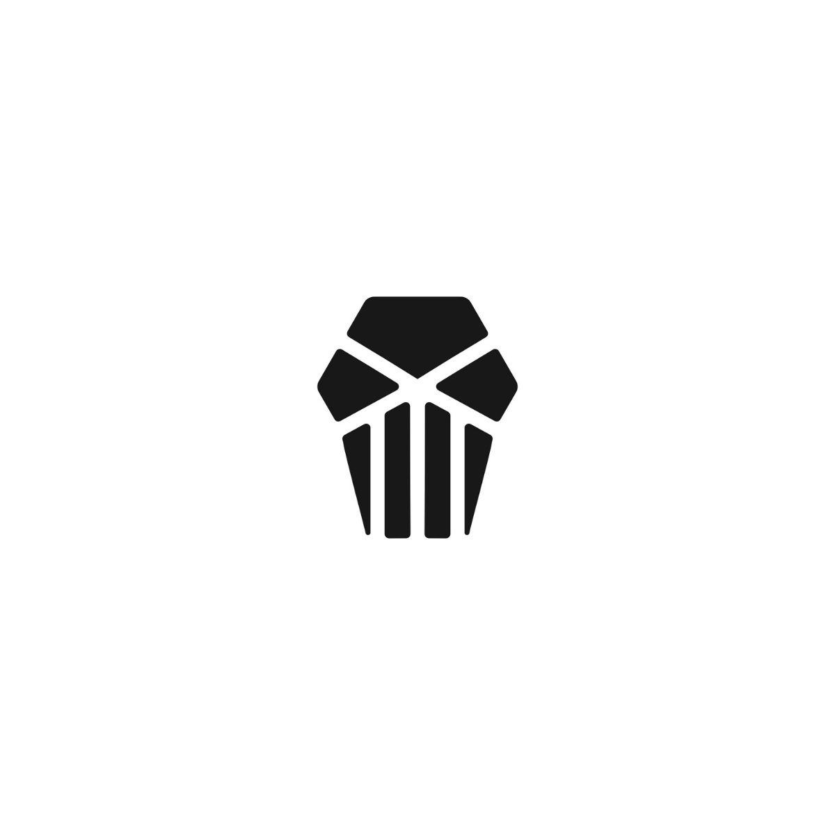
Gaming Club Logo Design crafted as a sharp, minimalist skull face an instantly recognizable emblem for esports teams, gaming clans, and competitive communities that want a modern, aggressive identity without visual clutter.
The geometric cuts and negative-space structure keep the mark crisp at small sizes (avatars, app icons) while still feeling premium on large placements like jerseys, hoodies, banners, and signage an important advantage for gaming brands that live across social platforms and merchandise.
Designed with versatility in mind, this modern logo mark works in monochrome and adapts cleanly to brand systems, making it ideal for stream overlays, Discord servers, tournament graphics, and sponsor decks. You’ll also get practical, production-friendly file readiness vector-first artwork that scales for print and can be exported to web formats without losing quality.
If you’re building a serious identity (not just a quick icon), this design style delivers the emotional trigger gaming audiences respond to confidence, intimidation, and team unity while staying clean enough for professional branding.

|
Aspect |
Details |
|---|---|
|
Title |
Gaming Club Logo Design | Cod Gray Minimal Skull Emblem (a clean, tournament-ready mark built for instant recognition across esports branding). |
|
Color Psychology |
Cod Gray (#1D1D1D) signals authority, control, and competitive focus perfect for gaming team identity where confidence and intimidation matter. Dark neutrals also elevate brand perception, making the logo feel premium, modern, and “pro league” across digital UI, merch, and sponsorship graphics. |
|
Shapes Used |
Geometric skull silhouette built from bold polygon blocks, sharp cut angles, and strong negative-space channels. The symmetrical structure creates a scalable icon mark that stays crisp as an avatar, while the vertical “teeth bars” add rhythm and balance for a clean esports emblem. |
|
Symbolism |
The minimalist skull communicates fearlessness, dominance, and high-stakes performance without looking chaotic or over-detailed. The sliced planes and hard edges hint at strategy, precision, and “no mercy” competitiveness, reinforcing a serious gaming club mindset. |
|
Typography |
Best paired with a condensed sans serif or tech-inspired wordmark (all-caps) to match the icon’s angular geometry. The type style should feel bold, tactical, and legible supporting fast recognition on jerseys, stream overlays, and social headers. |
|
Design Approach |
Modern minimal logo mark + negative space branding: fewer shapes, higher impact. The icon is designed for scalability-first use (small-size clarity), with a strong silhouette for brand recall ideal for esports teams that live on avatars, thumbnails, and merch drops. |
|
Best For |
Esports team branding, gaming clan logo systems, tournament clubs, FPS communities, streamers, and competitive gaming organizations. Also strong for “skull esports logo”, “minimal gamer logo”, “monochrome gaming emblem”, and “jersey-ready team icon” use cases. |
|
Target Audience |
Team owners, esports managers, gaming club admins, tournament organizers, streamers, and brand directors who need a professional identity that looks elite on merch and credible to sponsors—without the cost of complex illustration. |
|
Applications |
Discord server icon, Twitch/YouTube avatar, stream overlay badge, team jersey/hoodie print, stickers, patches, mousepads, event banners, signage, sponsor decks, website favicon, app icon, and social media branding templates. |
|
Why This Design? |
It differentiates by being aggressive yet clean a bold skull icon that reads instantly, scales perfectly, and stays premium in one color. The Cod Gray palette boosts versatility (dark/light backgrounds), while the geometric minimalism ensures long-term brand consistency across esports content and merchandise. |
Color Psychological Traits Table
| Color Name | Psychological Traits | Emotional Meaning | Branding Impact | Best For |
|---|---|---|---|---|
| Cod Gray | Sophistication, Neutrality | Calmness, Stability | Luxury, Trust, Balance | Luxury branding, Tech, Fashion, Packaging, Digital Design |
Color Description
Cod Gray (#1D1D1D) is a deep, neutral shade that embodies sophistication and modern elegance. In color psychology meaning, it communicates calmness, reliability, and balance, making it a powerful choice for brands seeking to project luxury and trust. Its subtle yet impactful presence in branding reinforces a sense of stability and refinement, positioning products and services as premium and dependable.
In branding, Cod Gray is synonymous with visual identity and professional maturity. Its use in logos and packaging conveys a message of exclusivity and minimalism, appealing to audiences who value quality and discretion. In digital design, this color creates a strong foundation for user interface, enhancing readability and user trust. The emotional impact of Cod Gray is subtle but profound, supporting consumer behavior by fostering feelings of security and confidence.
Modern branding trends favor Cod Gray for its versatility and ability to blend seamlessly with vibrant accent colors. It’s a staple in luxury color palettes and is frequently chosen for high-end fashion, tech, and corporate branding. By leveraging Cod Gray, brands can establish a memorable visual identity and connect with their audience through a refined, understated aesthetic.
Color Characteristics
-
Tone: Deep, neutral, understated
-
Depth: Rich, substantial, provides visual weight
-
Visual Temperature: Cool, calming, balanced
-
Saturation: Low, muted, subtle
-
Associations: Sophistication, luxury, professionalism, reliability
-
Branding Impressions: Premium, trustworthy, modern, minimalist
-
Cultural Significance: Universally associated with elegance and balance; often used in high-end branding across cultures
Full Color Conversion Table
| ValueFormat | Output |
|---|---|
| CSS HEX | #1D1D1D |
| RGB (Decimal) | 29, 29, 29 |
| RGB (Percentage) | 11.37%, 11.37%, 11.37% |
| CMYK | 0%, 0%, 0%, 88.63% |
| HSL | 0°, 0%, 11.37% |
| HSV / HSB | 0°, 0%, 11.37% |
| Web Safe Color | #333333 |
| CIE-LAB | 11.37, 0, 0 |
| CIE-XYZ | 1.37, 1.45, 1.56 |
| xyY | 0.313, 0.329, 1.45 |
| CIE-LCH | 11.37, 0, 0 |
| CIE-LUV | 11.37, 0, 0 |
| Hunter-Lab | 11.37, 0, 0 |
| Binary RGB | 00011101 00011101 00011101 |
Technical Color Explanation
In an RGB color space made from red, green, and blue light, Cod Gray (#1D1D1D) contains 11.37% red, 11.37% green, and 11.37% blue, resulting in a deep, neutral gray tone. In CMYK used for printing, it contains 0% cyan, 0% magenta, 0% yellow, and 88.63% black, making it ideal for premium print applications where deep, matte finishes are desired.
This color’s neutrality and low saturation provide a versatile base for branding, packaging, and digital design, supporting a wide range of emotional and consumer behavior responses.
1. Why choose professional Gaming Club Logo Design for your brand?
A professional Gaming Club Logo Design leverages brand psychology by evoking excitement, competition, and community core emotional triggers that resonate with gamers seeking belonging and thrill. From a design theory perspective, it incorporates bold geometry, dynamic lines, and pixel-inspired elements to ensure scalability across digital platforms like apps, streams, and merchandise, while maintaining versatility in color modes. This modern approach builds trust and authority in the competitive gaming industry, where a standout emblem differentiates your club from generic competitors and fosters long-term fan loyalty.
2. What key elements define effective Gaming Club Logo Design?
Effective Gaming Club Logo Design balances minimalist silhouettes with high-energy motifs like controllers, joysticks, or abstract avatars, drawing on design theory principles of negative space and asymmetry for instant visual impact. Brand psychology plays a pivotal role, triggering adrenaline and camaraderie to connect emotionally with esports enthusiasts and casual players alike. Tailored for industry relevance, these logos excel in versatile usage from Twitch overlays to apparel ensuring your gaming brand projects premium modernity and scalability without losing edge in fast-paced digital environments.
3. How does Gaming Club Logo Design incorporate modern trends?
Gaming Club Logo Design embraces modern trends like glitch effects and neon gradients, rooted in design theory’s emphasis on motion illusion to capture the high-octane essence of gaming culture. Psychologically, it taps into emotional triggers of empowerment and innovation, making members feel part of an elite, forward-thinking community. Ideal for industry applications such as tournament branding or social media, this approach guarantees flexible usage across vectors and animations, positioning your club as an authoritative player in the evolving esports landscape.
4. What makes a minimalist Gaming Club Logo Design stand out?
A minimalist Gaming Club Logo Design shines through clean lines and subtle icons like a stylized headset or pixel heart applying design theory’s less-is-more philosophy for timeless appeal and quick recognition. It harnesses brand psychology to evoke focus and intensity, emotional anchors that draw gamers into a sense of precision and shared passion. Highly relevant for gaming hubs, this style supports seamless logo usage in black-and-white prints, app icons, or VR interfaces, enhancing your brand’s premium authority amid cluttered digital marketplaces.
5. How to ensure scalability in Gaming Club Logo Design?
Scalability in Gaming Club Logo Design relies on vector-based construction and simplified forms, per design theory standards, allowing flawless adaptation from favicon size to massive arena banners. Brand psychology amplifies this by instilling reliability and professionalism, emotionally reassuring users of your club’s enduring commitment to quality gaming experiences. In the gaming industry, where logos appear on everything from mobile apps to event merch, this ensures versatile, high-impact usage that reinforces trust and positions your brand as a scalable leader.
6. Why is color psychology vital in Gaming Club Logo Design?
Color psychology in Gaming Club Logo Design uses vibrant hues like electric blue for energy and fiery red for competition, strategically triggering excitement and urgency to forge deep emotional bonds with gaming audiences. Grounded in design theory, these choices maintain harmony and adaptability for monochrome or themed variants, vital for consistent branding. For gaming clubs, this translates to powerful logo usage in live streams, jerseys, and ads, elevating industry presence with authoritative, mood-driven visuals that command attention and loyalty.
7. How does Gaming Club Logo Design boost brand identity?
Gaming Club Logo Design elevates brand identity by merging iconic gaming symbols with bespoke typography, leveraging design theory for memorable, proprietary visuals that stand alone or integrate seamlessly. It activates brand psychology’s emotional triggers triumph, teamwork, immersion to cultivate a devoted community in the gaming sector. With flexible usage across websites, Discord servers, and sponsorships, it establishes your club as a premium authority, driving recognition and growth in a crowded esports arena.
Reviews
There are no reviews yet.