


Description
Hand-drawn eco brand logo design is the antidote to the over-polished, AI-generated corporate look of the past decade. In 2026, consumers crave transparency and heritage; our custom logo service delivers a visual soul for your sustainable business. We blend freehand mascot art, organic fluid shapes, and rustic linework to create a signature mark that feels as natural as the products you create.
Why Choose an Artisanal Hand-Drawn Identity?
-
Human Connection: Our hand-inked details and pencil-sketch textures communicate a “back-to-nature” philosophy that sterile fonts simply cannot replicate.
-
Strategic Versatility: Every design is built as a responsive brand system, ensuring your emblem looks stunning on a 100% recycled hangtag or a high-resolution mobile retina display.
-
Eco-Conscious Palette: We utilize neuroscience-backed, earthy color stories—muted moss greens, warm minerals, and terracotta—to trigger emotional resonance and brand loyalty.
Features & Premium Benefits:
-
Custom Botanical Illustrations: Tailored imagery including vines, leaves, and organic symbols that avoid the “cliché green” traps.
-
Sustainable Typography: Hand-lettered fonts that mirror the ethical craftsmanship of your brand.
-
Packaging-Ready Assets: High-contrast, minimalist designs optimized for low-ink print sustainability on textured paper.
-
Full Commercial Rights: Own a unique, trademark-ready asset that stands out in a saturated marketplace.
Whether you are launching a slow-fashion boutique or a farm-to-table organic kitchen, our hand-drawn approach ensures your brand isn’t just seen—it’s felt.
| Aspect | Details |
| Title | Hand-Drawn Eco Brand Logo for Conscious Intellectual Identity |
| Color Psychology | The palette utilizes Deep Forest Green (#1F493D) and Subdued Sage (#336659). These professional shades move beyond “bright lime” clichés to communicate stability, heritage, and environmental wisdom. The dark tones signify authority and growth, grounding the brand in trust and eco-conscious maturity. |
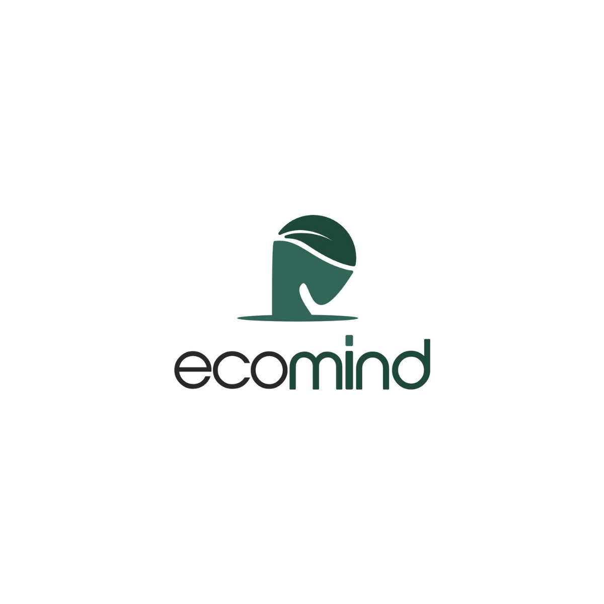
| Shapes Used | The design features a fluid silhouette of a human profile merged with a stylized botanical leaf contour. The soft, rounded curves of the “mind” suggest empathy and approachability, while the horizontal oval base provides a grounding “shadow” effect that anchors the brand in the physical world. |
| Symbolism | This logo symbolizes the synergy between human intelligence and nature. The leaf acting as the “brain” or hair suggests a brand rooted in sustainable thinking, mental wellness, or organic innovation. It evokes emotions of clarity, mindfulness, and a “green” state of mind, positioning the business as an ethical thought leader. |
| Typography | A modern geometric sans-serif typeface with generous kerning. The lowercase “ecomind” communicates accessibility and modernism. The clean, uniform stroke weights provide a high-contrast professional finish that balances the organic fluidity of the hand-drawn icon. |
| Design Approach | A minimalist-organic aesthetic that prioritizes negative space and silhouette clarity. By blending a human element with a botanical mark, the design uses “metaphorical fusion” to create a memorable brand anchor that feels both artisanal and technically precise. |
| Best For | Ideal for sustainable tech startups, environmental consulting firms, organic mental health apps, and eco-friendly educational platforms. It specifically targets the “Green Intellect” niche where sustainability meets professional services. |
| Target Audience | Eco-conscious decision-makers, millennial entrepreneurs, and ethical consumers who value “Mindful Living.” It appeals to B2B and B2C buyers who prioritize intellectual sustainability and social responsibility. |
| Applications | Optimized for sustainable corporate stationery, high-resolution web headers, embossed eco-packaging, and mobile app icons. The solid-fill design ensures perfect legibility on embroidered apparel and low-ink sustainable print media. |
| Why This Design? | This logo stands out because it avoids the “generic leaf” trope by adding a human-centric narrative. It bridges the gap between nature and logic, offering a premium visual identity that promises both environmental stewardship and high-level strategic thinking. |
| Color Name | Psychological Traits | Emotional Meaning | Branding Impact | Best For |
| Deep Forest Green | Authority, Stability, Wisdom, Heritage. | Evokes a sense of permanence and deep-rooted trust. | Establishes a brand as a high-authority leader in sustainability. | Corporate eco-consulting, luxury sustainable goods, ethical finance. |
| Subdued Sage | Balance, Growth, Tranquility, Renewal. | Triggers feelings of calm, clarity, and “mindful” consumption. | Softens brand perception; makes complex organizations feel approachable. | Organic skincare, mental wellness apps, slow-fashion boutiques. |
2. SEO-Optimized Color Description
The color symbolism of this palette centers on the “Evolution of Green.” While neon greens often signal cheap or transient eco-labels, the combination of Deep Forest Green and Subdued Sage creates a premium brand perceptionrooted in color psychology meaning. The deep emerald undertones of #1F493D act as an anchor of reliability and traditional wisdom, while the lighter sage provides a breath of freshness and modern innovation.
In terms of marketing color theory, this duo directly influences consumer behavior by lowering visual stress and increasing user trust. It moves the narrative from “environmentally friendly” to “environmentally responsible.” This visual identity is highly effective in logos or product packaging because it mimics the natural shading found in deep foliage, creating an emotional impact of authenticity and high-value craftsmanship. In modern branding trends, these desaturated, earthy tones are the gold standard for “quiet luxury” in the sustainable sector.
3. SEO-Optimized Color Characteristics
-
Tone & Depth: Features a rich, low-value base (Forest) contrasted with a medium-value mid-tone (Sage), creating a professional “chiaroscuro” effect in hand-drawn illustrations.
-
Visual Temperature: Cool to neutral. These colors recede slightly, making the brand appear calm, composed, and non-aggressive.
-
Saturation: Subdued and desaturated. This choice avoids “digital fatigue” and aligns with luxury color palettestandards.
-
Branding Impressions: Conveys an image of an “Expert Naturalist”—someone who understands science and nature equally.
-
Cultural Significance: Globally recognized as the color of life, renewal, and ecological preservation; in many cultures, these darker greens also represent wealth and prosperity.
-
Design Behavior: Highly legible as a background or a primary stroke color; pairs exceptionally well with metallic gold or recycled craft-paper textures.
4. Full Color Conversion Table
This table provides the precise technical data for Deep Forest Green (#1F493D), the primary anchor of your brand.
| Value Format | Output (#1F493D) | Output (#336659) |
| CSS HEX | #1F493D | #336659 |
| RGB (Decimal) | 31, 73, 61 | 51, 102, 89 |
| RGB (Percentage) | 12.2%, 28.6%, 23.9% | 20.0%, 40.0%, 34.9% |
| CMYK | 58%, 0%, 16%, 71% | 50%, 0%, 13%, 60% |
| HSL | 163°, 40%, 20% | 165°, 33%, 30% |
| HSV / HSB | 163°, 58%, 29% | 165°, 50%, 40% |
| Web Safe Color | #333333 (Approx) | #336666 (Approx) |
| CIE-LAB | 26.54, -18.72, 3.42 | 39.46, -21.43, 3.39 |
| CIE-XYZ | 4.38, 6.42, 5.31 | 10.65, 14.54, 11.64 |
| xyY | x:0.271, y:0.398, Y:6.42 | x:0.290, y:0.395, Y:14.54 |
| CIE-LCH | 27, 19, 170 | 39, 22, 171 |
| CIE-LUV | 27, -18, 1 | 39, -23, 2 |
| Hunter-Lab | 25.34, -11.96, 3.39 | 38.13, -16.22, 4.35 |
| Binary RGB | 00011111 01001001 00111101 | 00110011 01100110 01011001 |
1. Color Psychological Traits Table
2. Color Description
The color symbolism of this palette centers on the “Evolution of Green.” While neon greens often signal cheap or transient eco-labels, the combination of Deep Forest Green and Subdued Sage creates a premium brand perceptionrooted in color psychology meaning. The deep emerald undertones of #1F493D act as an anchor of reliability and traditional wisdom, while the lighter sage provides a breath of freshness and modern innovation.
In terms of marketing color theory, this duo directly influences consumer behavior by lowering visual stress and increasing user trust. It moves the narrative from “environmentally friendly” to “environmentally responsible.” This visual identity is highly effective in logos or product packaging because it mimics the natural shading found in deep foliage, creating an emotional impact of authenticity and high-value craftsmanship. In modern branding trends, these desaturated, earthy tones are the gold standard for “quiet luxury” in the sustainable sector.
3. Color Characteristics
-
Tone & Depth: Features a rich, low-value base (Forest) contrasted with a medium-value mid-tone (Sage), creating a professional “chiaroscuro” effect in hand-drawn illustrations.
-
Visual Temperature: Cool to neutral. These colors recede slightly, making the brand appear calm, composed, and non-aggressive.
-
Saturation: Subdued and desaturated. This choice avoids “digital fatigue” and aligns with luxury color palettestandards.
-
Branding Impressions: Conveys an image of an “Expert Naturalist”—someone who understands science and nature equally.
-
Cultural Significance: Globally recognized as the color of life, renewal, and ecological preservation; in many cultures, these darker greens also represent wealth and prosperity.
-
Design Behavior: Highly legible as a background or a primary stroke color; pairs exceptionally well with metallic gold or recycled craft-paper textures.
4. Full Color Conversion Table
This table provides the precise technical data for Deep Forest Green (#1F493D), the primary anchor of your brand.
5. Technical Color Explanation
In an RGB color space (digital displays), Deep Forest Green (#1F493D) is composed of 12.2% red, 28.6% green, and 23.9% blue. This low-red concentration is what gives the color its cool, shadowy depth.
In the CMYK color model used for professional offset printing and sustainable packaging, this color is achieved with 58% cyan, 0% magenta, 16% yellow, and 71% black. The high percentage of black (K) is critical for maintaining the “Forest” depth on porous, recycled paper stocks, ensuring the logo does not appear “washed out” during the printing process.
1. How does a hand-drawn eco brand logo improve customer trust compared to a standard vector logo? I
In a market saturated with generic “stock” icons, a hand-drawn logo acts as a visual certificate of authenticity. It communicates that your brand is “human-led” rather than “corporate-driven.” This “handmade” aesthetic triggers a psychological connection with consumers who value transparency, as the tiny imperfections in hand-inked lines mimic the organic irregularities found in nature, making your brand feel more relatable and honest.
2. Can a hand-drawn logo actually reduce my brand’s physical environmental footprint?
Yes. Through a process called Eco-Branding Design, we optimize hand-drawn marks to use less ink during mass production. By utilizing “hollow” hand-lettering, fine linework instead of heavy flat areas of color, and “ink-saving” textures (like stippling or cross-hatching), we can reduce ink consumption by up to 35% on packaging. This significantly lowers the chemical waste and costs associated with large-scale printing.
3. Is a hand-drawn aesthetic suitable for high-tech sustainable startups?
Absolutely. Modern sustainable tech brands often use the “Hand-Drawn” style to “soften” their technical image. It creates a bridge between advanced innovation and the planet. By pairing a hand-sketched icon with a clean, modern sans-serif typeface, you create a “Minimalist-Organic” identity that feels both cutting-edge and environmentally grounded.
4. How do you ensure a hand-drawn logo remains scalable and clear on small digital screens?
While the process is hand-drawn, the delivery is high-precision vector. We meticulously trace hand-sketched artwork into digital paths, ensuring that the “organic feel” is preserved while the file remains technically perfect. This allows the logo to remain crisp and legible whether it’s on a tiny website favicon or a massive billboard.
5. Why are muted greens like Forest (#1F493D) and Sage (#336659) preferred over bright lime greens in 2026?
The branding industry is moving away from “Neon Green” because it is often associated with “Greenwashing.” Muted, earthy tones represent the “True-to-Nature” movement. Deep Forest Green conveys authority and heritage, while Sage represents renewal and balance. These shades are more sophisticated and suggest a long-term, serious commitment to environmental stewardship.
Reviews
There are no reviews yet.