Description
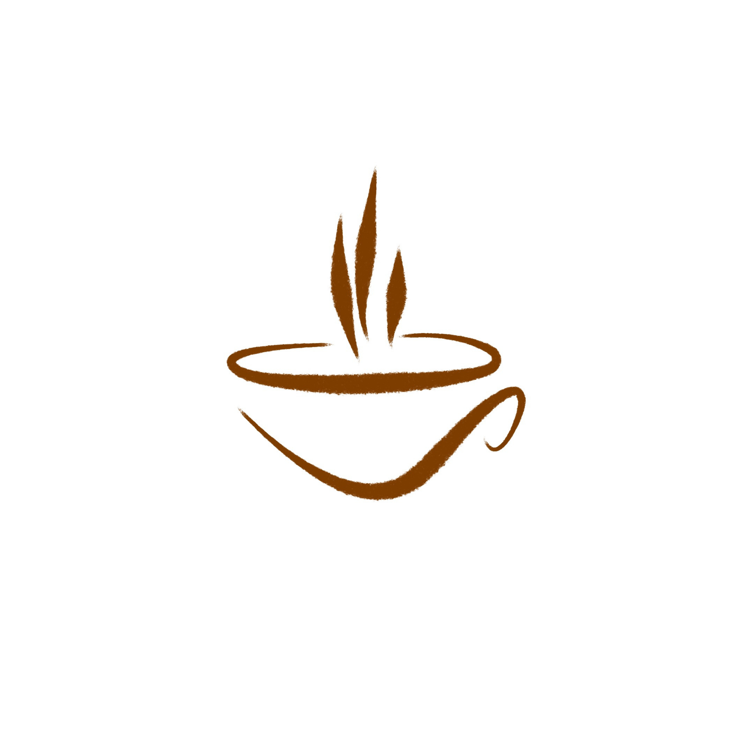
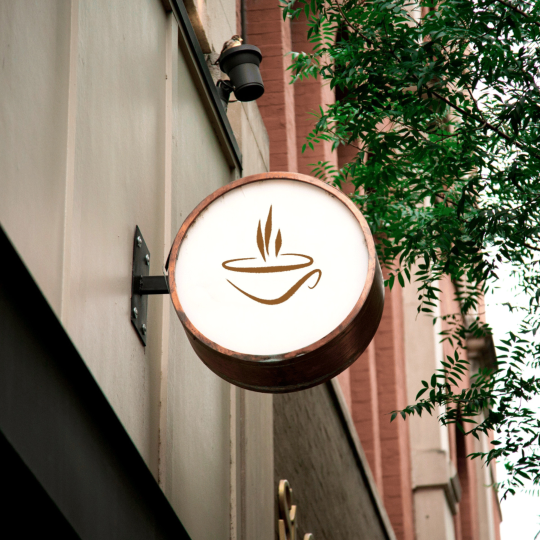
Brush style coffee shop logo created to capture that “freshly brewed” feeling with expressive, hand-brushed lines and a simple steam-cup silhouette. This mark is designed to feel premium yet approachable perfect for coffee houses that want a clean visual identity with a handcrafted touch (without looking messy or overly rustic).
Why it works for coffee branding:
-
Brush-style linework adds personality and warmth, giving your brand an artisanal, human vibe.
-
Minimal silhouette stays clear at small sizes (social avatars, app icons) and looks bold on large placements (signage, wall graphics).
-
Built for scalability a vector-based logo can be resized for anything from stickers to storefront signs without losing sharpness.
|
Aspect |
Details |
|---|---|
|
Title |
Brush Style Coffee Shop Logo Design – Handcrafted Steam-Cup Identity |
|
Color Psychology |
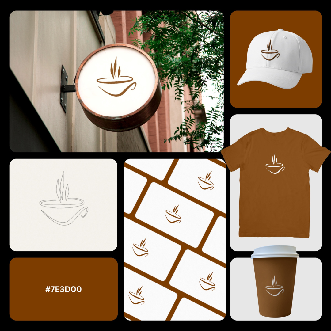
The deep espresso-brown #7E3D00 delivers instant “coffee credibility.” In brand psychology, warm browns signal comfort, authenticity, craft, and premium warmth perfect for cafés that want to feel welcoming while still elevated. This tone also cues roasted beans, cacao, wood interiors, and barista culture, helping customers associate the brand with quality and familiar aroma. |
|
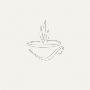
Shapes Used |
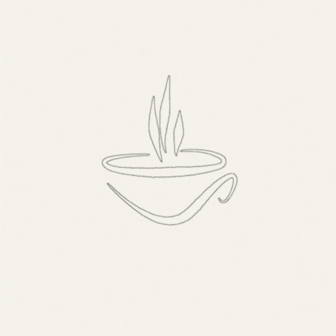
A minimal cup silhouette built with brush-stroke contours, an elliptical rim for volume, and vertical steam strokes that create upward motion. The handle is a single flowing curve, keeping the icon clean, scalable, and recognizable at small sizes ideal for modern logo mark usage. |
|
Symbolism |
The cup communicates hospitality + service, while the rising steam evokes fresh brew, warmth, and aroma. The brush-style lines add a human touch subtly signaling handcrafted drinks, small-batch roasting, and artisan coffee moments, without needing complex illustration. |
|
Typography |
This icon is designed to pair best with clean sans-serifs (modern café feel) or refined serifs (heritage roaster vibe). Because the mark is expressive, typography should be balanced and legible, giving the brand a confident, premium impression across signage and packaging. |
|
Design Approach |
A minimalist brush logo approach: fewer elements, stronger recall. The expressive stroke texture adds personality while the simplified form protects clarity, scalability, and brand consistency a smart choice for coffee brands that want a distinctive visual identity without visual noise. |
|
Best For |
Specialty coffee shops, espresso bars, artisan cafés, coffee roasters, bakery + coffee concepts, coffee trucks, boutique beverage brands, and minimal café branding for modern storefronts. Also ideal for coffee packaging logo design (beans, labels, sleeves) and premium café logo identity projects. |
|
Target Audience |
Café founders, specialty roasters, coffee truck owners, boutique hospitality brands, and brand managers who want a clean, premium coffee logo that feels crafted and memorable. Also suited for agencies building cohesive café brand systems across digital + print. |
|
Applications |
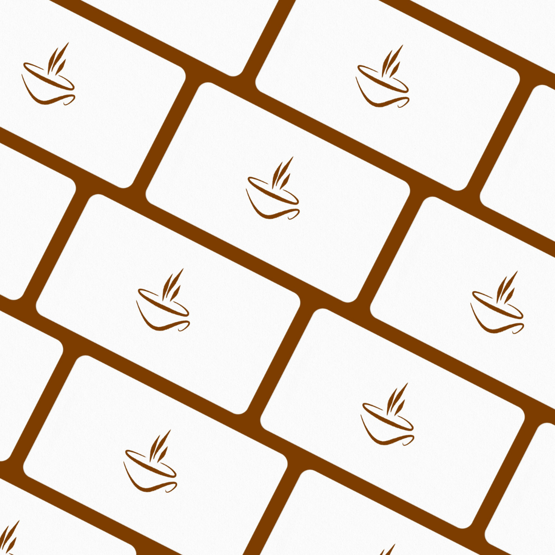
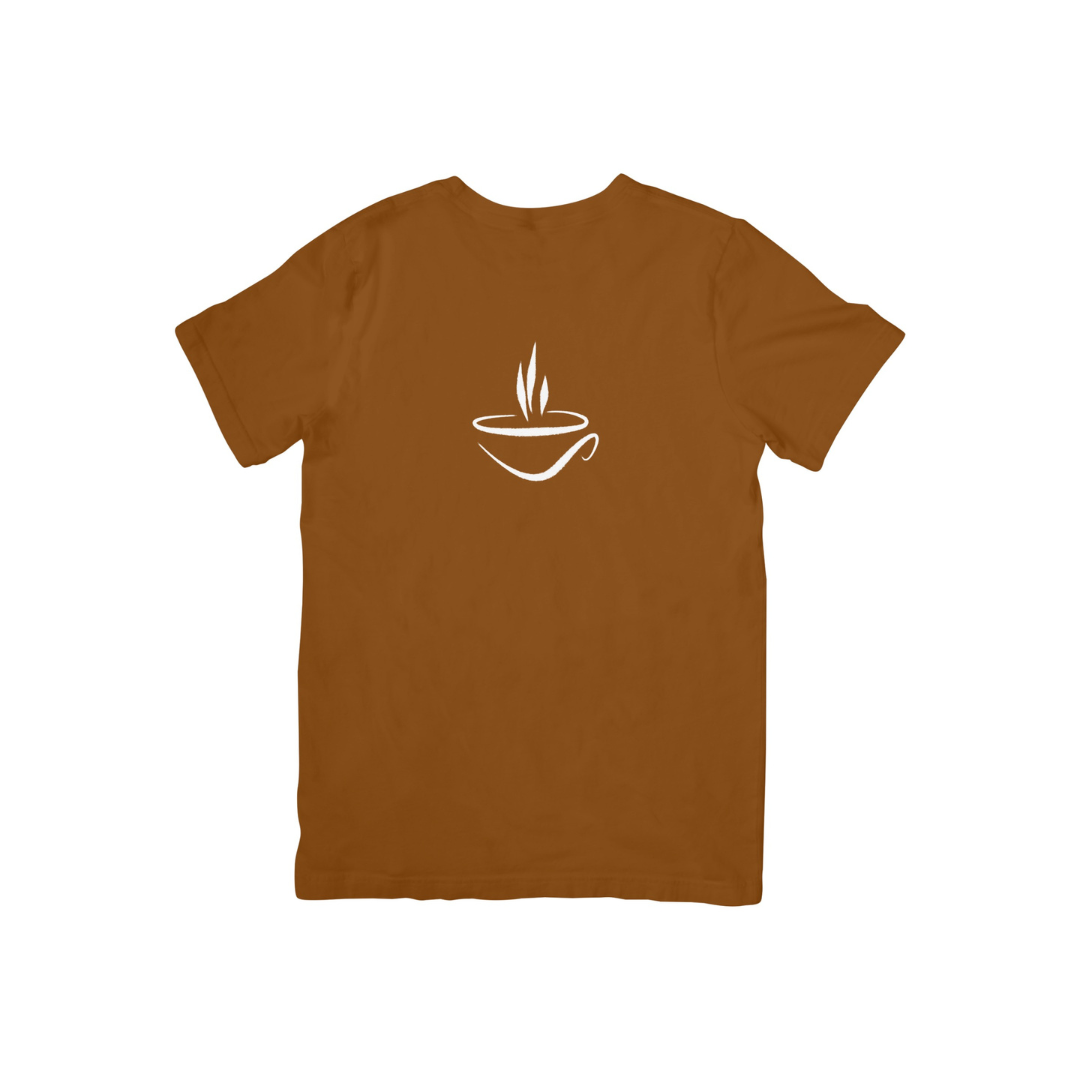
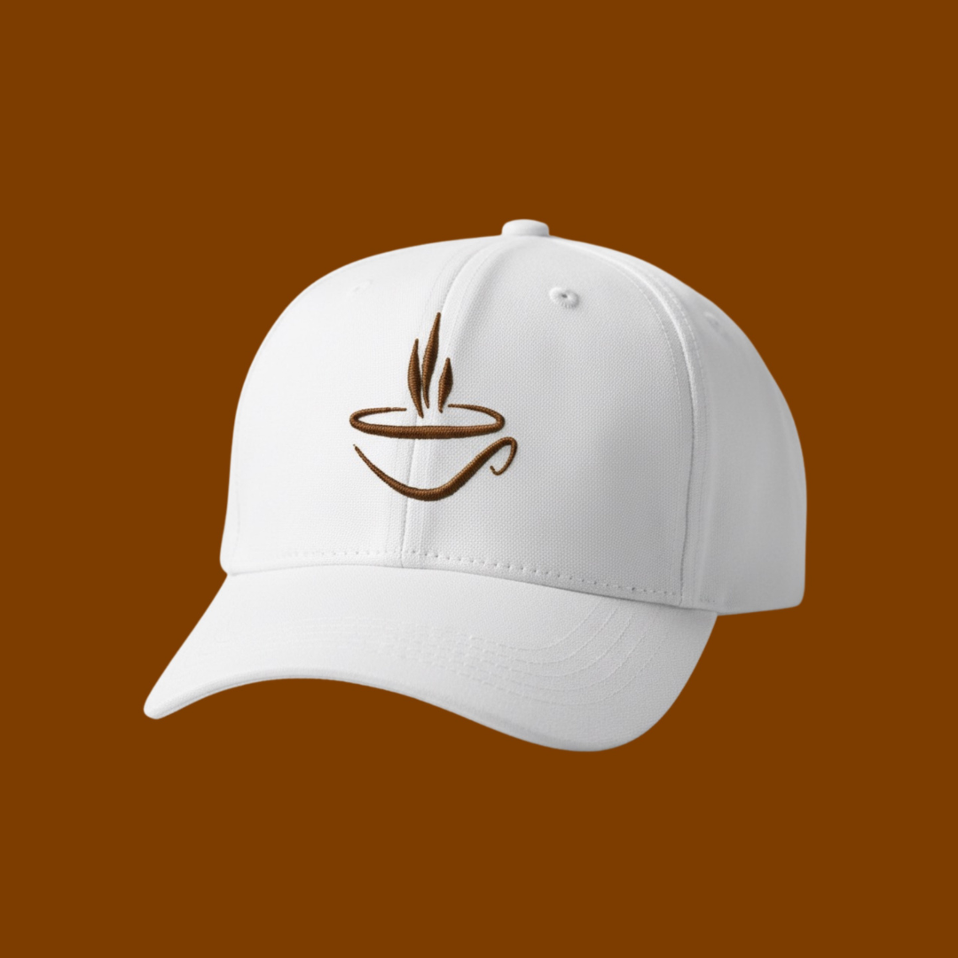
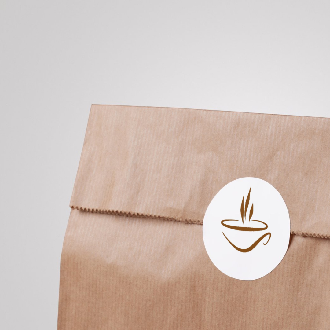
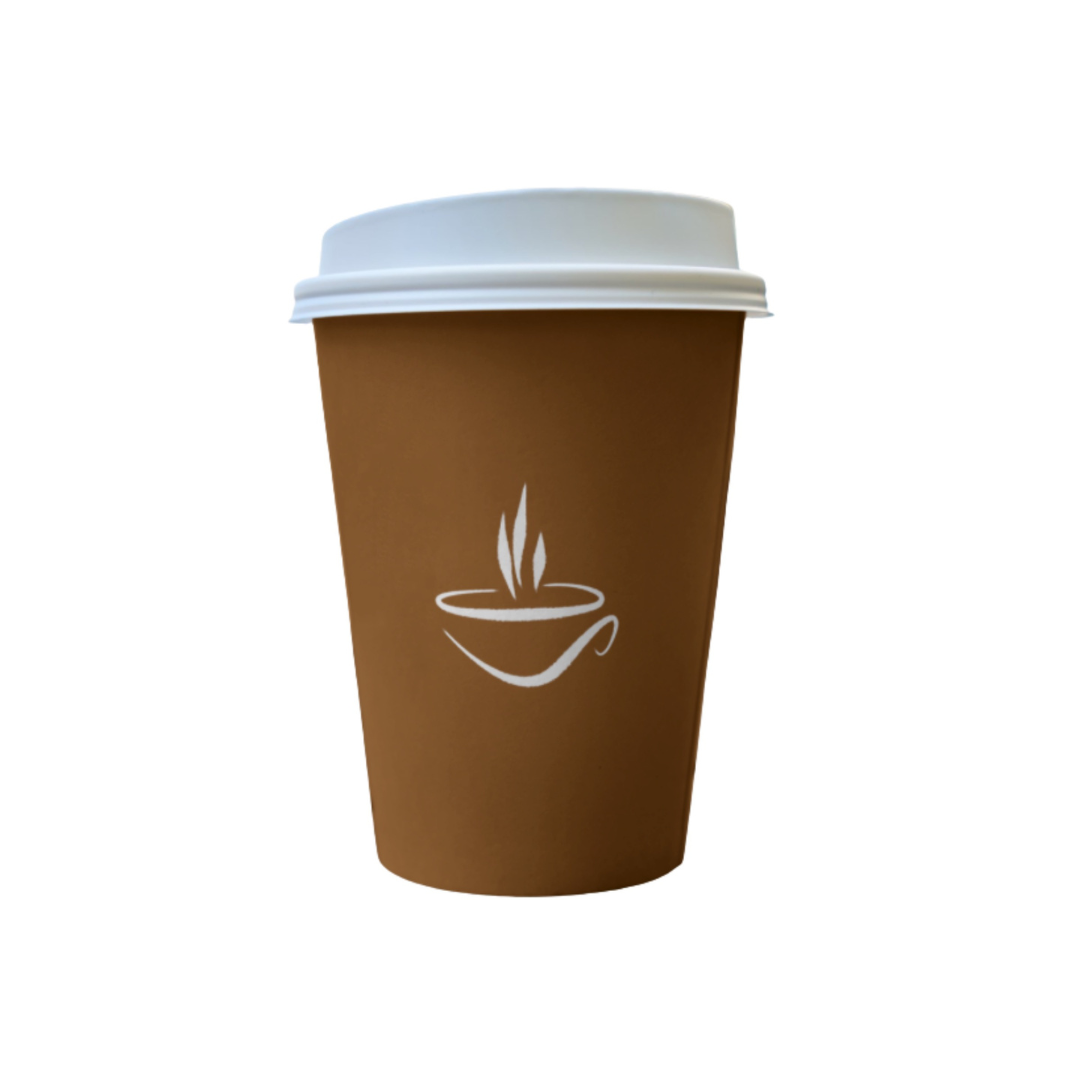
Storefront signage, menu boards, loyalty cards, cup sleeves, takeaway cups, packaging labels, coffee bags, stickers, stamps, social media avatars, website headers, delivery apps, uniforms, embroidery, and merch (caps/tees). The simple mark structure supports single-color printing, foil, emboss, and laser engraving. |
|
Why This Design? |
It differentiates through brush-style character while staying minimal and versatile. The mark feels warm and handcrafted (emotional pull) yet remains clean enough for premium positioning (commercial pull). This balance improves recognition, scalability, and brand trust, making it a strong long-term asset for café branding and packaging. |
1. Color Psychological Traits Table
| Color Name | Psychological Traits | Emotional Meaning | Branding Impact | Best For Industries |
|---|---|---|---|---|
| Deep Copper Brown (#7E3D00) | Grounded, authentic, reliable, sophisticated, resilient | Stability, warmth, security, tradition, comfort | Establishes trustworthiness and premium craftsmanship | Luxury goods, artisanal products, outdoor apparel, heritage brands, organic foods, financial services, furniture design, leather goods, specialty coffee, automotive finishing |
2. Color Description
Deep Copper Brown (#7E3D00) represents a profound intersection of earth and craftsmanship in color symbolism. This rich, oxidized hue carries the weight of aged leather, roasted coffee beans, and hand-forged metal elements that speak to authenticity and enduring quality. In color psychology meaning, this shade communicates unwavering reliability while maintaining an approachable warmth, creating an emotional impact that resonates with consumers seeking substance over fleeting trends.
Within brand perception strategies, this color operates as a non-verbal anchor of trust. It evokes associations with artisanal mastery and natural materials, making it exceptionally effective for brands that wish to emphasize heritage, durability, and organic origins. The color’s visual identity strength lies in its ability to appear simultaneously premium and accessible a rare duality in marketing color theory. When applied to packaging or digital interfaces, it creates a psychological container that suggests protected value and thoughtful curation.
Modern branding trends increasingly favor such authentic, grounded palettes as consumers demonstrate heightened awareness of greenwashing and superficial marketing. Deep Copper Brown addresses this discernment through genuine material associations that align with sustainable practices and conscientious consumer behavior. In logo implementation, this color performs exceptionally well for companies in premium food and beverage, luxury leather goods, heritage financial institutions, and artisanal crafts sectors where trust must be visually immediate and emotionally compelling.
The color’s effectiveness in packaging design stems from its tangible quality perception. Studies in visual identity response indicate that warmer brown tones subconsciously signal reduced risk in purchasing decisions, particularly for consumable goods and investment-grade products. When paired with metallic accents or textured substrates, #7E3D00 achieves a multi-sensory suggestion of quality that transcends mere visual appeal, creating holistic brand experiences that foster long-term customer loyalty.
3. Color Characteristics
• Tone & Depth: A low-luminance, high-chroma shade with substantial visual weight and material presence
• Visual Temperature: Warm terrestrial hue with subtle fiery undertones reminiscent of smoldering embers
• Saturation Profile: Highly saturated yet naturally muted, avoiding artificial vibrancy for organic credibility
• Primary Associations: Aged mahogany, dark roasted coffee, weathered leather, terra cotta pottery, bronze patina
• Branding Impressions: Artisanal craftsmanship, heritage preservation, environmental consciousness, premium durability
• Cultural Significance: Globally recognized as representing earth, stability, and handmade quality across diverse markets
• Psychological Positioning: Occupies the nexus between rugged reliability and sophisticated warmth in consumer perception
• Adaptive Compatibility: Functions as both dominant brand color and sophisticated accent within luxury color palettes
4. Complete Color Conversion Table
| Value | Format | Output |
|---|---|---|
| CSS HEX | #7E3D00 |
|
| RGB (Decimal) | rgb(126, 61, 0) |
|
| RGB (Percentage) | rgb(49.4%, 23.9%, 0%) |
|
| CMYK | cmyk(0%, 52%, 100%, 51%) |
|
| HSL | hsl(30°, 100%, 25%) |
|
| HSV / HSB | hsv(30°, 100%, 49%) |
|
| Web Safe Color | #663300 |
|
| CIE-LAB | L*: 33.12, a*: 21.46, b*: 45.92 |
|
| CIE-XYZ | X: 10.12, Y: 8.02, Z: 1.03 |
|
| xyY | x: 0.531, y: 0.421, Y: 8.02 |
|
| CIE-LCH | L*: 33.12, C*: 50.67, h°: 64.96 |
|
| CIE-LUV | L*: 33.12, u*: 45.12, v*: 53.94 |
|
| Hunter-Lab | L: 32.18, a: 14.33, b: 34.91 |
|
| Binary RGB | 01111110 00111101 00000000 |
5. Technical Color Explanation
In the RGB additive color model used for digital displays, #7E3D00 comprises approximately 49.4% red light intensity, 23.9% green light, and 0% blue light. This combination creates the distinctive warm brown-orange perception through controlled chromatic balance.
Within the CMYK subtractive system essential for professional printing, this color decomposes to 0% cyan, 52% magenta, 100% yellow, and 51% black a formulation emphasizing the dominance of yellow and magenta pigments moderated by substantial black density.
The HSL representation at hue 30° (within the orange spectrum), 100% saturation, and 25% lightness confirms its position as a deeply saturated warm earth tone with reduced luminance.
The CIE-LAB coordinates (L: 33.12) indicate a moderately dark color with significant chromatic intensity (C: 50.67) positioned within the orange-yellow quadrant of the color space, confirming its visual characteristics as a rich, material-inspired shade suitable for premium applications across both digital and print media.
1) What makes a brush style coffee logo design ideal for artisan cafés and specialty roasters?
A brush style coffee logo design signals “handcrafted quality” at first glance perfect for brands that want to feel small-batch, personal, and premium. From a brand-psychology angle, organic brush strokes trigger warmth, authenticity, and creativity, which customers often associate with fresh roasting and curated blends. In design theory, controlled irregularity (natural stroke taper, texture balance, and negative space) helps the mark feel human without looking messy. It performs especially well on coffee bags, cup sleeves, loyalty cards, and storefront signage where a “made with care” vibe drives purchase decisions.
2) How do you keep a brush style coffee logo design readable on cups, stamps, and small labels?
For a brush style coffee logo design to stay legible, the stroke contrast and letter spacing must be engineered for micro-sizes not just a pretty hero mockup. A branding system approach uses simplified logo variations (primary mark, small-size wordmark, and icon-only badge) so the design remains crisp on cup stamps, lid stickers, and bag seals. Design theory matters here: reduce texture noise, avoid ultra-thin terminals, and build a high-contrast silhouette that survives one-color printing. Psychologically, clarity reinforces trust customers read “professional craft,” not “DIY.”
3) What logo variations should a brand request for a brush style coffee logo design system?
A complete brush style coffee logo design package should include a primary brush wordmark, a simplified brush style coffee logo for small sizes, and a badge emblem (often a cup, bean, or roaster seal) for packaging and social avatars. Add a one-color version for stamping and embroidery, plus a reversed mark for dark backgrounds like chalkboards and espresso machines. From a brand-identity standpoint, these variations protect consistency across touchpoints while keeping the handmade energy. Emotionally, the system keeps the brand recognizable everywhere creating familiarity that increases repeat orders.
4) Which colors and typography pair best with a brush style coffee logo design without looking generic?
A brush style coffee logo design pairs best with grounded, appetite-friendly palettes espresso brown, oat cream, charcoal, or muted terracotta because they evoke comfort, richness, and ritual. In design theory, brush lettering works when it’s anchored by a clean secondary typeface (modern sans or refined serif) to create hierarchy and balance. This contrast communicates “art + precision,” ideal for premium cafés, organic coffee, and boutique roasters. The emotional trigger is cozy confidence: it feels approachable yet elevated, like a café customers want to identify with.
5) Is a brush style coffee logo design better for modern brands or rustic brands?
A brush style coffee logo design is flexible it can lean modern or rustic depending on stroke treatment, spacing, and supporting elements. Smooth, controlled brush scripts with minimal texture feel contemporary and “design-forward,” while rougher brush marks and distressed badges lean farmhouse or street-market. From brand psychology, smoother forms signal premium and curated, while textured strokes suggest raw craft and authenticity. The key is aligning the brush energy with your positioning: specialty, lifestyle café, coffee truck, or heritage roaster.
6) How do you make a brush style coffee logo design stand out in a crowded café market?
To differentiate a brush style coffee logo design, focus on unique brand cues: a custom stroke style, a distinct ligature, or an original icon that reflects your origin story (single-estate, local roast, latte culture, or espresso bar). Design theory recommends building a signature silhouette and consistent visual rhythm so the mark remains recognizable even in one color. From an industry perspective, this helps on shelves, delivery apps, and social feeds where customers compare in seconds. Emotionally, distinctiveness creates “identity pride” people remember it, photograph it, and share it.
7) What should I include in a design brief for a brush style coffee logo design to get premium results?
A strong brief for a brush style coffee logo design should define brand personality (cozy, bold, minimalist, luxury, playful), target audience, and where the logo must work (bags, cups, signage, app icon, stamps, merchandise). Include competitors you want to avoid, plus must-have cues like “hand-painted brush style logo,” “minimal coffee emblem,” or “modern café wordmark.” From a strategy standpoint, mention your emotional goal comfort, energy, indulgence, or craft so the designer can shape stroke dynamics and typography accordingly. Clear usage requirements lead to a scalable logo system that looks premium everywhere, not just on Instagram.
Reviews
There are no reviews yet.