
Description
U+Bird Lettermark Logo Design is a minimalist logo concept crafted to help brands look instantly credible without visual noise. Lettermarks are trusted for professional identities because they simplify a brand name into a sharp, memorable initial that stays legible across tiny icons and large signage.
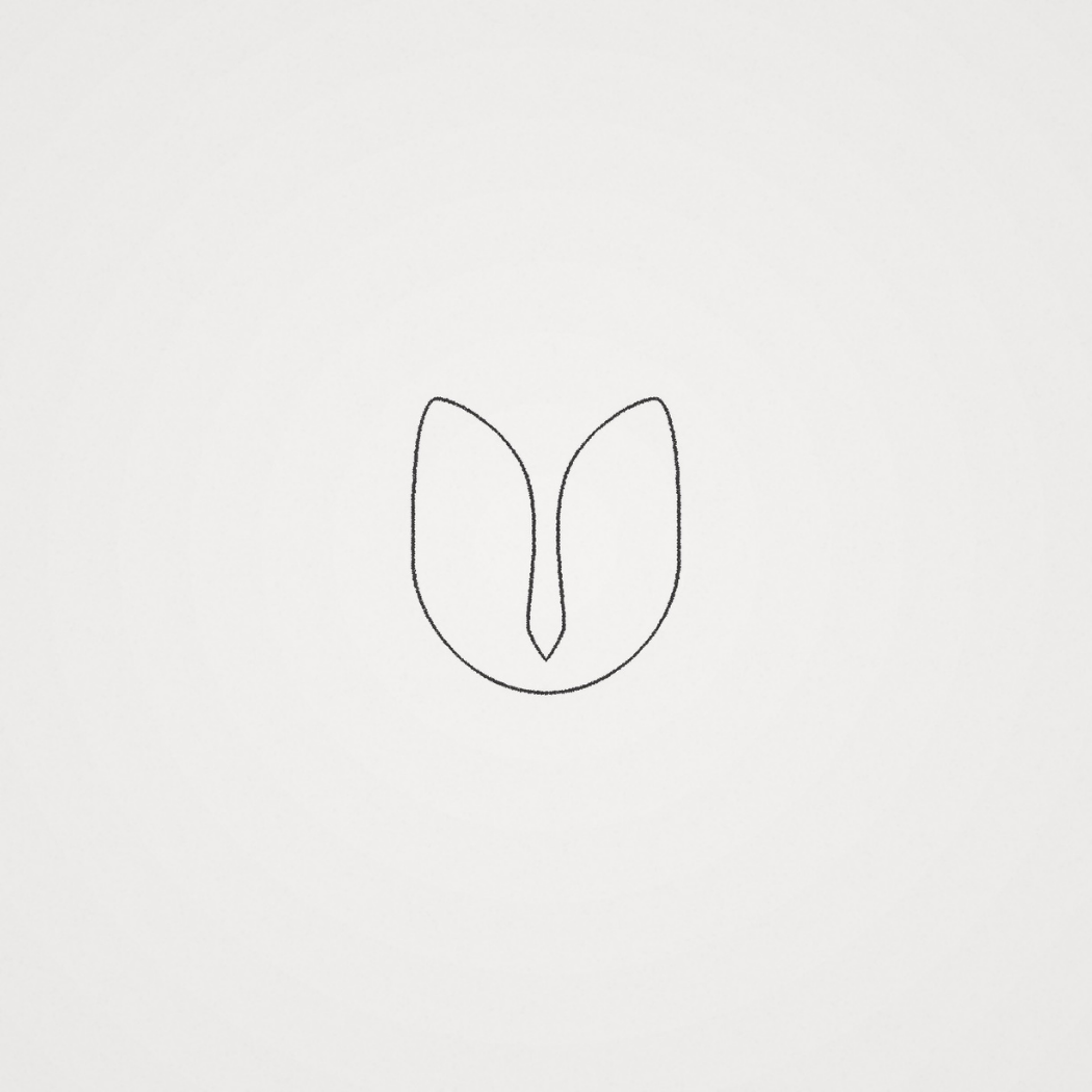
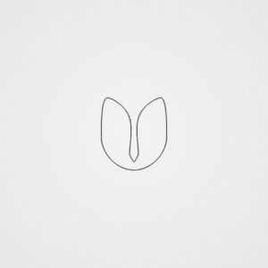
The defining detail here is the negative space bird tucked into the “U” form an elegant symbol of vision, direction, and forward momentum. Negative space design adds “aha” value and makes a mark feel smarter and more premium, which is perfect for consulting firms, agencies, startups, and modern service brands.
What you get (built for real-world branding):
-
A scalable vector logo mark for crisp results at any size (web, print, signage)
-
Practical logo variations for flexibility (full color, one-color, icon-only, light/dark use
-
Professional delivery formats for every workflow, including EPS for high-resolution print production
-
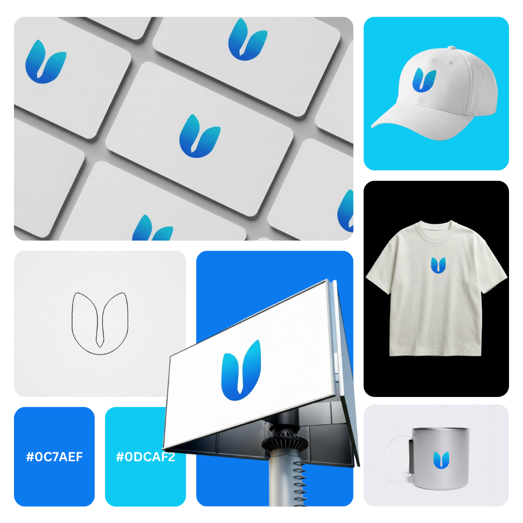
Mockup-ready assets for social media, stationery, pitch decks, website headers, and app icons
|
Aspect |
Details |
|---|---|
|
Title |
U+Bird Lettermark Logo Design Modern Negative Space Brand Mark |
|
Color Psychology |
The palette blends deep azure (#0C7AEF) with bright cyan (#0DCAF2) to communicate clarity, trust, momentum, and forward-thinking energy. Blue signals reliability and expertise (ideal for consulting, tech, and professional services), while cyan adds a fresh, modern edge that feels innovative, approachable, and digital-first perfect for brands that want a confident, contemporary visual identity. |
|
Shapes Used |
A minimal lettermark “U” formed with soft, symmetrical curves and a clean central taper. The silhouette reads as a balanced monogram logo, with smooth geometry designed for icon scalabilityacross app favicons, social avatars, and small-size print. |
|
Symbolism |
The negative space bird embedded inside the U creates a smart dual-meaning: uplift, guidance, agility, and vision. This kind of hidden-symbol approach increases memorability and adds a premium “discoverable detail,” strengthening brand recall without visual clutter. |
|
Typography |
While the mark is icon-led, it pairs best with a clean sans-serif wordmark (modern, corporate, and legible). A geometric or humanist sans keeps the tone professional, calm, and high-trust, supporting a strong brand system for consulting and modern service brands. |
|
Design Approach |
A modern minimalist logo built on negative space design theory—simplify the form, maximize recognition, and keep the mark versatile. The gradient-like transition between blue tones enhances depth and dimension while remaining minimal, making it feel premium in digital UI and presentation decks. |
|
Best For |
Consulting firms, business strategy, startups, SaaS, finance/fintech, marketing agencies, leadership coaching, corporate training, and Utah-based brands needing a clean lettermark logo design with a distinctive, scalable icon. |
|
Target Audience |
Founders, partners, CMOs, and product teams who want a professional brand identity that looks credible in proposals and pitch decks plus designers seeking a sharp monogram concept that performs well in responsive branding. |
|
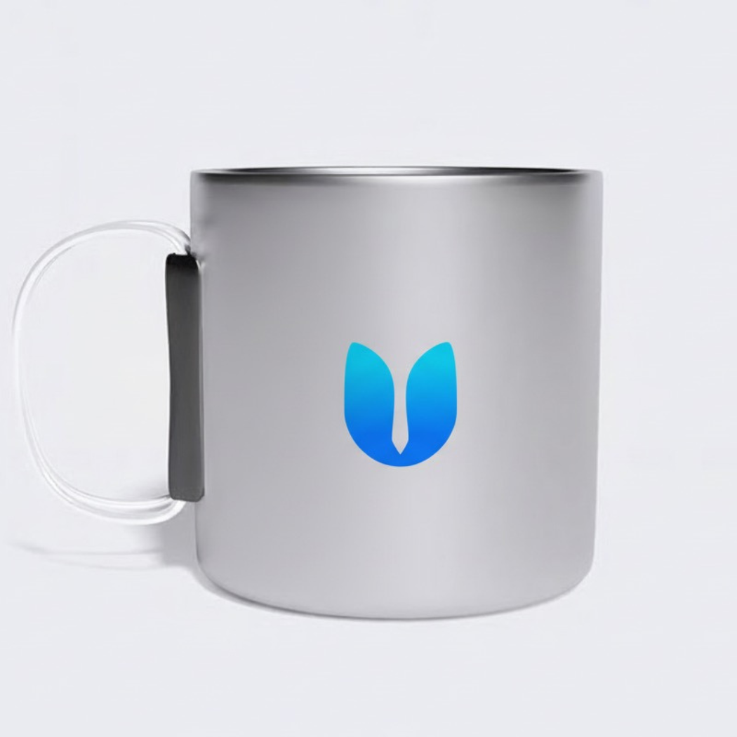
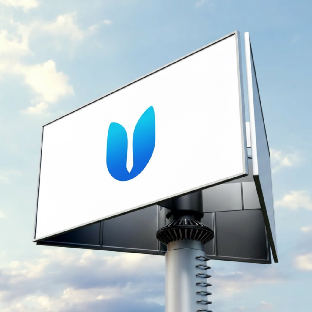
Applications |
Website header, app icon, LinkedIn profile, pitch decks, proposal templates, email signatures, office signage, stationery, brand guidelines, merch embroidery, presentation covers, favicon sets, and social media brand kits (dark/light background variants). |
|
Why This Design? |
Because it combines lettermark simplicity with symbolic storytelling. The U + bird concept projects confidence and upward progress, while the blue-cyan palette boosts trust and modernity. Result: a clean, premium mark that stays readable at tiny sizes and feels “big brand” across every touchpoint. |
1) Color Psychological Traits Table
|
Color Name |
Psychological Traits |
Emotional Meaning |
Branding Impact |
Best For |
|---|---|---|---|---|
|
#0C7AEF – Electric Trust Blue |
confident, stable, precise, “expert-led” |
reassurance, clarity, authority, dependability |
Signals credibility + competence, elevates perceived quality in professional branding and digital-first visual identitysystems |
consulting brands, SaaS, fintech, corporate identity, UI/UX, app icons, modern lettermark logos |
|
#0DCAF2 – Signal Aqua Cyan |
energetic, open, modern, progressive |
freshness, optimism, approachability, momentum |
Adds innovation + friendliness without losing trust—ideal for modern logogradients and standout brand accents |
startups, tech services, creative agencies, healthcare tech, clean UI palettes, social media branding |
2) Color Description
This blue-to-cyan palette is built for high-trust, modern brand perception. In brand color psychology meaning, saturated blues communicate reliability, expertise, and calm control qualities that help a logo feel “safe to choose,” especially in consulting, tech, and service-driven industries. The aqua-cyan lift introduces a fresh, contemporary edge, which supports stronger recall and a more approachable tone.
From a marketing color theory perspective, this pairing performs exceptionally well in digital design, because it stays vibrant on screens, reads clean at small sizes, and supports gradient-based hierarchy in a visual identity. When used in a logo mark or product packaging, it creates a crisp, premium feel positioning the brand as current, confident, and efficient.
In modern branding trends, blue/cyan gradients are often used to signal innovation and speed while maintaining trust. That combination helps improve consumer behavior signals like perceived professionalism, conversion confidence, and overall usability in UI-heavy environments.
3) Color Characteristics
-
Tone: modern, crisp, tech-forward (clean spectrum blues with high clarity)
-
Depth: strong mid-to-deep blue base paired with a lighter, airy cyan highlight
-
Visual temperature: cool (calming, rational, “systematic”)
-
Saturation: high saturation for strong shelf/screen presence and brand recall
-
Associations: trust, intelligence, efficiency, freshness, innovation, clarity, transparency
-
Branding impressions: premium digital brand, reliable expertise, approachable modernity, confident service quality
-
Cultural significance: blue is widely read as dependable and professional; cyan adds a contemporary “progress” cue in global brand language
4) Full Color Conversion Table
Color 1:
#0C7AEF
|
Value |
Format |
Output |
|---|---|---|
|
CSS HEX |
HEX |
#0C7AEF |
|
RGB (Decimal) |
RGB |
(12, 122, 239) |
|
RGB (Percentage) |
RGB% |
(4.71%, 47.84%, 93.73%) |
|
CMYK |
CMYK |
(94.98%, 48.95%, 0.00%, 6.27%) |
|
HSL |
HSL |
(210.93°, 90.44%, 49.22%) |
|
HSV / HSB |
HSV |
(210.93°, 94.98%, 93.73%) |
|
Web Safe Color |
HEX |
#0066FF |
|
CIE-LAB |
Lab (D65/2°) |
(52.0920, 16.6504, -66.2864) |
|
CIE-XYZ |
XYZ (D65/2°) |
(0.2269, 0.2023, 0.8435) |
|
xyY |
xyY |
(0.1783, 0.1589, 0.2023) |
|
CIE-LCH |
LCH |
(52.0920, 68.3456, 284.1003°) |
|
CIE-LUV |
Luv |
(52.0920, -27.8708, -104.2977) |
|
Hunter-Lab |
Hunter Lab |
(44.9735, 14.1689, -89.1003) |
|
Binary RGB |
Binary |
00001100 01111010 11101111 |
Color 2:
#0DCAF2
|
Value |
Format |
Output |
|---|---|---|
|
CSS HEX |
HEX |
#0DCAF2 |
|
RGB (Decimal) |
RGB |
(13, 202, 242) |
|
RGB (Percentage) |
RGB% |
(5.10%, 79.22%, 94.90%) |
|
CMYK |
CMYK |
(94.63%, 16.53%, 0.00%, 5.10%) |
|
HSL |
HSL |
(190.48°, 89.80%, 50.00%) |
|
HSV / HSB |
HSV |
(190.48°, 94.63%, 94.90%) |
|
Web Safe Color |
HEX |
#00CCFF |
|
CIE-LAB |
Lab (D65/2°) |
(75.2846, -27.3797, -31.2968) |
|
CIE-XYZ |
XYZ (D65/2°) |
(0.3731, 0.4873, 0.9143) |
|
xyY |
xyY |
(0.2102, 0.2746, 0.4873) |
|
CIE-LCH |
LCH |
(75.2846, 41.5830, 228.8192°) |
|
CIE-LUV |
Luv |
(75.2846, -53.5420, -46.6397) |
|
Hunter-Lab |
Hunter Lab |
(69.8086, -23.7694, -35.3325) |
|
Binary RGB |
Binary |
00001101 11001010 11110010 |
5) Technical Color Explanation
-
#0C7AEF in an RGB color space made from red, green, and blue light contains 4.71% red, 47.84% green, and 93.73% blue—which is why it reads as a deep, trust-heavy electric blue. In CMYK (print), it converts to 94.98% cyan, 48.95% magenta, 0% yellow, 6.27% black, keeping it vivid while adding print stability.
-
#0DCAF2 contains 5.10% red, 79.22% green, and 94.90% blue, producing a bright aqua-cyan that feels modern and energetic. In CMYK it becomes 94.63% cyan, 16.53% magenta, 0% yellow, 5.10% black, which preserves the clean “fresh tech” look for brand collateral and packaging.
1) What is a U+Bird Lettermark Logo Design and why does it work?
A U+Bird Lettermark Logo Design merges a clean “U” monogram with a negative-space bird to create a simple, memorable brand symbol. From a design theory perspective, it uses shape economy and figure/ground contrast to improve recognition at small sizes. Psychologically, the bird cues freedom, direction, and optimism while the lettermark adds structure and authority. This balance makes it ideal for modern consulting, tech services, and premium professional brands.
2) Which industries benefit most from a U+Bird Logo concept?
A U+Bird Lettermark Logo Design is especially effective for consulting firms, SaaS products, finance/fintech, legal services, and modern agencies that need trust-first branding. The monogram communicates reliability and professionalism, while the bird introduces forward motion and leadership. This combination supports high-conversion brand perception on websites, proposals, and pitch decks. It also scales beautifully for app icons and social avatars where clarity matters most.
3) How does negative space improve a U+Bird Lettermark?
In a U+Bird Lettermark Logo Design, negative space creates an “aha” moment an emotional trigger that boosts memorability and brand recall. Good negative-space marks feel smart and intentional, which elevates perceived expertise. It also keeps the logo minimal, making it adaptable across backgrounds, sizes, and print methods. For brand identity systems, that versatility reduces redesign needs as the business grows.
4) Is a U+Bird Design better as a flat color or gradient mark?
A U+Bird Lettermark Logo Design can work in both, but the decision should follow usage and brand strategy. Gradients add modern energy and digital polish great for tech-forward brands and UI-first environments. Flat versions are essential for print, embroidery, stamps, and small-scale uses where consistency is critical. A professional identity package typically includes both so the mark stays premium everywhere.
5) What typography pairs best with a U+Bird Lettermark Logo Design?
A U+Bird Lettermark Logo Design pairs best with clean sans-serif typography geometric or humanist because it supports the minimal, high-clarity symbol. Brand psychology-wise, modern sans fonts signal efficiency, confidence, and contemporary professionalism. For consulting and B2B, slightly wider letter-spacing can add calm authority. The goal is visual harmony: the wordmark should feel like a system with the icon, not a separate piece.
6) Where should a U+Bird Logo be used for maximum brand impact?
A U+Bird Lettermark Logo Design performs strongest on website headers, LinkedIn banners, proposal covers, pitch decks, business cards, and app icons where trust and clarity drive conversions. On social media, it reads instantly as a recognizable avatar, helping brand consistency across platforms. For physical branding, it works well on signage, notebooks, uniforms, and premium packaging due to its strong silhouette. Using consistent spacing rules and color variants keeps the identity polished.
7) What files and variations should I get with a U+Bird Design?
A U+Bird Lettermark Logo Design should be delivered as vector files (AI, EPS, SVG, PDF) plus web formats (PNG, JPG/WebP) for fast loading and sharp rendering. You’ll also want variations: full color, one-color, black/white, icon-only, and reversed versions for dark backgrounds. From a brand-system standpoint, include a small usage guide covering safe area, minimum size, and color codes. This protects consistency and makes your logo look premium across every touchpoint.
Reviews
There are no reviews yet.