
Description
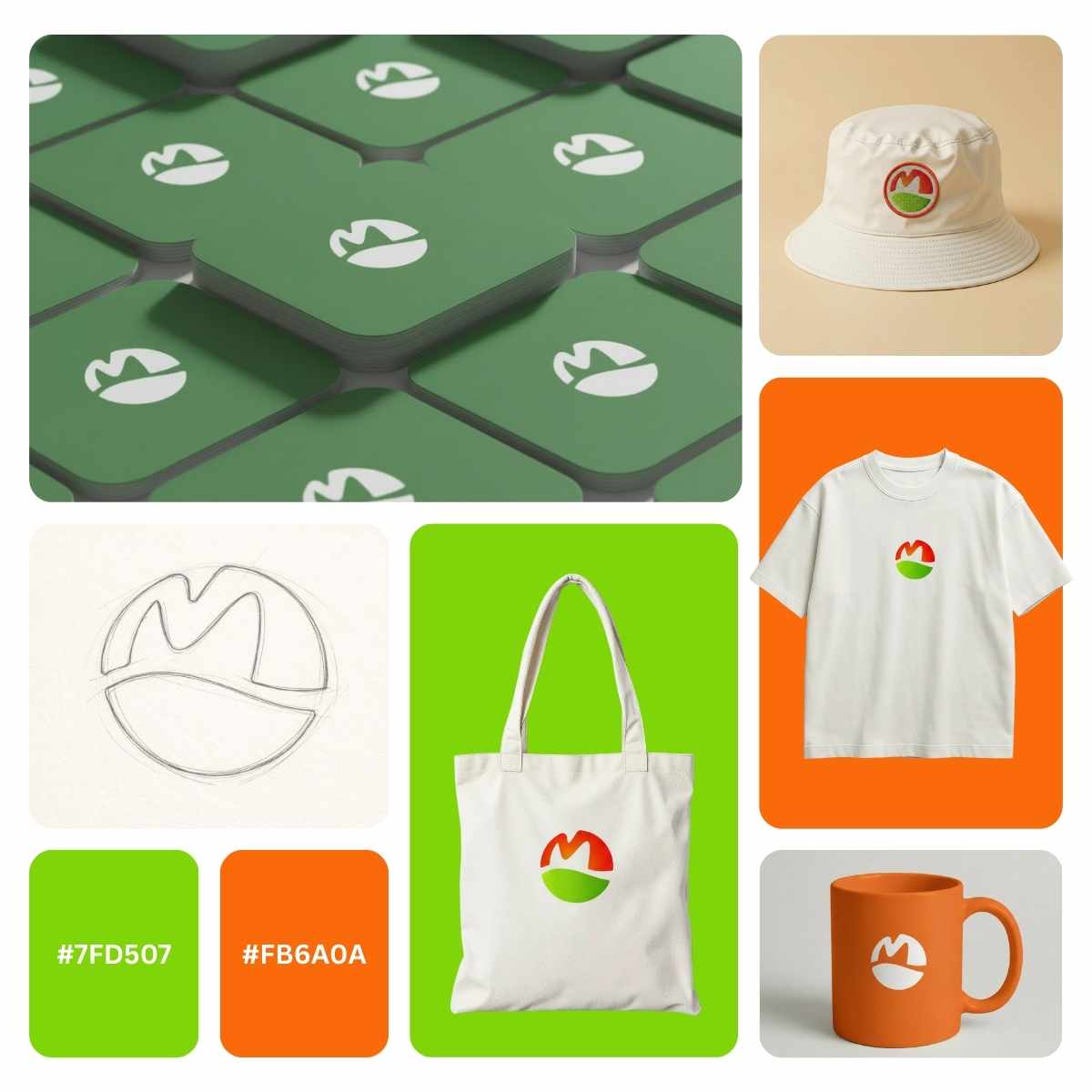
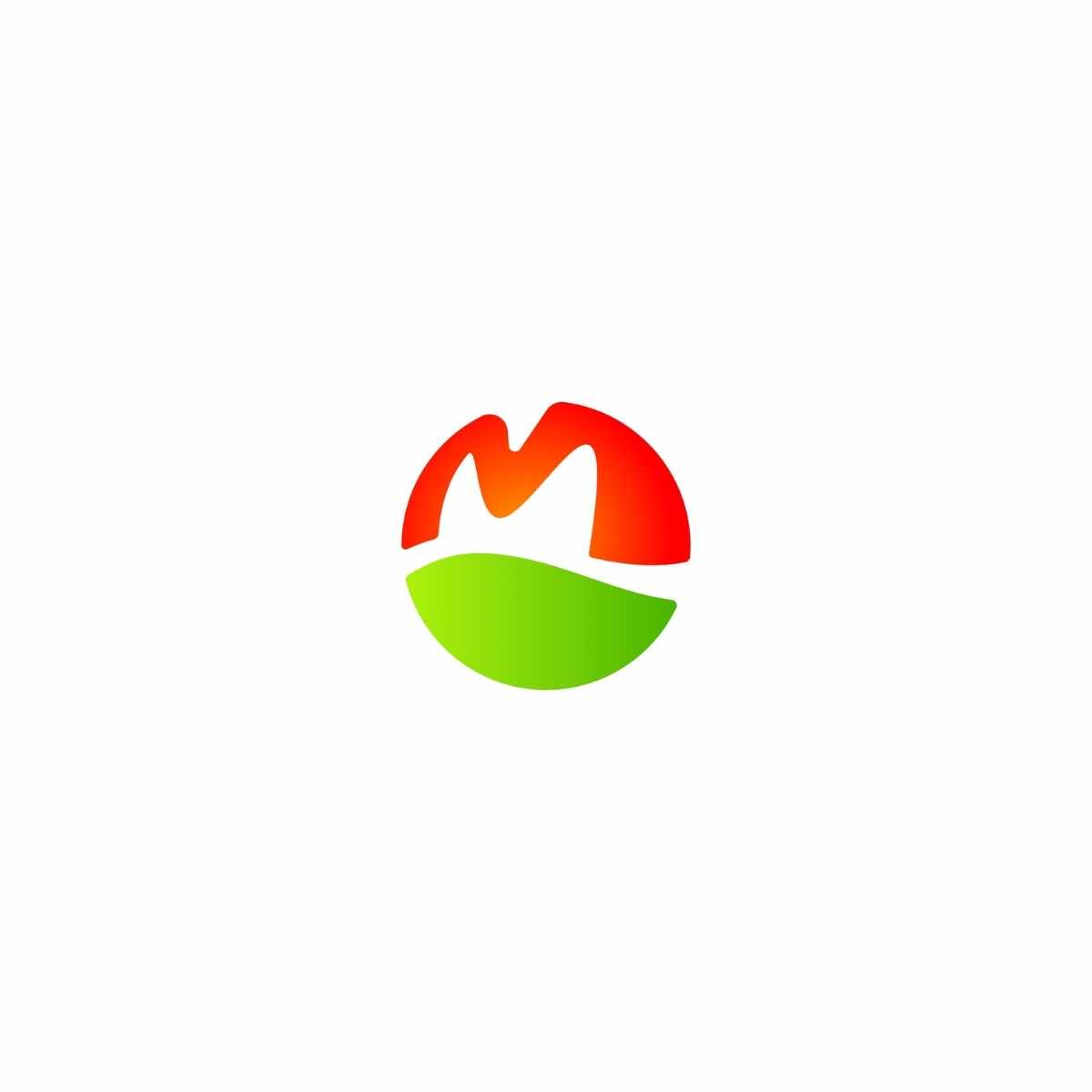
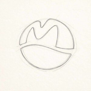
M Farm Logo Design is a modern circular monogram crafted to communicate growth, freshness, and trust in one simple mark. The bold “M” silhouette reads like a hill-line or barn-roof crest, while the curved lower shape forms a field horizon creating an instantly recognizable agriculture emblem with strong visual balance.
The pistachio green delivers a clear organic, eco-forward signal, while blaze orange adds harvest energy and confident visibility for both print and digital branding.
Designed as a minimalist logo mark, this identity works beautifully for farms, ranches, dairy brands, produce labels, agribusiness startups, farmers markets, and rural lifestyle merchandise.
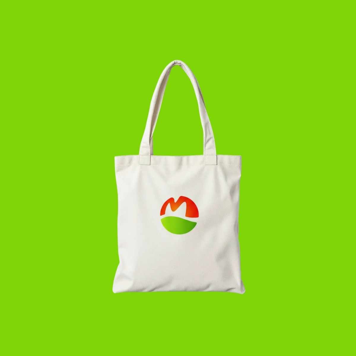
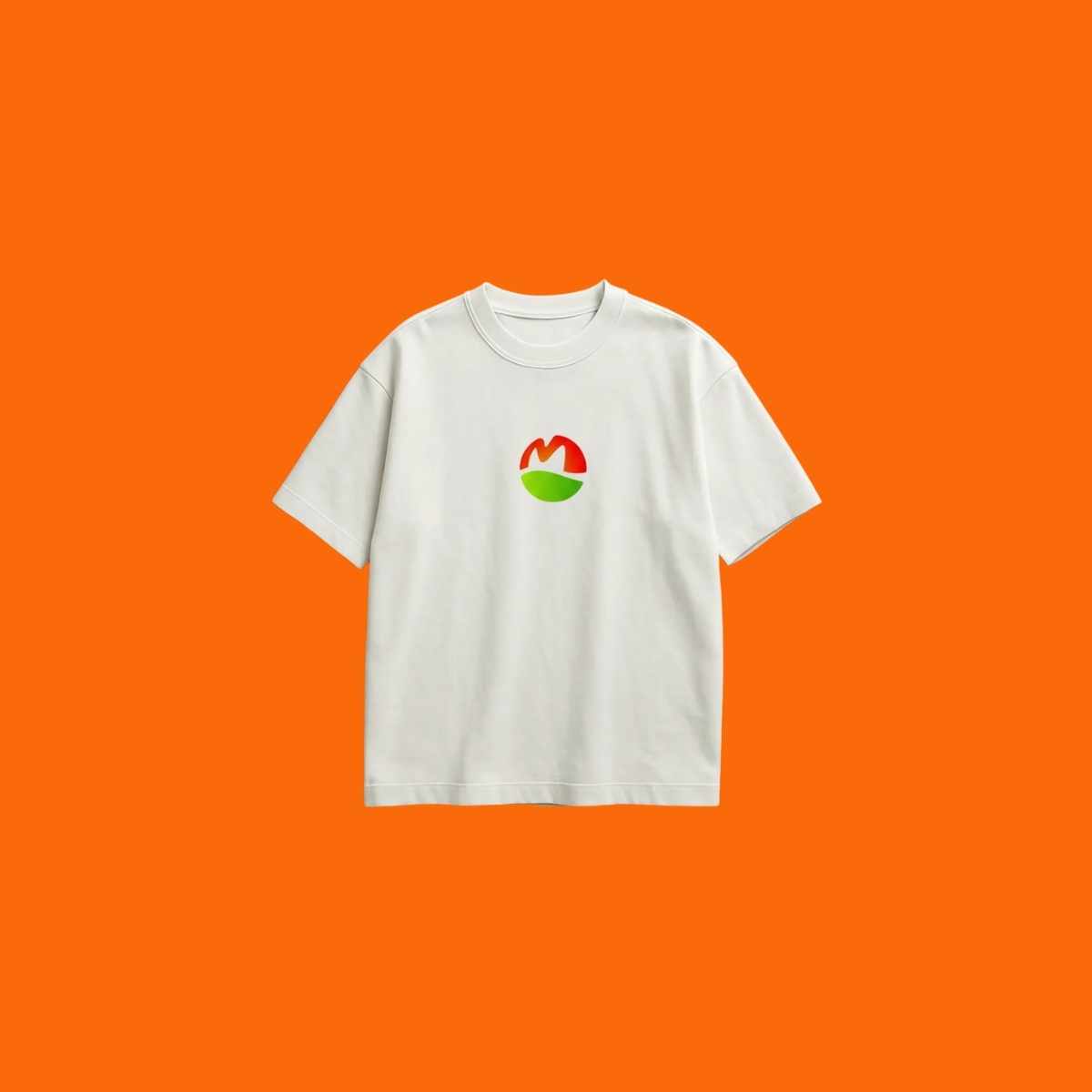
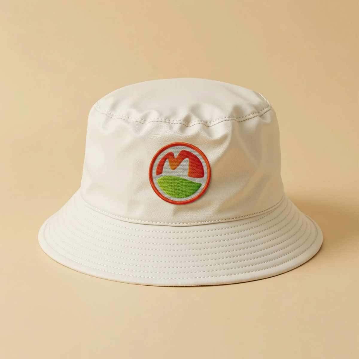
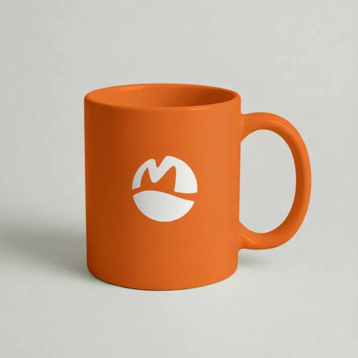
It scales cleanly from small favicon use to large storefront signage, and looks premium on hats, t-shirts, tote bags, stickers, cartons, and social media profiles. Ideal if you want a professional farm brand identity that feels modern, friendly, and commercially ready.
|
Aspect |
Details |
|---|---|
|
Title |
M Farm Logo Design – Modern Circular Field Monogram Identity |
|
Color Psychology |
The pistachio green (#7FD507) signals freshness, organic growth, and sustainable farming ideal for brands that want “from the field” credibility. Blaze orange (#FB6A0A) adds harvest energy, optimism, and standout shelf visibility for produce and rural lifestyle goods. Scarlet (#FC2404) brings bold confidence and urgency, helping the mark pop on signage and digital thumbnails while reinforcing a strong, market-ready farm brand presence. |
|
Shapes Used |
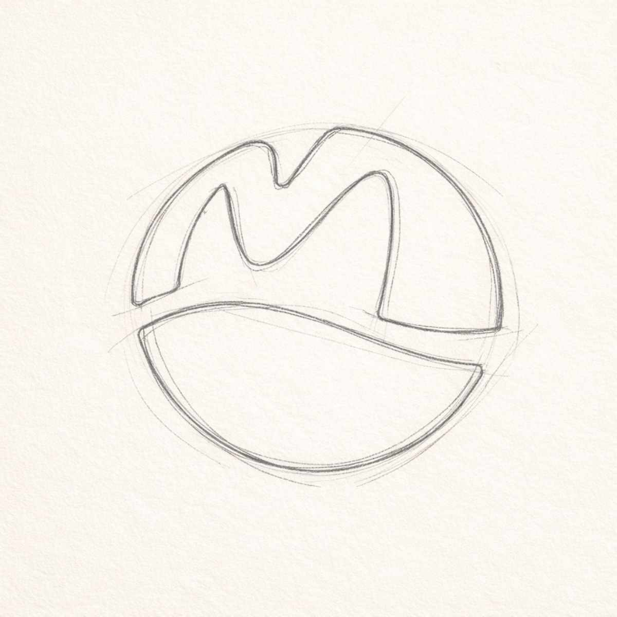
A circular badge frames the identity for easy stamping and label use. Inside, a stylized “M” peak reads as a hillline/barn-roof silhouette, paired with a curved field horizon that creates a clean agricultural emblem. The simplified geometry keeps the logo scalable and recognizable at small sizes. |
|
Symbolism |
The mark merges land + legacy: the “M” suggests the farm name and leadership, while the lower curve represents cultivated fields and steady yield. The circle implies community, trust, and continuity important cues for farm-to-table brands, markets, and agribusiness. Overall, it communicates “fresh, local, dependable” without visual clutter. |
|
Typography |
This logo functions as a standalone icon/monogram, designed to pair best with a modern sans-serif or a warm slab-serif wordmark. The icon-first approach gives a premium, confident brand impression and supports flexible lockups (horizontal, stacked, badge-style). |
|
Design Approach |
A minimalist monogram badge built for commercial clarity: strong negative space, balanced proportions, and color-block simplicity for fast recognition. The style fits modern farm branding trends clean, friendly, and scalable while still feeling authentic for rural and agriculture categories. |
|
Best For |
Ideal for farms, ranches, dairy brands, produce packaging, agribusiness startups, farmers markets, organic goods, seed companies, and rural lifestyle apparel. Works especially well for “modern farm logo,” “agriculture brand identity,” “farm-to-table branding,” and “produce label logo” search intent. |
|
Target Audience |
Farm owners, agribusiness founders, organic product makers, and local-market vendors who want a professional visual identity that builds trust quickly. Also strong for buyers/decision-makers focused on packaging, retail presence, and consistent branding across digital and print. |
|
Applications |
Optimized for packaging labels, cartons, stickers, stamps, embroidered hats, t-shirts, tote bags, signage, vehicle decals, social media avatars, website headers, app icons, and favicon use. The circular format also suits seals, quality marks, and certification-style badges. |
|
Why This Design? |
This M Farm Logo Design differentiates by combining a memorable monogram with clear field symbolism so it feels both modern and authentic. The palette supports attention + trust: green for freshness, orange/scarlet for energy and visibility. It’s a versatile, scalable mark that performs in real-world branding from tiny labels to large outdoor signage without losing impact. |
Color Psychological Traits Table
|
Color Name |
Psychological Traits |
Emotional Meaning |
Branding Impact |
Best For |
|---|---|---|---|---|
|
Scarlet (#FC2404) |
High-energy, decisive, action-driven, attention-grabbing |
Bold confidence, urgency, appetite, momentum |
Creates instant recall in logo design, strengthens calls-to-action, and adds a premium “standout” edge in visual identity systems |
Food & beverage branding, farm-to-table labels, digital ads, signage, sports & retail promotions |
|
Pistachio (#7FD507) |
Fresh, optimistic, growth-focused, clean and modern |
Nature, renewal, health, trust |
Signals sustainability and “fresh from the farm” credibility; works beautifully as a brand identity anchor color in packaging and UI |
Organic products, agriculture brands, eco packaging, wellness, grocery, outdoor and lifestyle brands |
|
Blaze Orange (#FB6A0A) |
Warm, friendly, spirited, energetic without aggression |
Harvest warmth, creativity, approachability |
Adds a vibrant “sunlit” accent that boosts legibility and brand warmth across print + digital; great for highlight elements |
Product packaging, social media, store displays, apparel prints, event branding, seasonal campaigns |
Color Description
This palette blends Scarlet, Pistachio, and Blaze Orange into a high-contrast, modern system that communicates freshness + energy + approachability a powerful combination for contemporary branding. In color psychology meaning and marketing color theory, scarlet drives attention and action, pistachio signals growth and natural credibility, and blaze orange adds warmth that feels human, welcoming, and optimistic.
From a brand perception perspective, these hues work especially well in logos because they balance emotional impact with clarity. Pistachio performs as the “trust and freshness” base, while the reds/oranges act as memorable accents that guide the eye ideal for icons, badges, and simplified marks used in digital design. In packaging, this trio supports strong shelf visibility and fast recognition; in UI, it delivers clean hierarchy for buttons, highlights, and category markers.
As a luxury color palette alternative for modern brands, it feels energetic yet controlled perfect for identity systems that need to look premium, current, and conversion-focused without losing an organic, real-world tone.
Color Characteristics
Scarlet (#FC2404)
-
Tone: Bold, punchy, high-impact
-
Depth: Strong saturation, crisp contrast on light backgrounds
-
Visual temperature: Hot / energetic
-
Associations: Passion, urgency, appetite cues, confidence
-
Branding impressions: “Premium attention,” performance, strong CTA behavior
-
Cultural significance: Often linked to celebration, emphasis, importance
Pistachio (#7FD507)
-
Tone: Fresh, lively, nature-forward
-
Depth: Bright green with clean modernity
-
Visual temperature: Cool-leaning but vibrant
-
Associations: Growth, sustainability, health, agriculture
-
Branding impressions: “Fresh & trustworthy,” eco-friendly, farm-grade authenticity
-
Cultural significance: Connected to renewal, prosperity, and wellbeing
Blaze Orange (#FB6A0A)
-
Tone: Warm, friendly, energetic
-
Depth: Saturated accent that stays readable in UI and print
-
Visual temperature: Warm / sunlit
-
Associations: Harvest, enthusiasm, creativity, approachability
-
Branding impressions: “Inviting and active,” modern retail energy
-
Cultural significance: Often tied to warmth, community, seasonal abundance
Full Color Conversion Table
Scarlet —
#FC2404
|
Value |
Format |
Output |
|---|---|---|
|
Scarlet |
CSS HEX |
#FC2404 |
|
Scarlet |
RGB (Decimal) |
252, 36, 4 |
|
Scarlet |
RGB (Percentage) |
98.82%, 14.12%, 1.57% |
|
Scarlet |
CMYK |
0.00, 85.71, 98.41, 1.18 |
|
Scarlet |
HSL |
H 7.74° / S 97.64% / L 50.20% |
|
Scarlet |
HSV / HSB |
H 7.74° / S 98.41% / V 98.82% |
|
Scarlet |
Web-Safe HEX |
#FF3300 |
|
Scarlet |
CIE-LAB |
L 53.9983 / a 75.4686 / b 66.1499 |
|
Scarlet |
CIE-XYZ |
X 40.8031 / Y 21.9730 / Z 2.2077 |
|
Scarlet |
xyY |
x 0.627897 / y 0.338130 / Y 21.9730 |
|
Scarlet |
CIE-LCH |
L 53.9983 / C 100.3559 / H 41.2353° |
|
Scarlet |
CIE-LUV |
L 53.9983 / u 165.0074 / v 39.4431 |
|
Scarlet |
Hunter-Lab |
L 46.8753 / a 78.2368 / b 29.7849 |
|
Scarlet |
Binary RGB |
11111100 00100100 00000100 |
Pistachio — #7FD507
|
Value |
Format |
Output |
|---|---|---|
|
Pistachio |
CSS HEX |
#7FD507 |
|
Pistachio |
RGB (Decimal) |
127, 213, 7 |
|
Pistachio |
RGB (Percentage) |
49.80%, 83.53%, 2.75% |
|
Pistachio |
CMYK |
40.38, 0.00, 96.71, 16.47 |
|
Pistachio |
HSL |
H 85.05° / S 93.64% / L 43.14% |
|
Pistachio |
HSV / HSB |
H 85.05° / S 96.71% / V 83.53% |
|
Pistachio |
Web-Safe HEX |
#66CC00 |
|
Pistachio |
CIE-LAB |
L 77.3491 / a -52.4259 / b 75.3253 |
|
Pistachio |
CIE-XYZ |
X 32.5846 / Y 52.1142 / Z 8.5431 |
|
Pistachio |
xyY |
x 0.349463 / y 0.558914 / Y 52.1142 |
|
Pistachio |
CIE-LCH |
L 77.3491 / C 91.7736 / H 124.8377° |
|
Pistachio |
CIE-LUV |
L 77.3491 / u -42.8980 / v 90.5776 |
|
Pistachio |
Hunter-Lab |
L 72.1902 / a -43.2266 / b 42.9250 |
|
Pistachio |
Binary RGB |
01111111 11010101 00000111 |
Blaze Orange — #FB6A0A
|
Value |
Format |
Output |
|---|---|---|
|
Blaze Orange |
CSS HEX |
#FB6A0A |
|
Blaze Orange |
RGB (Decimal) |
251, 106, 10 |
|
Blaze Orange |
RGB (Percentage) |
98.43%, 41.57%, 3.92% |
|
Blaze Orange |
CMYK |
0.00, 57.77, 96.02, 1.57 |
|
Blaze Orange |
HSL |
H 23.90° / S 96.79% / L 51.18% |
|
Blaze Orange |
HSV / HSB |
H 23.90° / S 96.02% / V 98.43% |
|
Blaze Orange |
Web-Safe HEX |
#FF6600 |
|
Blaze Orange |
CIE-LAB |
L 62.3770 / a 51.8588 / b 69.3668 |
|
Blaze Orange |
CIE-XYZ |
X 44.9976 / Y 30.8455 / Z 3.8715 |
|
Blaze Orange |
xyY |
x 0.564484 / y 0.386950 / Y 30.8455 |
|
Blaze Orange |
CIE-LCH |
L 62.3770 / C 86.6088 / H 53.2181° |
|
Blaze Orange |
CIE-LUV |
L 62.3770 / u 120.6338 / v 53.7251 |
|
Blaze Orange |
Hunter-Lab |
L 55.5388 / a 51.9809 / b 34.3957 |
|
Blaze Orange |
Binary RGB |
11111011 01101010 00001010 |
Technical Color Explanation
-
These conversions assume sRGB color space with D65 white point (standard for web/digital branding).
-
In RGB (light-based), each color is made by mixing red, green, and blue channels (shown above in decimal and percentage).
-
In CMYK (ink-based, print), values represent how much cyan, magenta, yellow, and black are used to approximate the same visual color on paper—useful for packaging and production planning.
-
CIE spaces (Lab/XYZ/Luv/LCH) describe color in ways that better match human perception, which helps when aligning brand color meaning, accessibility, and cross-device consistency.
1) What makes M Farm Logo Design effective for modern agriculture brands?
An M Farm Logo Design works best when it balances instant recognition with a clear “farm-fresh” message often through a clean monogram, simple field curve, or circular badge structure. From a brand psychology standpoint, minimal forms feel trustworthy and organized, which helps buyers associate the farm with quality control and consistent sourcing. Design theory-wise, strong negative space and a single iconic silhouette improve legibility on packaging, signage, and social avatars. This approach is ideal for farm-to-table positioning, CSA programs, and premium produce brands that need a modern visual identity.
2) How does color choice impact an M Farm Logo Design and customer trust?
In an M Farm Logo Design, greens typically signal freshness, sustainability, and natural growth, while warm oranges/reds add energy and appetite appeal key triggers in consumer behavior. A high-contrast palette also improves visibility at small sizes, supporting better recall on labels and digital ads. In branding terms, consistent color application across touchpoints builds familiarity, which is a major driver of trust in food and agriculture markets. The right color system also helps differentiate “organic,” “artisan,” or “local farm” positioning without over-explaining.
3) Should an M Farm Logo Design be a monogram, emblem, or mascot?
An M Farm Logo Design often performs best as a monogram or emblem because farms need versatile marks that scale cleanly on stamps, crates, merch, and web icons. Emblems (circular badges) feel established and premium, while monograms communicate modern simplicity and fast readability. Mascot-style farm logos can work too, but they typically require more detail and may lose clarity on small applications. For a premium brand identity, a minimal logo mark with a strong silhouette usually delivers the highest usability across print and digital.
4) Where can you use an M Farm Logo Design for maximum brand consistency?
An M Farm Logo Design should be built to work across packaging labels, egg cartons, produce stickers, tote bags, hats, vehicle decals, storefront signage, and social media profiles. The strongest systems include primary and secondary lockups (icon-only, stacked, and horizontal) to fit different layouts. From a practical usage standpoint, you’ll also want a one-color version for embossing, laser engraving, and rubber stamps. This kind of flexible visual identity helps your farm look professional everywhere customers encounter it.
5) What file formats should I request with an M Farm Logo Design?
A professional M Farm Logo Design should come with vector files (AI, EPS, PDF) for perfect scaling and print production, plus PNG/SVG for websites and social media. Vector artwork ensures the mark stays sharp on large signage and tiny product stickers. You’ll also want a brand kit with color codes (HEX/RGB/CMYK), clear-space rules, and background variations. These deliverables make your brand identity easier to manage and keep consistent across vendors.
6) How do I make an M Farm Logo Design look premium instead of generic?
To make an M Farm Logo Design feel premium, focus on distinctive geometry, balanced spacing, and a unique “field line” or landscape cut that’s ownable to the brand. Premium logos avoid overused clipart and rely on refined proportions, clean curves, and intentional negative space. In marketing terms, simplicity increases memorability, while subtle detail creates differentiation—especially in crowded agriculture and organic product categories. A modern minimalist emblem can still feel warm and authentic when paired with the right color psychology and application style.
7) Can an M Farm Logo Design still work if the farm expands into new products?
Yes, a M Farm Logo Design is ideal for growth because a strong monogram/emblem can stretch across produce, dairy, honey, poultry, or farm shop retail without needing a redesign. From a brand strategy perspective, the symbol becomes the “signature” that unifies sub-products through consistent typography, color, and packaging layout. This scalability is one reason minimal logo systems outperform overly specific illustrations long-term. With smart brand architecture (sub-labels and secondary marks), the identity stays coherent as the business evolves.
Reviews
There are no reviews yet.