


Description
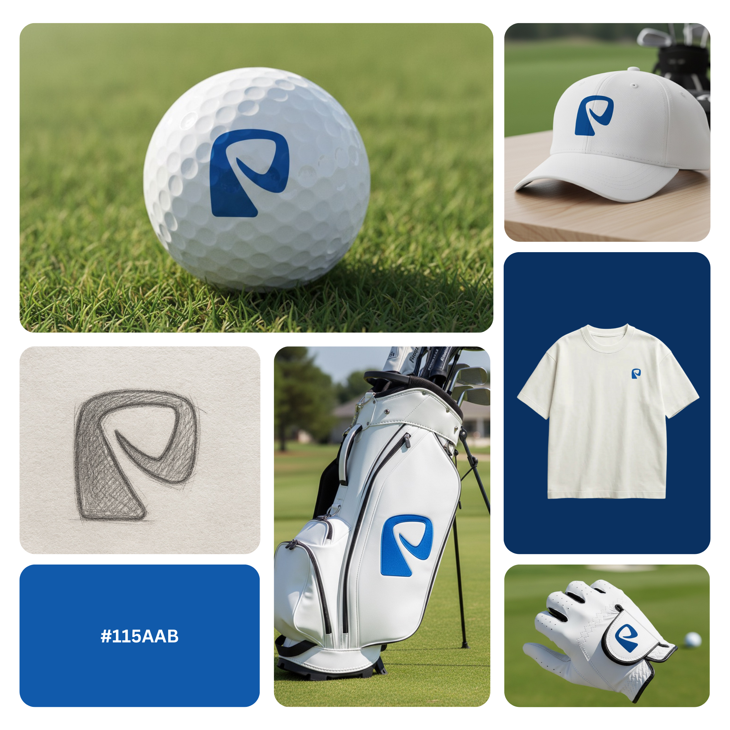
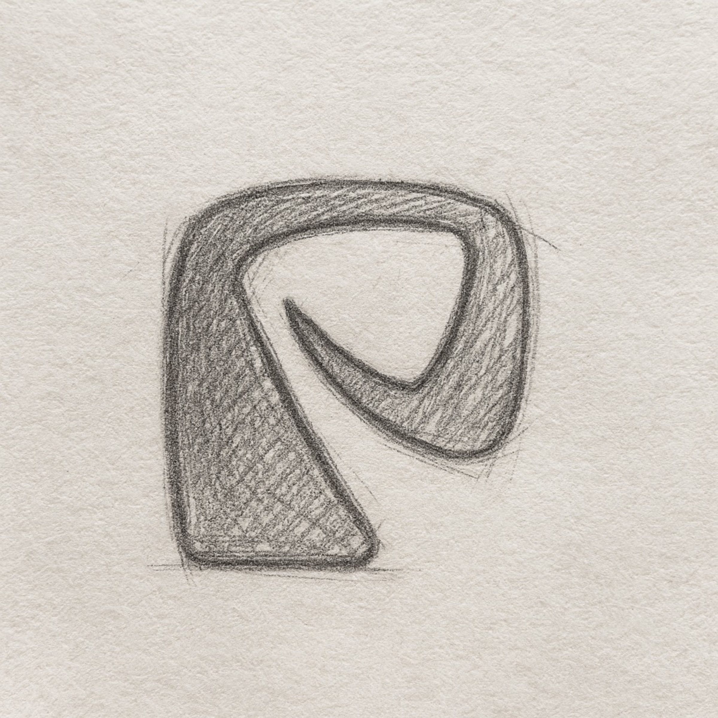
Girls Golf Club Logo Design created to deliver a powerful visual identity for women-focused golf clubs, teams, academies, and sports brands. This logo concept combines elegance and athletic strength through a clever hidden golf stick integrated into a flowing feminine hair silhouette, making the mark both symbolic and instantly recognizable.
Designed with modern branding principles, the logo uses clean curves, balanced negative space, and a bold blue tone inspired by classic sports heritage. The result is a professional golf logo that communicates trust, unity, and empowerment while maintaining a fresh and contemporary aesthetic.
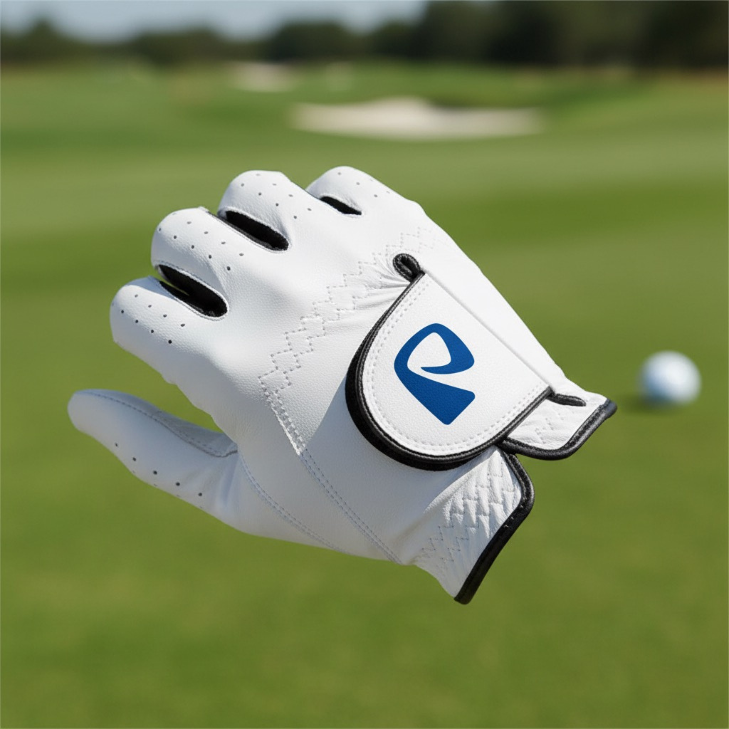
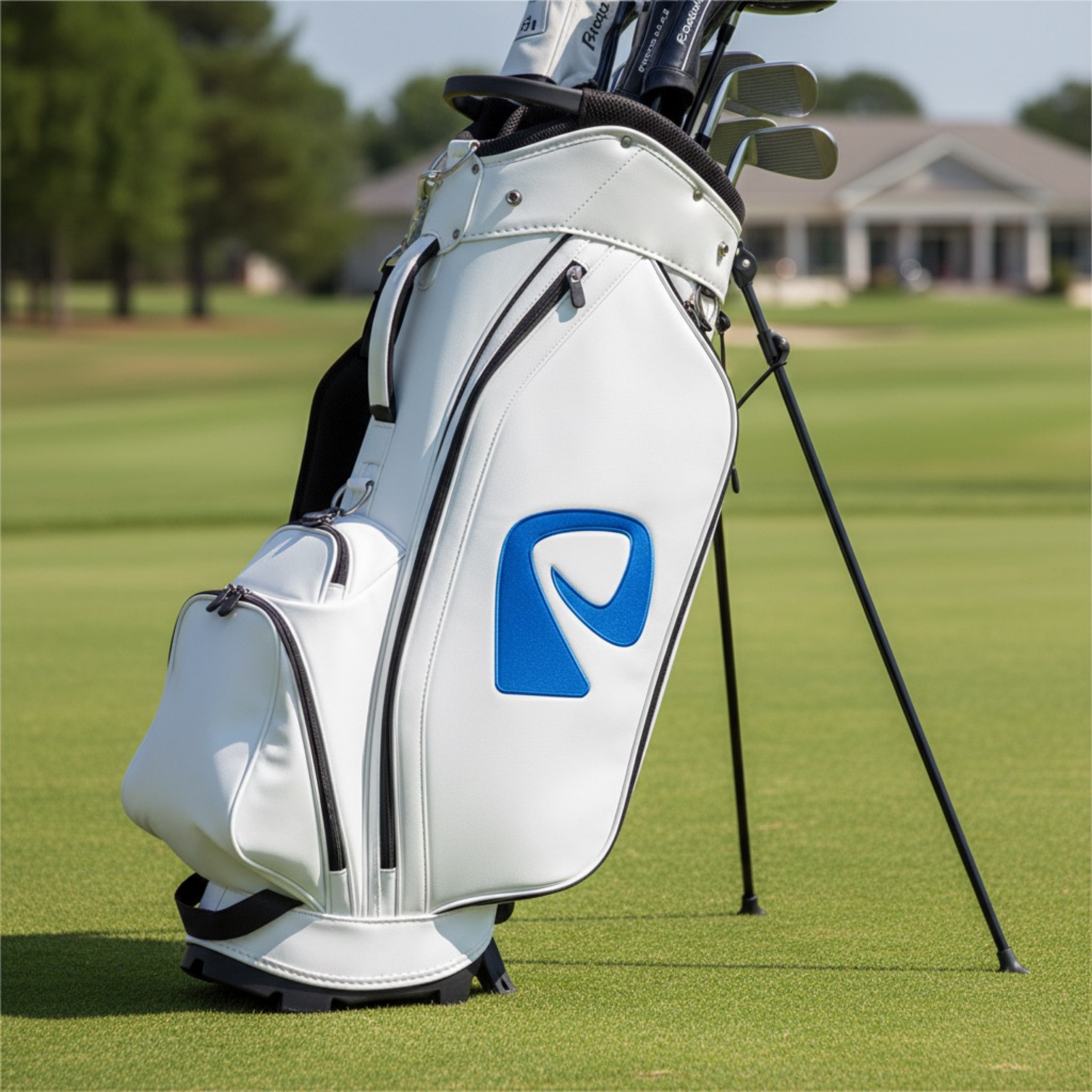
This design is ideal for golf clubs, women’s leagues, apparel brands, training academies, events, and social media branding. Its minimal structure ensures excellent scalability, allowing seamless use across merchandise, uniforms, websites, signage, digital platforms, and promotional materials.
More than just a visual mark, this girls golf logo builds emotional connection by celebrating confidence, inclusivity, and passion for the game making it a strong foundation for long-term brand recognition in the competitive sports industry.
|
Aspect |
Details |
|---|---|
|
Title |
Girls Golf Club Logo Design – Modern Feminine Sports Identity |
|
Color Psychology |
The deep blue tone (#115AAB) conveys trust, discipline, and heritage while reflecting the competitive spirit of golf. Blue is strongly associated with professionalism, confidence, and stability, making it ideal for women’s golf branding that balances strength with elegance. |
|
Shapes Used |
The logo features smooth, flowing curves combined with a compact monogram-style structure. Rounded contours enhance approachability, while the bold outer silhouette ensures strong visibility, making it a scalable modern logo mark suitable for digital and print use. |
|
Symbolism |
A hidden golf stick seamlessly integrated into a feminine hair silhouette represents skill, identity, and empowerment. This clever symbolism communicates precision, confidence, and passion for golf, reinforcing a strong emotional connection with women-focused sports communities. |
|
Typography |
Designed to complement modern sans-serif typography, the logo pairs best with clean, contemporary typefaces. The overall typographic tone feels confident, minimal, and professional—ideal for sports clubs, premium apparel brands, and athletic organizations. |
|
Design Approach |
This logo follows a modern minimal branding approach, emphasizing negative space, visual storytelling, and symbolic simplicity. The concept-driven design ensures memorability while maintaining versatility across multiple branding environments. |
|
Best For |
Women’s golf clubs, girls golf academies, sports training centers, athletic apparel brands, golf events, community leagues, and professional sports branding projects seeking a feminine yet powerful logo identity. |
|
Target Audience |
Female golfers, youth golf programs, club founders, sports brand managers, apparel buyers, and organizations focused on empowering women through athletic excellence and community-driven sports branding. |
|
Applications |
Golf apparel and uniforms, caps, embroidery, merchandise, club signage, website branding, social media profiles, event banners, printed materials, mobile apps, and promotional campaigns. |
|
Why This Design? |
This girls golf club logo design stands out through its intelligent symbolism, strong color psychology, and modern execution. It offers high brand recall, emotional resonance, and professional versatility—making it a long-term branding asset rather than a short-term visual trend. |
FAQ 1: What makes a Girls Golf Club Logo Design effective for modern sports branding?
An effective Girls Golf Club Logo Design blends athletic energy with feminine sophistication, creating a mark that resonates with women and youth golfers. Strong visual psychology—such as clean curves, balanced negative space, and minimal shapes—helps the logo communicate confidence and inclusivity. This approach is ideal for modern feminine brand identity and aligns with the design principles used in successful female sports logos. When executed well, it becomes a timeless emblem suitable for apparel, signage, and digital branding.
FAQ 2: Why is symbolism important in a Girls Golf Club Logo Design?
Symbolism strengthens a Girls Golf Club Logo Design by embedding emotional meaning into its form, ensuring the logo stands for more than just a sport. Feminine silhouettes, subtle line-art elements, or modern abstract marks can convey empowerment, precision, and community. This design psychology enhances brand recognition, especially for clubs seeking an elegant female logo concept. Symbolism also makes the identity more memorable across social media and merchandising.
FAQ 3: What design elements work best in a minimalist Girls Golf Club Logo Design?
A minimalist Girls Golf Club Logo Design typically uses streamlined shapes, refined curves, and intentional spacing to maintain clarity across all sizes. These elements mirror the principles behind minimalist feminine emblems and simple woman-silhouette logo styles. The goal is to create a clean, modern feminine brand identity that retains impact on golf apparel, embroidery, and mobile screens. Minimalism also improves long-term versatility as the brand evolves.
FAQ 4: How does color psychology influence a Girls Golf Club Logo Design?
Color psychology plays a critical role in shaping the emotional tone of a Girls Golf Club Logo Design. Shades of blue, teal, or soft neutrals can communicate trust, ambition, and athletic discipline—key traits in female sports branding. These hues are often used in modern feminine brand identities because they balance strength with professionalism. The right palette ensures the logo feels premium, approachable, and aligned with club culture.
FAQ 5: Can a Girls Golf Club Logo Design work for merchandise and apparel?
Yes, a well-crafted Girls Golf Club Logo Design is highly adaptable for apparel, accessories, and premium golf merchandise. Its clean geometry and modern feminine emblem structure ensures crisp results on fabric, embroidery, hats, and sports equipment. A strong feminine brand identity increases product desirability, making merchandise more appealing to members and supporters. This versatility also enhances long-term brand consistency across all touchpoints.
FAQ 6: Who benefits most from a Girls Golf Club Logo Design?
A professional Girls Golf Club Logo Design benefits women’s golf clubs, girls’ training academies, youth leagues, tournaments, and lifestyle sports brands. These organizations need an identity that reflects empowerment, athletic excellence, and community spirit. Modern feminine brand identity principles ensure the logo appeals to decision-makers such as coaches, club directors, and brand managers. It also helps attract new members who value strong, elegant, and inclusive branding.
FAQ 7: What makes a Girls Golf Club Logo Design stand out from traditional golf logos?
A standout Girls Golf Club Logo Design integrates feminine symbolism, refined lines, and modern visual storytelling—elements not often seen in traditional golf branding. It replaces harsh, masculine motifs with softer curves, balanced proportions, and minimalist woman silhouette styles, making it emotionally relevant to a female audience. This shift enhances brand differentiation and helps clubs establish a premium, contemporary identity. By merging elegance with sport, the logo becomes instantly memorable and market-ready.
Reviews
There are no reviews yet.